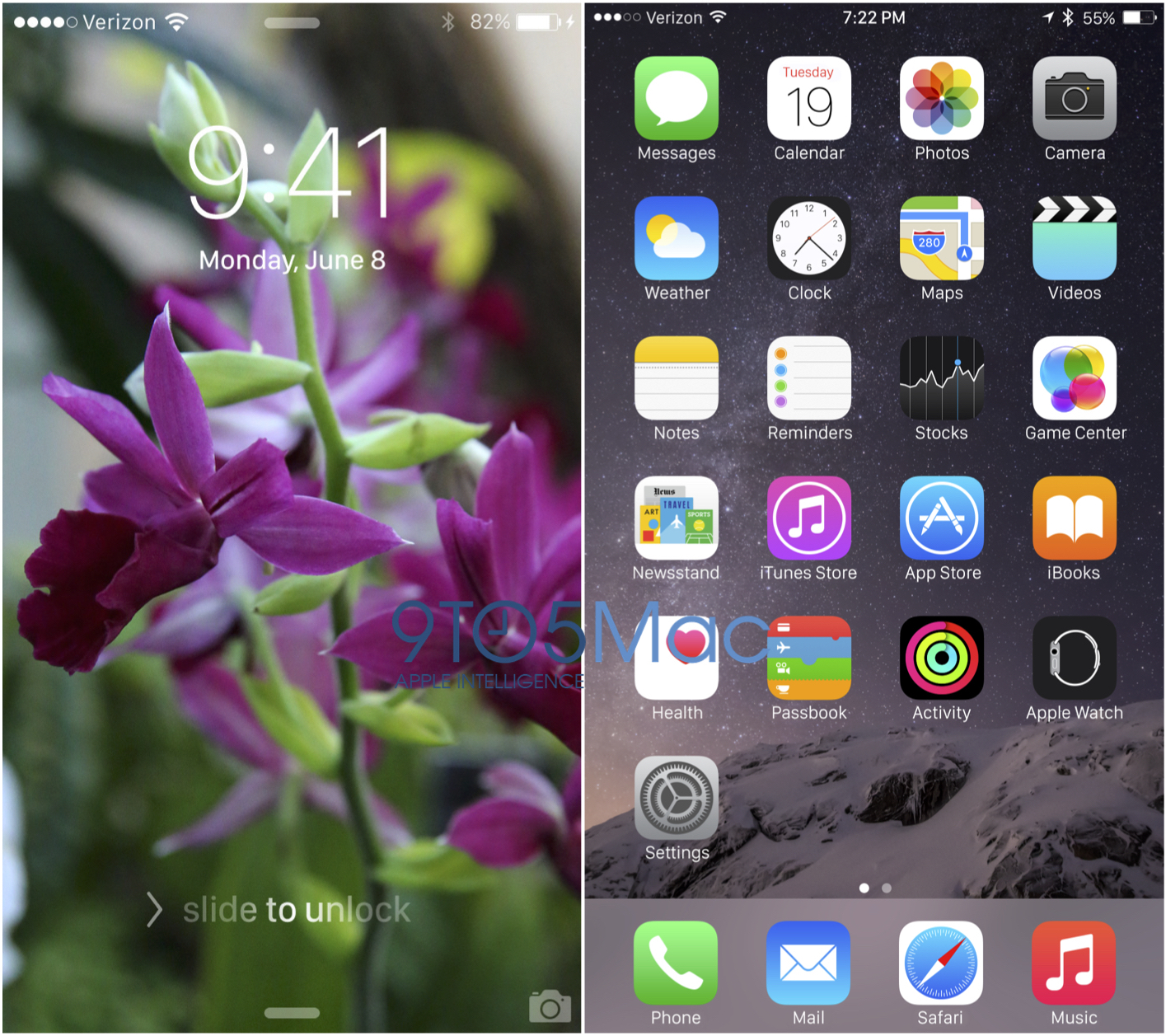
Apple is currently planning to use the new system font developed for the Apple Watch to refresh the looks of iPads, iPhones, and Macs running iOS 9 “Monarch” and OS X 10.11 “Gala,” according to sources with knowledge of the preparations. Current plans call for the Apple-designed San Francisco font to replace Helvetica Neue, which came to iOS 7 in 2013 and OS X Yosemite just last year, beginning with a June debut at WWDC…
The slightly flashier and somewhat more readable San Francisco font first appeared on the Apple Watch, which was shown in September 2014 and released last month. Given the considerably smaller displays used on 38mm and 42mm Apple Watches, Apple developed the San Francisco font “specifically for legibility,” according to a description of typography on the Apple Watch Human Interface webpages for developers. San Francisco scales more dynamically to “maintain clarity and legibility” regardless of text size.
 Users have already hacked OS X Yosemite to use San Francisco
Ever since switching to particularly thin weights of Helvetica Neue in iOS 7, Apple has been chastised for using a font that emphasizes clean lines over readability, and San Francisco is intended to solve this. According to the sources familiar with the decision to move to the San Francisco type face on iOS and OS X, Apple higher-ups also believe that the new look will serve to refresh its familiar operating systems, helping iOS and OS X to avoid becoming stale. However, some Apple engineers have told us that they are not fans of the new font, which may look particularly rough on non-Retina screens.
Installing a new system-wide font is also not as simple as it may seem. The change requires Apple to tweak all of its pre-bundled applications across iOS and OS X to fit the new font. It also requires additional quality assurance testing to ensure that the font does not unintentionally alter usability at different font sizes, or across third-party App Store apps. Multiple Apple employees tell us that new daily builds of OS X 10.11 and iOS 9 began including the new font toward the end of March. Apple will likely also push developers to redesign their apps ahead of the new font’s general release this fall.
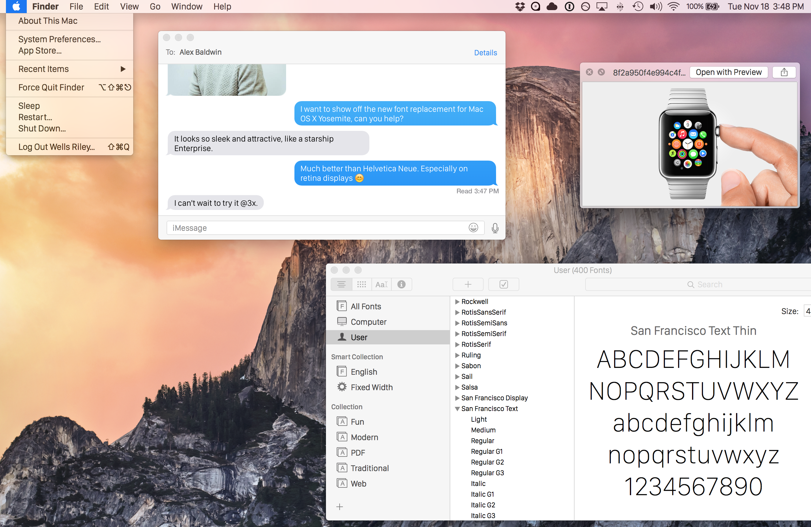
Some third-party developers have already started to redesign their apps for San Francisco, which began to stretch beyond the Apple Watch when the new 12-inch MacBook debuted with keyboard characters printed in the new font. While Apple is certainly well into the process of redesigning its two main operating systems to match the Apple Watch’s typography, sources did warn that Apple could ultimately choose to retain Helvetica Neue this year and push back or cancel its plans for San Francisco. The WWDC keynote will be held on Monday, June 8th.
FTC: We use income earning auto affiliate links. More.

I wonder what the chances are the font also comes to the new Apple TV 4.
What AppleTV needs is a better way to show you which app you’re on. It’s crazy to me that they expect that thin while box around an app to be visible enough for quick and easy navigation, I’m always off before I get my bearings on the screen. It could glow a bit or the app icon could enlarge above the rest, something more obvious.
What annoys me is if you are watching a video and need to read the description you have to quit the video, read the description and wait it to load again. The Apple TV should keep the cache for few minutes so you can back to the video faster or have access to the description over the video, like any cable TV.
Also, you should be able to exit an app and access the home screen saving the state of this app. So, when you re-open it you don’t have to navigate everything again to find the video you were watching.
@kyrodes You know that in most apps you can push up on the remote for the description.
I don’t know guys. When I look at the lock screen on my iPhone and then the one in the article, I like the current one better :/
The one in the article is a compressed JPEG. Don’t expect much of it.
I’m guessing that a real system font at that size would be hinted differently, or even a different weight selected before it becomes an iOS system font. Those strokes are very thin for the mockup’s screenshot size.
The Camera app already uses the font San Francisco.
No it’s actually DIN. SF looks somewhat similar.
I prefer the one in the article. Always fount the new font too thin.
You do know that you can “bold” the font in the general settings, right? Once done, restart the device and the font will be easier to read (a tiny bit thicker).
http://cdn.osxdaily.com/wp-content/uploads/2013/09/bold-fonts-easier-to-read-ios.jpeg
Please don’t.
No and no. No. Noooooooo. NO!
The WWDC Poster isn’t written in San Francisco. I would guess this change is still a year away.
I believe it was then wasn’t.
While you are partially right, in that “The epicenter of change” is written in Myriad Pro, the “WWDC15” logo *is* written in San Francisco…
Helvetica Neue? Last I saw, it was Avenir…
iOS and OS X use Helvetica. Avenir is far more geometric similar to Futura. The R and G are big give aways of Helvetica. They’re quite distinct.
I’ve switched to San Francisco on my MacBook Air OS X and really like the look. I’m hoping they make the change on iOS and OSX with the next releases!
Me too. The font looks great on a retina screen.
Could you explain how and where, or even just point me in the right direction? Thank you in advance!
In the lockscreen screenshot, the colon is really close to the nine.
I’d say it was fairly well centred optically bearing in ming the negative space over the 4.
Agreed. It’s spaced surprisingly well.
Huh? Looks well away from it to me.
I’m simply not a fan of the San Francisco typeset, I personally love the Helvetica font family on the current OS/IOS
I’m just going to guess that at this point Apple doesn’t much care about non-retina screens. Plus it’s not like Helvetica Neue was great for non-retina devices.
Hopefully this means the original iPad mini will go away and the MacBook Air will be the next to go. I’ll be very curious if Apple updates the MBA’s next year.
You’re going to guess?
How about that colon placement on the time? That looks good…
That’s 9 to 5’s Photoshop job – those screens aren’t real.
True, but San Francisco does have a contextual alternate that raises the colon when placed between numerals. So yes, this is how it works on the Watch and most likely on any other system.
I wish Apple would spend less time on minutia like this and more time on actually fixing things. There are issues with the UI that are far more important than changing the font to an ever so slightly different font.
And still BT issues that continue to annoy.
You’re right—the ONLY change coming to iOS 9 is a new font. It’s weird how Apple only works on one thing at any given time. Yep. Uh huh…
You do realize the main focus of iOS 9 not really aesthetics but bug fixing and optimization.
you do realize apple never actually said that and it’s reported only thru rumor sites?
also — apple has more than 3 programmers. they can have some people doing typeface work and some people doing fixing bugs or whatever your desired thing is.
You do realize that Apple can also focus on aesthetics at the same time they work on iOS optimization, don’t you? It’s called “multi-tasking.”
Ha, I got that sarcasm.
And to the rest:
LOL, seriously, don’t you guys all know there’s like thousands of engineers there with different roles and who can only be good at a specific portion of the system??
Do you think it’s only one person working on OS X? You don’t think that maybe, just maybe, it’s like a whole department of hundreds or thousands of engineers, with many groups/divisions with different responsibilities?? Like a group whose best talents are in fixing bugs, while another group is great at visual design and fonts and has no clue how to fix those bugs… You don’t think that’s how it works there? You don’t think Apple hires lots of engineers for different roles??
And two people liked this comment? Jeez you people never worked in a real company I guess.
Come on people….
I don’t think the people designing the UI and fixing bugs are the same. They’re usually different teams.
https://www.youtube.com/watch?v=RWcrM5SRCQw
Bleh…Do not want.
With today’s high resolution screens Helvetica Neue is great. No need to change it but I guess we won’t have a choice.
From the first unveiling of this font with the Apple Watch, I was immediately put off by “San Fransisco”. I’m not averse to change, but as a font geek there’s something about this one which simply doesn’t work for me.
My sense is Apple’s simply going in the direction of everything coming from in-house, so this makes sense. I don’t like the font, and my designer blood will always be bothered by it, but this move isn’t at all surprising.
Ok I’m not a font geek. What exactly is bad about it?
nothing. its like vanilla vs peach ice creams…whichever you prefer.
me, i find Helvetica is better suited for print and just doesnt look quite right on computing devices. and that opinion is 100% as valid as somebody’s “as a designer…” opinion.
Nooooo! I like Helvetica Neue better!
Where can I find this flower wallpaper?
Your backyard, garden center, park… I’m sure you can download it for free from one of those places.
Agreed, download it from the garden.
Wait, since when do iOS major releases have code names? First I’ve heard of this…
Also, I thought SF was made to work on smaller screens… or is it just meant to scale well?
I thought it was easier to read in smaller sizes. Which just means you can bump the font down on iOS for the benefit.
Honestly I’m still on OS X 10.9 because I think Helvetica sucks as a UI font and San Francisco sucks as a font for anything bigger than the watch it was designed for. That said, if I must upgrade at some point I’d rather have Helvetica than San Francisco any day.
Here’s 6′ of rope.
This screenshot on OS X with San Francisco is so much better than the current Helvetica version… I hope they really change the font :)
iOS 9 sounds like a total snooze fest.
where did apple release a product page for it? i missed that one.
the funny thing tho — people here complain “they should stop adding new features and fix things!” then people like you complain “it’s boring! new! moar!” — they just cant win, can they….
iOS has enough features, it’s time for fixing all the bugs and making it perfect. A snooze fest is exactly what a lot of people want. These phones do a ridiculous amount of things already, it’s time to slow down and fix bugs.
Here’s an idea to keep the OS from looking stale on iOS 9, do something different than a wall of statically aligned icons.
try windows phone.
Why? That’s the fastest way to get to your apps. A wall filled with static widgets that can only be seen from that wall is better?? So when you’re in an app you have to go home to check a widget? How does that make sense, you might as well have just gone to the app then, the homescreen wall becomes just another app container, and one you can’t get to from an app unless you leave it.
Are you one of those people who just look at their device and play with nothing but the OS and default utility apps rather than actually USE it? The home screen is there to show your apps and launch them. That’s it.
With the truths widgets , no need to launch an application to have an information.
Everything is visible . No need Slide ….just open your phone
Flashier? It’s just a slightly condensed sans serif.
Nothing to see here. Move along.
I like the current font way better. Please don’t change it, at least give us an option.
Switcher are we?
bring it — SF resonates with me better than HN does.
Good description of it. I’m the same.
“may look particularly rough on non-Retina screens” seems like that would be a pretty big deal.
Because Helvetica looks great on non-retina devices?
every designer knows that the helvetica font is the best estetic font in the world. even there’s a movie about helvetica font.
Nope. It’s the best neutral font. It doesn’t colour your expectations of what it’s used for. It’s designed this way, to get out of the way of the message and in this task it excels, hence it being the most popular font in the western world after more than 50 years.
San Francisco font looks great on desktop too, even when compared to Helvetica Neue. I can’t think how many non Retina devices are out there yet.
I’m still waiting for Chicago to make a comeback.
San Francisco looks a lot like Google’s Roboto
Roboto is a sloppy attempt at a Frutiger and Helvetica type mix. The kerning on it is pretty dreadful and many characters look like they don’t belong in the same type face. Still, it’s better than Segoe, the kerning on that is even worse. Even the Windows logotype that’s set in it has this shockingly bad kerning present.
Sorry your wrong, Roboto is ugly and dreadful kerning than Segoe. Segoe is one of the best, its even better than San Fransisco, it evolves unlike those two ugly duckling fonts here. Stop acting like the fanboy here.
wow a new font?!! how exciting. Apples IOS is stale – sorry
And I’m so fascinated with stale thing if it is like the iOS. !
Anything is better than Lucida Grande! :-)
Yosemite doesn’t use Lucida Grande.
NO!
I think there are many fonts that work even better than Helvetica.
I´m on Fira Sans for a long time and i don´t want to miss it!
https://github.com/jenskutilek/FiraSystemFontReplacement
I hope that iOS 9 will come with Apple Watch UI for applications too.
I thought SF was especially designed for small screen readability, not for Macs.
I like the new San Fransisco, it seems to look a bit the way Helvetica 10 was rendered on classic black and white Macs in the nineties. There was always something nicely clear and substantial about that.
What next? Is the Apple system font in 2016 going to be Comic Sans?!?!
No! The current font being used in iPhones is pretty cool and awesome! It (current font) looks classy and clean, and ruling on iPhones since first iPhone !!
I don’t want Apple to change this font, and if they do so they should must provide and option to change the font in Settings app !
That’s not San Francisco .. I owned an original 128K Mac. I know what San Francisco really looks like.
That’s awesome. I run the original OS (version 1.1 is the earliest I could find) in the vMac emulator. Wish I had the real thing.
They are literally the same thing
why can’t os x be its own thing anymore. It annoys me how they are trying to make it like the iwatch or iphone when it is not.
and what’s the advantage of this change.
I always thought Helvetica was Steve Job’s favorite font and Apple would honor that. Personally, I wish Apple sticks with the current Helvetica Neue on OS X, iOS and iCloud.com – Looks really modern and contemporary.
I’ve always thought that while Helvetica Neue brought a ‘cleaner’ look, it was just a bit too formal for my Mac screen. Also, the letter-spacing is a bit too tight.
This new San Francisco looks nice, and more legible than the Helvetica.
“…rough on non-Retina screens”? I can’t imagine. I suspect you looking through Retina-biased eyes. I like this new San Francisco much better…
Will this font as well adapt to the Bold setting within iOS? If so, how does that look?
As a fan of Helvetica Neue, I have nonetheless not been a fan of it on my iPhone. My older eyes require the Bold setting in place which in turn shows one of the weaknesses of the font…it’s too wide. Especially when enlarging the text as well, it often truncates words within menus and critical info like phone numbers.
San Fran appears to be slightly more narrow as demonstrated in the “e” and “o”.
there are a lot of non-retina screens still around; we’re not all ready to upgrade just like that. i’m sure most of us will in time, but until then . . .
for screen fonts, readability is in the eye of the beholder, literally. we all like what we like. apertures and kerning make a big difference to readability. tight apertures and too tight kerning pretty ensure tired eyes, especially as we age. san francisco has more generous apertures than helvetica — that is not in question, that’s a bit of science. and the kerning is not as tight as that used with helvetica. in fact, generous apertures mean you can get away with tighter kerning.
for those thinking helvetica is a modern font, well, it is a modernist font, created in 1957, although it draws heavily on akzidenz grotesk designed in the 1896. fonts designed for devices and screens are truly modern fonts, e.g., lucida grande and san francisco are far more modern than helvetica.
San Francisco is abhorring to the psyche.
It may not be apparent to all the eyes out there, but the typeface is still considered fairly new in contrast to Helvetica’s decades-long proven track-record with historical conditioning to back it up.
Sorry, San Francisco, you haven’t even reached puberty yet, let alone should you be headlining daddy’s company all-of-a-sudden. Like fine wine, a good typeface needs precious time to properly age in the psyche of its designers. The new typeface was pushed out way too soon. Might look pretty good today, but wait a few seasons, it’s going need tweaks here and there, and before you know it, it’ll already be time to change typefaces again in keeping up with fashion.
It’s a shame the typographers couldn’t see how awkward WATCH looks by itself. Now when we are presented with new Apple ads, they just aren’t feeling at all like Apple. The red lipstick sexiness is nowhere to be found. Instead, we’ve been duped by its slightly handicapped doppelgänger donning black Velcro sneakers.
For example, let’s take the all caps, ‘WATCH’ and look at it next to Helvetica Neue. There’s no comparison, to the trained and conditioned eye of the professional typographer, Helvetica clearly wins. WATCH written in San Francisco looks “immature and awkward”. It does look like what’s been said of a “Chinese knock-off” which is a hilarious but sad reality—it’s been an incredibly short-sighted move on Apple’s part to mess with the fine nuances of type, adopting an unfamiliar shape and sound for the company’s communication during a pivotal, ‘whole world is watching’ product release as the WATCH. Whatever happened to Steve Jobs’ once exalted praise for the knowledge of typography? Didn’t his designers get the memo?
I totally understand that the layperson will not have the eye of sophistication to pick up nuances of typeface design, but their consciousness will feel it. I will tell you that type is a dedicated and learned art and those with eyes for typography are the visual musicians of our era, for each successful typeface designed, they enter the public psyche and create emotionally and visually harmonic associations to the heart. Helvetica has always been a visually sound typeface that moves billions of us every day. We are conditioned to it, subliminally and appreciatively, our eye and brain take it in easily, invisibly, and quickly.
It should be Apple’s smart move to realize that San Francisco is still not ready to be served to the masses because it doesn’t look perfect in a plethora of situations and arrangements. ‘WATCH’ being a prime example of it looking just bad from the get-go. Especially in all caps. An unsightly n00b move.
Helvetica is sexy and Apple is sexy. That’s why Apple stores are in fashion malls. That’s why Helvetica has been used by almost every high-end fashion label at some time. Typeface for a brand is everything. I hope Apple will see a proper typeface tailor next time to avoid any sartorial lettering problems that will subliminally affect the way each of their hundreds of millions of users will feel in their heart if not seen by their eyes.