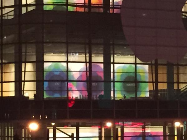
MacStories’ Federico Viticci has posted an interesting image of WWDC banners from the second-floor of Moscone West, the WWDC event venue.
These images show Apple highlighting its three platforms: iOS, OS X and watchOS. These banners do not follow the same pattern as previous years with dramatic photography in rectangular banners. These are more like full-height wall posters with simpler geometric logos. Each image has the name of Apple’s OS written in a light font-face (the image is not clear enough to see whether this is Sans Francisco) on a simple background of multicoloured translucent shapes.
What’s particularly striking about this photo is that it confirms a rebranding of Apple’s smartwatch operating system. On Apple’s current public marketing, the Apple Watch is described as running ‘Watch OS’. By these banners, it can be seen that the new name for this platform is actually ‘watchOS’.The updated WWDC app also includes this way of writing the platform in its Filter view, but I had assumed that this was a mistake as it was not supported by any other Apple marketing. With these banners spotted at WWDC, it seems that this was not actually a mistake and shows a bit of a rebrand for Apple’s smartwatch operating system.
Wait. Is this really how it is written – 'watchOS'? pic.twitter.com/AFNWlmtWmX
— Benjamin Mayo (@bzamayo) May 30, 2015
watchOS looks quite odd initially although makes some sense if you consider taking iOS and replacing the prefix ‘i’ with the word ‘watch’. It is also quite amusing that Apple is branding watchOS as a separate platform, when it really is more of a layer on top of an iOS base. Note that the banners also confirm that Apple’s desktop operating system will continue to be called OS X, as some people had speculated it was time to drop the X nomenclature.
This lines up with Apple’s pre-announcement that the event will feature a native Apple Watch SDK, giving developers more functionality (with access to sensor data, the Digital Crown and other parts of the hardware stack) as well as better performance than the current WatchKit app extension system.
Moving further on to the speculative front, it’s interesting to note that whilst OS X is depicted on a rounded rectangle shape both the iOS and watchOS text is superimposed onto a circle. Meanwhile, the superellipse shape which is iconically connected to the iOS App Store is used for the OS X banner. For the Watch, this makes sense as app icons on that device are masked into circles. For iOS, it is less clear as the app icons have always been traditionally rounded-rectangles and we don’t expect major design changes on this front to be a part of iOS 9.
Catch all our WWDC coverage live from June 8th at 10 AM PST. On Friday, we posted a roundup of everything to expect from Apple’s flagship event: the next-generation software platforms as well as an unveiling of Apple Music, the streaming music service. Apple will also be streaming the event live from its website.
FTC: We use income earning auto affiliate links. More.


This is rather un expected. Because if you look at the shape of the icons; iOS is in a circle (odd not shape of icon), OS X is in a rounded square (Like an IOS Icon), and Watch OS is in a circle ( Same as Icon).
What is going on here?????
I’m not sure if this is sarcasm or not, but as soon as the icon was released for this years WWDC, I noticed that the icons of the operating systems were all there.
could “Epicentre of change” signal watchOS style home screen coming to iOS?
That would be horrifically bad, they would never do that I don’t think.
I think the shape represents the Apple TV, as it will be central hub for HomeKit.
But the real questions is, what about the posters on the floor above this one?
way too close to webOS
I was hoping to at least see something depicting OS X or iOS. Sad they didn’t do that this year.
I don’t understand why they can’t just consolidate the three into one unified ‘AppleOS’ but with different user interfaces for each.
They do: Darwin (XNU) kernel. watchOS is internally called “iPhone OS Nano” (as per Darwin kernel source code compilation target). iOS is internally called just “iPhone OS”; OS X uses the same Darwin kernel as both iOS and watchOS do.
It seems to me that are are really reducing the number of leaks, as Tim Cook hinted at, during the iPad event in October 2014. Hence no banner like they had for OS X Yosemite and iOS 8 last year and going for a look similar to the original invitation.
To be honest, I thought the Watch OS was already spelt watchOS as to me it makes more sense how it is written more similarly compared to iOS since it is a mobile operating system as you wear it on your wrist and not a desktop OS like OS X.
I think they are also doing more generalised artwork to make it less cryptic like previous years including the image from Yosemite itself as the backdrop of one of the banners, so it can build up even more hype since there will be more to announce that people have not already guessed/assumed, including names and version numbers.
This banner may also show that there will definitely be no Apple TV announcement of any sort and that this is a software and services only event, which I hope the TVSDK is at least announced for developers sake, but odds of that are slim to none!
But if this is the case, I hope they really deliver with iOS 9 with not just bug fixes and small improvements. It needs to earn the number 9 with features like split-screen multitasking, transit directions, Google Now competitor, vastly improved Siri, more customisable home screen and/or customisable control center!
I agree with most of your input, except I fully believe ‘epicenter of change’ over an Apple TV looking shape was fully intended to hint at the major announcement that was planned for this event, which was the new Apple TV and the bringing of the living room into the future. I guess they decided against it after having sent the invitations, which is really crazy since they should have already known if it was ready or not.
Yes, the shape is basically identical to an iOS app icon, but anyone with a brain knows that was not the intended graphic representation, but instead, an Apple TV. It was a simple graphic to read: the epicenter of change or the epicenter of the home is the new Apple TV which seamlessly connects and works with all of your other devices, hence the round circles, and the iOS app rounded squares.
yup +1
What you are saying is right ‘o0smoothies0o’. I just viewed it as though if there was going to be an TV announcements, they would have a separate section on the banner that says TV like how they have a separate one for ‘watchOS’.
They could almost tie it into a minor announcement being you can control HomeKit devices with the ‘Epicenter of change’ being the TV when you are away from home via Siri via a software update, but that would make it a very weak tagline for the invite.
Don’t get me wrong I really want to see it, but after these latest reports and them struggling to get TV content streaming deals they would at best do a sneak peek for the TV hardware but not discuss anything TV related like free-to-air TV integration and TV subscription service until they actually release it, hopefully later this year, but talk about stuff more like an updated remote, Siri and App Store so they can get developers to use the TVSDK or TVKit if all streamed from iOS device even though AirPlay APIs would technically speaking do this already.
Also another weird thought I had was if the icons are mostly circles for iOS in the banner, maybe it means they will make iOS app icons more flexible like Android in there shapes, to make the home screen look less stale, but make it optional for developers to implement.
I really like the new banners at WWDC this year… I just hope that Apple will add back the depth and drop shadows on iOS…just like the OS X.
It just occurred to me that the “obvious” TV shape at the center of the big diorama might actually be the Watch instead.
Except the watch isn’t the epicenter of anything. The TV is the epicenter of the home.
Is TV software considered iOS? That banner to me suggests no TV news at this event.
you didn’t read the confirmation that the new Apple TV won’t be unveiled here? NYT and Recode are confirmation, just saying. Granted it would have been nice if they released TVkit so there could be some apps ready for it to release in the fall…
Who knows.. maybe no TV device but they could still announce a TVKit tomorrow.. wouldn’t make strategic sense to not announce it at a developer event.. the device could always wait…
remember how devs programmed Apple Watch apps without an actual product last year.. same thing would be done for the Apple TV..
XCode would integrate the SDK with no problem, then, before the Fall Apple TV Keynote, Apple could send invites to few select developers to come and test their code on the actual device at the Campus.. just like they did for the watch..
What is on the three posters on the next floor up is what intrigues me!
TV, music, pay?
Hahah. Where the hell is the guy with the 4K drone?!
Or TV, MUSIC, and iCloud (or CLOUD).
i can’t wait for apple to add apps store to apple TV , is going to be the SHIT !
Man, I thought watchOS was just a default name because they haven’t come up with a better option. watchOS is so not like Apple, it looks amateurish.
However, consider almost all of us will just call it Apple Watch, I’m not sure it is a big deal. AWOS is a better name IMO.
It should be iOS, OS X, Watch OS, TV OS
Why don’t they just call the whole shebang: OS .. then they could just say OS for watch , for Mac, for iPad, for iPhone, for TV.. and so on.. (for Car, for Fridge.. )
“watchOS” Sounds like a snack.
I don’t see Apple changing the grid system they have to accommodate a circular icon.
I belive it would look better to have circular icons on the phone and Pad.. Jailbreak tweaks already allow this and shows that most of the actual icons work in circular form without any tweaking of design.. even third party apps..
I’m sure to works, but for the majority I don’t believe Apple will change as this design has been with us since the beginning.
@GunningGunny, what a stupid argument. You think that because the design has “been with us since the beginning” is a reason for it not to change? With that mentality we would still be riding horses everywhere because they have been with us since the “beginning”.
@GunningGunny, if we would have kept the design of iOS from the beginning, iOS 7 would never have happened… App Store might never have existed.. innovation means change.
Would they be making one OS for all platforms like Windows is doing with windows 10??
So, what does it say in that orange field on the upper floor? it’s the only color, where we can’t see the text.
How is branding watchOS separately from iOS amusing? Sure, it’s present state is as an iOS layer but give it a native SDK and suddenly it’s a separate platform.
Watch them rename it to wOS next year, similarly to how iPhone OS was shortened to iOS in 2010. Also, has a nice ring to it, and could be an homage to Woz, one of the Apple founders.