The Apple TV+ debut is a mixed affair. It may only have a handful of shows right now, but people seem to be enjoying them (even if most critics didn’t). I know I am anxiously looking forward to Friday for the next episode of The Morning Show and For All Mankind.
However, Apple TV+ content is only available through the TV app. And the TV app is pretty bad, mediocre at best…
The Apple TV set-top box launched in 2015 with the guiding vision that ‘the future of TV is apps’. Users would download all sorts of video apps from the App Store and switch in and out of its platform.
However, users demanded a more integrated experience. The idea of the TV app, introduced in 2016, was to combine all the TV shows and movies from all of the apps and unify the viewing experience into a single interface, with a combined Up Next queue.
The idea was that when browsing for something new to watch, the TV app could automatically show you every provider that offered it and deep link into the video apps you were logged in to. Find Jack Ryan in the TV app? Tap on it to get bounced to the Amazon Prime Video app to watch it, then you can go back to the TV app portal when you are done.
At least, that was the proposition.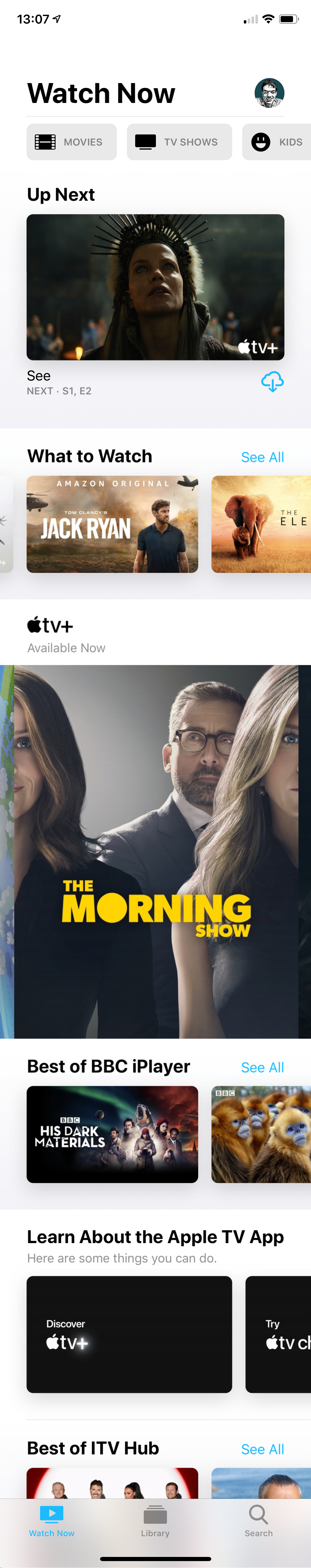
Several years after the TV app came out, most people didn’t bother with it. The ideals of the experience were hampered by the fact that Apple could not cut enough deals with content apps; Netflix being the biggest holdout.
Fast forward to today. The TV app now has to juggle being a somewhat neutral curation of every TV show and movie available and act as the venue for Apple’s TV+ original content. It has to serve dual duty as directory and provider.
Apple has made very few changes to the TV app design and feature set to accommodate the TV+ launch. TV+ is shoehorned in as just another source of content with very little consideration. With other streaming services, if you want to commit to their world and explore everything they have to offer, you can just open the dedicated app and never touch the TV app. With TV+, that’s simply not possible.
There is a channel section of the TV app that is dedicated to TV+ content — but it’s far from perfect. Finding the TV+ section requires a lot of scrolling, meandering past several screens worth of Watch Now recommendations for everything in the iTunes catalog.
When you get there, it lacks basic hierarchy like filters or subcategories. And most annoyingly, you can’t see the Up Next queue because you aren’t on the main screen anymore.
I want the TV app to only show me the stuff that I pay for and can actually watch right now. Advertising of the full iTunes store or Apple TV Channels library should be in a separate tab, like a new “Browse” experience. The primary tabs like “TV Shows”, “Movies” and “Kids” should not be thinly-veiled ad platforms.
It’s also frustrating that the “Library” is not really a library. The Library only includes iTunes content. I want to be able to build a personal library of content regardless of how I paid for it. TV+ shows should be able to be saved to the library to find later, or any Apple TV Channels content for that matter. Obviously, you have to keep subscribing to be able to watch the shows that you didn’t buy outright. The Up Next queue is not enough organization on its own.
The tension of the TV app’s purpose is my primary issue. I want to treat TV+ like Netflix and I can’t do that today.
Even with a library of 9 titles, I just don’t want to need scroll past buy buttons when I’m relaxing in the evening and simply want to watch TV. In six months to a year when the TV+ catalog doubles in size, the need for library management and better organization will become more pressing.
Secondarily, the TV app is lacking when you actually get to the point of finding a show to watch. There are bugs like watch progress not always saving or autoplay sometimes not suggesting the next episode. I tend not to worry about bugs too much as I know they will get fixed eventually. I get annoyed by the intentional design decisions, and their pitfalls.
It’s insane to me that on the iPhone, you can’t get a normal vertical list of episodes for a show. The horizontal card design is very space inefficient and it’s annoying to scroll so much, even on a show with a handful of episodes. You also can’t mark an episode as played or unplayed from the show details; you can only do it from the Up Next queue on the main screen.
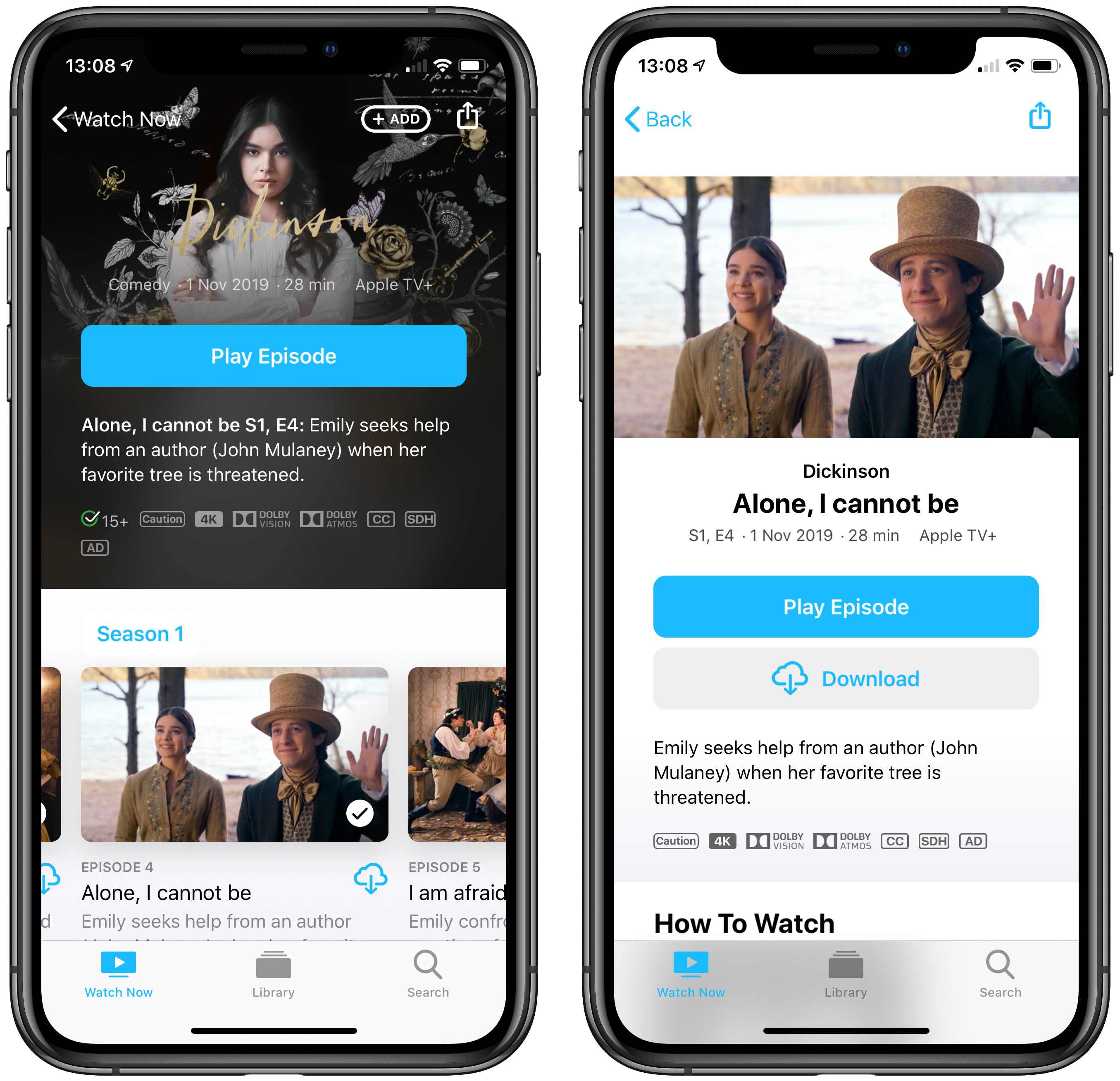
I also think Apple needs to better signpost whether a season is over, and if not when the next episode is coming out. At the end of the episode list for The Morning Show, there should be a placeholder card that says ‘next episode airs Friday 5th’. Then, I could tap on it and subscribe to be notified for alerts when the episode drops. The notification system for the TV app is very implicit. I want to be able to actively sign up for targeted news to the shows I am invested in. Along the same lines, the show pages should also have jumping-off points to the associated Twitter or Instagram social accounts.
Truly, feature requests for the TV app is an endless pit. My point here is that a lot of attention has been given to the shows and the stories themselves, but enjoying TV+ is as much as about the app that you have to access it through. Every weakness of the TV app is a bullet point against the TV+ experience.
It is true that a lot of TV+’s downsides can be papered over by the fact that most people are paying nothing for a year. However, soon enough, Apple is going to be billing you $4.99 a month. Then, they have no excuses.
FTC: We use income earning auto affiliate links. More.


Comments