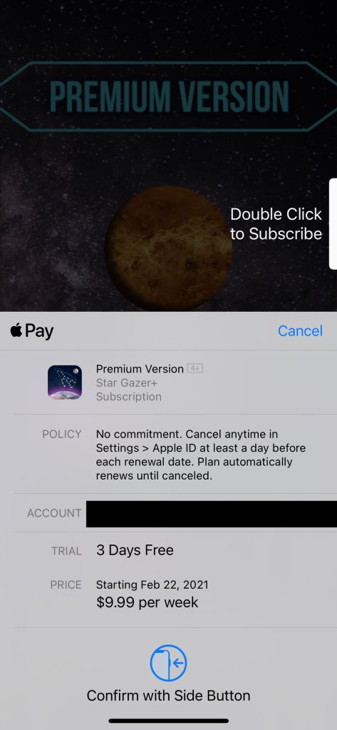
Last week, we shared a concept that explored ways Apple could improve the subscription sheet in iOS to help customers better understand what they’re signing up for. The issues with the subscription sheet have been a hot topic lately amongst the community. But tonight, the developer behind Launch Center Pro, David Barnard, has pointed out that in the latest beta of iOS 14.5 Apple has started to make some changes to improve the experience.
The changes are subtle, but they’re sure to make an impact on subscription sign-ups. Apple has made all of the text on the sheet more legible, and they’ve updated the language to be clearer to the customer. The first and one of the biggest changes to the sheet is the replacement of the “App Store” word mark with “Pay” so that it is clear to the customer they are buying something.
The formatting of the subscription name has also been updated. It’s no longer in all-caps but rather in a normal case. Directly below it, you can see that they’ve increased the size of the policy text. It’s much easier to read and right in your face now.
The most important changes though come in the bottom section of the sheet. First and foremost, the free trial explanation has been made much more succinct. It uses plain English to say, look you’ve got “3 Days Free” in the case of the screenshots below. It’s much better than the way it currently is in iOS 14.4, with small text that separates the name of the trial from the “Free” label. Apple has also substantially increased the size of the price and placed it directly above the confirmation animation. Like with the free trial text, they’ve also changed “$X/week” to “$X per week.”

iOS 14.3 & 14.4 
iOS 14.5 beta 2
I still think there’s more that Apple can do to improve the experience, but this is certainly a step in the right direction. What do you think of these changes? Are they enough to satisfy customers and regulators? Let us know in the comments below!
FTC: We use income earning auto affiliate links. More.


Comments