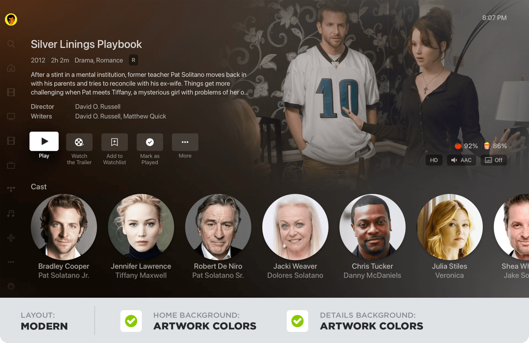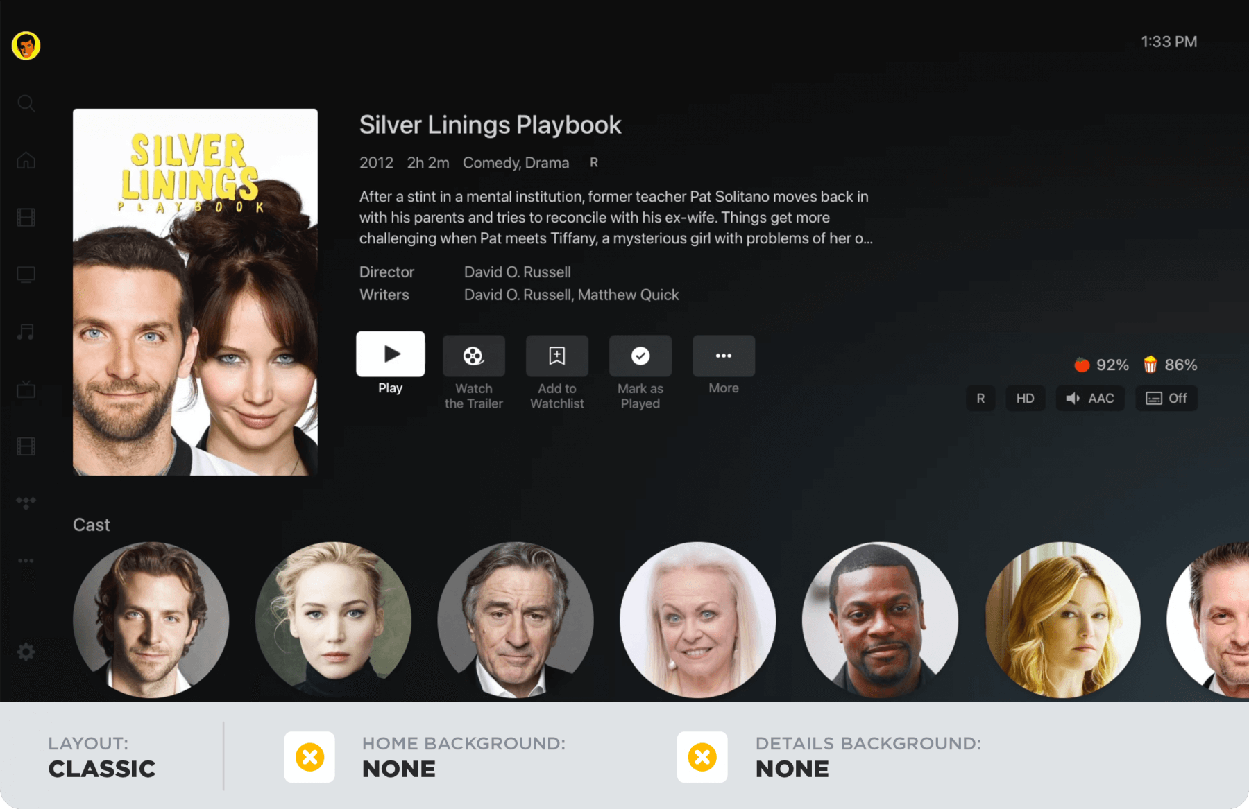
Plex is out today with a major update to the user interface for its Apple TV and Roku apps. Along with a new “Modern Layout” option, the UI can be customized with options for the app/home background and details background.
Plex announced the new UI experience in a blog post today. Here’s what inspired the platform to work on an overhaul:
Well our challenge is that since Plex is used by so many different types of users (a great problem to have!), each one of you has different habits and desires and styles as well as a vast variety of TVs with different resolutions and brightness and contrast ratios. So how do we ensure we offer the best experience for as many of you as possible? And build a dynamically responsive system that pulls visual styling from millions of different pieces of art? Turns out, the solution was not something we could pull off all by ourselves. So we got a little help from our friends.
After running an experimental beta with Plex users, the company “opted for a more personalized experience (a crucial part of the Plex DNA) and worked hard to provide the right mix of options for our diverse community of Plex users and devices.”
In the Plex Apple TV and Roku app, you can now head to Settings > Experience to customize the UI. Here are the new options:
- Content Layout:
This setting controls the layout used to display your content. Okay, so before you say “No, duh!”, this setting also controls whether “inline metadata” is displayed on the homescreen and the poster is displayed on detail pages.- Modern (the default): Displays artwork and “inline” details about the title on some screens when focused on a poster. This layout also prefers background artwork over posters on title detail pages.
- Classic: No “inline” metadata is shown, displays title and additional information below posters, and prefers posters to artwork on detail pages.
- App/Home Background:
This setting allows the user to select the base background of the app (i.e.: the background used for the home screen, settings, etc…).- Artwork Colors (the default): Applies colors from the current title’s artwork to the background and gracefully (we hope!) transitions the colorfield as the title selection changes.
- None: Displays the default background for the application (dark gradient).
- Details Background:
This setting controls the background displayed on the detail pages for items.- Artwork Colors (the default): Utilizes colors from the title’s artwork within the background on title detail pages.
- Dimmed Art: Displays a full screen, dimmed version of the background artwork on detail pages.
- None: The default background for the application is used for detail pages (dark gradient).
Plex for Apple TV is a free download from the App Store.
FTC: We use income earning auto affiliate links. More.


Comments