There are three categories of Apple Watch face requests:
- More watch faces from Apple
- More watch face customization from Apple
- Watch faces that aren’t from Apple
Apple has added around 50 new watch faces since watchOS 1.0 in 2015, and most watch faces have added or updated customization options over the years. Apple has never allowed custom watch faces in any capacity to run on the watch.
While Apple will continue to satisfy some people with new watch faces, there’s no evidence Apple will ever allow third-party watch faces. There is, however, a strategy change to watch-face customization that would alleviate a lot of frustration.
Setting aside third-party watch faces, I believe the best way to satisfy most people is by vastly expanding watch face customization. Not with more colors or complications, but with more control over colors and complications.
Complications
The constraints are not new, but a recent software update highlights the current limitations. watchOS 9 updates how complications can appear on watch faces as well as how colors are presented. The update brings “rich complications” (i.e. corner complications from Apple Watch Series 4 and later) to watch faces that originate back to Apple Watch Series 3 or earlier. Larger displays and rounded corners introduced the modern watch face style, especially for analog faces. Not everyone appreciates this change.
Simple
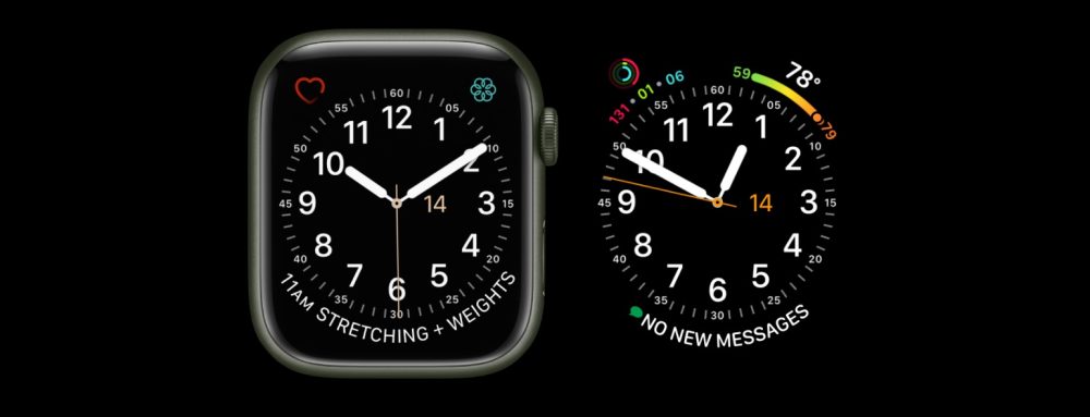
For my colleague Ben Lovejoy, the issue is simple. Complications on his preferred watch face aren’t simple anymore.
Instead of that very minimalist look, the watchOS 9 complications are far from minimalist. I’m sure they look great in some watch faces, but definitely not in the most pared-down Simple face. Instead of a simple day and date, there’s now three tiles with today’s date in the middle. Why? What was a simple weather icon and a temperature now has a bigger icon and a curved bar with the temperature range for the day.
Preference is the most important part of this argument. There is, however, a functional piece to it.
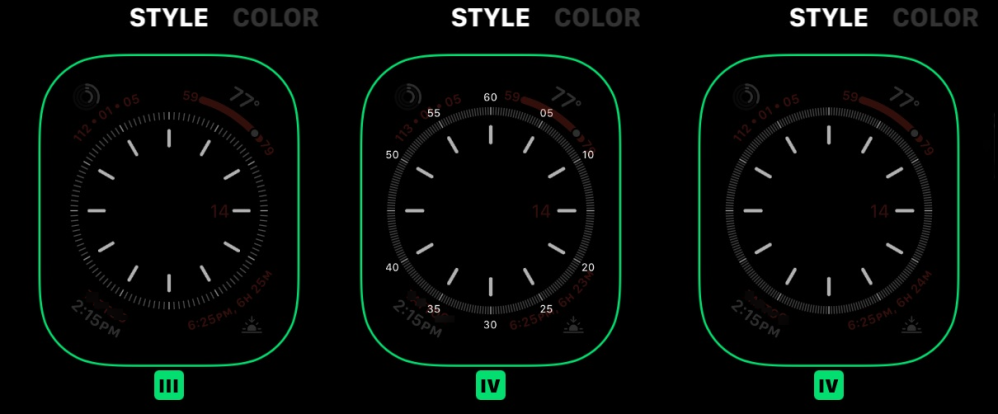
Simple supports four styles that change the amount of detail in the clock. Style IV includes numerals around the dial for minute marks, and the dial includes more detail.
In watchOS 9, the numerals in style IV briefly show in the watch face editor before disappearing because rich complications do not accommodate them. Style IV can only be presented as originally designed when no complications are present. The solution prior to watchOS 9 was to include numerals 10, 20, 40, and 50 in style IV.
At minimum, Apple needs to use additional time to polish how older watch faces handle rich complications. A watch face editor without artificial limits based on Apple’s decisions is preferred.
Utility
While I agree with the decision to update the complication style on older watch faces, my frustration is with which parts didn’t change.
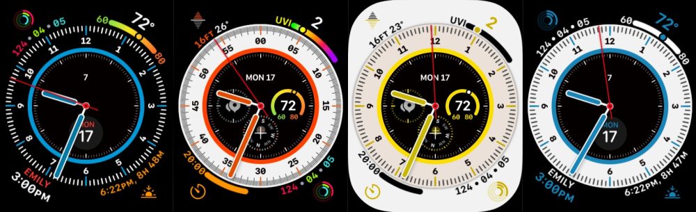
Utility and Explorer are two faces that are always in my rotation. Both have two top corner complications and one wide rounded text complication. Starting with Apple Watch Series 4, the wide rounded text complication replaced the wide straight text complication.
watchOS enhances (in my opinion) the two top corner complications. My disappointment is with the bottom complication. I would much prefer two bottom corner complications. I just think the smiley face-style text looks goofy. The correct solution would be to integrate wide text complications into the dial like what the California face does.
That’s only my preference though. Others are relieved that this wide rounded text style survived the migration to rich complications. These are personal preferences that an Apple Watch face editor with elements available on similar watch faces could present.
Technically speaking, there’s no reason why Apple couldn’t allow you to chose between compact corner, wide rounded, and detailed corner complication styles. It’s a design choice Apple makes for you.
Colors
Color choice is an artificial limit within the realm of first-party faces. Most watch faces have dozens of color choices including every shade of blue visible to the human eye. Yet there are details that you just wish you could change. These are often basic tweaks like watch hand color choice or choosing between multicolor or single color complications. Lifting this constraint would satisfy a lot of people a lot of the time.
Then there are big color changes that sneak their way in to software updates and run on new hardware that you buy because you’re enthusiastic about the Apple Watch you have. That’s when this happens:
Both watch faces are equally functional, yet it’s possible to have a watch face ruined for you when Apple makes a new decision on how it should be presented. My version of this happened with “mostly white, hints of gold” becoming “mostly gold, hints of white” on a stainless steel Apple Watch. I didn’t identify what happened and just thought I was starting to like that watch face a lot less.
Personal preference is such an important aspect of Apple Watch. A more functional Apple Watch face editor would introduce the new color style while preserving the original. The two can coexist and should.
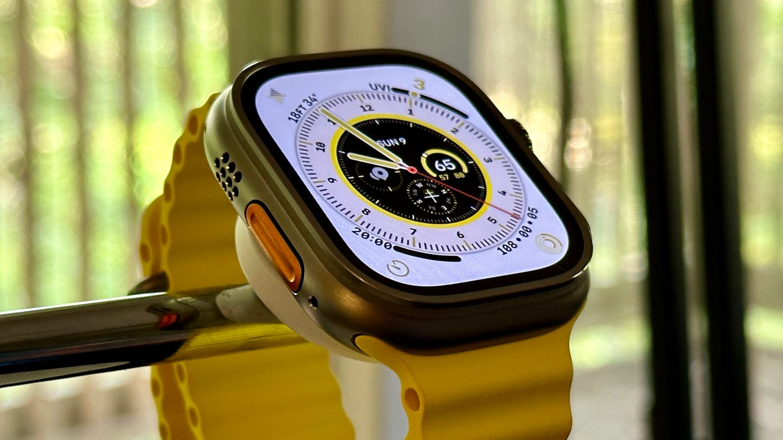
Wayfinder
Complication and color constraints continue with every new watch face. The latest is Wayfinder on Apple Watch Ultra. It has three custom colors with three possible combinations plus dozens more single color options. Yet the lack of full color control over complications and other elements of the watch face prevents me from making the combination I want to use regularly.
Set one includes these colors:
- Ultra Orange/White
- Ultra Blue/White
- Ultra Yellow/White
The center dial is black, the bezel is white, and the background is white. Complications including the LTE signal indicator are color matched to orange, blue, or yellow.
Set two is labeled as follows:
- Ultra Orange
- Ultra Blue
- Ultra Yellow
The center dial is black, the bezel is white, and the background is black. Complications including LTE appear in full color.
Top comment by Think Different
Set three is my almost favorite:
- Ultra Orange/Black
- Ultra Blue/Black
- Ultra Yellow/Black
Black center dial, black bezel, black background. So far, so good. Complications including LTE appear in full color. That’s where it loses me. My preference is all black with Ultra Blue accents. So set three with set one’s complication colors. Not possible.
Set four encompassing every other color option includes a black dial, white bezel, and black background with color matched complications. This is almost a workaround for me, but the white bezel isn’t what I want. My solution is to not use the new watch face exclusive to the new hardware.
In all of these instances, an Apple Watch face editor that lets you make your own decisions based on elements that are already available on other watch faces would provide great satisfaction. That’s a change that could happen today without dealing with the policy and infrastructure for third-party watch faces.
FTC: We use income earning auto affiliate links. More.


Comments