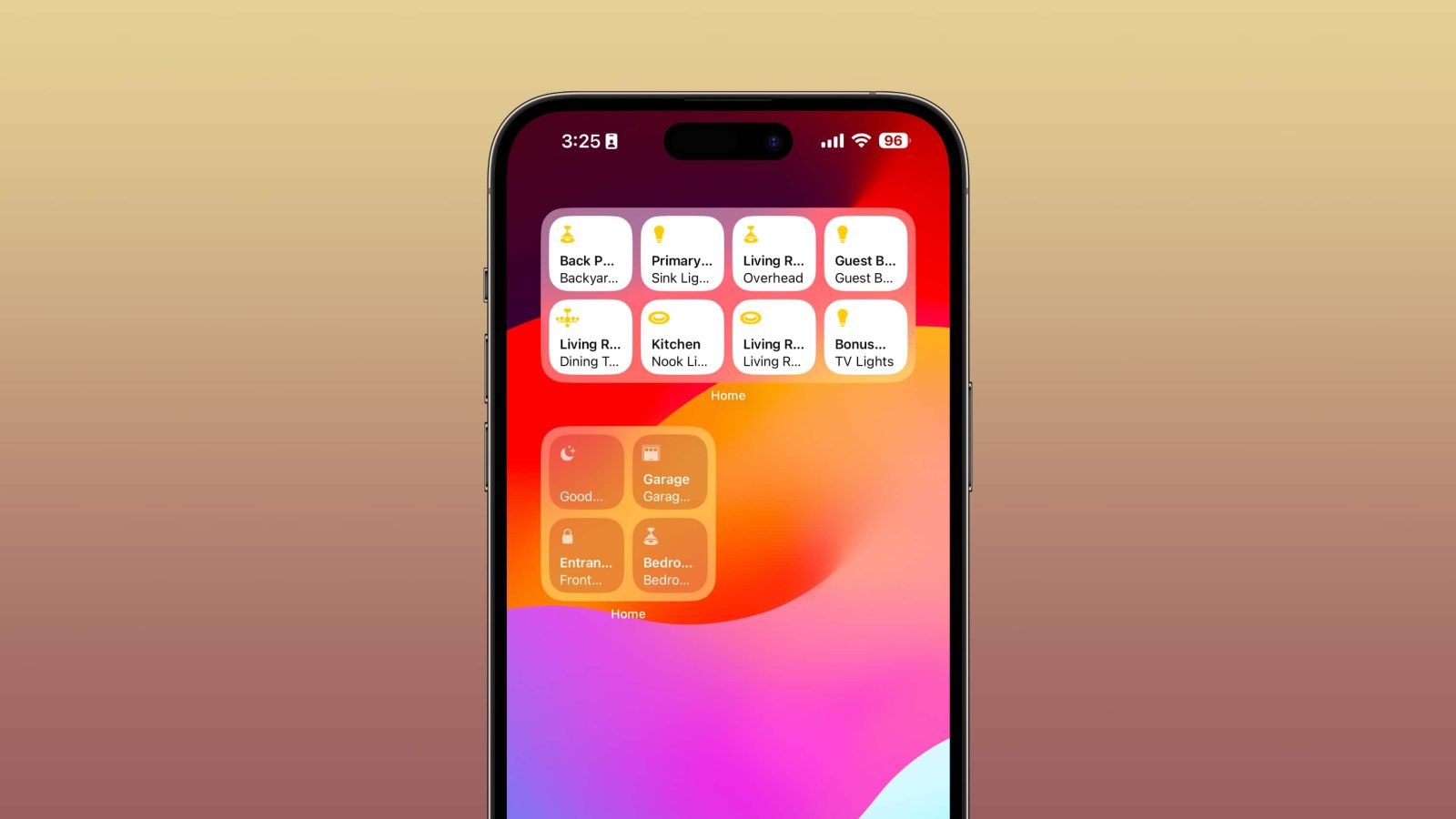
One of the big changes in iOS 17 is support for interactive widgets, a major improvement compared to the initial version of widgets that debuted with iOS 14. In line with this, Apple has also added dedicated widgets for the Home app, letting you control your favorite HomeKit accessories right from your iPhone’s Home Screen.
In prior versions of iOS, tapping on a widget would take you directly to the corresponding app. For instance, tapping on the Music app widget would take right to the Music app rather than immediately starting playback from the widget itself. This limitation is presumably why Apple didn’t offer Home app widgets until this year.
In iOS 17, Apple has added two different widgets for the Home app. There’s a 2×2 widget that offers you quick access to four HomeKit accessories alongside a larger version that shows up to eight accessories. Meanwhile, iPadOS 17 offers the same two sizes for Home app widgets with the same level of interactivity.
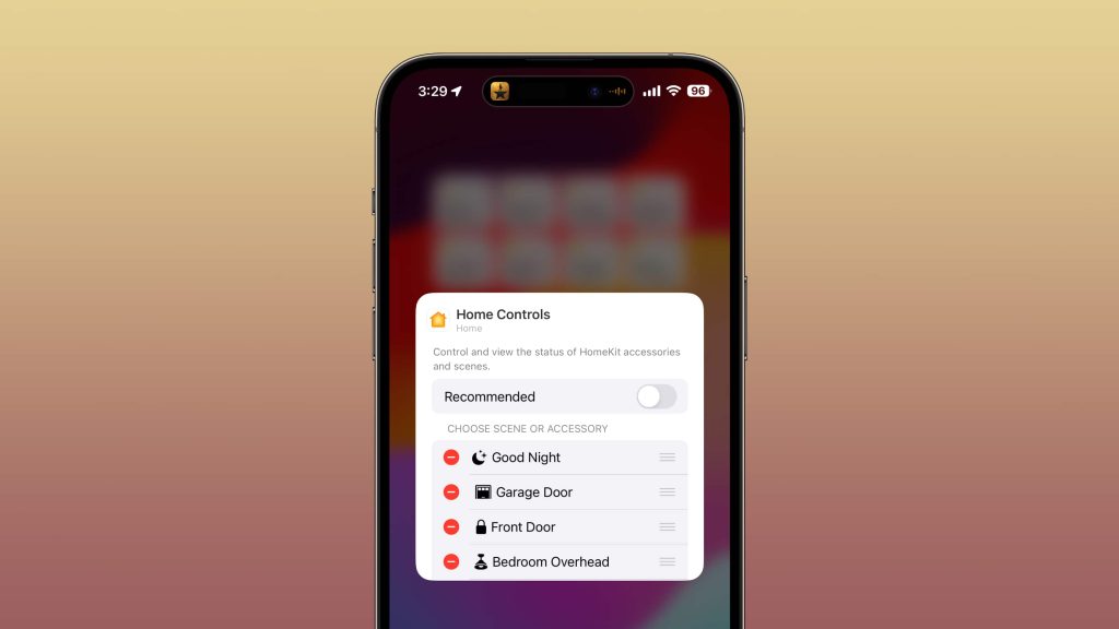
Each of these Home app widgets has two different setup options for determining which accessories show up at any given time. You can choose “Recommended,” and iOS 17 will attempt to intelligently choose which HomeKit accessories you control at different times of the day.

Alternatively, you can disable the “Recommended” option and specifically choose which HomeKit accessories and scenes appear in the widgets.
Tapping on the individual squares for each accessory will turn it on or off in the case of lights, lock/unlock doors, and open/close garage doors. More advanced changes, such as adjusting brightness levels, colors, or thermostat temperatures still have to be done via the Home app itself.
If you use custom Home Screens linked to Focus modes, you can have different versions of the widget for each Focus Mode. For instance, if you have a specific Home Screen for the “Sleep” Focus mode, you can set up a version of the Home app widget that shows accessories you most commonly use at night and first thing in the morning.
iOS 17 is only in its first developer beta, so I’m optimistic Apple can make a few tweaks before the update is released to everyone later this fall. For instance, if you have accessory or room names that are more than one (very short) word, there will be quite a bit of cutoff text in the widgets that really clutters up the design.
FTC: We use income earning auto affiliate links. More.


Comments