Concept by Parker Ortolani
Taking a look at an aspect of iOS that’s remained mostly unchanged for years, Parker Ortolani has shared an interesting Control Center concept. What if it adopted a list-style UI like the new Messages app in iOS 17 with a playful, fluid, and customizable focus and even third-party app integration? Here’s what Parker has dreamed up.
Earlier this spring there was a rumor about Apple redesigning Control Center with iOS 17. However, that didn’t come to pass – at least as of the fourth beta.
But inspired by the overhaul of the new Messages app picker in iOS 17, Parker shared his latest concept on X, here’s how he describes it:
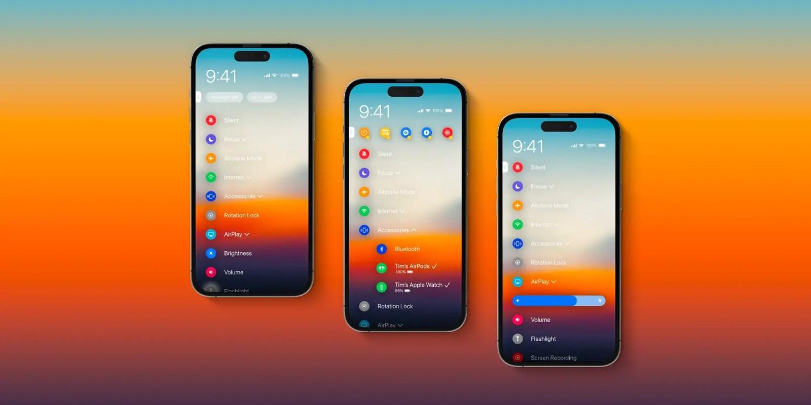
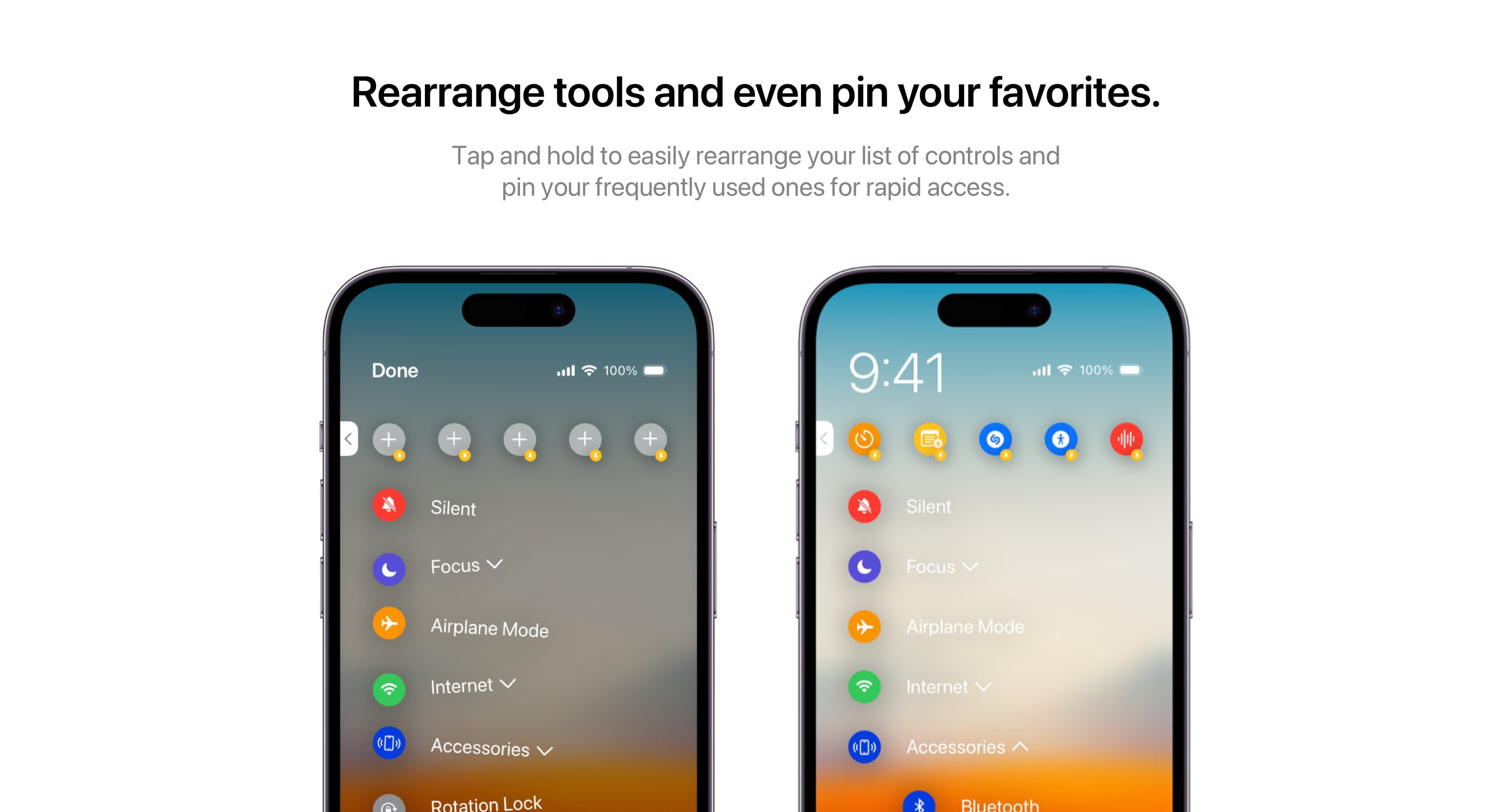
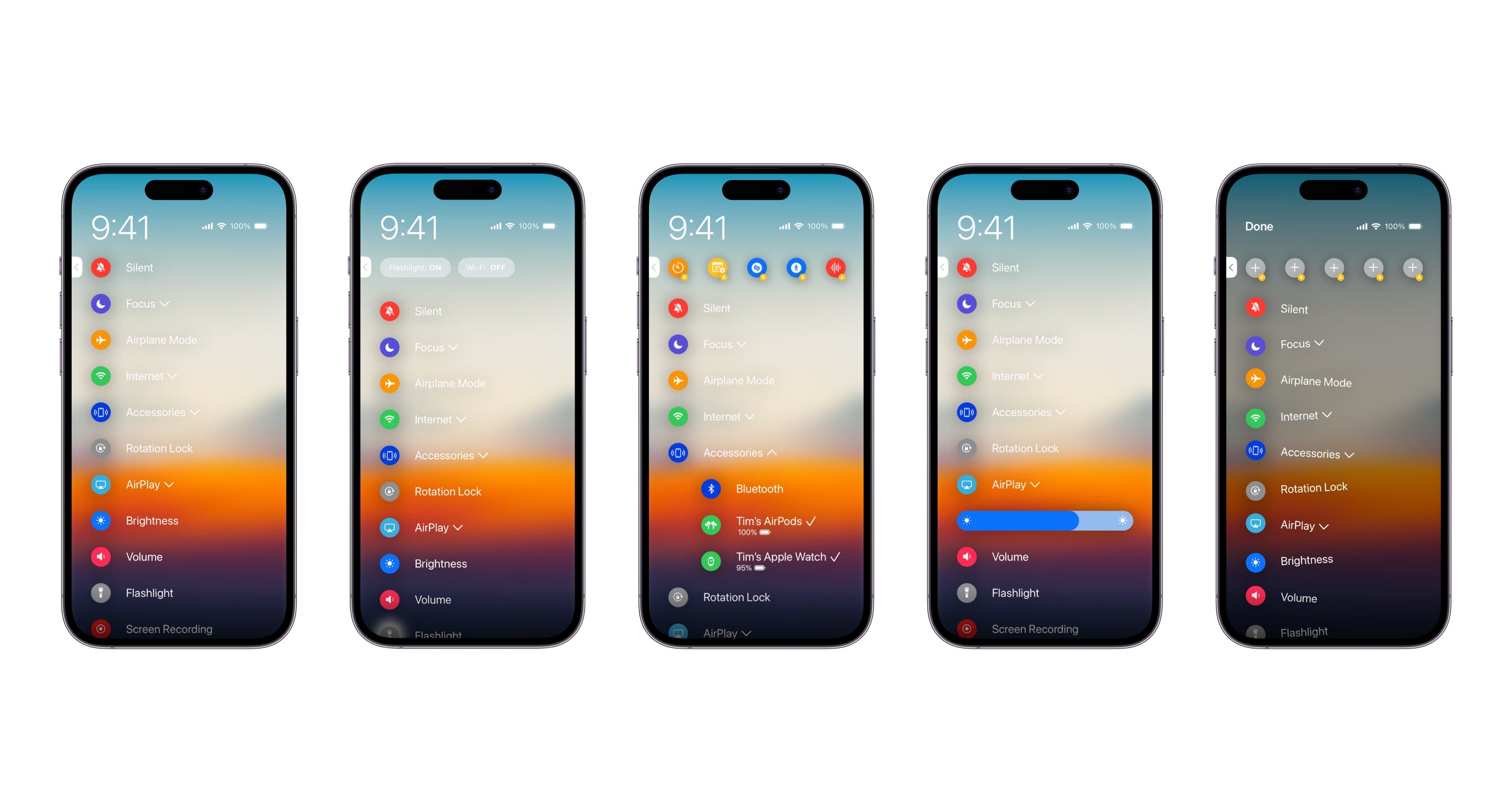
Reimagining control center on iPhone with an entirely new interface inspired by the modern iMessage app picker in iOS 17. It’d be more playful and respond to your actions with fluid animations. Pin your favorite controls at the top. Rearrange the list. Drill down into newly organized control categories. Add actions from your favorite third-party apps. And more.
The overall UI is a minimal list view with drop-downs to get access to further settings.
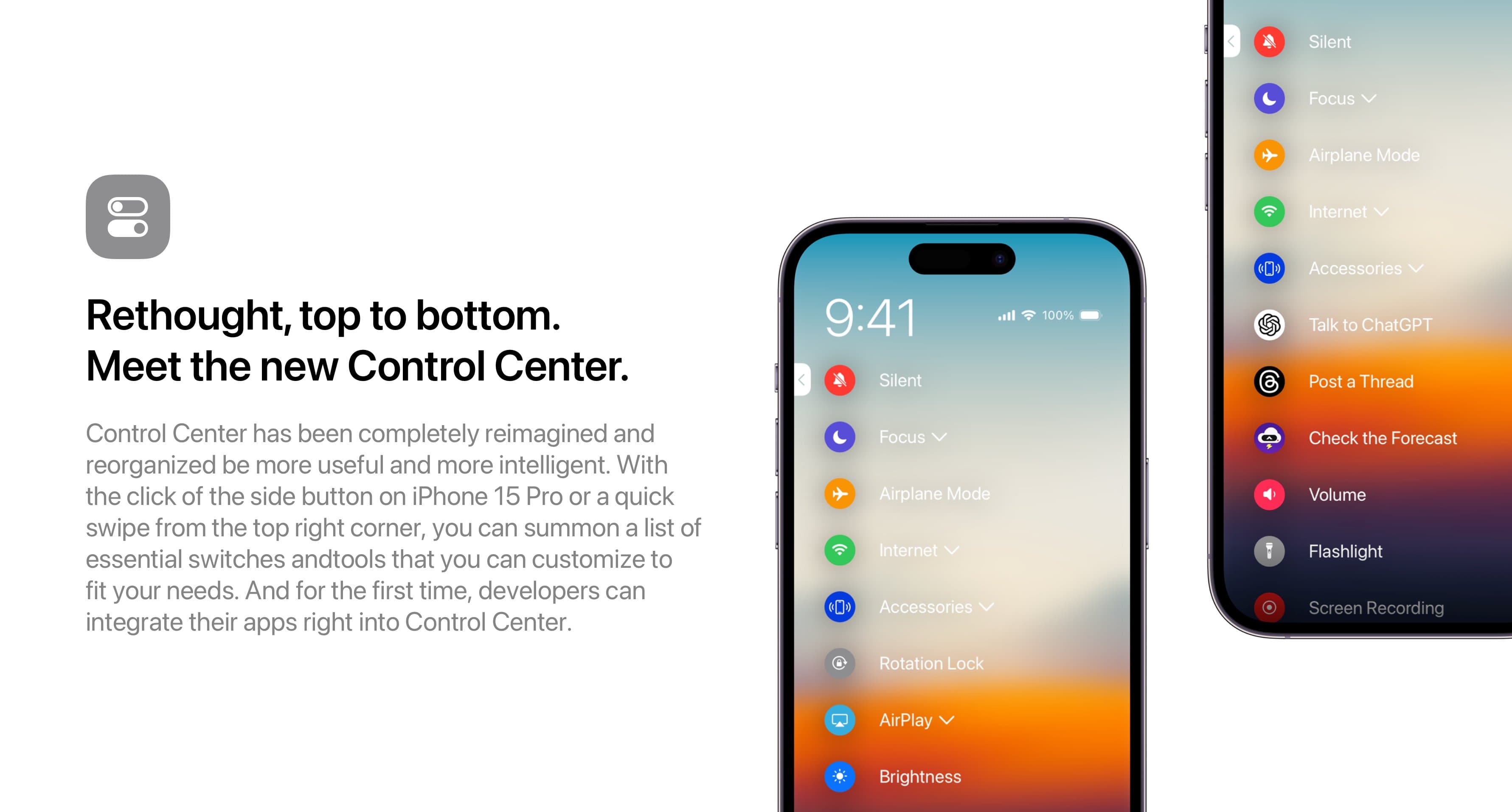
To offer quick access, Parker imagines the ability to pin controls to the top of the UI along with the option to reorder everything. And coming as another big change, the concept imagines Apple opening up Control Center to third-party apps.
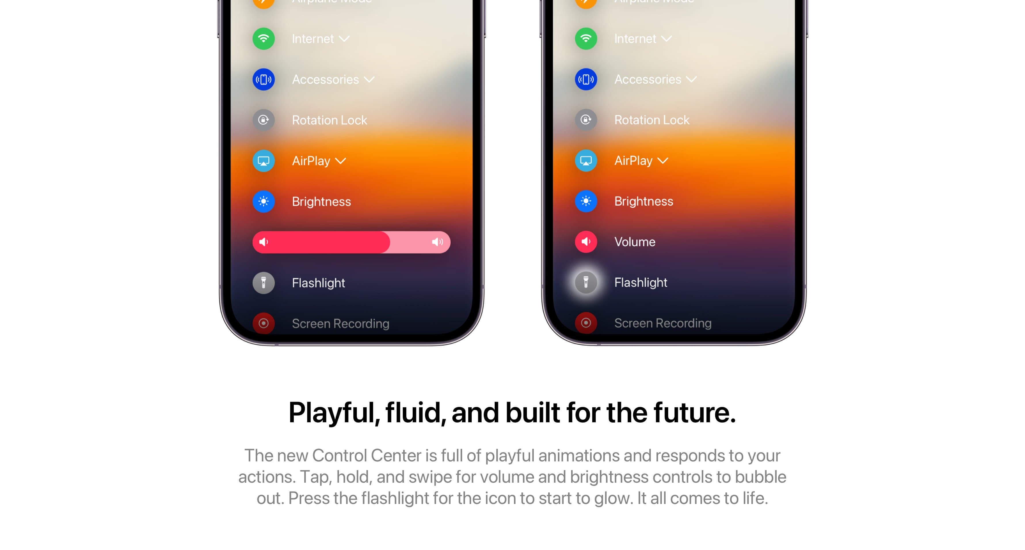
For a fluid, playful, and responsive experience, this Control Center lets you “Tap, hold, and swipe” to adjust settings like volume and brightness while the Flashlight button glows when you turn it on.
9to5Mac’s Take
Top comment by Tech_Enthusiast
I'm sorry to be that person but this is not good nor would it be helpful. iOS needs less endless lists of text, not more. Control center and its large buttons and customizable layout is working great as it is.
Even though this is quite the departure from the Control Center we’re used to, I like the idea here. Part of that may be because I’ve had the chance to use and get used to the same list-style UI in the Messages app over the last few months using the iOS 17 beta.
But in any case, I find the UI visually and functionally appealing. One thing I did notice was that Parker didn’t include what controlling HomeKit devices with this new Control Center would look like. That could be interesting to figure out with the list design as opposed to the small, efficient tiles used in the existing Control Center.
On a related note on the Android side of things, my colleague Jordan just went hands-on with a list-style UI called Niagara Launcher.
What do you think about this Control Center concept? Love it, hate it, not sure? Share your thoughts in the comments!
FTC: We use income earning auto affiliate links. More.


Comments