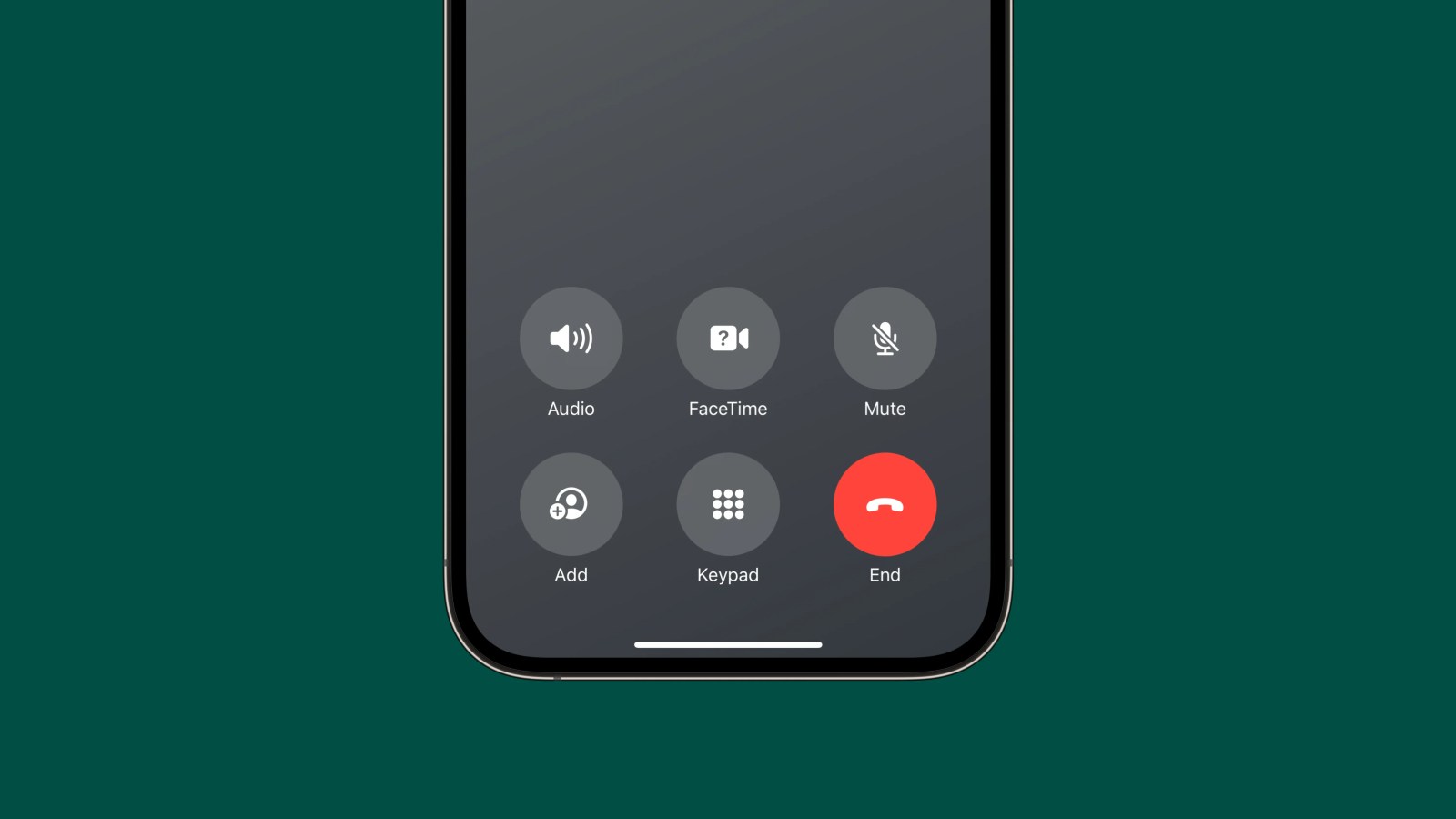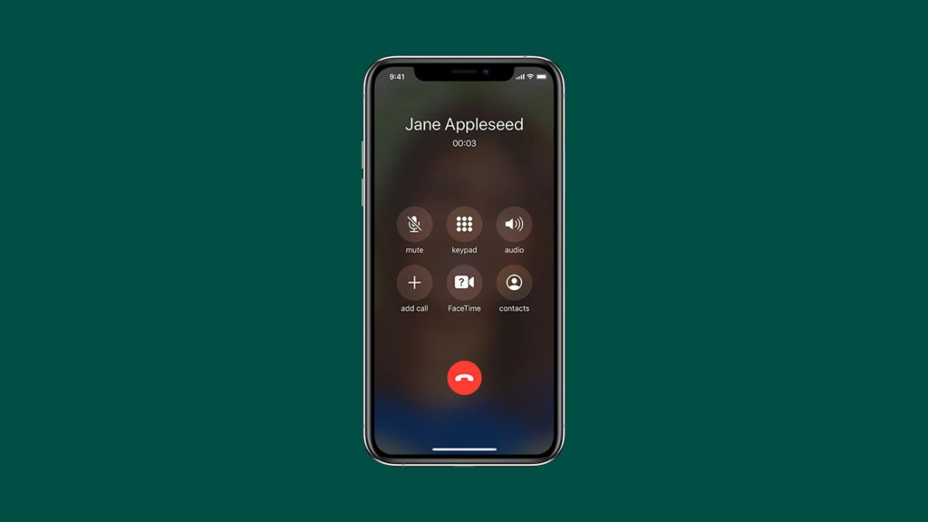
A change that Apple introduced with the first beta of iOS 17 back in June is going viral this week. As part of a number of changes to the Phone app and the calling experience, Apple has relocated the positioning of the red “End” button. The change, perhaps unsurprisingly, is drawing quite a bit of criticism on social media.
This story is supported by Mosyle, the only Apple Unified Platform. Mosyle is the only solution that fully integrates five different applications on a single Apple-only platform, allowing businesses and schools to easily and automatically deploy, manage, and protect all their Apple devices. Over 38,000 organizations leverage Mosyle solutions to automate the deployment, management, and security of millions of Apple devices daily. Request a FREE account today and discover how you can put your Apple fleet on auto-pilot at a price point that is hard to believe.

Apple is revamping quite a bit of the Phone app and calling experience in iOS 17. This includes adding new features like Contact Posters, Live Voicemails, FaceTime voicemails, and more. The company has also redesigned the interface that appears on your iPhone’s screen while you’re on a phone call.
In iOS 16 and earlier, the iPhone’s end call button was located at the very bottom of the in-call interface. Above it were two separate rows of buttons for things like mute, the keyboard, FaceTime, audio controls, and more.
In iOS 17, Apple has revamped this interface to shift everything down to the lower third of the screen. This means that the “End” button has been intermixed with other buttons for audio controls, FaceTime, muting, adding callers, and the keypad. The “End” button is no longer off by itself, centered at the bottom of the screen. Instead, it’s located at the lower-right corner of the interface.

The iOS 16 calling interface
It’s clear why Apple made this change in iOS 17. One of the biggest new features is something called Contact Posters, which show full-screen pictures of the person you’re talking to on the phone. To show the full-screen picture and artwork, Apple shifted the buttons down. This is true even if the person you’re talking to doesn’t actually have a Contact Poster set up.
9to5Mac’s Take
Top comment by Hannibal Lester
This is one of those things I’m gonna wait to pass judgement on. When it was first reported that Apple was moving the address bar on Safari I instantly hated the idea and swore about it, but then when I updated and experienced the change, I fell in love with it and haven’t changed it back since I got use to it.
I do appreciate that Apple did the very unApple like thing and gave us the option to have it either way. It made it easier to adjust to the change, I swapped back and forth a few times deciding which way I liked it more.
So I’ll wait to experience it before I swear I hate it.
This feature and change has been included in iOS 17 since the first beta was released at WWDC in June. It’s going “viral” this week after being reported on by CNBC on Tuesday. Since then, a number of other outlets have also covered the change – including the Associated Press. The AP version of the story was then published on a number of local news outlets through syndication.
The response to this change seems to be rather negative from many iPhone users, though I’ll be curious to see what those users think once they actually try iOS 17 and see how Contact Posters are implemented.
Nevertheless, this is one of those interesting iOS changes that gets a different reception from the broader iPhone userbase, beyond those of us who installed the iOS 17 beta when it was first made available in June.
Follow Chance: Threads, Twitter, Instagram, and Mastodon

FTC: We use income earning auto affiliate links. More.


Comments