Update: MacRumors has updated its piece with this: “We’ve received information from several sources indicating that the image is fake.”
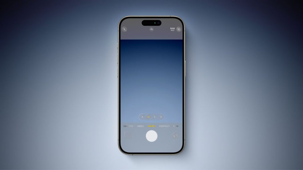
Apple Vision Pro’s greatest contribution to humankind in year one may just be inspiring the iOS 18 redesign everyone wants. Our friends at MacRumors have published what they describe as an “iPhone frame template from an anonymous source who claims they obtained it from an iOS engineer.” It could be nothing, or it could be the first glimpse at a return to realism in iPhone software design.
Here’s the image that MacRumors calls an alleged iOS 18 design resource:

Wonky text aside, the alleged leak is clearly intended to show the sort of button-y depth that Apple platforms like Apple TV, Apple Vision Pro, and even the Mac already use. If real, the design is neither a departure from current iOS element layouts nor a return to the pre-iOS 7 era of photorealism that defined iPhone software. Instead, it’s a subtle but notable amount of depth that would be consistent with the aforementioned Apple platforms.
So is it real or is it fan fiction? No judgement calls here, and none from the source material either:
We cannot attest to the authenticity of the image, but believe it is worth sharing because it is consistent with previous rumors.
All we can do is hope that iOS 18 actually includes this sort of design — if depth is your thing, of course. What do you think? Let us know in the comments!
Apple will unveil iOS 18, depth or no depth, on June 10 as part of the Worldwide Developer Conference opening keynote address.
FTC: We use income earning auto affiliate links. More.


Comments