
Yesterday’s release of iOS 18 brought many new improvements and enhancements to the iOS Home Screen. The update includes a few subtle changes but also features fundamental changes to iOS design paradigms that have been around since the iPhone’s inception.
New iOS 18 wallpaper
Like every major new iOS release, iOS 18 includes a new release-specific wallpaper. Apple includes a new dynamic wallpaper that changes throughout the day. For those who prefer a more static approach, there are four different color styles: yellow, pink, azure, or purple.
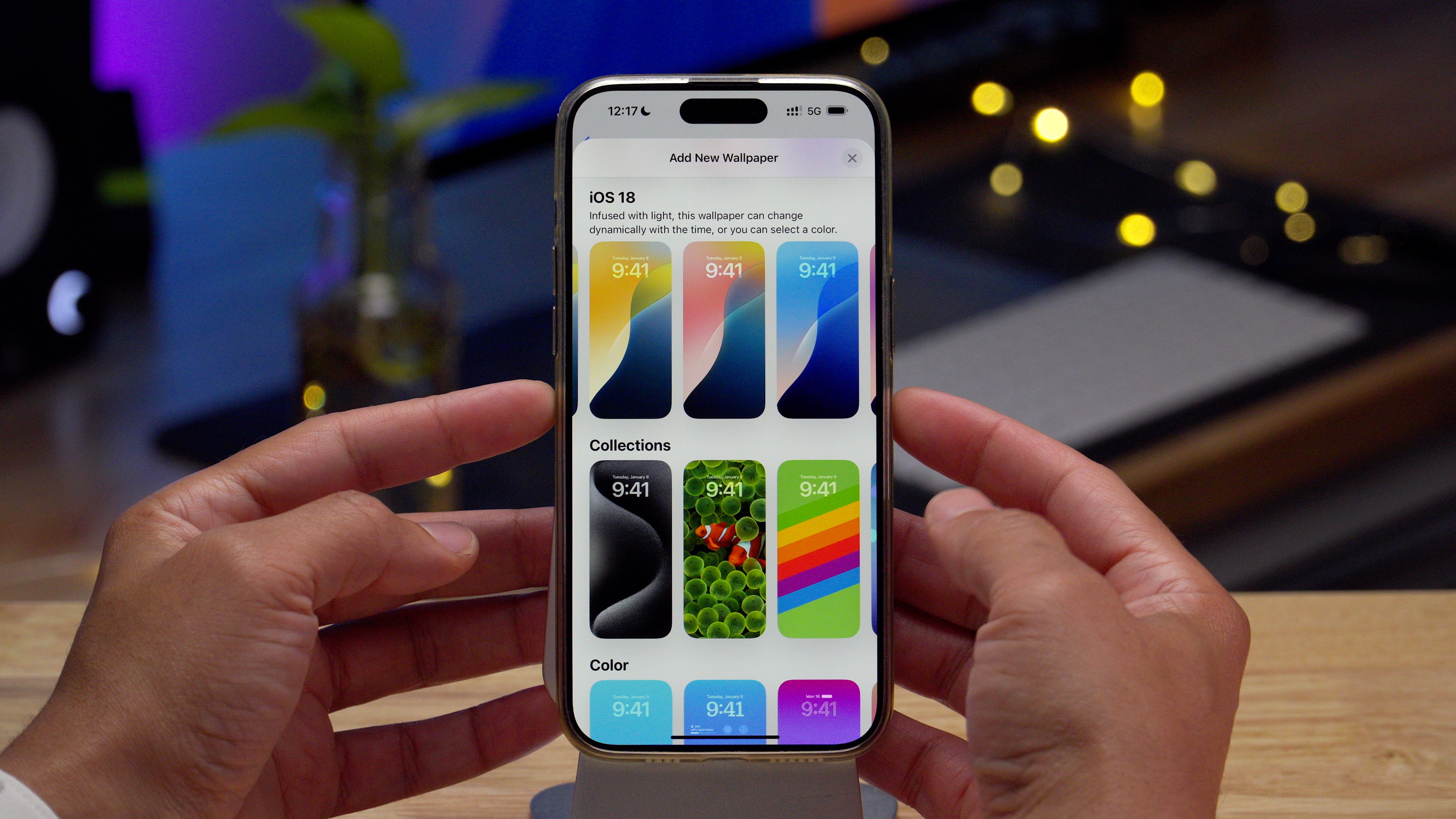
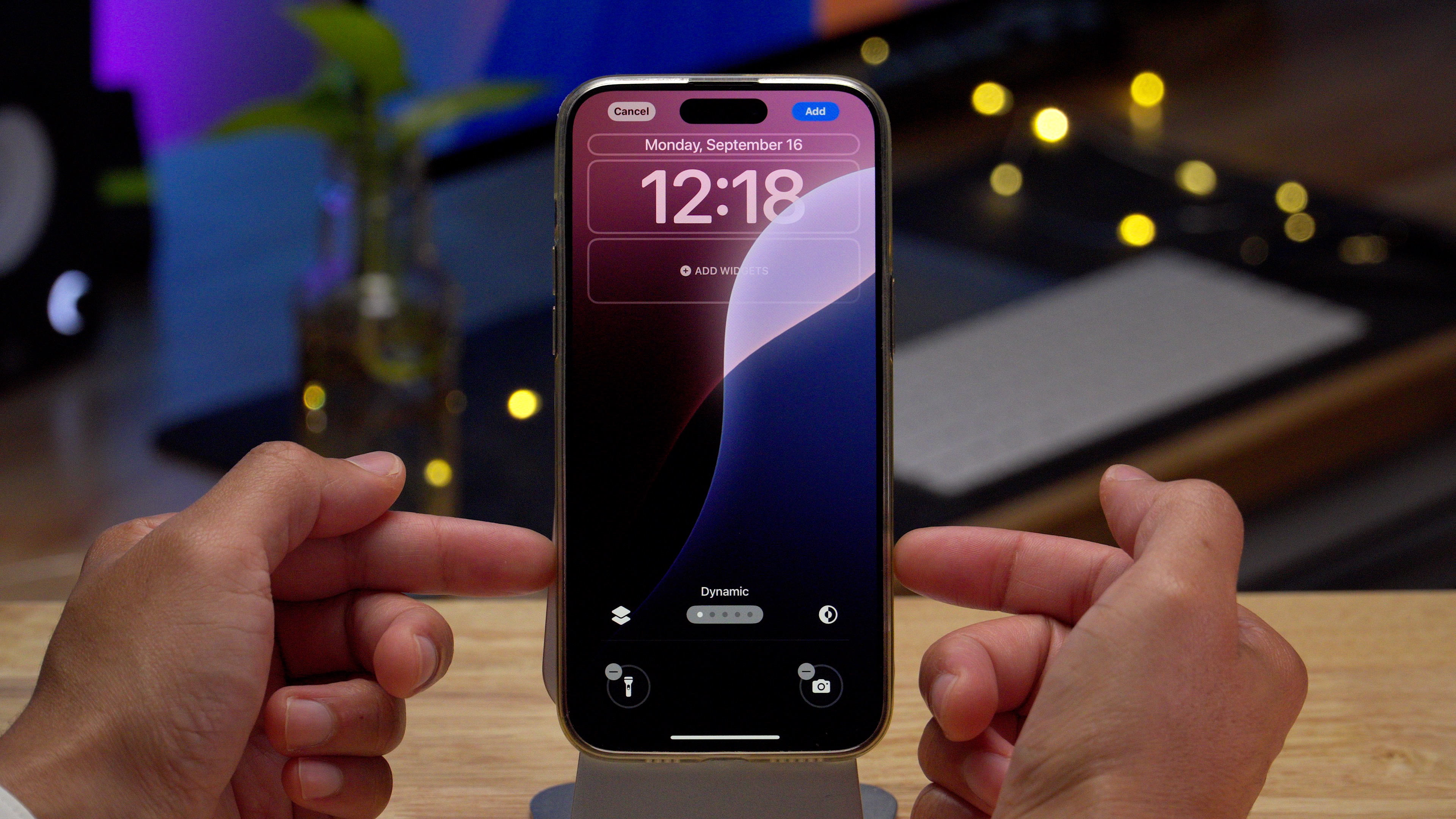
Video: iOS 18 Top Features – Home Screen
Subscribe to 9to5Mac on YouTube for more videos
Flexible app and widget placement
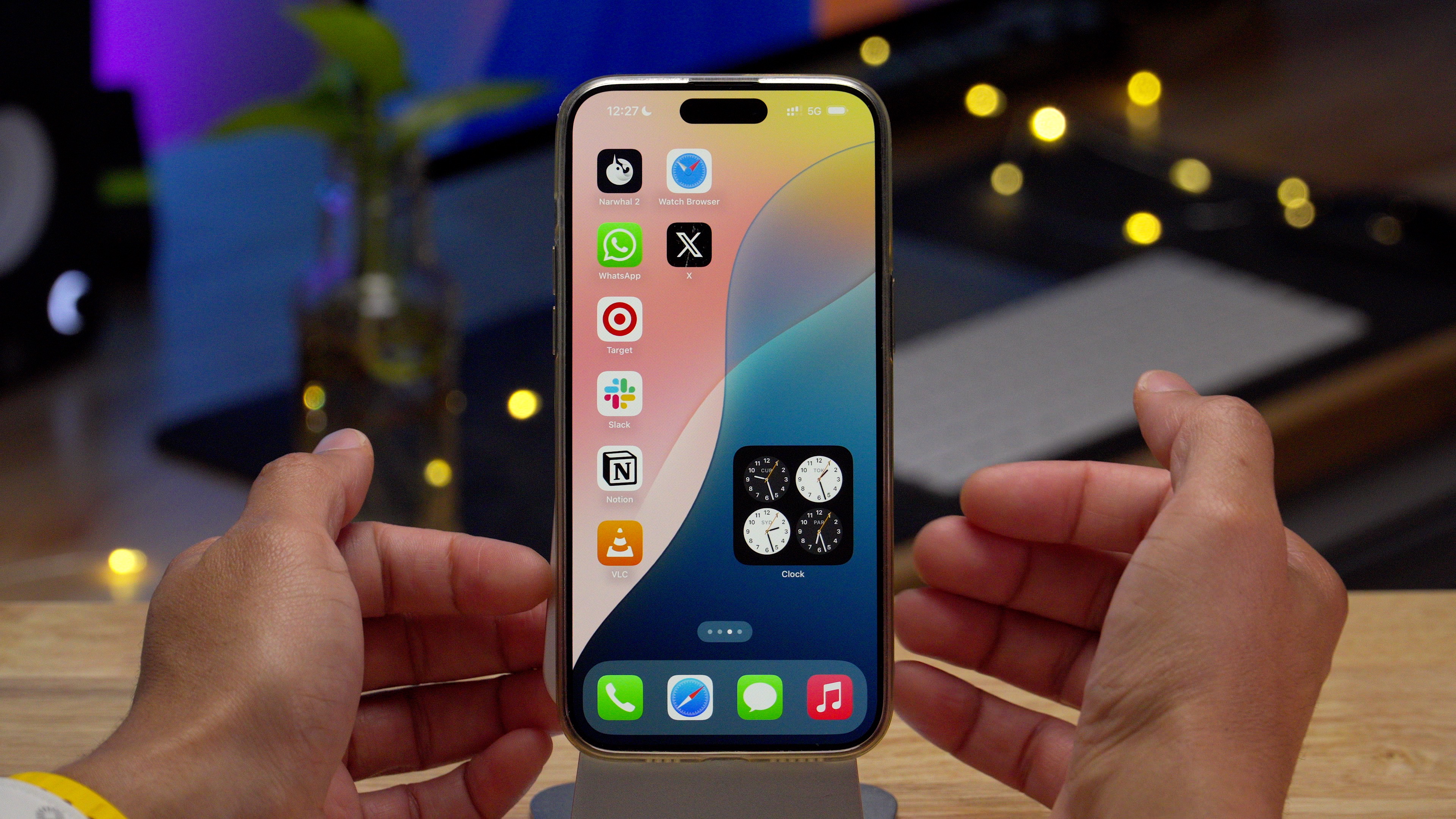
For the first time in iOS’ history, you can place app icons and widgets anywhere on the home screen grid. You can leave gaps between icons or strategically place them in different areas to showcase the wallpaper underneath. Android users have enjoyed these features for years, as diehard Google fans will be quick to highlight in the comment sections of our YouTube videos. 😆
Resizing widgets
iOS has long supported different widget sizes, but until now, you have not been able to adjust the size of a widget already placed on the Home Screen. With the release of iOS 18, Apple gives users not just one but two ways to customize widget sizes in post.
The first way to alter a widget’s size is to use the drag handle that appears in the bottom right-hand corner of the widget while in edit mode. You can use the drag handle to upsize or downsize the widget if there are other size options available for that widget type.


You can also resize widgets by performing a long press and tapping one of the glyphs representing each available widget size. This long-press action also has another benefit: You can resize a widget down to its app icon.
Customizing the Home screen
When in edit mode, you’ll notice a new ‘Customize’ option when tapping the edit button in the upper left-hand corner of the Home Screen. This option reveals a new Home Screen customization panel dedicated to altering the look of Home Screen app icons and, to a lesser degree, Home Screen wallpaper.


There, you’ll find options to switch between light and dark icons and to change wallpaper tint. Both first-party and third-party apps downloaded from the App Store can display dark app icons, but the app’s developer needs to make sure that feature is enabled.


You’ll also find a dedicated icon tint option with a color and saturation slider. Using tint will simultaneously affect all Home Screen app icons, giving them a uniform color. For those looking to complement the home screen wallpaper, there’s a handy eyedropper tool to sample colors for use on icon tint.


In addition to the customization mentioned above, you’ll find a button that lets you switch between small and large app icons and widgets. App icon names are hidden when using large icons to accommodate the additional size, which makes for a cleaner and perhaps more aesthetically pleasing setup.
Locking and hiding individual apps
Finally, iOS 18 allows users to lock individual apps behind Face ID or a passcode. To lock an app, long-press the app icon and select Require Face ID. Once Face ID authenticates, the app will be locked and require authentication upon each launch. Locked apps won’t be featured in notification previews or Spotlight Search results, and not all apps, such as Settings and Maps, can be locked.


In addition to locking apps, iOS 18 lets users secure individual apps by hiding them. Hidden apps work similarly to locked apps but are stashed away in a new Hidden category in the iOS App Library. To hide an app, press its icon and select Require Face ID → Hide and Require Face ID. Only apps downloaded from the App Store may be hidden.
To reveal apps within the Hidden Appl Library category, tap on the category and then verify with Face ID. Hidden apps will not receive notifications, calls, or critical alerts, but their presence will still be apparent via places like Settings.
9to5Mac’s Take
iOS 18’s Home Screen opens up the iPhone like never before to customization options that allow users to personalize their devices to a high degree. Coupled with iOS Shortcuts and popular third-party apps like Widgetsmith, users can now concoct original-looking iOS Home Screens like never before. While some may balk at the customization possibilities, considering them gaudy, I welcome it and feel such features are long overdue.
FTC: We use income earning auto affiliate links. More.




Comments