
We yesterday highlighted what is quite possibly the smallest user-facing change in the latest iOS 26 beta: the ability to revert the camera app slider to its previous direction.
While this is in itself a very tiny change, I do think it ought to be a guiding principle for Apple’s approach to user interfaces …
To me, there are two different ways in which you can judge a user interface.
The first is how intuitive it is. In other words, can you immediately see how to perform a function even if you’ve never seen it before and nobody has explained the UI to you?
The second is how natural and easy it seems once you do know how it works, even if it wasn’t immediately intuitive when first encountered.
In an ideal world, a UI will tick both boxes, but there are times when the second of these is more important. For example, I recently noted that the camera app slider is no longer immediately visible.
The bottom slider has been ‘replaced’ with two buttons: Video and Photo. I do think this makes perfect sense. Probably 98% of iPhone owners only ever use these two functions, and most of the 2% likely mostly do so.
I put ‘replaced’ in inverted commas because the slider is still present. If you slide across these buttons, then all the previous options (timelapse, slo-mo, and so on) appear in the same way as they did before.
While this fails the intuitive test, it’s an extremely efficient UI, and I’ve come to like it a lot. For me, it definitely passes the second test.
However, Apple made another change which both puzzled and annoyed me: it reversed the direction of the slider. Previously, you were controlling the direction in which the button moved through the various camera options. Now, you are instead sliding the background beneath the button.
One could argue that this is more consistent across Apple devices. Think of the Mac trackpad, for example, and we are scrolling the content beneath our fingers. It’s the same when scrolling in iOS. The new default camera slider behaves in the same way.
Top comment by CarAnalogy
I think Apple's "design" has become very opinionated but without any solid evidence.
They don't seem to base their UI in science at all anymore and judge it solely by what looks cool, and apparently by how much UI they can hide.
It is good that they give the option, but it's not good that they have inconsistent controls and change them without notice. And then when they do give in to usability, they label it with things like "Classic" or "Legacy."
All the same, this doesn’t feel to me like scrolling, and I have too many years of muscle memory to want to make this switch. I’m clearly not the only person to complain about this, as the latest iOS beta includes a settings toggle to revert back to what Apple calls “classic” switching.
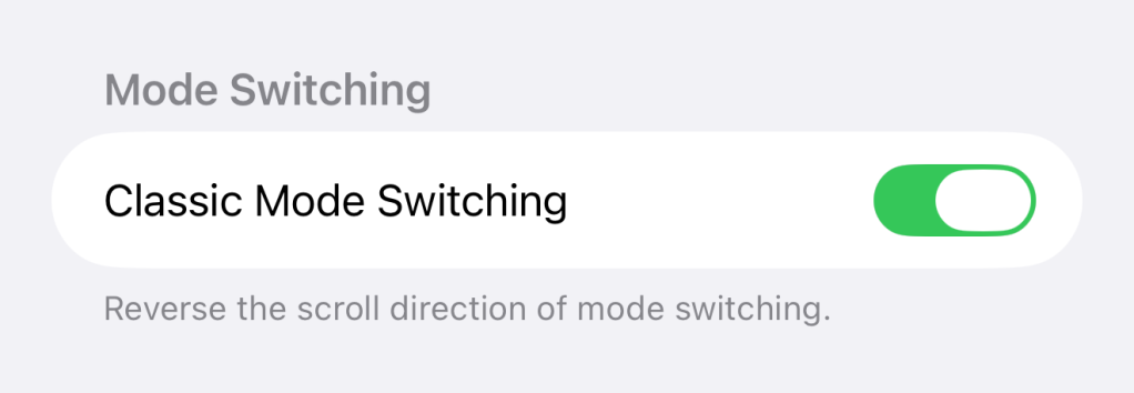
I’ve now flipped the switch and I’m happy again. But it strikes me that, as a general principle, Apple should always include a toggle to revert to the previous behavior any time it makes a 180-degree change like this.
Like I say, this is the most nitpicky of nitpicky issues, but given it mildly irritated me every time I used the camera app, I do think it’s a good principle for Apple to follow. What are your thoughts? Please let us know in the comments.
Highlighted accessories
- Official Apple Store on Amazon
- Anker 511 Nano Pro ultra-compact iPhone charger
- Spigen MagFit case for iPhone 16e – adds MagSafe support
- Apple MagSafe Charger with 25w power for iPhone 16 models
- Apple 30W charger for above
- Anker 240W braided USB-C to USB-C cable
9to5Mac collage using background from Codioful (Formerly Gradienta) on Unsplash
FTC: We use income earning auto affiliate links. More.


Comments