macOS Tahoe app icons came under fire late last year with commenters describing them as “terrible” and “objectively bad.” In our poll, 9to5Mac readers had exceedingly mixed views.
Software engineer Nikita Prokopov has now drawn attention to the icons used within menus and pointed out that they almost exactly mirror the approach which Apple’s Macintosh Human Interface Guidelines advised against back in 1992 …
Prokopov shared a graphic from the guidelines which showed what Apple described as an “ugly” menu, with each item having its own icon, contrasted with what the company considered good practice, which was very few in-menu icons.

He then points to Apple breaking this guideline with Tahoe menus.
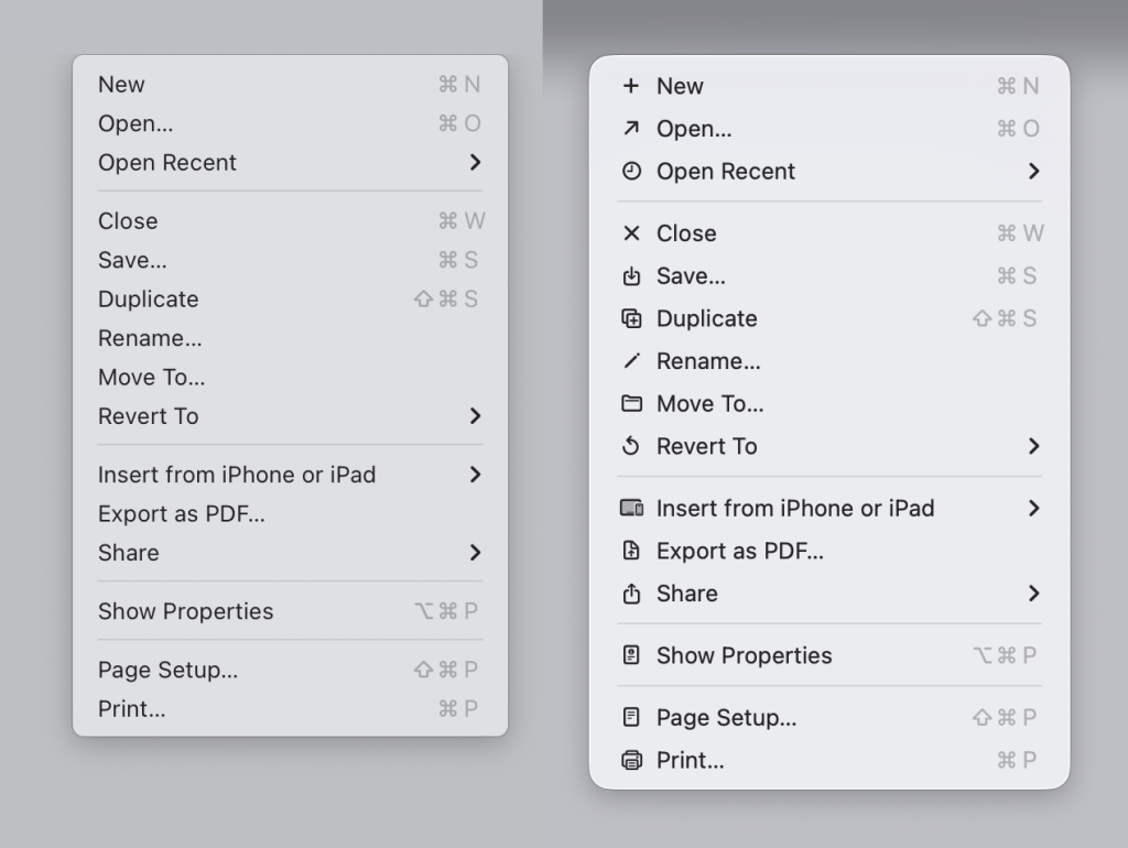
Admittedly, resolutions have improved dramatically since those days, and it could be argued that in-menu icons today are much clearer, but Prokopov argues against that too.
The main function of an icon is to help you find what you are looking for faster. Perhaps counter-intuitively, adding an icon to everything is exactly the wrong thing to do. To stand out, things need to be different. But if everything has an icon, nothing stands out.
He suggests the approach Microsoft took in the early days, with icons restricted to only the most commonly used functions, is a better one.
But it gets worse. He also points out that Apple uses inconsistent icons for the exact same function in different apps – Including things as basic as New. Depending on the app, Apple uses five markedly different icons to essentially mean the same thing.
Top comment by lek
the problem with how the menus are constructed in os 26 is that if a single item has an icon, then every item in that menu has to have an icon to be horizontally aligned with other items, which inherently leads to arbitrary icons for actions, and that is visual clutter that only confuses. so the guy is right
people who designed ios 13-18 menus understood this, and thats why they put the icon as an optional, trailing item that didnt mess with the layout
As if that weren’t bad enough, he also points to examples where Apple uses the exact same icon to mean completely different things! For example, the icon for a new note in the Notes app is the same one as the “edit address” icon in the Contacts app.
His blog post is illustrated with a great many examples, as well as suggested improvements using fewer icons and colour coding them. It’s definitely worth checking out.
Once you’ve taken a look at his examples, do share your thoughts in the comments.
- Official Apple Store on Amazon
- NordVPN – privacy-first VPN with no logs and independent audits to verify
- Official Apple iPhone Air cases and bumpers
- iPhone Air MagSafe Battery
- Official iPhone cases: iPhone 17 | iPhone 17 Pro and Pro Max | iPhone Air
Image: Nikita Prokopov. Via Daring Fireball.
FTC: We use income earning auto affiliate links. More.


Comments