Apple’s Mac icons in Tahoe have come under fire from quite a few people. Adjectives that have been applied to them include terrible, awful, amateurish, dumbed down, and objectively bad.
With the announcement of Apple Creator Studio, the company has gone even further in terms of minimal icons for its creative apps, provoking further controversy …
We should just note that the Apple Creative Studio (ACS) icons are not replacements for the standard ones, but rather specific versions unique to the new subscription plan.
However, if you plot a path from the original versions of each through the macOS 26 version to the ACS implementations, you can clearly see a trajectory from skeuomorphism to minimalism. This path was highlighted on Mastodon by BasicAppleGuy (above image).
Ben Cotterill summed up the opposition:
Nobody knows what icons are for now. A Tron teleporter means pixelmator. The purple McDonalds logo is motion. Stacked wooden building blocks is compressor. A signpost in the rain is something to do with music.
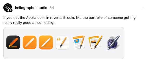
Héliographe went even further in a post on Threads.

John Gruber agrees.
Go back in time and each previous Pages icon had more detail and looked cooler. And then you get back to the original Pages icon and that one clearly belongs in the App Icon Hall of Fame.
I’ll wholeheartedly agree with him on the latter point: the original Pages icon was indeed a classic, and I still feel a great deal of affection for it.
However, I’m less sure about the overall criticisms being leveled at the trend. Yes, it’s true that unless you already know the apps, it’s virtually impossible to guess what some of them might represent. But that’s honestly true of a great many icons, and has been so for forever.
Most icons only make sense to us because we already know what they are. For example, the compass icon for Safari. If we’d never seen that before and didn’t know what it represented, we would really have no clue that it was a web browser. As I look at the icons in my dock, that’s true for a great many of them. Chrome, Slack, Lightroom, Photoshop, iPhone Mirroring, ChatGPT … I could go on.
The fact that the icons don’t have an obvious meaning is not, I would argue, important: we quickly get to know what they represent. What’s important is that I can quickly distinguish each one from other icons.
Top comment by OrangeTree
Icons should represent the application and also be visually distinct and easy to identify on the taskbar. The new icons fail in both areas. The first is a softer requirement - Ben is correct that it’s hard to relate Safari’s icon to a web browser but it is distinct and easily identifiable.
Just comparing the 3 sets of icons it’s clear that graphic designers decided they needed to get a ‘fresh new look’ and made changes based on a design trend rather than any sort of need or drive to improve the interface. The progression of the icons for Pages sums the trend up perfectly.
For me, the ACS icons pass that test thanks to having visually distinctive identities and a good spread of colors. Once I know what each one represents, I don’t feel there is the slightest danger of me forgetting that. And I have to say that I do find the ACS versions very aesthetically pleasing. I wouldn’t have been at all upset had Apple adopted these as standard.
My affection for the ink bottle aside, I think in general the later versions are better than the originals, and the ACS implementations are perhaps the most attractive.
What’s your take? Is Apple headed in the wrong direction, or the right direction? Please take our poll and share your thoughts in the comments.
- Official Apple Store on Amazon
- Wireless CarPlay adapter
- NordVPN – privacy-first VPN with no logs and independent audits to verify
- Official Apple iPhone Air cases and bumpers
- iPhone Air MagSafe Battery
- Official iPhone cases: iPhone 17 | iPhone 17 Pro and Pro Max | iPhone Air
Main image: BasicAppleGuy
FTC: We use income earning auto affiliate links. More.


Comments