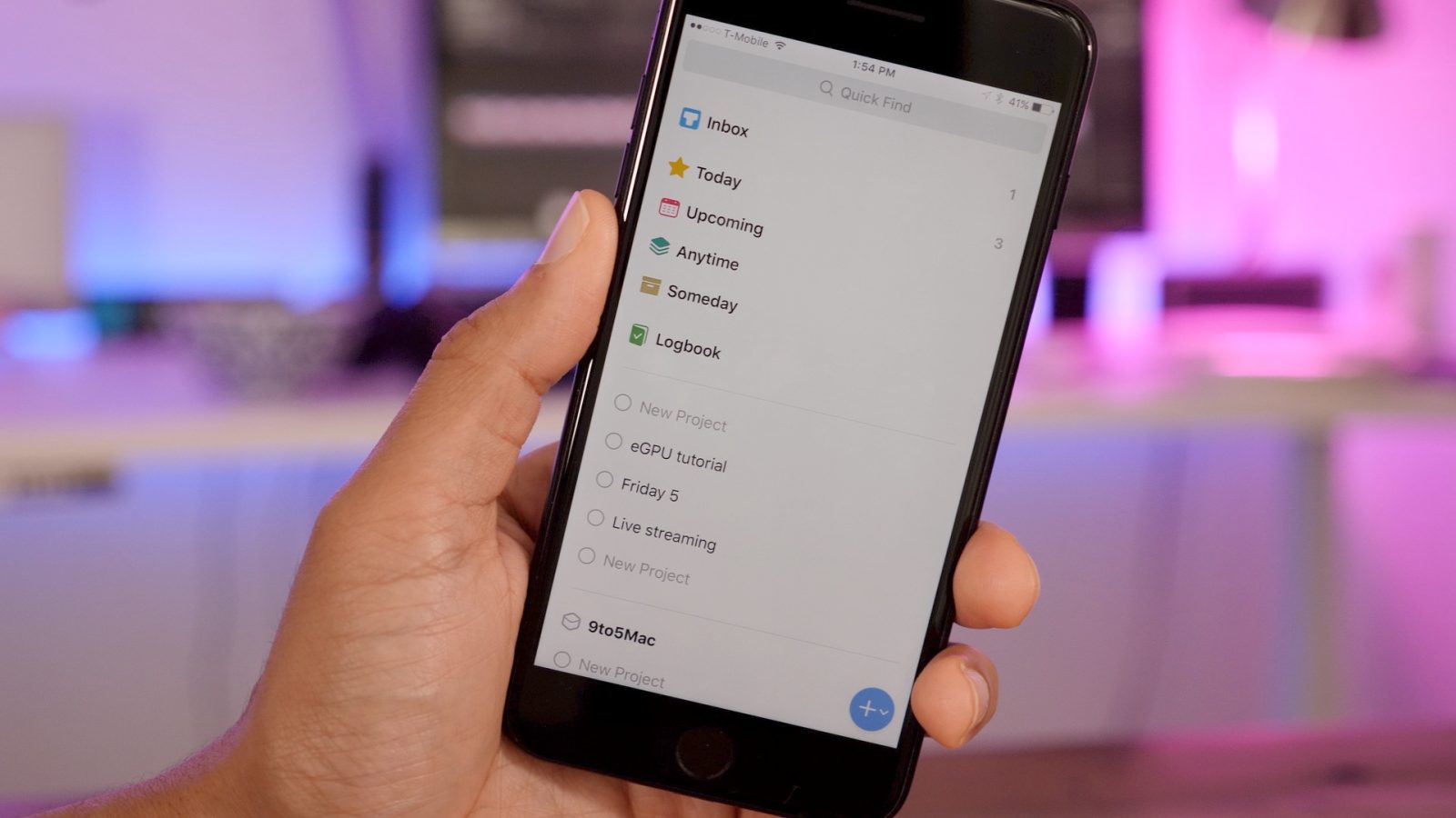
Yesterday Cultured Code released the long-awaited update to Things 2, aptly entitled Things 3. The third edition of Things features a significant design overhaul, and fundamentally changes the way you interact with the app’s many features. Watch our hands-on video walkthrough inside for a look at some of the app’s best new additions.
Design overhaul
Things 3 has received a major visual overhaul to every facet of the app’s design. The new design is not only brighter and more modern, but it’s faster and features less friction as you move throughout the interface.
Magic Plus Button
Almost every “To-Do” app features a button that allows you to add a new to-do item, but the ‘+’ button in Things 3 adds a clever twist that allows for more fine-grained control over where those items are added.
A tap of the Magic Plus Button may invoke a menu to add a new To-Do, new Project or Area. But if you tap and drag the button, you can determine where your new items are added in a more efficient and specific manner.
For example, I can drag the Magic Plus Button directly to the Inbox area to add a new To-Do to my Inbox, or I can drag the button to an already existing project. I can even use the Magic Plus Button to determine the order that I add new items to that project.
Video walkthrough
Subscribe to 9to5Mac for more videos
Checklists
Instead of creating a new project just to make a checklist, Things 3 allows any individual to-do item to contain a checklist. Simply tap the checklist button when creating a new item, and a checklist appears in the body ready to be populated.

Quick Find
After you build a substantial to-do library, it’s essential to be able to search through your data in order to find specific items. Things 3 features a handy Quick Find interface that allows you to invoke a Spotlight-esque search box from anywhere within the app; simply swipe down on the screen.

Efficient list editing
Unlike previous editions of the app, Things 3 allows users to quickly and efficiently edit multiple to-do items, projects, or areas by performing a left swipe gesture. This makes it super-easy to move, delete, or assign dates to multiple items simultaneously.

Conclusion
As you can see, Things 3 is much more than just a fresh new coat of paint. It features design details that fundamentally change the way the app works for the better. The app allows users to add, edit, and find their data faster. These updates are why it’s a no-brainer that Things 3 stands alone as this week’s Friday 5 app of the week.
The iPhone version of the app is currently on sale for $7.99 for a limited time. You can also find the iPad version, and Mac version — both on sale — right now.
Do you currently employ the use of a To-Do app in your daily or weekly workflow? What do you think about Things 3? Sound off in the comments below with your thoughts.
Also be sure to check out last week’s edition of Friday 5, where I discussed some of my favorite macOS utilities. You can find the full video walkthrough for that below:
FTC: We use income earning auto affiliate links. More.


Comments