
The ultimate goal of a creative tool is to foster seamless innovation and collaboration. Adobe understands this, having built its brand on industry-leading creative products for decades. But how do you evolve a brand to become more approachable to a larger audience? For many tech companies of late, brand illustrations have proved successful. When a logo or wordmark isn’t personal enough, illustrations help bridge the gap between a product and a user, becoming part of a brand identity. Today Adobe is rolling out a fresh illustration style for here that will begin to populate its tools and services. 9to5Mac took an inside look at the process of reimagining the aesthetics of tools that creative professionals rely on every day.
Companies like Mailchimp, Dropbox, and even Chobani have made illustrations central to their brands. But Adobe’s position is unique. The creative industry’s most discerning customers use its products. Mac and iOS apps in particular are expected to offer world-class experiences as polished as the hardware they run on. And even the most inoffensive brand identities have become polarizing conversation starters online. That’s a lot of pressure. Emma Zhang, Brand Experience Designer at Adobe, tells me that the company’s expectations are mutually stringent. “At Adobe, we hold a high bar for curating the artwork featured in our tools and services. It’s our priority to present the best quality work to spark our users’ creativity.”
Going forward, the artwork Zhang speaks of has been dramatically transformed. Adobe’s new illustration system revolves around four key elements. Outlines, geometric shapes, tool brand theme colors, and textures welcome users as they launch Creative Cloud applications. These ideas are consistently expressed in 2D side profile depictions across the system. Adobe calls the look “creative, playful and representative of what the products are today.”
 Variations on a theme.
“We delivered on our goal of creating a style that represents our brand values and provides a lot of room for creativity within these guidelines,” Zhang said, pointing to Acrobat DC’s illustrations as a clear example of variations that can be created within the system. “By changing the color themes, adding new textures and changing compositions, the system can generate infinite possibilities.” Inspiration for the style was drawn from elements of ancient Egyptian art and geometry. Clean lines and bright colors are juxtaposed with more organic textures and fills. (Perhaps there’s even a touch of Art Deco influence?)
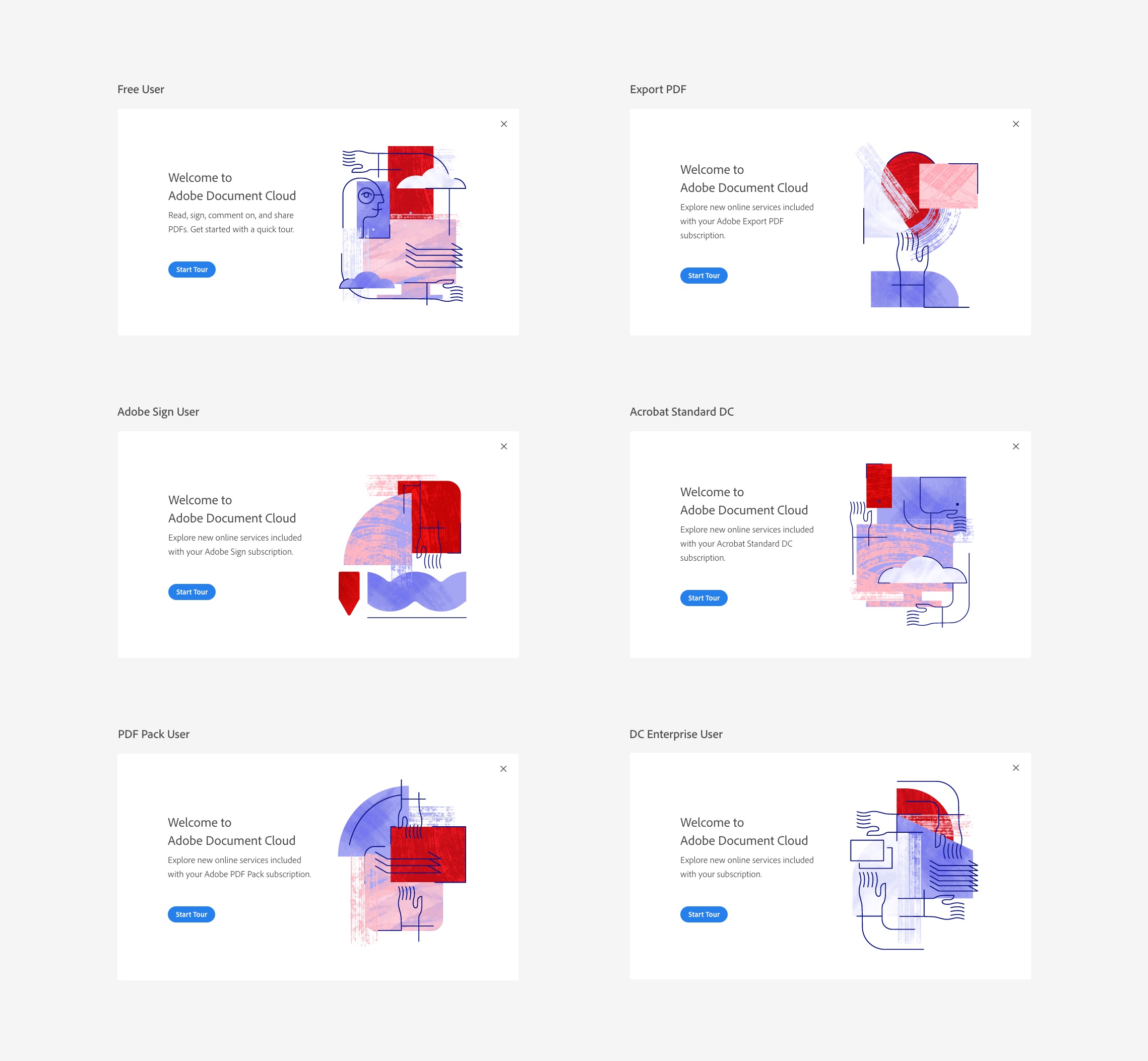
 Illustrator CC onboarding.
Users will see the new style today in several Creative Cloud applications and services including Adobe XD mobile, Illustrator CC’s onboarding experience, Capture CC on mobile devices, the new Adobe Fonts, and more. The company expects additional illustrations to continue rolling out across tools and services by next year.
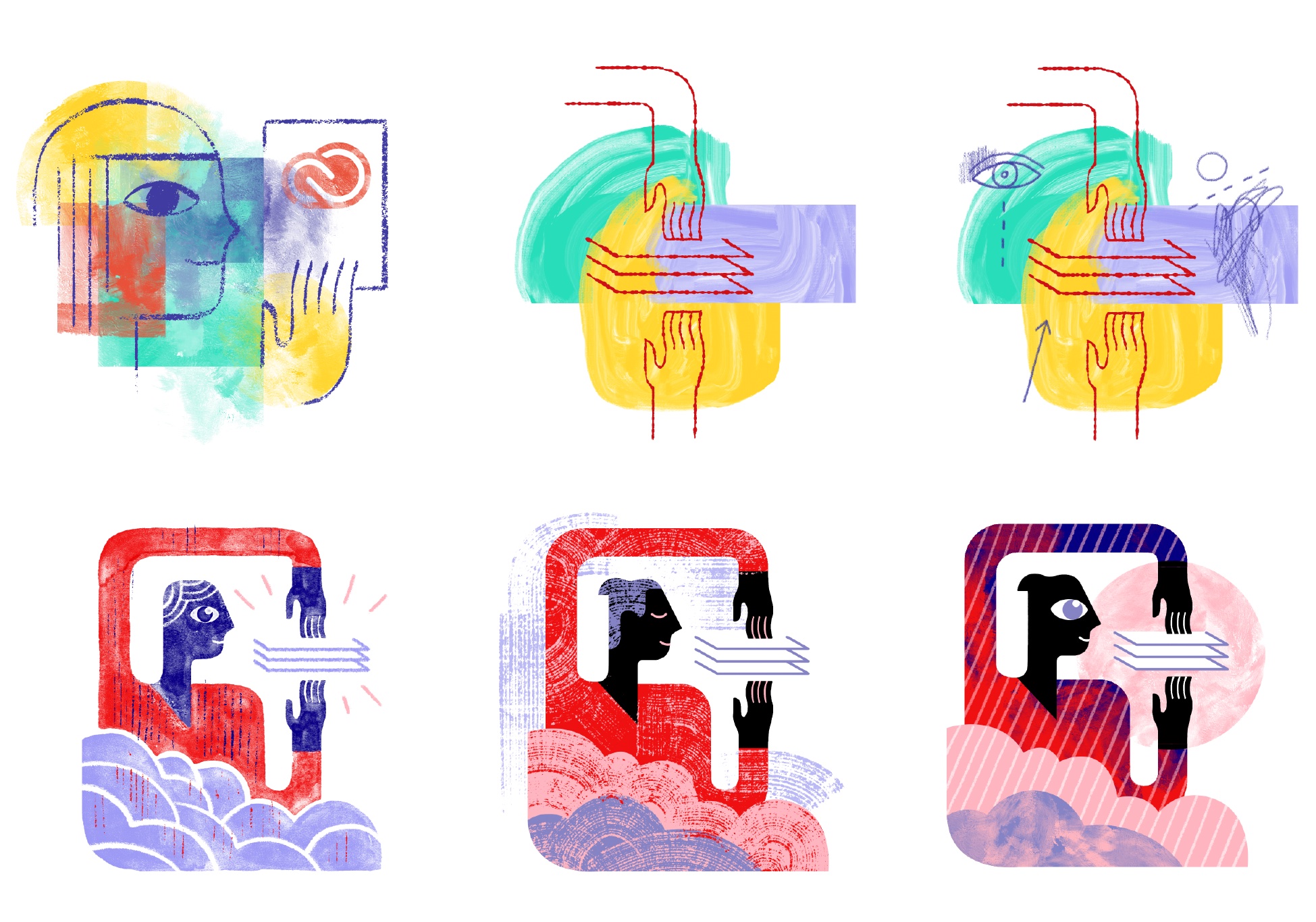
 Previous and new illustration styles.
Adobe’s exploration of illustration in its products isn’t entirely new. In 2016, the company’s icon team began using a notably more muted linear illustration style for onboarding experiences and empty states in applications. By now reimagining the larger goal of user interface illustration, Adobe hopes to add context to actions, make workflows more efficient, and provide a more enjoyable user experience through clearer design.
If Adobe’s new style looks a little different than you might expect, that’s by design as well. “The approach of using a combination of vector shapes and human figures has been widely used across the tech industry. We want to challenge the trend in the spirit of our continued innovation and boundless creativity,” Zhang notes.
 Ideation and creative thinking behind the new illustration style.
It’s true: the tech world can’t get enough of flat, cartoony human drawings – sometimes to the point of parody. Even Apple hasn’t escaped the trend in its App Store illustrations. But Adobe isn’t hoping to buck one trend in order to lead the next. “I think trends come and go, it is not just the look that matters, but it is the thinking behind it that can drive an artwork further,” Zhang added. “I think we are starting to see more and more businesses starting to use textures and abstract forms. I don’t want the style to be seen as informing the future trend, but treated as something that inspires people to flex their creativity and explore different options. As we look ahead, I’m excited to see the blooming of art and illustration styles in tech products and services in the future.”

More on today’s announcements:
- Premiere Rush CC released, Apple Photos to Lightroom migration, XD voice apps, more
- Adobe announces full Photoshop CC for iPad shipping 2019, syncs with desktop
Follow along with 9to5Mac all week long for continued coverage of Adobe MAX 2018.
All photos courtesy of Adobe.

Check out 9to5Mac on YouTube for more Apple news:
FTC: We use income earning auto affiliate links. More.

Comments