
With iOS 15 quickly approaching, I wanted to take some time to revisit my favorite iOS 14 features and examine how they’ve held up over time. Are there obvious areas for improvement? Watch our iOS 14 rewind review, as we take another look at the software that drives the iPhone, and be sure to subscribe to 9to5Mac on YouTube for more coverage.
Compact phone interface
The compact phone interface is something that I instantly fell in love with upon first trying it, and it remains one of my favorite iOS 14 features to this day. Incoming phone calls no longer steal focus from the current app or website that I’m viewing, which is a huge improvement over how iOS handled incoming phone calls prior to iOS 14.
With the compact phone interface, incoming calls are presented as a banner notification at the top of the screen. This design allows you to continue a current task, uninterrupted, while deciding how to handle the incoming call.
Long-term verdict: The compact phone interface is a highly useful feature, and I can’t believe went over a dozen iOS releases without it. That acknowledged, I sometimes feel like the compact phone interface and the iPhone’s proximity sensor aren’t on the same page, causing occasional issues with accidental touch input. Have you had a similar experience with the compact phone interface? Let me know in the comments.
Video: iOS 14 rewind review
Sponsor: Special thanks to TenorShare, creators of Reiboot – Download Tenorshare Reiboot now.
Subscribe to 9to5mac on YouTube for more videos
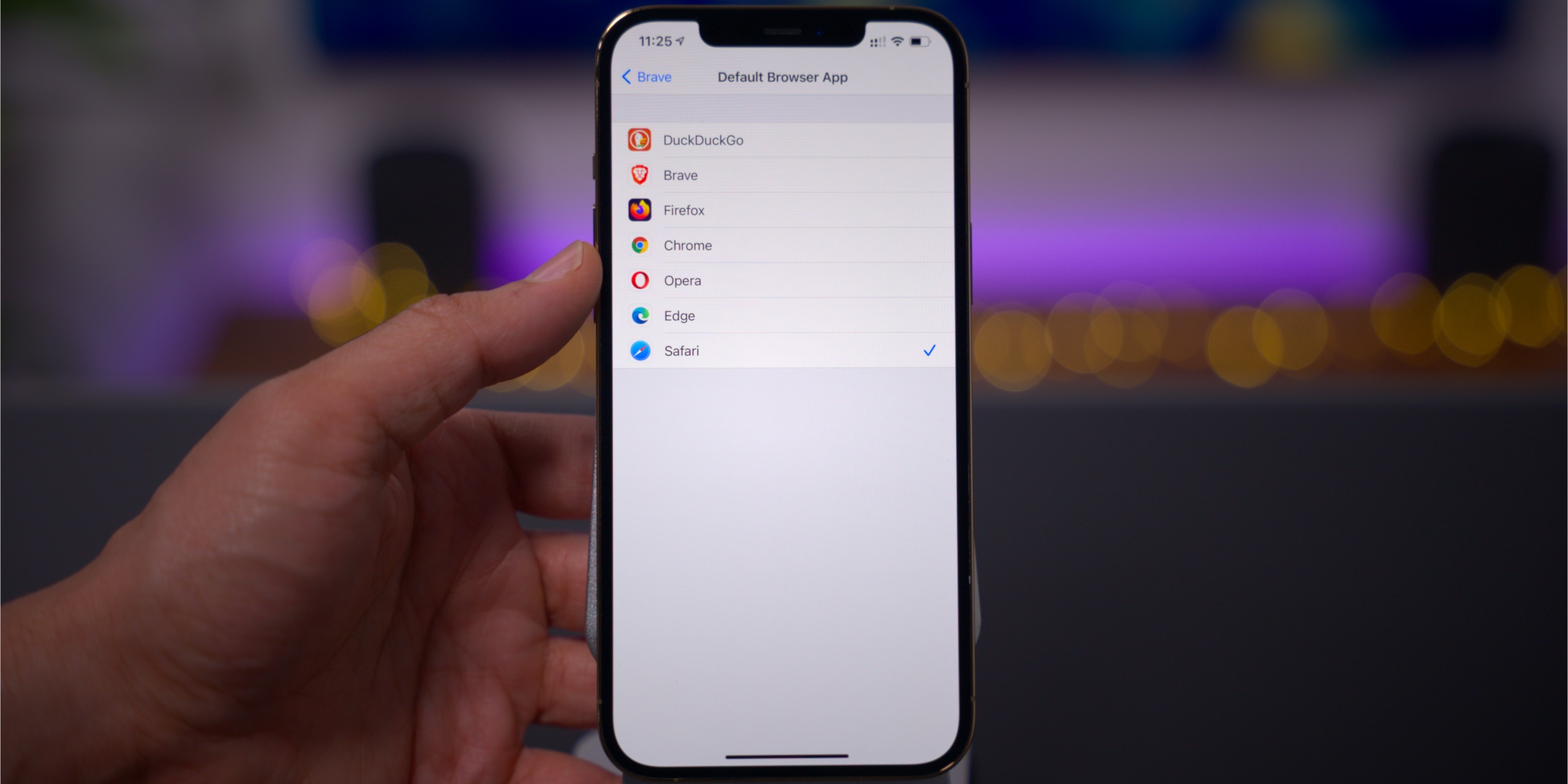
Choose default browser and default mail app
The ability to choose a default browser is great for those of you who like to use alternative browsers like Firefox, Microsoft Edge, DuckDuckGo, Brave, Opera, etc.
In addition to choosing a default browser, iOS 14 also allows users to set their preferred mail app. Like third-party browsers, there is no shortage of third-party mail clients for iOS. Some of the popular mail clients include Outlook, Gmail, Spark, Airmail, and Newton Mail.
Long-term verdict: Default app functionality was a little slow out of the gate, and there were issues with the selected apps reverting back to the stock Mail and Safari app after reboots. There was also an issue with “mailto” links not working properly for users that had their default browser set to Safari. Both of these issues eventually got fixed via an iOS update.
In future updates, I’d like to see default app functionality directly selectable via the Mail and Safari preferences, instead of having to visit the preferences of the app that you’d like to set as default. I’d also like to see Apple remove the confirmation dialogue whenever tapping mailto: links that take you to a third-party default mail app.
Those issues aside, the ability to set both default mail and browser apps is a feature that iOS users have been clamoring to have for years, and it’s finally possible in iOS 14.
App Clips
App Clips are lightweight, smaller portions of an app that are instantly available when you need them. Weighing in at 10MB or less, App Clips can be downloaded quickly to access parts of an app when you don’t already have the primary app downloaded. An App Clip may allow you to demo the first level of a game, or quickly access the menu and ordering interface while at your favorite restaurant.
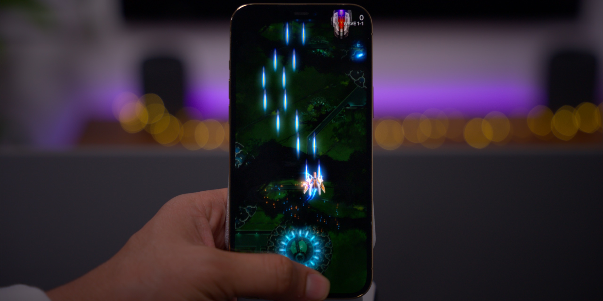
Phoenix 2 Prologue – an App Clip demo game
You can access App Clips directly from a Safari app banner, via QR-style App Clip codes that can also incorporate an NFC tag, via links in the Messages app, and in Place Cards within the Maps app. App Clips also work with Apple Pay, Sign in with Apple, and feature a convenient link to download the full application.
Long-term verdict: App Clips are ideal for using while out an about, but the COVID-19 pandemic limited the feature’s visibility. Once things fully open back up, App Clips have the potential to increase in popularity.
Related video: iOS 14 top features
Picture in Picture
The addition of Picture in Picture is something that I’ve been wanting for years on iOS. Picture in Picture, which was previously only available on iPhone via a popular jailbreak tweak, was one of the main reasons why I always looked forward to jailbreaking my iPhone. Now available by default in iOS 14, Picture in Picture allows you to watch video content while simultaneously browsing the web, send text messages, etc.

Long-term verdict: In real world usage, Picture in Picture has been a bit of a disappointment for me, but the blame lies at the feet of the developers **cough** Google **cough** that refuse to support it. For example, YouTube TV, my go-to streaming television app, outright lacks support for Picture in Picture. Even worse, standard YouTube, while capable of using Picture in Picture by means of workarounds, doesn’t really play nice with the feature, either. Obviously this is not Apple’s fault, but Google has made the decision to limit or outright refuse to support Picture in Picture. At least companies like Netflix do it right.
Privacy enhancements
There are many privacy-centric enhancements featured in iOS 14, but the following three stand out to me the most:
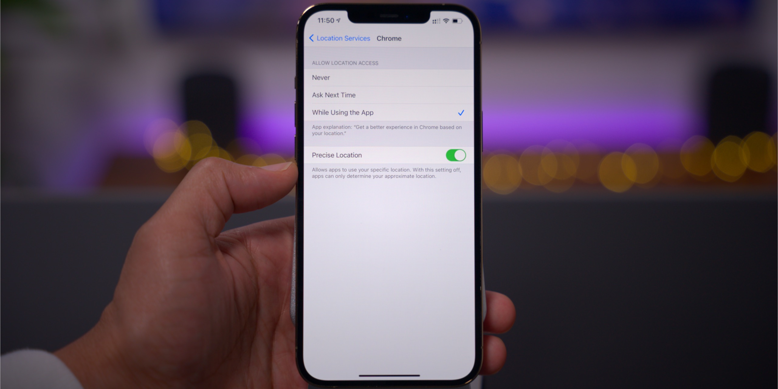
Approximate location support
Instead of giving an app access to your exact location, users now have the option of establishing an approximate location. This feature protects your privacy by providing a wider location scope, while still placing you in the general area.
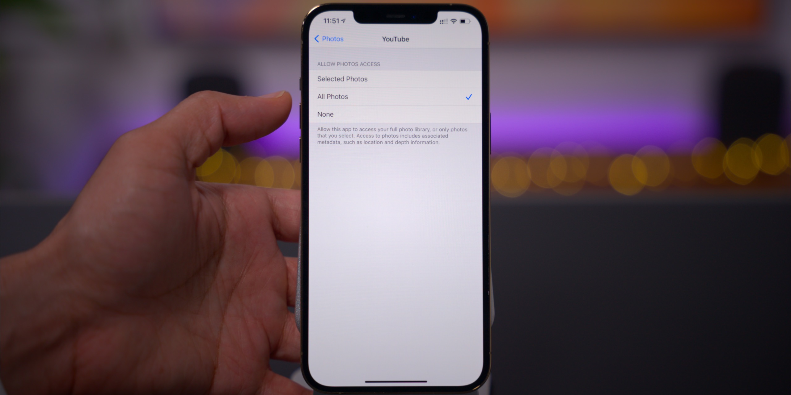
Only access selected photos
Instead of giving an app access to your entire photo library, you can now limit photo sharing to designated photos of your choosing.
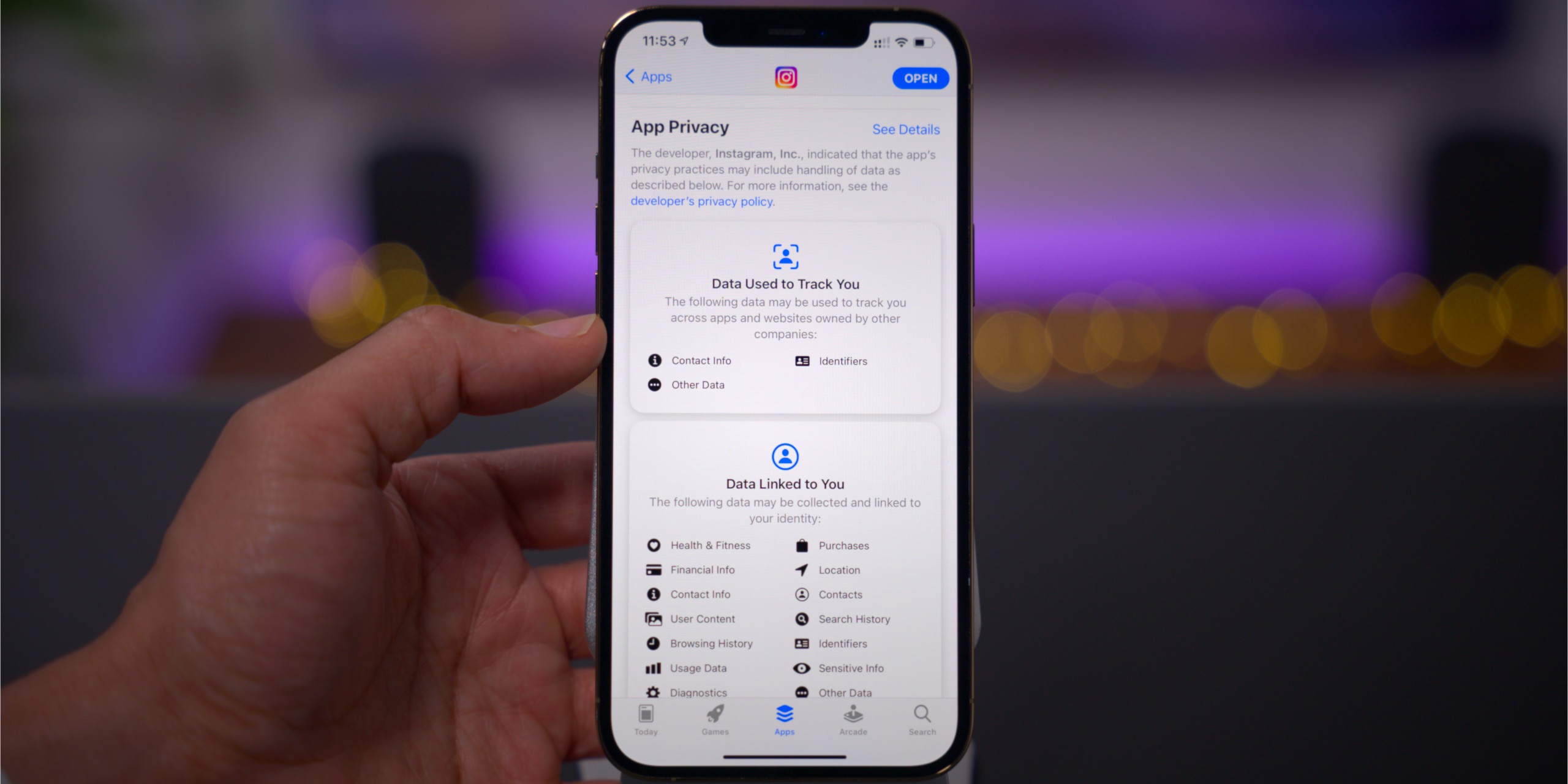
App Privacy labels
The App Store’s App Privacy labels feature empowers users by providing deeper insights into how an app uses your personal data.
Long-term verdict: iOS 14 is a huge win for consumers’ privacy, but there are improvements that can be made. For starters, I’d like the ability to make approximate location the default global selection, instead of having to manually choose it each time my location is requested by a new app. I’d also like the ability to give apps access to entire albums of photos, instead of having to select individual photos one-by-one. The individual photo selection is cumbersome, and makes it less likely that people will actually use it.
Home Screen enhancements
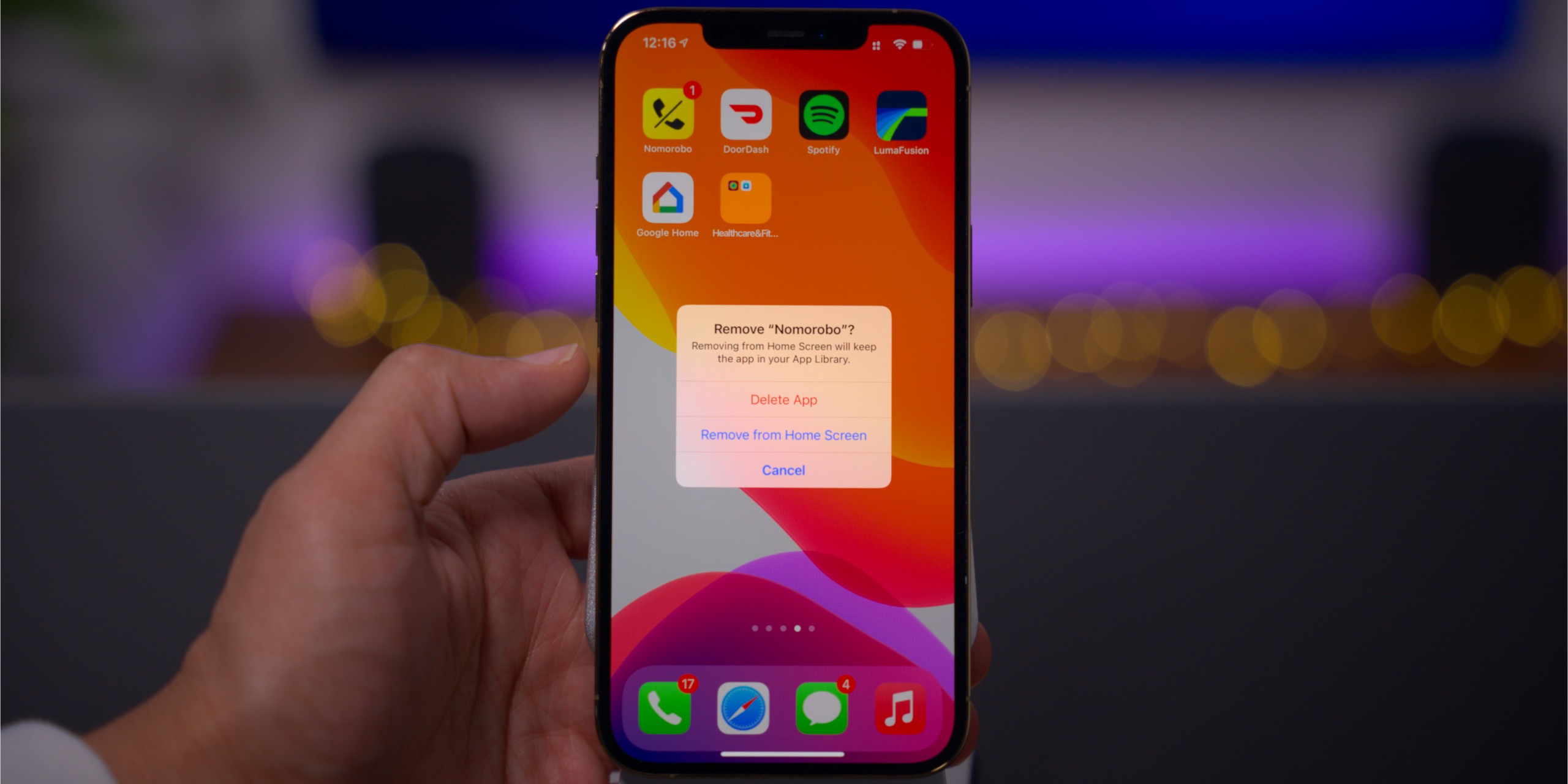
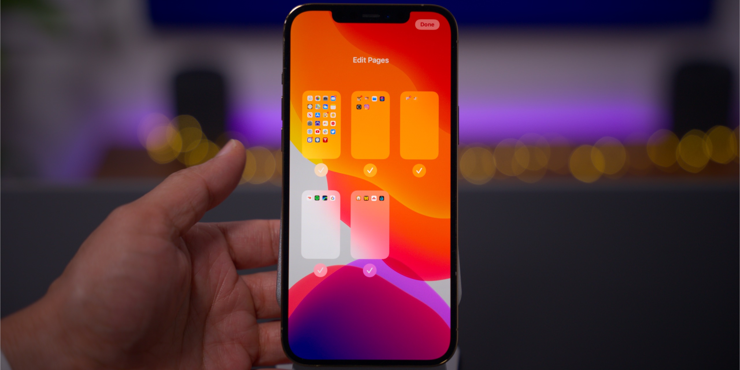
One of the biggest additions to iOS 14 is the ability to add or remove entire Home Screen pages in just a few taps. Thanks to the new App Library in iOS 14, it’s also possible to remove individual apps or entire folders from the Home Screen, while keeping them installed on your iPhone.
Long-term verdict: Being able to edit pages in iOS 14 affords users more control over the Home Screen experience, and this feature has held up well. However, I wish the page editing interface had more customization options for quickly moving apps and folders between pages, and for rearranging the order of pages.
Related video: 250+ iOS 14 features
App Library
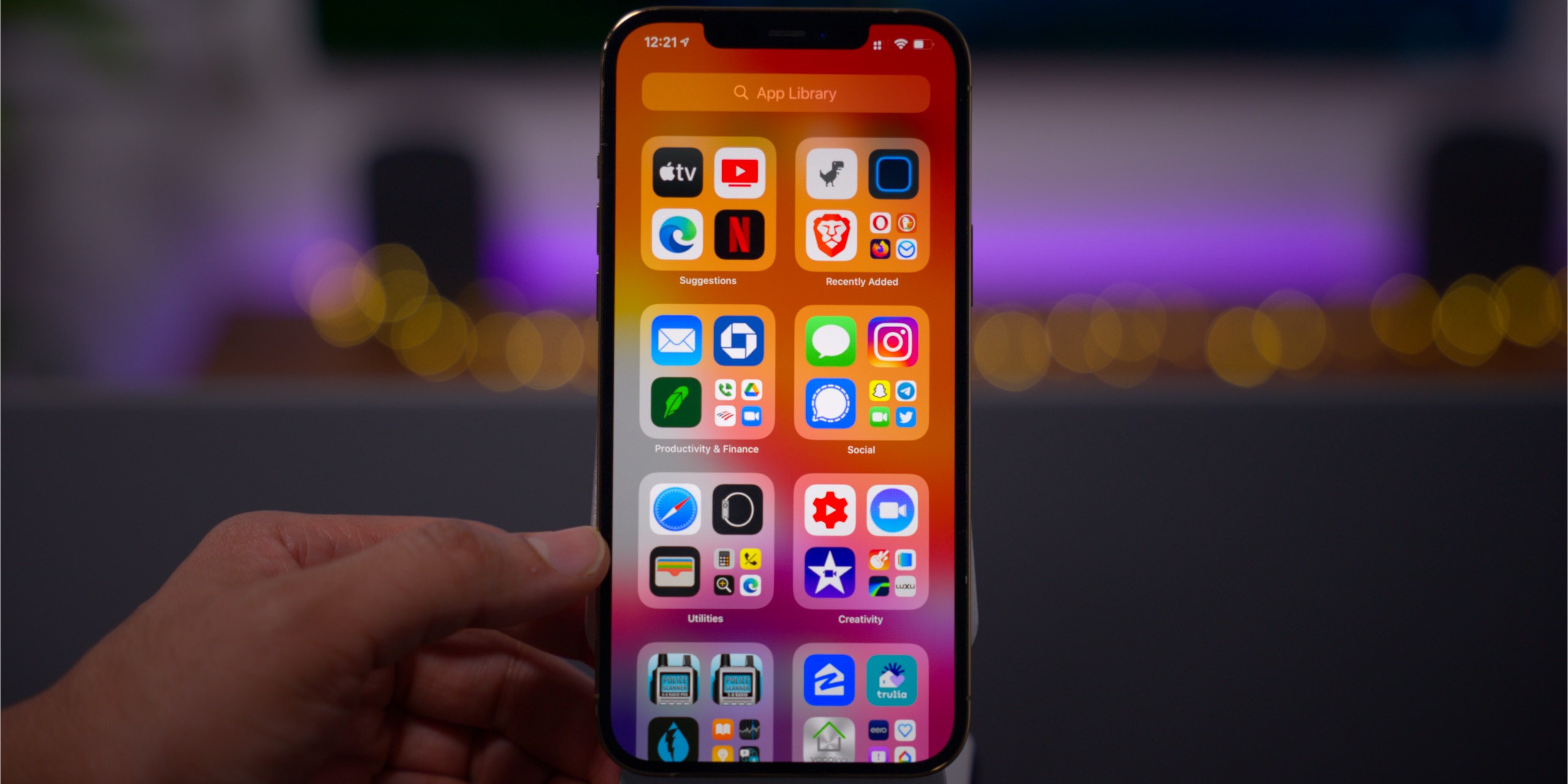
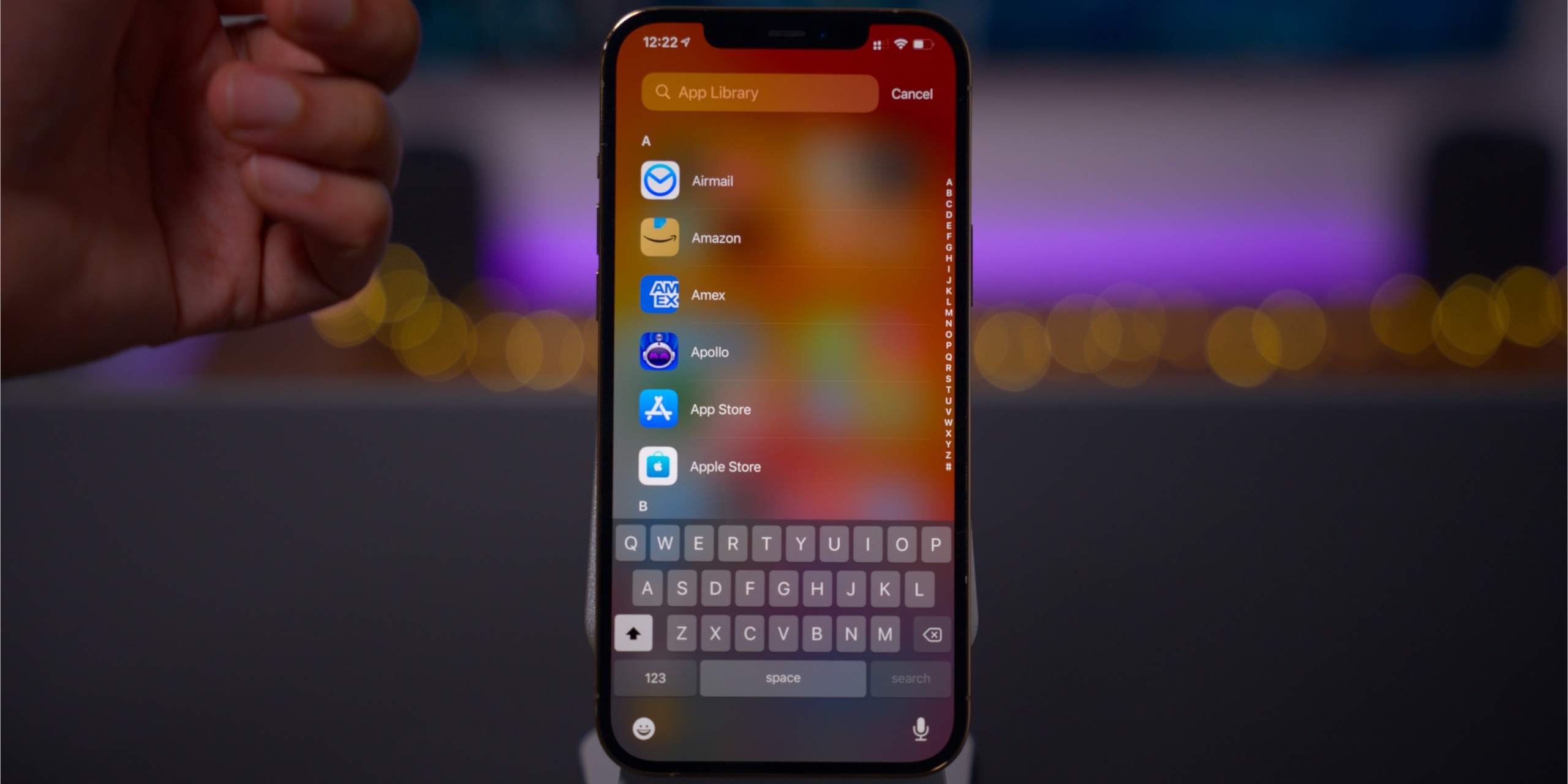
The App Library is a catch-all location where all of the apps installed on your iPhone can be found. Apps are automatically sorted in pre-named categories that work similarly to folders, but users have no control over category names, or how apps are sorted. The App Library also features the ability to search for a specific app and view all apps in an alphabetically sorted list.
Long-term verdict: I like the idea of the App Library, primarily because it’s what makes part of iOS 14’s Home Screen enhancements possible, but it’s largely a mixed bag. After using the App Library for the last nine months, I find that Apple’s auto-sorted categories can often be difficult to parse on the fly. I much prefer the alphabetically sorted list that appears when tapping the search box, and I wish there was an option to only display this list of apps when using the App Library.
Music app enhancements
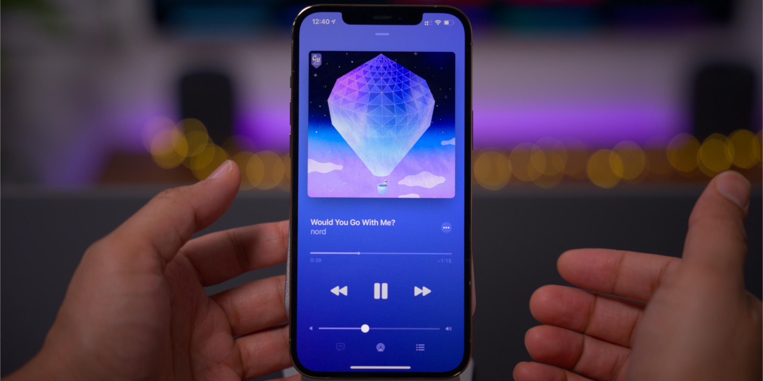
Several of the Music app enhancements are visual upgrades, such as the color-matched now-playing interface that corresponds to the album artwork. The new now-playing interface is very similar to Spotify, adding a more interesting visual flair to the stock Music app.
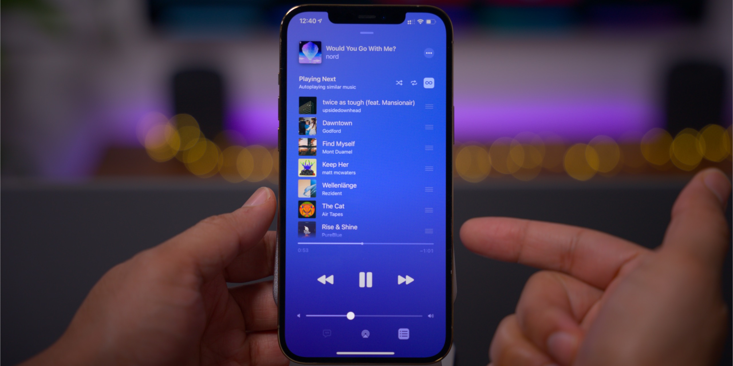
But perhaps the best new addition to the Music app in iOS 14 is the inclusion of AutoPlay, which coincidently, is another Spotify feature. AutoPlay continues music playback once you reach the end of your music queue, affording continuous playback that’s themed around the songs that were previously playing.
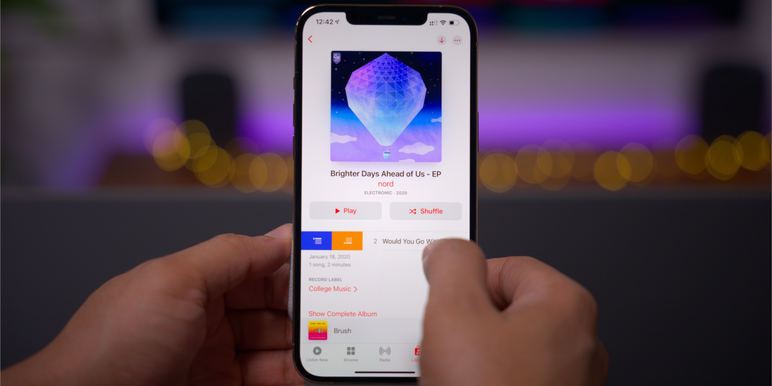
Long-term verdict: The Music app in iOS 14 is one of iOS’ best new software updates, even if a lot of it was influenced by Spotify. What’s even better is that the upcoming release of iOS 14.5 will bring even more enhancements to the Music app, such as the ability to share lyrics, updated pop-over menus, and a new swipe gesture interface for quickly managing your play queue.
In light of the ability to set the default mail and browser applications, the fact that you cannot set a default music player is a glaring omission. iOS 14.5 addresses that issue, albeit in sort of a lackluster way. In iOS 14.5, Apple uses Siri intelligence to select music services based on listening behavior. If you ask Siri to play a song, it may ask you which service, such as Spotify, that you’d like to use for playback. Unfortunately, there remains no dedicated setting to permanently configure a default music service.
Emoji search
The ability to quickly search within an ever-growing cache of emoji characters is surprisingly useful. This iOS 14 enhancement helps me to be more productive and creative when engaged in conversations.

Long-term verdict: In future versions of iOS, Apple could make emoji even better by allowing users to create emoji favorites, or disable emoji characters and categories that they never use. That said, I’m happy with the addition of emoji search. Instead of having to swipe through pages and pages of characters that I never use, the new search interface makes it super-easy to find the exact emoji that I’m looking for.
Related video: top iOS 14 hidden features
Widgets
iOS 14 brought widgets to the main iPhone Home Screen for the first time, and this heavily influenced user customization. There are many default widgets in iOS 14, but it was the availability of third-party Home Screen widgets, especially ones that provided aesthetic customization, that made waves with iPhone users.

iOS 14 widgets brought forth a whole new class of apps, such as Widgetsmith, which paved the way for extensive Home Screen customization. Coupled with more friendly icon theming capability, also made possible in iOS 14, the look of the Home Screen has never been more customizable or more versatile on a stock iPhone.
Long-term verdict: Combined with the new iOS 14 Home Screen controls and App Library, Widgets are another great way to alter the look of the iPhone. Hopefully Apple builds on this momentum and allows more widgets sizes and deeper widget interactivity directly from the Home Screen.
9to5Mac’s Take
By and large, the release of iOS 14 has been a major success, and Apple has addressed tons of issues of concern, while simultaneously providing the type of fan service that makes this release a favorite among Apple users. I think iOS 14 has more than lived up to its initial billing, and is one of the best iPhone software releases in its storied history.
Of course, there are many things that Apple could fix, which I’ve outlined throughout this review, that could make the iPhone experience even better. Here’s hoping that Apple addresses at least some of these concerns in the upcoming release of iOS 15.
What are your long-term thoughts on iOS 14? Do you agree with my observations and commentary? Feel free to drop a comment down below with your input.
FTC: We use income earning auto affiliate links. More.






Comments