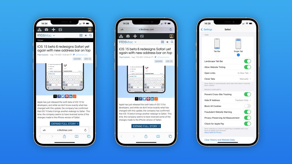
We are at least one month away from Apple releasing iOS 15 to the public. After a lot of controversies with Safari’s new look, the company has finally managed a way to please most of the beta users. How do you feel about Safari design in iOS 15 now?
Safari with iOS 15 started with a radical new design. One week after the announcement of this new look, we conduct a poll about how our readers felt about this big change. Surprisingly, 43% thought it was a good change, although they haven’t tried Safari’s design at that time.
Also, almost 20% of our readers who were already trying the new beta thought the revamped Safari was a great choice design-wise, although Twitter’s complaints were massive.
In beta 3, Apple made the first big change with Safari on macOS Monterey bringing Separated Tab Bars. Then with the upcoming betas, the company also brought it to iPadOS and with the latest iOS 15 beta, Apple not only revamped the “new design” as it brought back the old one.

With iOS 15 beta 6, we’re now closer to what the final version of the operating system and Safari will look like. While Safari will still be presented with a revamped experience, users will have the option to go back to the “Single Tab” rather than going all-in with the new “Tab Bar.”
The new Safari look has really grown on me since beta 1 and I really think this new design is great. I enjoy swiping between pages at the bottom and seeing the same color as the website on the tab bar. For macOS Monterey and iPadOS 15, I feel the same way.
With Apple now offering the “old design” and this new approach, do you think the company got Safari right now? Vote in the poll and share your thoughts in the comment section below.
FTC: We use income earning auto affiliate links. More.


Comments