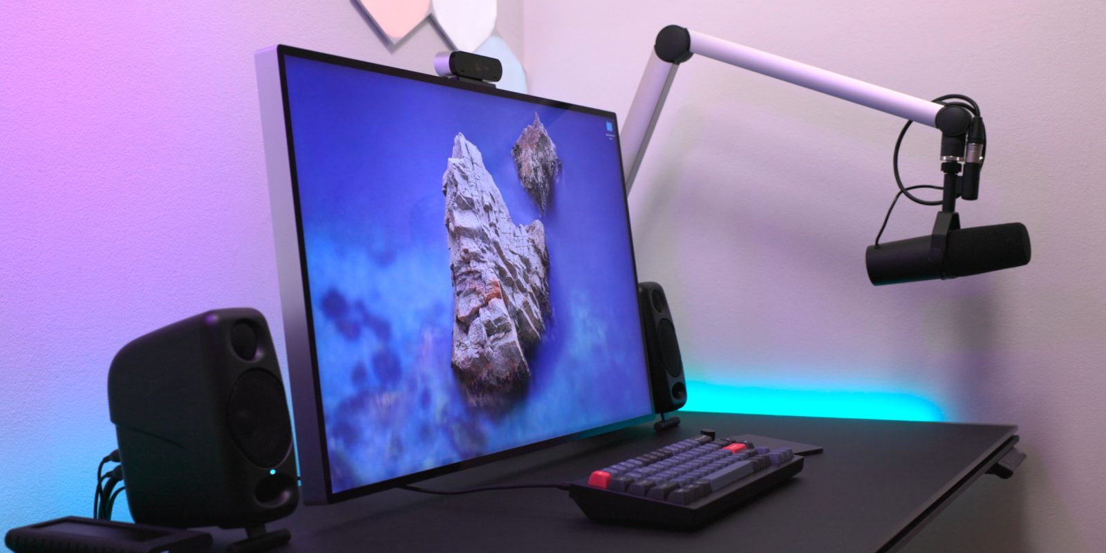
In this first episode of Back to the Mac for 2022, I explore my latest Mac desktop workspace setup. Although some things remain the same, I’ve made some significant changes to increase the versatility of my workspace.
Back when the pandemic started, I thought that it would be a good time to redo my desktop setup with the goal of using my small space more efficiently. Prior to the redesign, I had an oversized desk, oversized table for product shots, light stands littering the floor, and don’t even mention the horrific cable management.
With my workspace redesign, I addressed most of those issues to some degree, and it has resulted in an easier-to-navigate footprint that’s more flexible than before. In this particular episode of Back to the Mac, I’ll be primarily focusing on my desktop working area to showcase the tools that I use and add context to my gear and layout decisions.
Back to the Mac – My Mac desktop setup for 2022
Subscribe to 9to5mac on YouTube for more videos
BDI Stance desk
I’ve been a standing desk advocate for many years, so when I was looking to replace a desk that was too large for my workspace, my primary criteria was that it be motorized. BDI products have always been attractive to me design wise, so I narrowed it down to the BDI Centro and the BDI Stance. Ultimately I opted for the matte black Stance, a big departure from the all-white desk that it replaced.
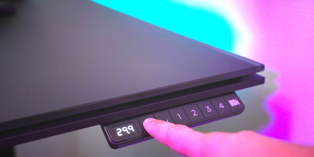
Like most standing desks, the Stance features a panel on the side to adjust its height. You can manually raise or lower the desk, or you can use the four available memory settings to move the desk to a preset height.
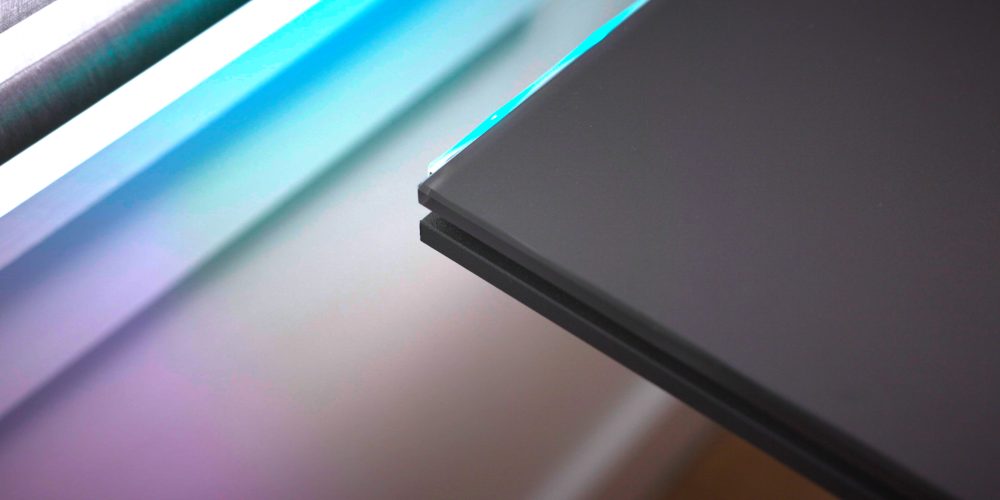
The desktop surface of the BDI Stance is made from satin-etched tempered glass, which lends it a frosted matte black look. The desktop surface feels soft and cool to the touch, but you’ll need to wipe it down daily to remove things like fingernail marks and smudges. The tempered glass is tough, but it can be scratched if you’re not careful — I have several nicks already to prove it. After this post went live, BDI shared with me an easy buffing treatment to remove scratches, and I plan on trying that soon. The remainder of the desk is comprised of powder-coated steel, which complements the desktop surface.
I opted for the BDI Stance 6651, which features a spacious, but not too large, 60 x 24 inch desktop. The desk comes with a cable management ledge, which I use to hide the power strip that powers my Mac mini, display, monitors, and other components.
Pro Display XDR
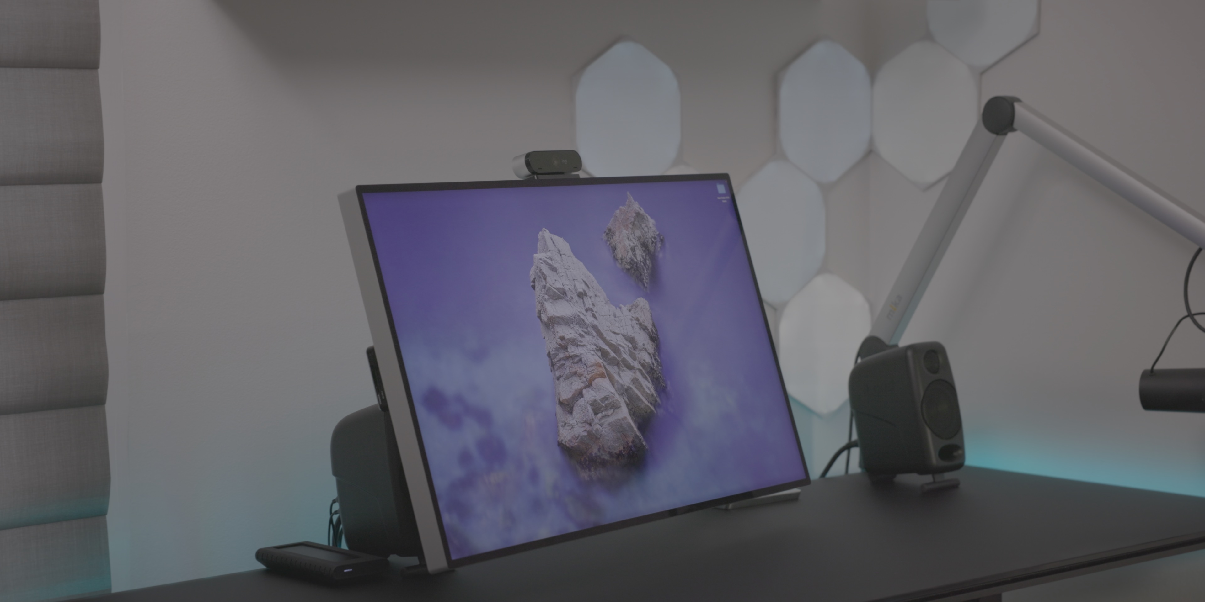
The Pro Display XDR is a good desktop monitor, but it’s ridiculously expensive, and I wouldn’t recommend it to anyone who isn’t involved in high-end production/design work with an immediate need. We know that Apple is working on new displays, and at least one of those displays will probably be a direct replacement for the Pro Display XDR.
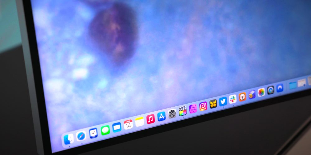
That being said, the 32-inch Pro Display XDR is a good monitor for video editing, and it provides plenty of screen real estate. Thanks to its 6016 x 3384 resolution, I can view 4K videos at full resolution in Final Cut Pro, and still have room left over for the timeline and browser.
The Pro Display XDR is also a boon for HDR video editing, thanks to its Extreme Dynamic Range (XDR) and color accuracy. The dynamic range is partly made possible by the local dimming with its 576 individual controlled LEDs. The LED backlighting system is a complex design featuring several layers to help shape light while maintaining clarity. I highly recommending reading Apple’s Pro Display XDR white paper to see how much has gone into the design.
Apple’s $5000 monitor features up to 1600 nits peak brightness, although that brightness capability comes with some constraints based on the type of content you’re viewing. I’ve found it to work well as I’ve dabbled in HDR workflows, but after the release of new MacBooks featuring mini LED technology and a variable refresh rate up to 120Hz, the Pro Display XDR is beginning to show its age.
As good as Apple’s stand is, a monitor arm is way more flexible than any stand and can easily be placed in pretty much any position you can imagine.
Skip the stand and get a monitor arm.
One of the biggest kerfuffles related to the launch of the Pro Display XDR was the fact that Apple charges an extra $1000 for the stand, which isn’t included with the $5000 Pro Display XDR. The stand, which is all aluminum, adjustable, and matches the aesthetic of the display housing, is extremely well designed, but the price is hard to get past.
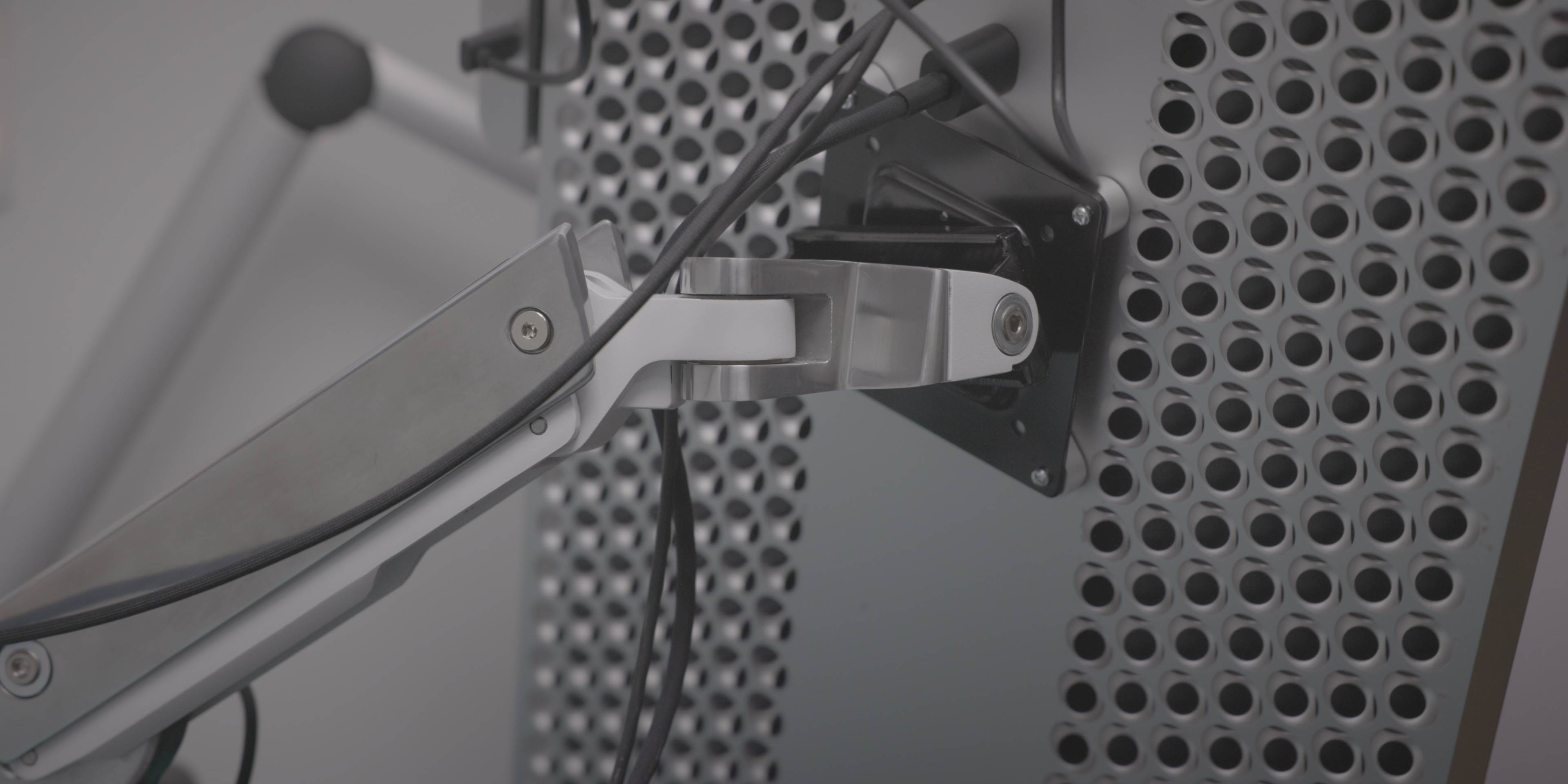
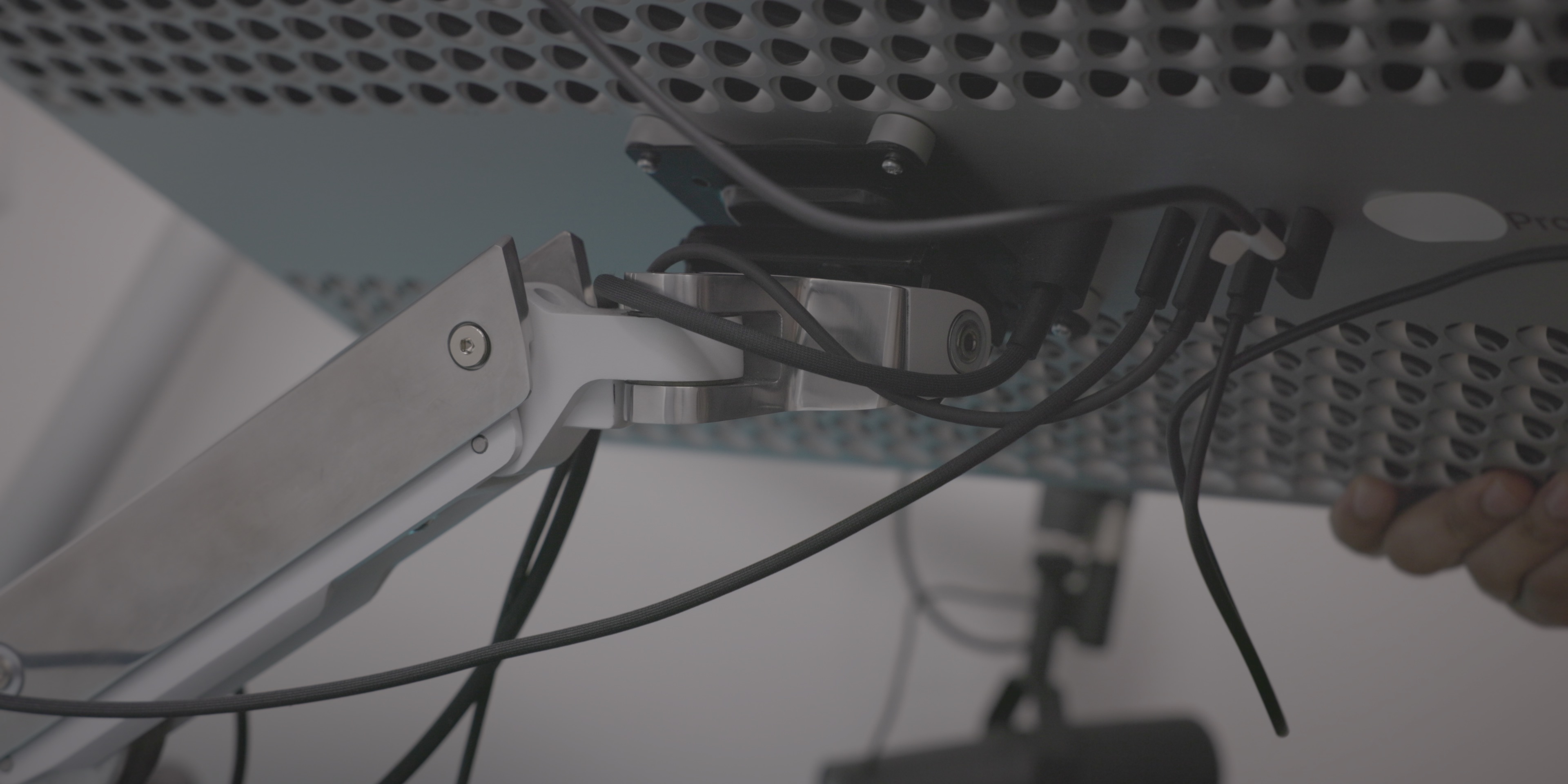
As an alternative, I highly recommend opting for a monitor arm instead. I purchased the Ergotron HX, and I’ve been very happy with it. The design of the Ergotron HX, which features a polished aluminum surface, doesn’t exactly match the look of the Pro Display XDR, but it doesn’t look bad. At $329, it’s also a lot cheaper than the official Pro Display XDR stand, although you will need an additional $200 to purchase Apple’s magnetic VESA mount adapter in order to attach the arm to the display. In the end, you’ll save close to $500 by opting to go with the monitor arm as opposed to the stand.
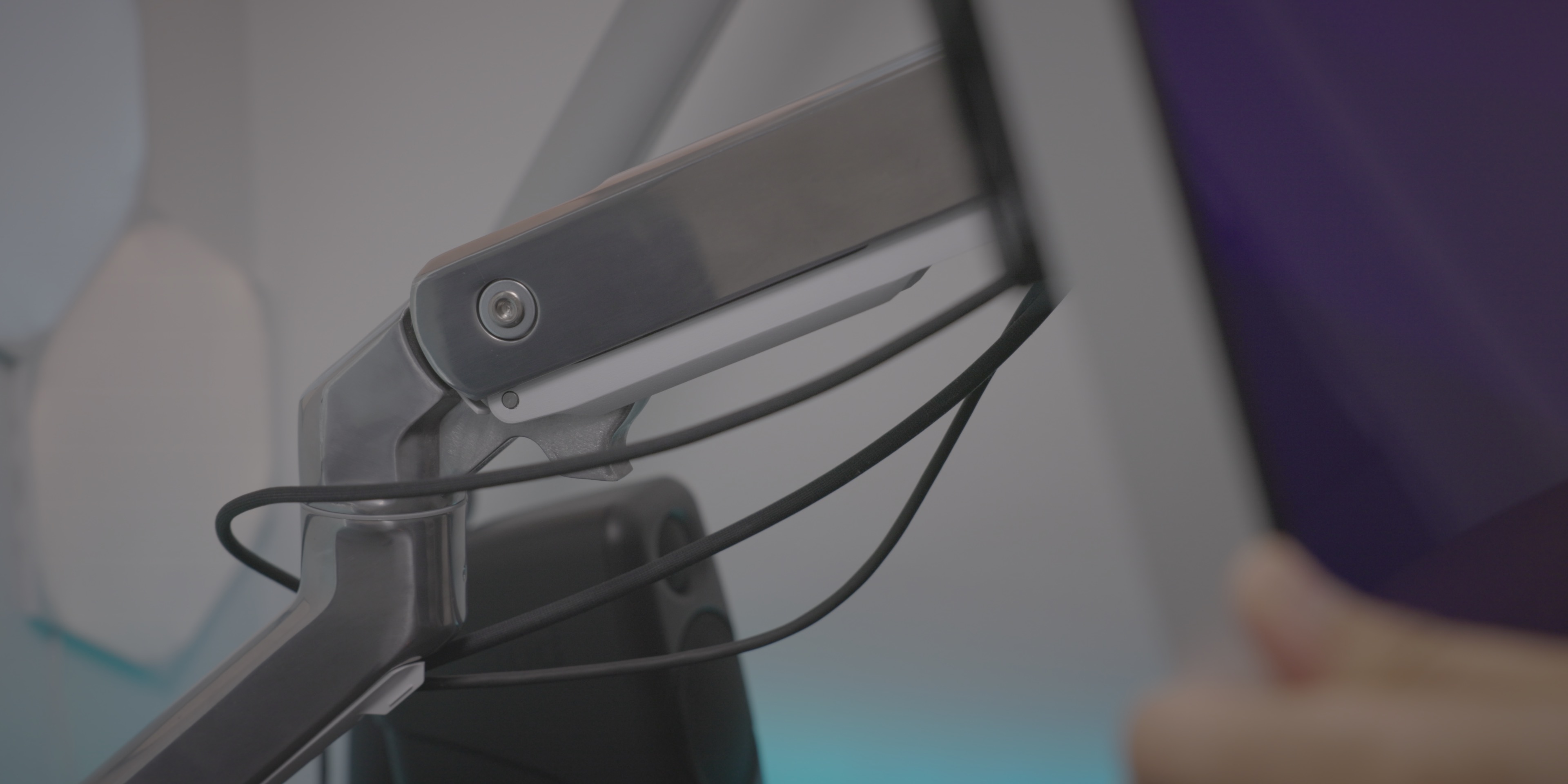
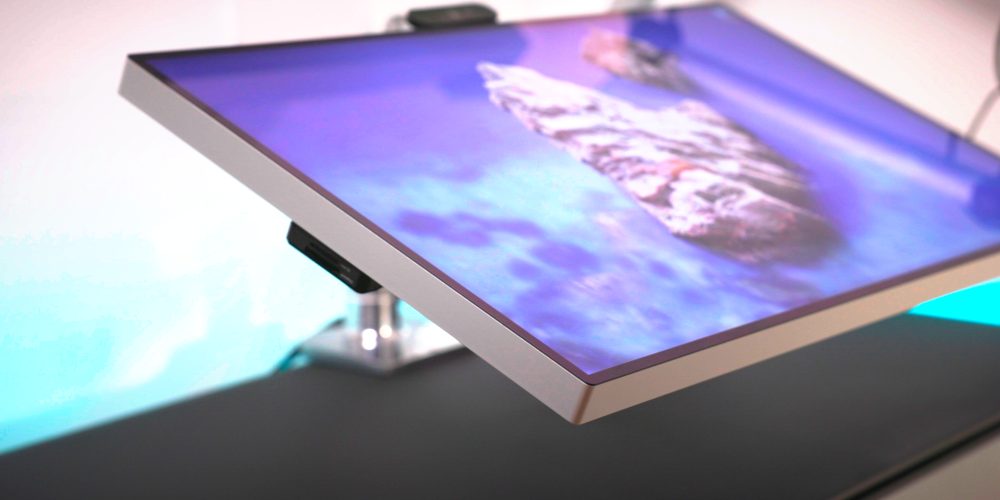
Pricing metrics aside, what I most appreciate about having a monitor arm is the vast amount of adjustability made possible. As good as Apple’s stand is, a monitor arm is way more flexible than any stand, and can easily be placed in pretty much any position you can imagine. Like Apple’s stand, the Ergotron HX also supports placing the monitor in vertical mode just by turning the display. As a bonus, the monitor arm, which attaches directly to my desk, occupies a smaller footprint than the stand, thus taking up less desktop real estate.
USB-C ports
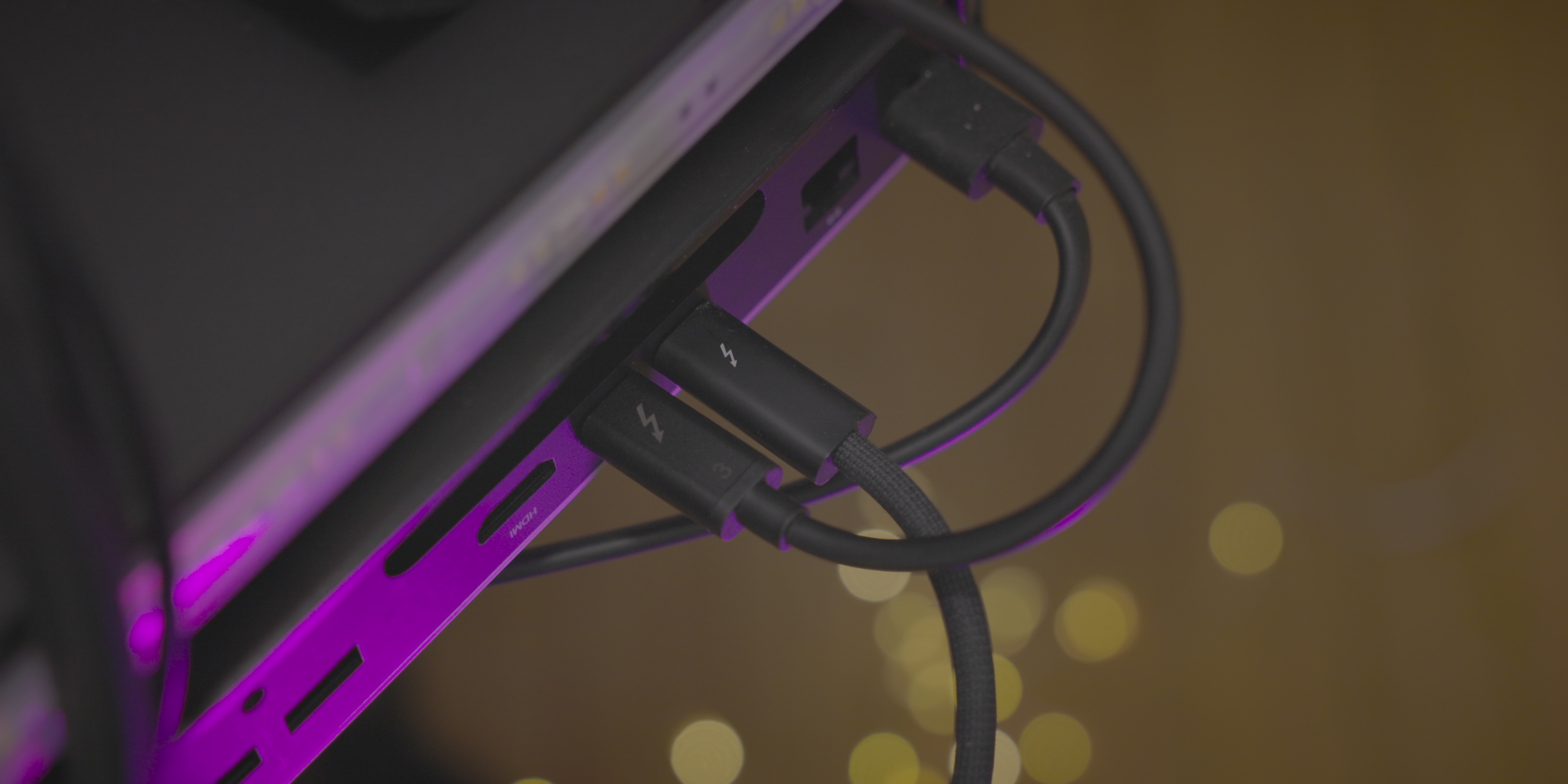
Although I wish the Pro Display XDR had Thunderbolt passthrough, I’ve grown to appreciate the three USB-C ports available on the rear of the display. I use these ports to connect two critical accessories: Logitech’s 4K Pro Magnetic Webcam and the ProGrade Digital CFexpress Reader. Both of these products attach magnetically to the Pro Display XDR, and both connect to the USB-C ports on the rear of the display.
The Logitech webcam isn’t anything to write home about from a image quality standpoint, but it’s the best option for the Pro Display XDR since it was designed with Apple’s display in mind. Its magnetic stand allows it to tilt and rotate with ease, and the aluminum housing matches the Apple aesthetic.
As a Canon R5 user, having quick access to the contents of my CFexpress cards is crucial, and the ProGrade reader performs well. I love being able to attach the reader to the side of the Pro Display XDR for quick and easy access.
Overall I’m happy with the Pro Display XDR, but it’s clear that there needs to be both a cheaper display option and an outright replacement with the latest and greatest technology found in Apple’s M1 Pro and M1 Max-powered MacBook Pro machines.
M1 Mac mini
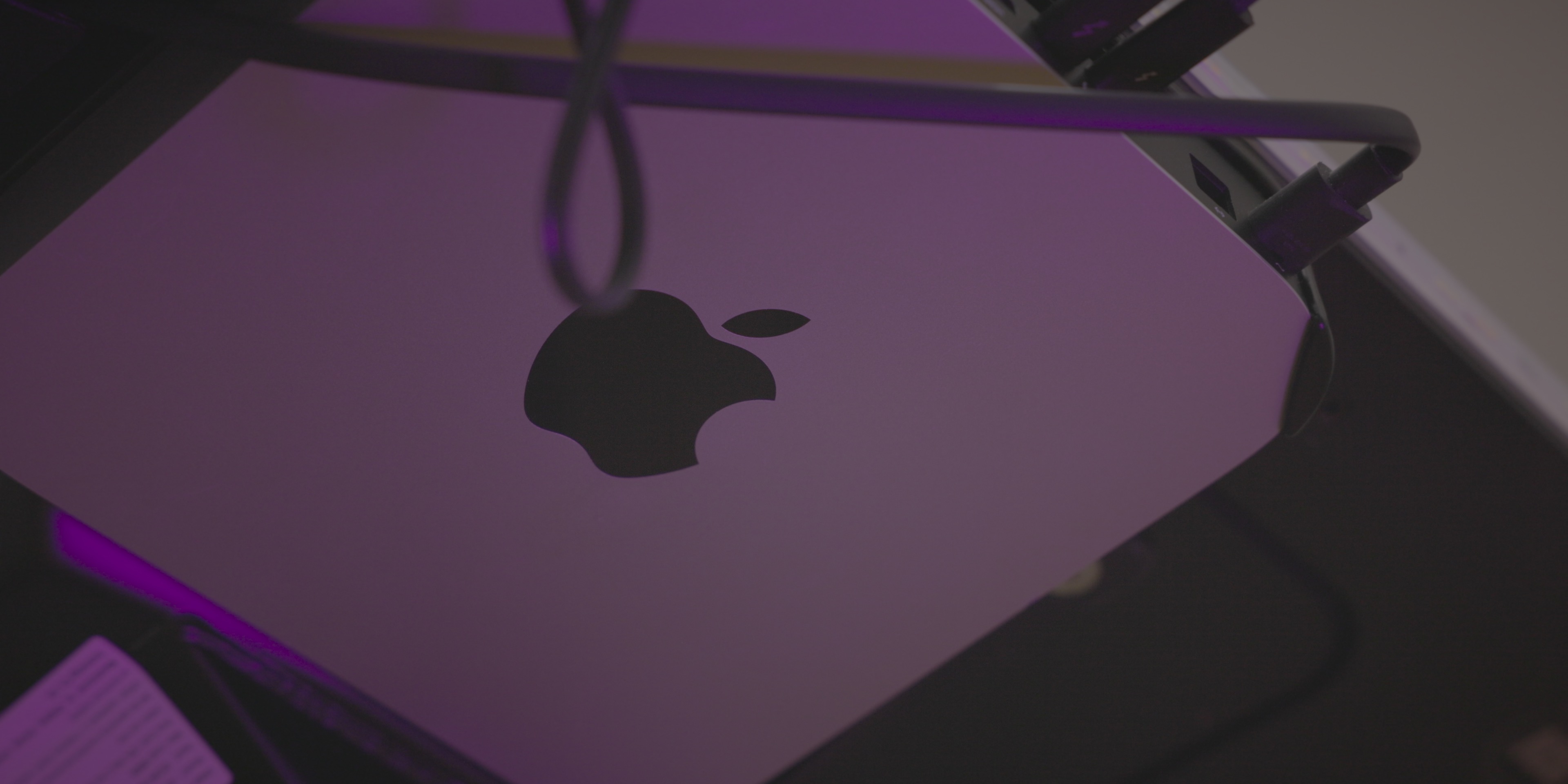
Performance aside, the biggest reason I still use the M1 Mac mini for my desktop setup is due to its form factor. The Mac mini’s small size and relatively light weight makes it easy to mount on the underside of my desk so that it’s completely hidden and out of the way.
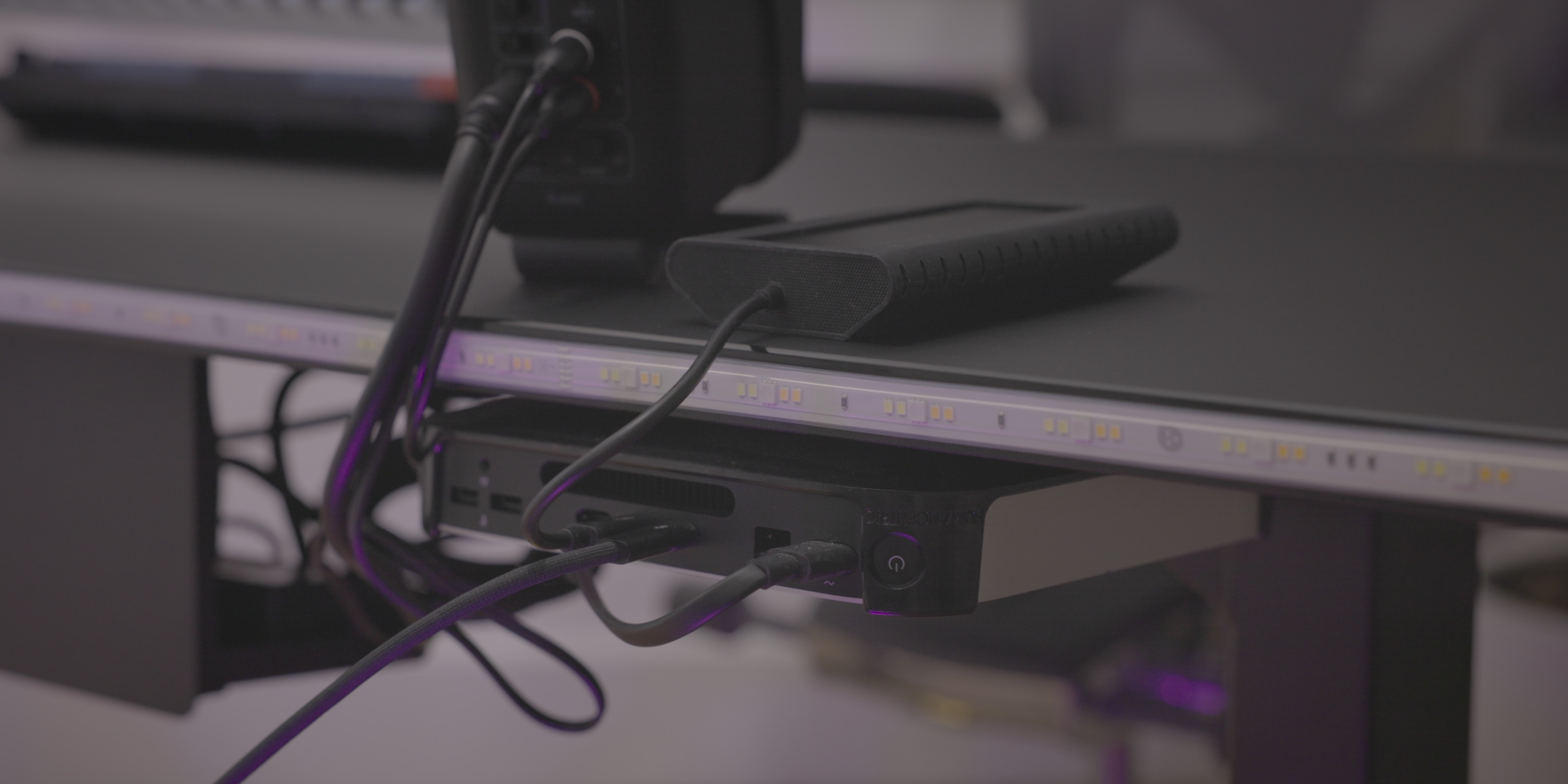
The HumanCentric Mac mini mount screws into the underside of my desk, and securely cradles the M1 Mac. Not only does this setup allow me to reclaim precious desktop real estate, but it also helps out with cable management, which is something I’ve always struggled with.
The M1 Mac mini is underpowered when compared to Apple’s newest MacBook Pro, but M1-powered Macs remain great options for general computing, and can handle 4K video editing. The biggest issue with the M1 Macs is the lack of storage space and the lack of I/O, something that Apple will hopefully address soon with a more powerful Mac mini. Be sure to watch my The Rewind episode featuring the M1 Mac mini, where I discuss its merits
Audio
My desktop audio setup consists of the following key items:
- iLoud Micro Monitors
- Sound Devices MixPre-3 II
- Shure SM7B mounted on a YellowTec M!ka microphone arm
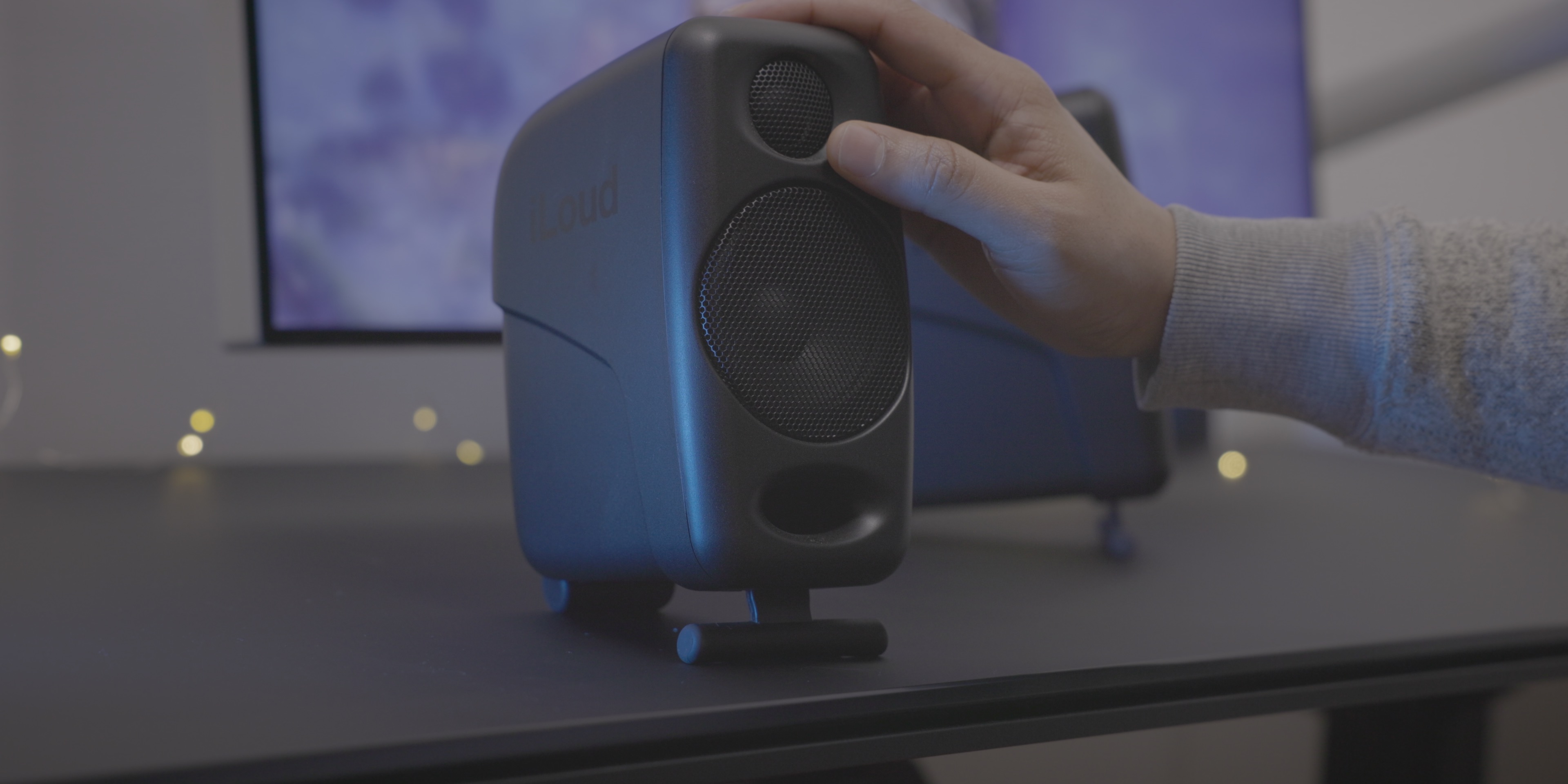
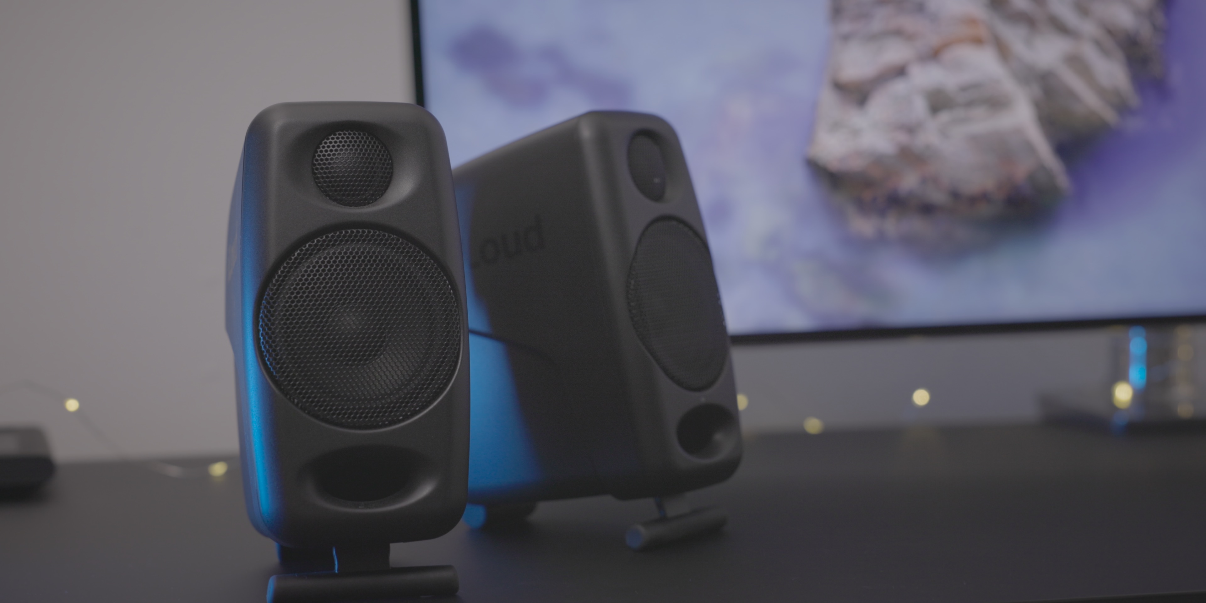
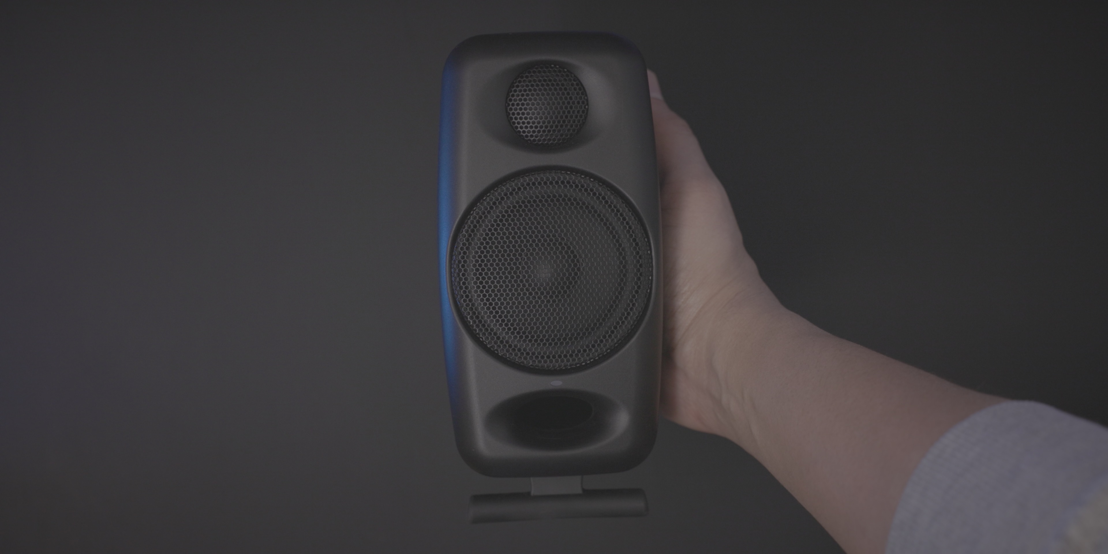
I’ve talked about the iLoud Micro Monitors in a previous episode of Back to the Mac, as they were recommended to me by Jonathan Morrison as a great budget pick. Not only do they sound good, but they also look good, especially in black (I owned a pair of white Micro Monitors when I had a white desk).
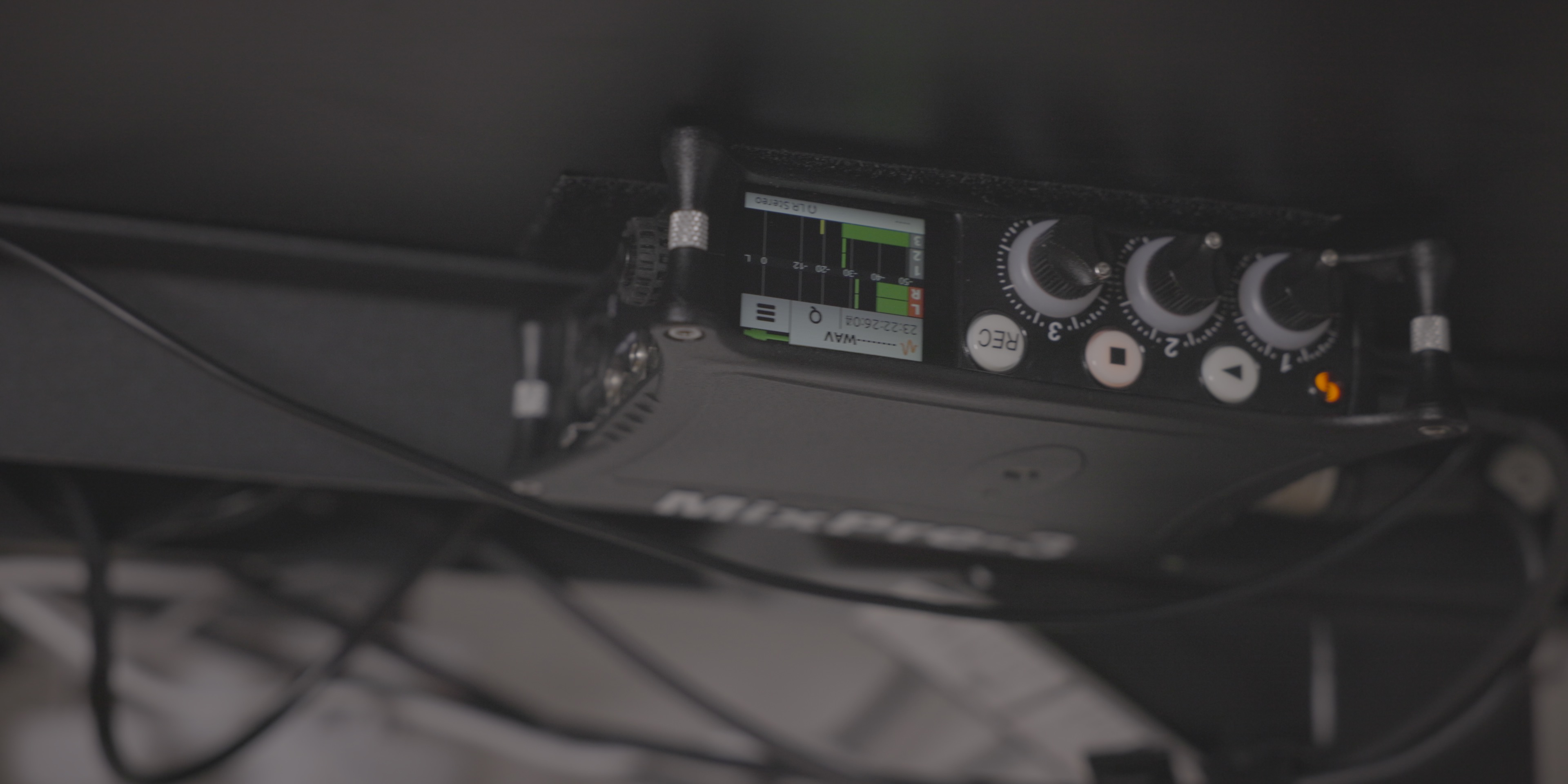
The iLoud Micro Monitors connect to the Sound Devices MixPre-3 II audio interface, which is mounted on the underside of my desk within arm’s reach. The venerable Shure SM7B, which is the microphone I use for voiceovers, podcast episodes, etc., is paired with the german-designed Yellotek M!ka, which has served me well for quite a few years.
Don’t forget the chair!
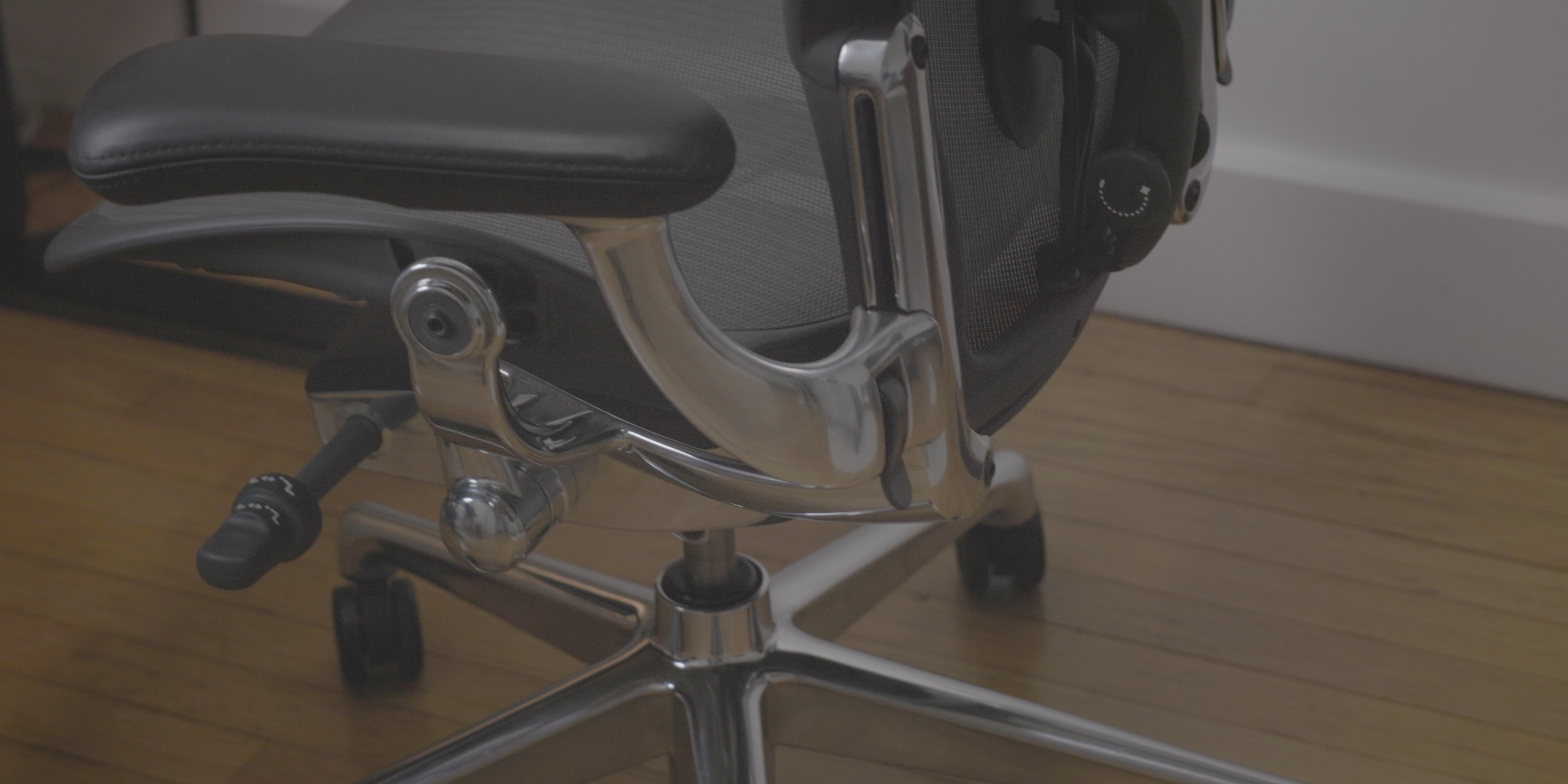
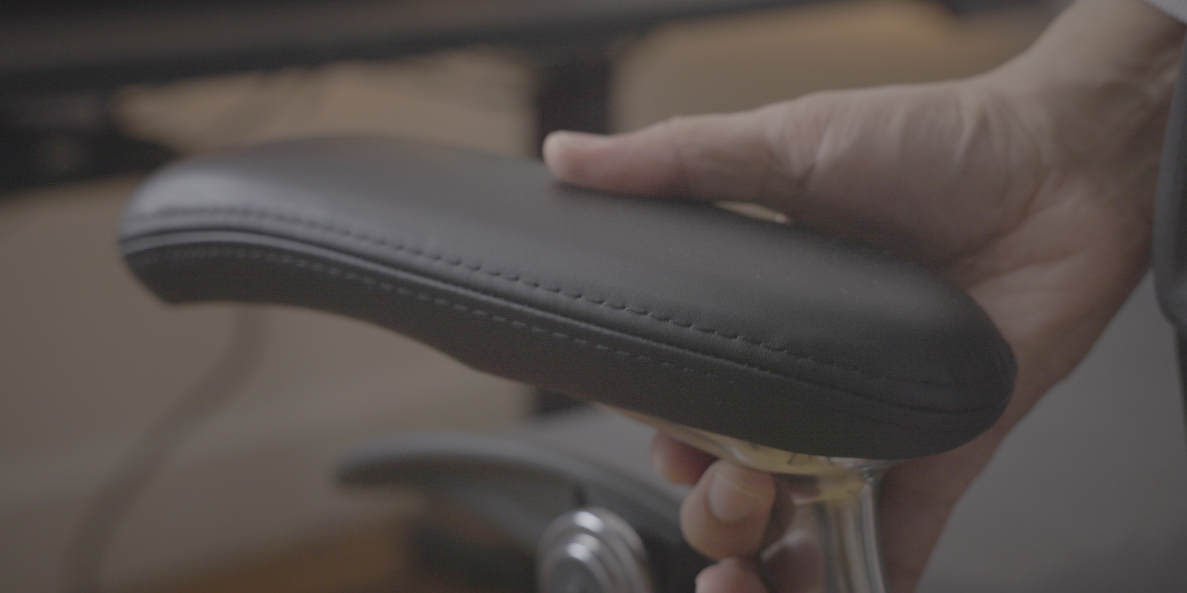
The biggest reason to own a higher-end chair is for the adjustability, and the Herman Miller Aeron is highly adjustable. Adjustability is important to ensure that your back and legs are properly supported, that you have the correct posture, and that the arm rests are at the correct level to promote a healthy typing position.
Aeron chairs are expensive new, but you can get them used for a reasonable price. If you sit for hours on end, having a good chair can be make a huge difference to your health. It’s greatly reduced back pain and wrist pain thanks to the better sitting position that it affords. Whether you buy new or used, this is going to be a better chair than pretty much anything you can buy from a place like Staples, and it’ll last longer as well.
Additional details
Input devices
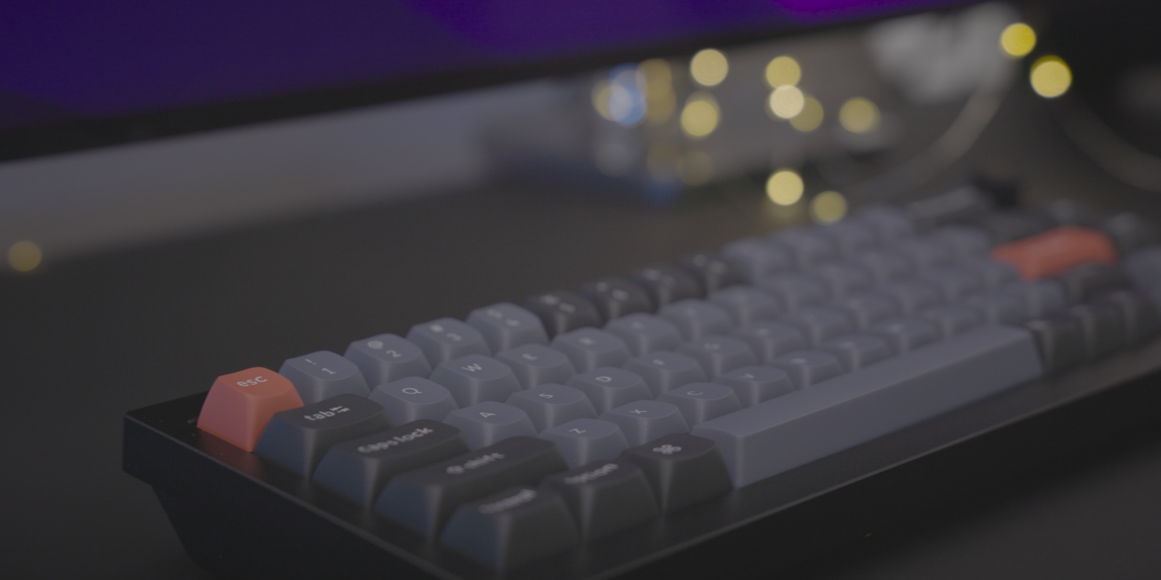
I recently switched from Apple’s Magic Keyboard to Keychron’s Q2 65% mechanical keyboard. Granted, you lose the convenience of Touch ID, but the typing experience, especially for long-form content, is so much more enjoyable with a mechanical keyboard.
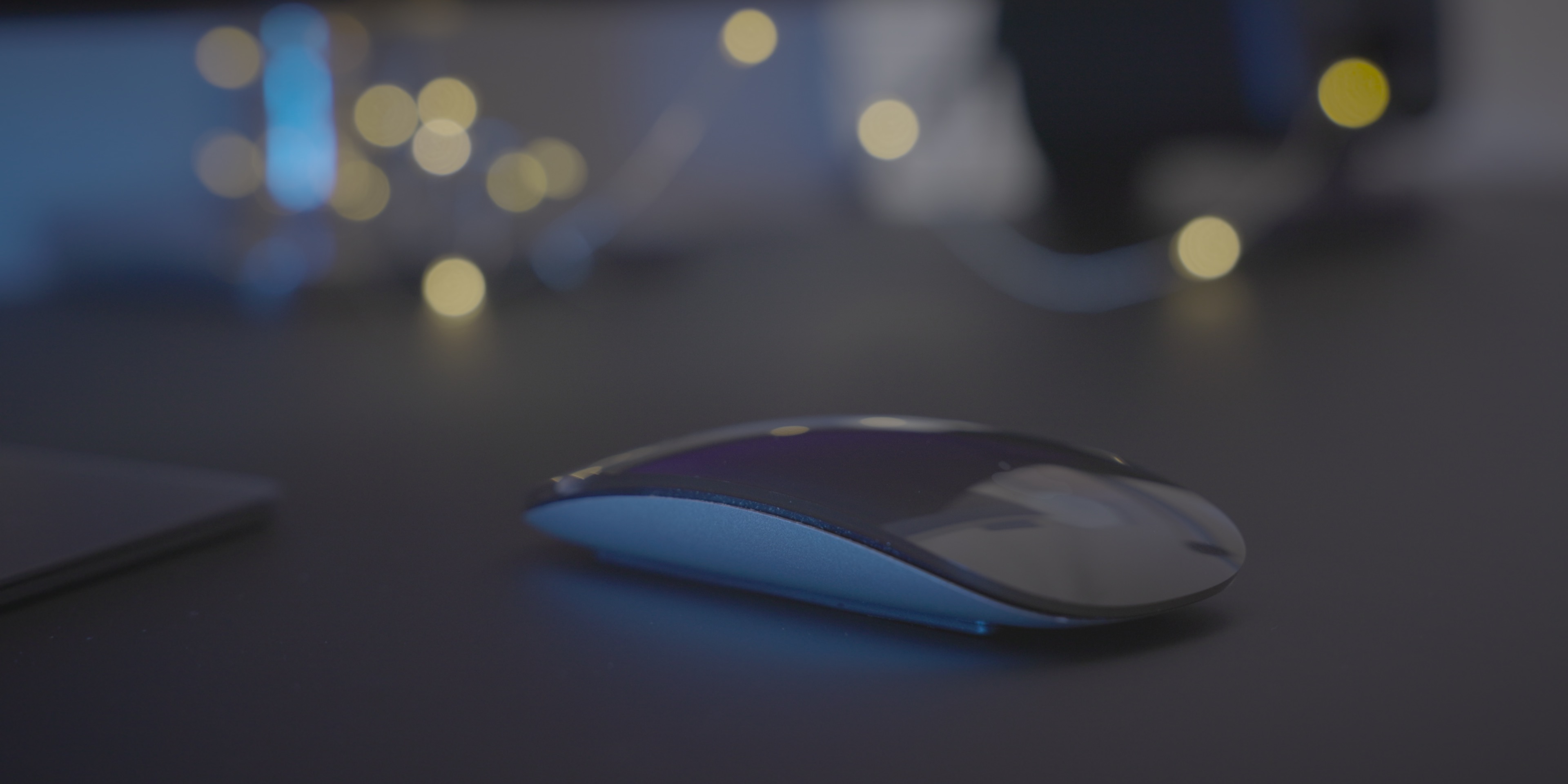
Apple’s Magic Mouse, which has been a desktop staple of mine since its release back in 2009, continues to be my main pointer input device, despite the fact that it’s an ergonomic nightmare. As I’ve stated before, the convenience of utilizing swipe gestures within macOS via the Magic Mouse is just too good to consider using anything else.
Nanoleaf Shapes and light strip
To add a splash of color to the background, I have a few Nanoleaf Shapes panels mounted to the wall behind my desktop setup. I also have a Nanoleaf LED light strip attached to the back of my desk for even more color when needed.
Wall-mounted boom arms
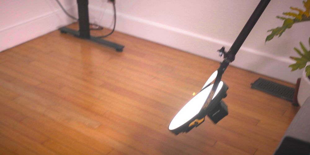
Although not specifically related to my desktop setup, one of the most fundamental changes that I made to my workspace was relocating light stands from the floor to the walls. Floor space is at a premium in my relatively tiny work area, so removing light stands from the floor has provided me with additional room to be creative.
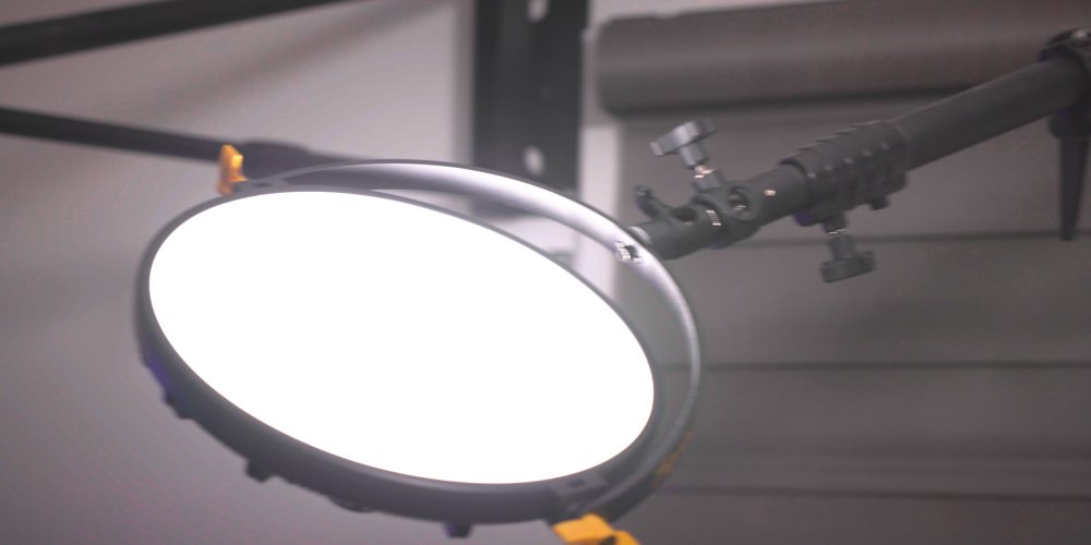
The Impact Wall-Mounted Boom Arms are highly adjustable, and allow me to position my lights to virtually any area within my workspace. If you’re in dire need floorspace, they can be a big help. I also used a wall-mounted boom to replace my cumbersome overhead shooting rig, and it’s so much better than the bulky setup that I used to use.
Conclusion
Although it’s not perfect, I’m happy with my desktop workspace for 2022. I’m confident that it will help me be more creative and more productive. Of course, there’s a lot more to my overall workspace than just my desktop setup. I’ll have more behind-the-scenes coverage later this year. In the meantime, please share your thoughts about my desktop setup below in the comments.
Back to the Mac is a topical Mac-centric series that explores the latest news affecting the Mac landscape and ecosystem. If you enjoyed this episode, consider subscribing to 9to5mac on YouTube and catch up with some of my previous episodes.
FTC: We use income earning auto affiliate links. More.









Comments