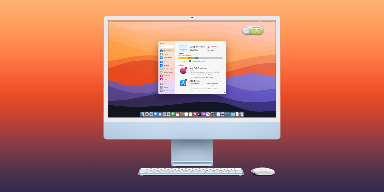
macOS has gone through a handful of visual changes over the last several years, but one thing that has stayed largely the same is System Preferences. A new concept imagines how Apple could revamp the System Preferences app design, with a focus on striking a balance between maintaining familiarity with the classic System Preferences design while also bringing it more in line with Settings on iOS and iPadOS.
Settings comes to the Mac
The concept comes from The Basic Apple Guy, who explains that even though there are clear differences between macOS and iOS, there is a common ground that can be achieved:
My other main gripe with System Preferences is how differently it operates and looks relative to iOS. Yes… yes… I know iOS and the Mac are different, but whereas many apps have tried to create coherence between platforms, System Preferences stubbornly resists. Not only is there a significant icon mismatch between the two platforms at a time where macOS is adopting the design language of iOS, but similarly named items contain radically different things. For example, General on macOS houses everything from accent colours, light/dark mode appearance, and setting a default browser; whereas General on iOS houses software updates, AirDrop controls, iPhone storage, Date & Time, and more.
As such, The Basic Apple Guy has taken a stab at a “better way” to manage settings and preferences in macOS, starting by renaming the app to “Settings” in line with iOS and iPadOS. The design imagined here features a sidebar-heavy interface rather than the current control panel-esque interface of the current System Preferences app.
The idea is that the sidebar gives quick access to different areas of the Settings app, with clearer names for each section and better organization. Some of the highlights here include:
The new Settings app arranges settings into more coherent categories. Inside Desktop Settings, all the features are laid out in a single scrollable window instead of buried behind multiple System Preferences icons.
All your software, AppleCare, storage, & subscription management can all now be done inside the ‘About This Mac’ tab inside redesigned Settings app.
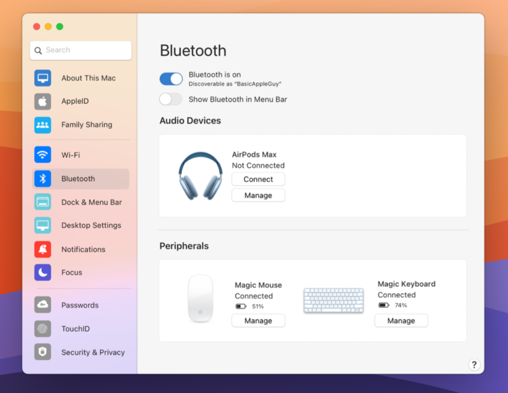
A modernized Bluetooth panel inside Settings adds more controls and a cleaner UI for displaying & managing Bluetooth devices.
One of my favorite changes here is that redesigned Bluetooth panel, which divides your accessories into different categories such as “Audio Devices” and “Peripherals.” This makes it easy to note which accessories are connected, the battery life of each accessory, and more.


9to5Mac’s Take
As The Basic Apple Guy notes, it’s an “ambitious” task to rebuild an app as critical as System Preferences on macOS. It seems that Apple’s solution to this issue over the years has simply been to stick with the status quo, even as the needs for System Preferences have expanded vastly.
This hands-off approach has led to a cluttered experience that can not only be overwhelming to new macOS users, but also confusing to long-time macOS users as Apple has added new options and features.
This concept is a great starting point for a redesigned Settings app in macOS. Apple is likely to announce the next version of macOS in just a few months at WWDC, but it remains to be seen whether a change as radical as this is in the cards for this year.
You can check out the full concept over on The Basic Apple Guy website.
FTC: We use income earning auto affiliate links. More.


Comments