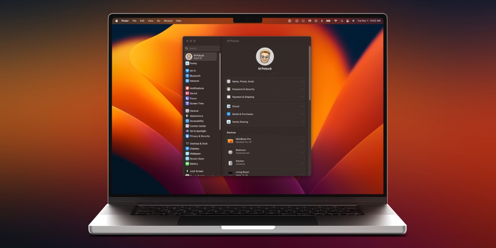
macOS Ventura has a variety of new features and changes and one that may be jarring is System Preferences morphing into System Settings. Follow along for a look at what’s changed, tips and tricks for using the new UI with Mac System Settings, feature requests, and more.
A big change in Ventura is the shift of System Preferences to System Settings. As the name alludes, this marks the transformation from the long-time tiled icon UI default to one more aligned with iOS.
Whether you’re frustrated by the new UI or like it, it can take a while to get used to the new Mac System Settings. I’ve been using it since June and it still takes me off guard every time I open it 😂.
Let’s dig into what’s new, tips on getting acclimated, feature requests, and more.
Mac System Settings: Tips and tricks for macOS Ventura
Table of contents
New design
System Settings in macOS Ventura brings a sidebar-focused design. While System Preferences on macOS Monterey and earlier offered the tiled icon view as the default, you could also customize it by removing items, changing the order, and switching to a list view.
With System Settings, you’re stuck with what you see. The list of settings on the left is roughly ordered in the same way as iOS with Apple ID and Family followed by Wi-Fi, Bluetooth, and Network. But the organization of items isn’t obvious or intuitive outside of it being like iOS.
Top comment by Anthony
Easily the worst thing to be introduced to MacOS for as long as I can remember. System Preferences certainly wasn't perfect but, even with your attempt to help, System Settings is objectively inferior. Whoever thought that a tiny vertical scrolling list with hidden features was a good idea for a widescreen 5K display should be removed from UX responsibilities.
And unfortunately, for now, you can’t reorder settings, change the main window to show alphabetically (there is a workaround for this below), or remove/sort them by recently used or favorites.
System Settings tips and tricks
- Think/visualize iPhone/iPad settings before you open System Settings on Mac to help train your brain for what to expect when you open it 😅
- Using search in System Settings (top left) works well overall, so take advantage of it
- This is particularly handy as some settings have been removed in the shift from System Preferences’ tiled UI to the new list UI
- Use Siri on Mac or Spotlight search to pull up specific settings you’re looking for quickly
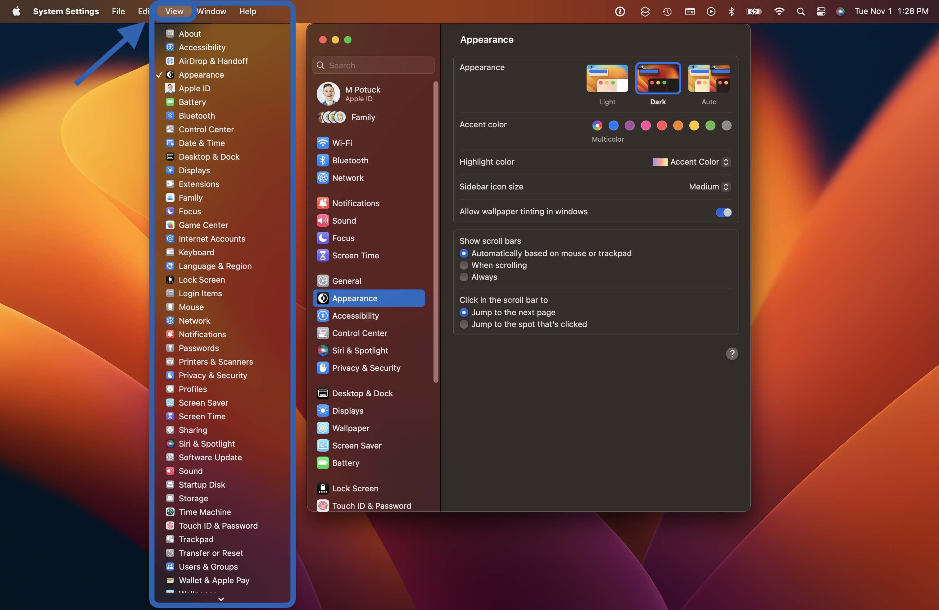
- To see all of your settings alphabetically, open System Settings > click View in the menu bar
- You can’t resize the width of System Settings, but you can increase the height of the window by dragging the top or bottom (or clicking the green + circled zoom button)

Room for improvement
Here are some tweaks I’d love to see for System Settings:
- Customization
- Either with the option of reordering, using recents/favorites, or hiding items (the latter was available for many years in macOS until Ventura)
- UI choice
- A simple option to select an icon/tile view – and Apple could still keep the iOS-inspired design
- Multi-level view
- An easy way to improve the current sidebar list view would be to take advantage of Mac’s display width with a multi-level view
- Jason Snell created a great mockup of what that could look like
For more really thoughtful ideas on overhauling System Settings, check out Jason’s full post.
Want to see changes too? You can let Apple know what you think on its Product Feedback page. And I’d love to hear your thoughts in the comments!
Read more 9to5Mac tutorials:
- Here’s where your Mac’s System Report lives in macOS Ventura
- iCloud Shared Photo Library: Here’s how it works in iOS 16
- Stage Manager on iPad: How to use the polarizing new feature in iPadOS 16 [Video]
- M2 iPad Pro vs iPad Air: What do you gain or give up?
FTC: We use income earning auto affiliate links. More.


Comments