Rob Janoff

See All Stories

Interview: Apple logo creator Rob Janoff on making timeless work, fielding criticism, and what makes a good designer
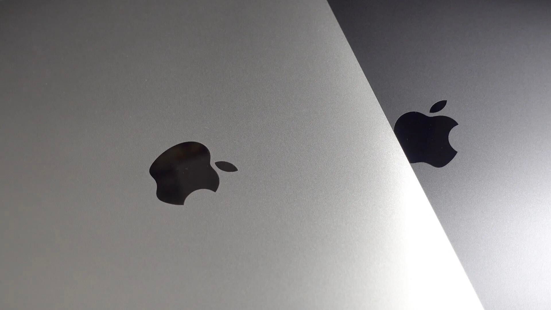
At a time when design trends and tastes seem to fluctuate with increasing speed, one image has remained remarkably persistent: the Apple logo. Often remixed but never replaced, the symbol has been continuously in use in one form or another since graphic designer Rob Janoff first sketched it in 1977. 9to5Mac talked with Janoff about his time working with Steve Jobs, the perspective gained from working over 40 years in the design industry, and an upcoming creative collaboration.

Expand
Expanding
Close

Site default logo image

Fancy a piece of Apple history? Apple’s original rainbow logo signs being auctioned

1

Apple’s rainbow logo was the symbol of the company from 1977 to 1998, and two of the signs that originally adorned the company’s Cupertino HQ are now being auctioned by Bonhams. They were given to an unnamed “longstanding Apple employee” when they were removed from the building.

The larger of the two signs measures 49×46 inches and is made from 1.5-inch thick foam with vinyl stripes. The smaller version is 36x33x6 inches, made from metal-backed fiberglass, again with vinyl colors.

Although generally thought of as the original Apple logo, the very first version was in fact an intricate drawing of Isaac Newton sitting under a tree with an Apple above his head.

apple-first-logo

The famous rainbow design was created a year later by Rob Janoff, who says on his website that it was the only logo concept shown to Steve Jobs, and was created in two weeks. The colors were designed to make Apple products look user-friendly, to make them attractive to school-children and to emphasize the Apple II’s unique color display.

Apple briefly switched to a translucent blue logo in 1998 before adopting a monochrome one later the same year, a white aqua version in 2001 and a Chrome variant in 2007.

logos

Apple could brand own Facebook-killer with fruity logos used by the Beatles

Site default logo image


In a strange turn of fate, California-based Apple is moving to trademark the famed fruity logos once used by the Beatles, following a 23-year legal dispute between the two companies. Furthermore, Apple makes specific mention of a social network in the fourteen international classifications that cover possible uses for the two logos. How can Apple, Inc. claim ownership of the Beatles’ logos in the first place, you ask.


Expand
Expanding
Close

Manage push notifications

notification icon
We would like to show you notifications for the latest news and updates.
notification icon
Please wait...processing
notification icon
We would like to show you notifications for the latest news and updates.
notification icon
Please wait...processing