At a time when design trends and tastes seem to fluctuate with increasing speed, one image has remained remarkably persistent: the Apple logo. Often remixed but never replaced, the symbol has been continuously in use in one form or another since graphic designer Rob Janoff first sketched it in 1977. 9to5Mac talked with Janoff about his time working with Steve Jobs, the perspective gained from working over 40 years in the design industry, and an upcoming creative collaboration.
Growing up and attending school in San Jose, Rob Janoff experienced Silicon Valley as it was in the midst of radical change. Plum orchards were being replaced with microprocessor factories. After pursuing graphic design, Janoff eventually landed a job with marketing firm Regis McKenna in Palo Alto.
“These two Steves came up,” Janoff recalls. “They had this home computer that was a big new deal. I got that assignment.” Despite having started his job only a few months prior, Janoff was assigned to work with Apple for one particular reason. “Later, I found out from the creative director that I got the assignment because out of the art directors, I seemed to be the most conceptual.”
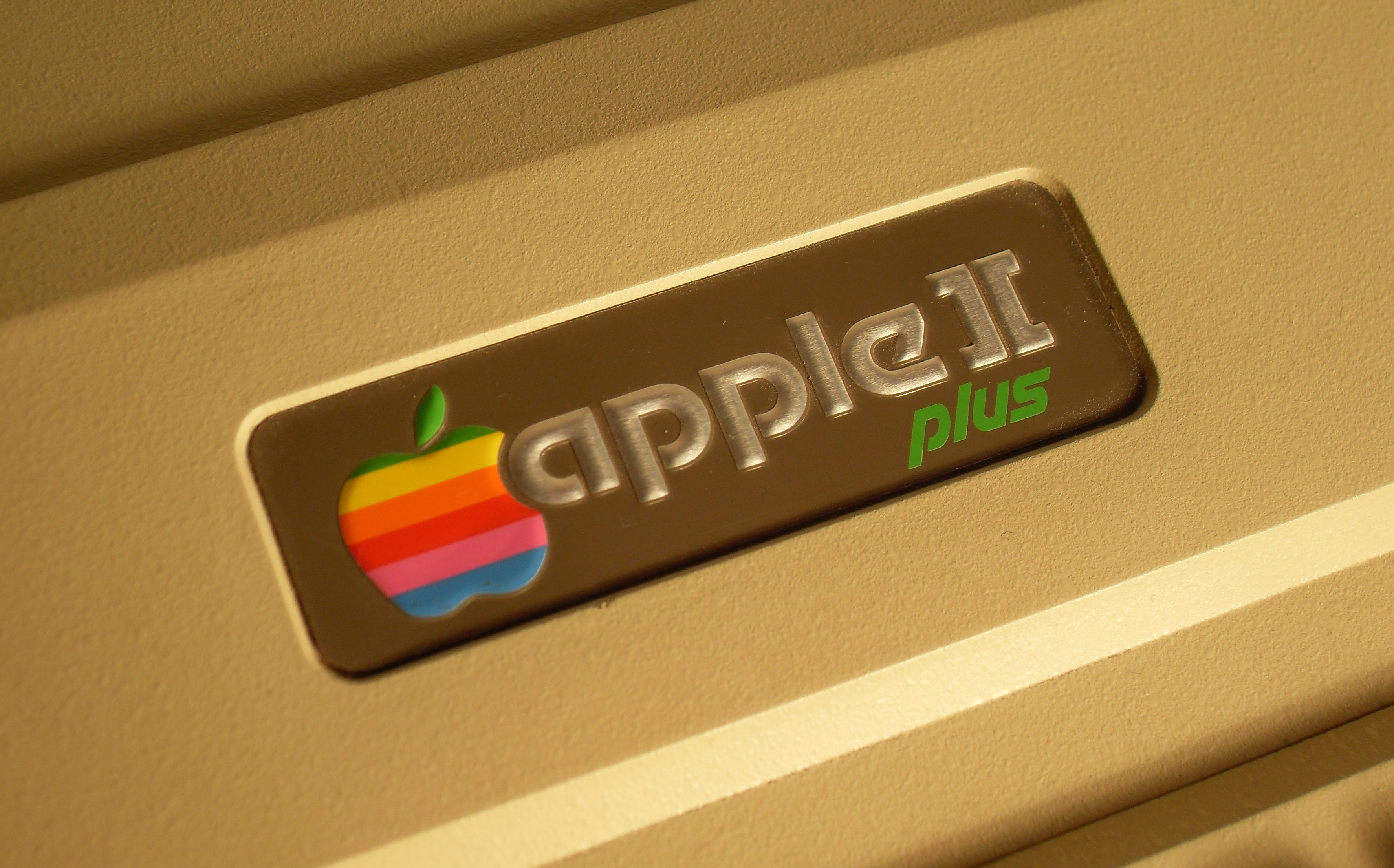
Branding a technology startup in the 1970s required an imaginative mind. Many companies looking to make their mark advertised in electronic trade publications, which were notoriously dry. Apple would need to stand out to rise above the noise. “My creative director explained the complicated things that this new product would do – the microprocessor – and I would try to put it into terms that I could understand, visual terms, metaphors,” Janoff describes. Prior to seeking the services of Regis McKenna, Apple’s logo was a heavily embellished pen and ink illustration of Sir Isaac Newton sitting under an apple tree, drawn by co-founder Ronald Wayne.
[getty src=”80823058″ width=”594″ height=”386″]
Steve Jobs at the 1977 West Coast Computer Faire
“The first thing I started on with Steve was designing the logo. And then I was asked to design the little label for what the software was on, which were audio cassettes at the time.” Janoff also worked on Apple’s transformative look for the 1977 West Coast Computer Faire, where the Apple II was introduced. A full color logo and professional branding attracted the attention of fair-goers and brought crowds to Apple’s bright and lively booth.
Janoff recalls that even though he was tasked with designing the identity of Apple’s upcoming computer, he wasn’t able to try one out himself. When Steve Jobs first presented the badge-less Apple II to Janoff, it was simply a prototype of the computer’s case. Made of fiberglass and sculpted with soft, curved edges, the off-white shell had the appearance of an appliance. “Steve wanted to do the first mass-produced computer. He would go to Macy’s in Palo Alto and go to their kitchen electrics and look at all those white plastic things for countertops. I think that inspired how he shaped the Apple II.”
More than 40 years later, Janoff is still working in graphic design, now with an agency of his own. Watching the changing landscape of the design community over the past four decades has revealed to him some insights about the industry. “It’s amazing to me how many people think that designers design stuff into their logos to have meaning and be profound. It’s enough of a job to get something to look halfway decent,” says Janoff. He points to Apple’s logo as an example.
“I worked with drawings of a bunch of apples for a couple of weeks, getting an easily recognizable silhouette. From there the bite came out of it, so that it would look like a piece of fruit and not a tomato or cherry. When I was that far with it, my creative director, who knew computer terms, said ‘You know, this bite you have, there’s a computer word b-y-t-e.’ So that was just a happy accident.”
Since early in his career, Janoff has been inspired by design legends like Saul Bass and Paul Rand. “Their kind of symbolic simplicity and how much they could say with such simple images I thought was great, really cool. I think that pushed me into getting into graphics.”
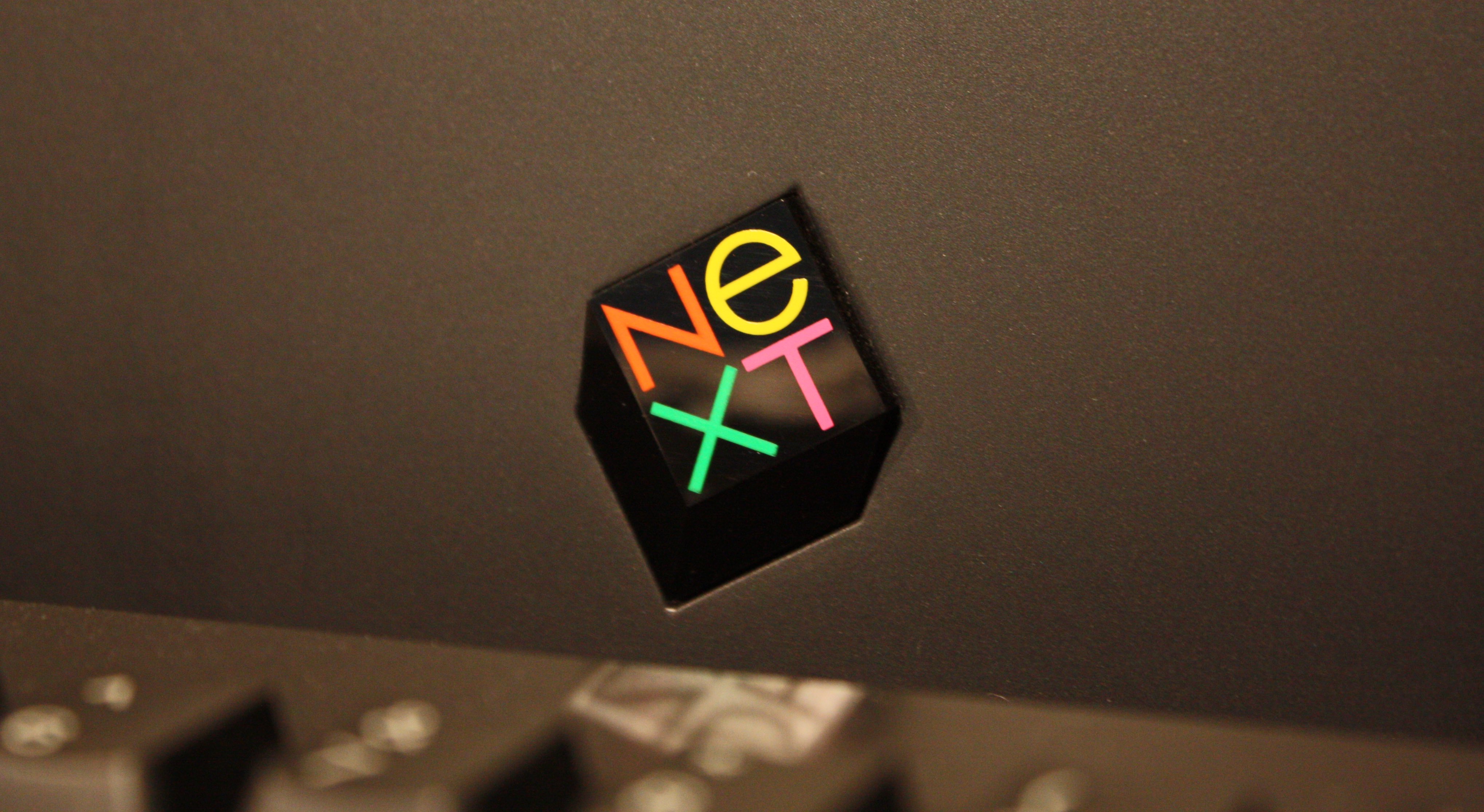
The Paul Rand-designed NeXT Computer logo. (Photo: Flickr)
Bass is perhaps known best for his pioneering work in animated title sequences for films like Alfred Hitchcock’s Psycho and North By Northwest. Rand designed corporate identities for companies like UPS, Westinghouse, and IBM. Notably, he would later work on the logo for NeXT, the computer company Steve Jobs founded in 1985 after his removal from Apple.
“I like having a sense of humor, I like being able to have provocative headlines, provocative imagery that makes people think in a different way. It’s a real powerful thing, and it becomes more powerful when you can be good enough to have people buy your work and publish it and it’s out there,” Janoff adds.
Apple’s logo has certainly fulfilled these criteria. The company has topped a list compiled by Interbrand of the most valuable brands in the world for the past five years. Speaking with the New Yorker in 2015, Apple’s Chief Design Officer Jony Ive reflected on the jarring nature of the creative process. “You go from something that you feel very protective of, and you feel great ownership of, and suddenly it’s not yours anymore, and it’s everybody else’s.”

The Apple logo interpreted in neon on the streets of Tokyo. (Photo: Storeteller)
When asked about his own creative relationship to the Apple logo – now a cultural icon – Janoff’s sentiment differed. “I am so happy and so proud whenever I see [the logo] anywhere. In real life, you see it a lot. When I walk through an airport, everybody’s got their laptops up, and half of them have little white shiny Apples all over them. It makes me feel very much at home. Something I thought of in English and in my world, somebody is relating to their language and their world, and what they think about. That’s awesome. Not a lot of designers get a chance to have that.”
Janoff now enjoys teaching other creative professionals when time allows, so that more designers might have the opportunity to produce truly significant work. On March 28th, Janoff will host a masterclass in New York City in collaboration with Fiverr, an online marketplace for creative services. He’ll also be offering his own services on Fiverr Pro, where he will design logos for five businesses that pitch him using the platform.
Janoff offers some insight into how he chooses which projects to give his attention to. “I look for something I want to work on that we don’t already have a lot of. Plus, I just want to have fun, I want it to be fun to work on. You can tell something about the company and the person who’s behind it [based on] how they present themselves and their product.”
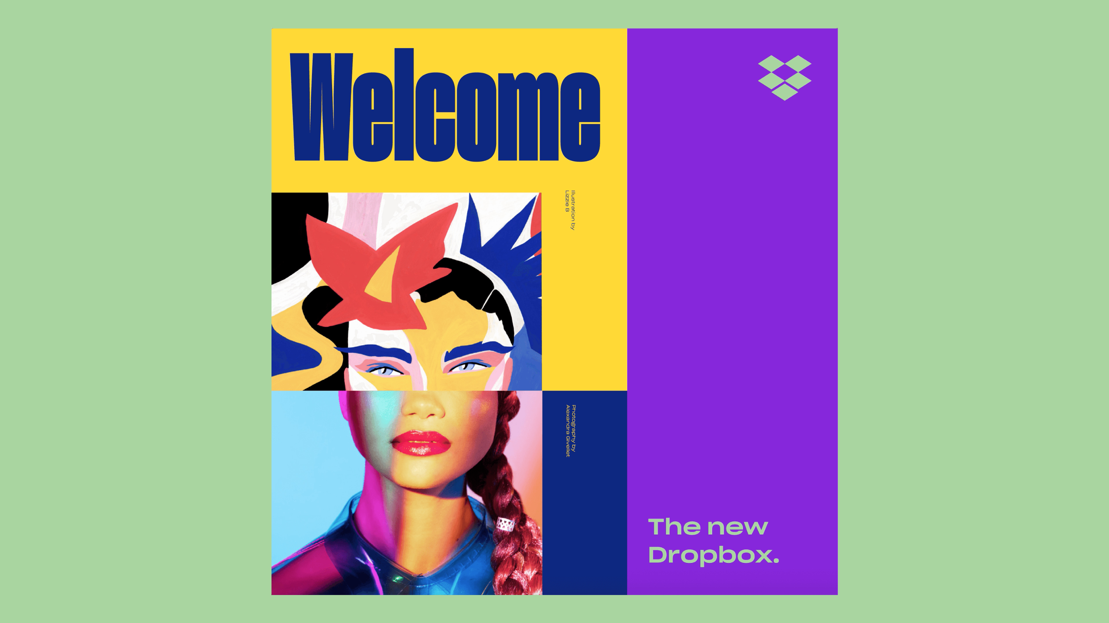
A component of Dropbox’s polarizing new design system.
Presenting the right image is more important than ever before. Both designers and clients alike are held accountable for even the smallest stylistic decisions. New logos and typefaces are scrutinized under the public microscope of social media platforms like Twitter.
Dropbox’s rebranding in 2017 sparked lengthy arguments among designers and casual observers alike, as did Instagram’s new logo revealed in 2016. In 2010, Gap decided to withdraw a new mark altogether after receiving negative public feedback. Janoff discussed the realities of working in an environment of polarizing opinions which pervade modern design discourse. “The internet is a great thing, sharing everything is a great thing. However, everyone has an opinion, and this stuff is subjective. Being creative, coming up with creative products is not going to please everybody. There’s a whole lot of people who don’t have an audience, they don’t have anybody to talk to, they don’t have any public voice.”
Filtering legitimate critiques from baseless criticism can be an exhausting task for even the most seasoned professionals. Janoff attempts to dispel misconceptions that drive away aspiring designers. “Most people, especially young people, put a lot of care and a lot of love into whatever they create, and when they get criticism it’s a crusher. I spend so much time talking about how this criticism is not about you. ‘I like you, but this piece you did has these things I don’t like, and here’s why.’ Somebody on the internet isn’t going to say that, or think that, or care really, because they don’t care what people think. I care a lot about designers and what designers think, especially from teaching them.”

An equally divisive topic persisting within the design community is whether designers need to master multiple disciplines to remain relevant today. Some companies favor hiring talent with a background in not only visual design, but writing code as well. Janoff takes issue with the practice. “I don’t think it makes a better designer, I think it gives you the possibility of getting more jobs. It’s a whole different world in that way.”
While both skillsets have unique merit, he believes that the technical implementation of a solution can get in the way of the creative process if left unchecked. “Whenever I’m talking to kids, there is such a tendency to go straight to the computer. But almost always, it’s devoid of idea. I think a lot of times tech can be an idea killer, because you’re spending all that time on making that corner good, or connecting some other thing, and you’re forgetting what the bigger picture is, what the bigger idea is. I think that only comes when you’re free and you’re just drawing and pouring stuff out of your brain.”
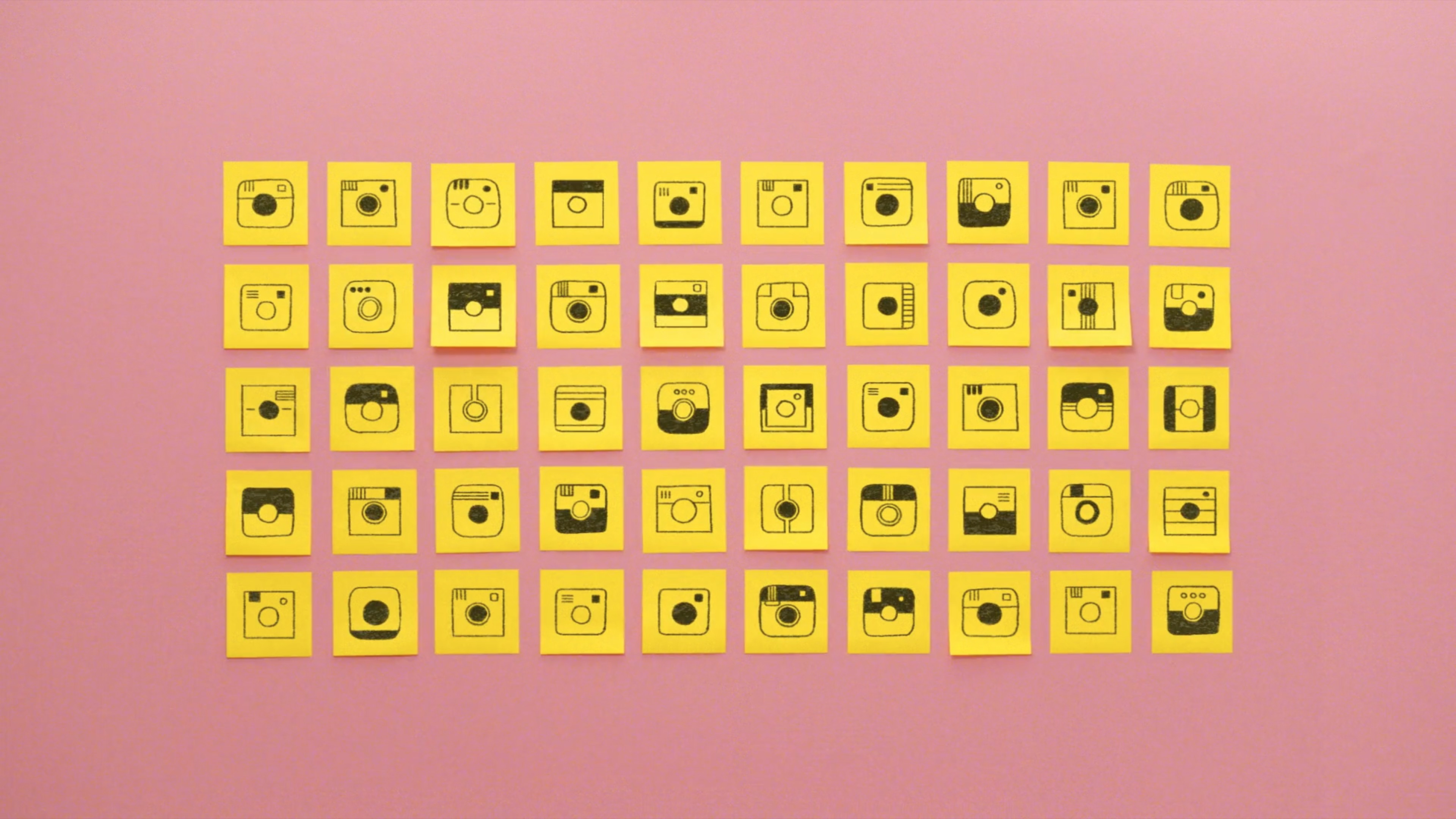
Unused Instagram logo concepts.
Thanks in part to websites like Dribbble which encourage designers to share their work in progress, and accessible publishing platforms like Medium, the artful presentation of the creative process has itself become a sub-genre of design. What was once a private and often solitary part of problem solving, “pouring stuff out of your brain” is now proof that you’ve done your homework. Clients are routinely presented with a buffet of options when narrowing down a final logo or layout. In contrast, Steve Jobs was only offered one design for Apple’s logo – which he accepted. Janoff says he hasn’t repeated that practice since.
“I think a lot of it was the naivety and inexperience of both Steve and I at the time. I always have more than one design now. I typically will do tens of logos and narrow it down. I always show all of the logos [to the client] so they think the money they’re spending was well spent.” But, he warns, it’s important not to overwhelm the client with options. Problem solving is the designer’s job. “To give a client a million options is way too hard for them to pick anything. We have to use our skills and feel what is the best way of doing this, narrow it down, and see what they say.”
Finally, Janoff offered advice for designers striving to create their own work that will stand the test of time. He advises against adopting design trends that distract from the core message. “Typography is like fashion, it changes. So I try to stay away from anything that might date itself or will be so flashy or interesting that it’s going to take away from any of the other imagery. When I look back to the very first thing that I did with Apple, it was trendy and the font evoked a certain kind of futuristic thing, which I wouldn’t do now. I think typography is best when you feel it but it doesn’t get in the way.”
Beyond fonts, shapes, software, and trends, to Janoff, the most rewarding part of being a designer remains arriving at a solution. “I love being able to have the position of using my tools to communicate on a fun level. The thing I do the best and that I like the most is all the thought processing, the problem solving, and listening to a client, trying to figure out what they really want.”
Check out 9to5Mac on YouTube for more Apple news:
FTC: We use income earning auto affiliate links. More.


Comments