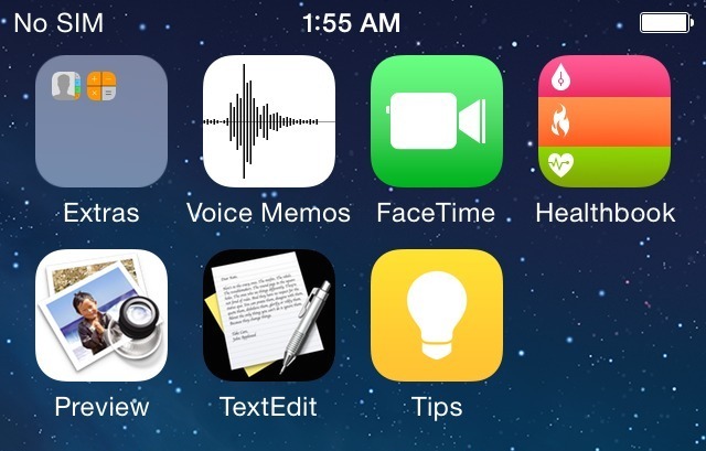
The above screenshot claiming to represent iOS 8 just showed up on a Weibo account. Even though the source of the images is absolutely uncertain, I have confirmed with several sources that these shots are legitimate. Earlier today, I detailed the new Preview and TextEdit apps shown above, and I previously discussed Healthbook. I’ll have more news on Healthbook in the coming weeks. Until then, you can check out a higher-resolution mockup of the Healthbook icon below. I’m not sure what the Tips icon is for, but it is probably a user-guide of some sort. Of course, it’s plausible that the icons are works in progress. More images below:
More images from Weibo:

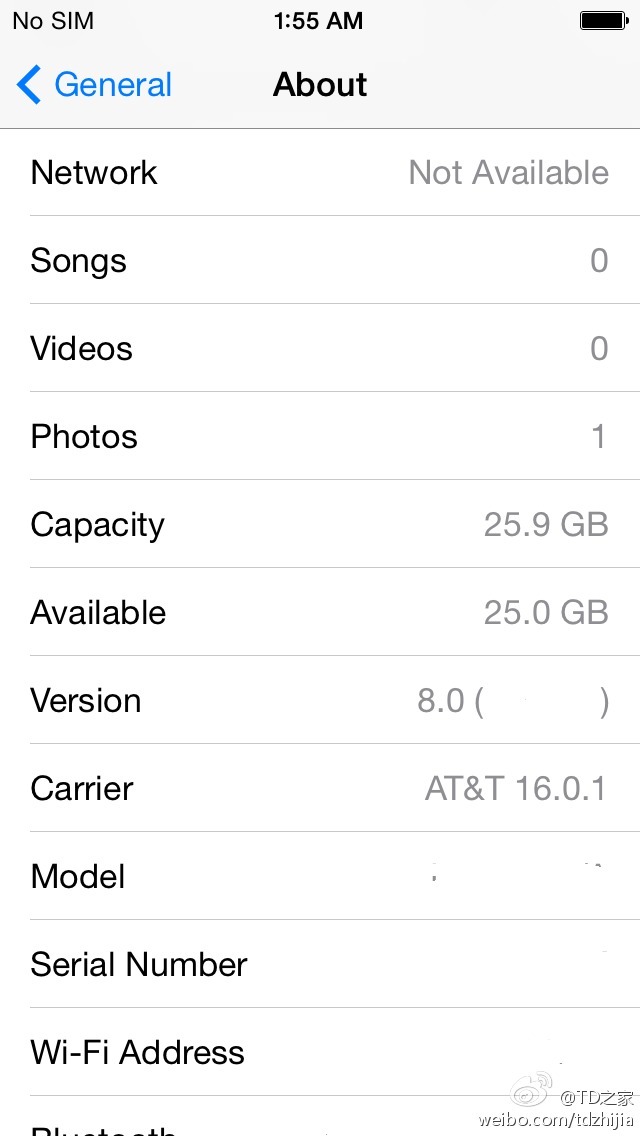
A Settings screen also from Weibo:
Healthbook icon mockup by Michael Steeber (red = Blood pressure, green = heart rate, orange = calories burned)
![]() [tweet https://twitter.com/tapbot_paul/status/444128694286573570/photo/1]
[tweet https://twitter.com/tapbot_paul/status/444128694286573570/photo/1]
[tweet https://twitter.com/CSZhang/status/444129160102178816]
FTC: We use income earning auto affiliate links. More.


Those are definitely not going to be the final iOS 8 icons.
I believe so…
Exactly.
And what does “I have confirmed with several sources that these shots are legitimate” even mean? Suspect source, but legitimate shots …. of what?
Gimme a break.
That’s what I was thinking. I can take a screen shot and it can be legitimate, then just PS the other icons in, tara, you have a “legitimate” screenshot with some PS done. This article is worthless. Mark you can do better and you know it. You’re just running a story to get something out which is bad journalism. Also, is it a 5.5 or 5.7in screen. Shouldn’t your “sources” have known that?
Legitimate meaning his sources are saying that looks like now in latest alpha builds. At this point, it just means those apps are in development but the icons are the least of their concerns.
Apple usually do not reveal the final icons nor designs until the media event.
Blah, I need to learn to proofread better. “..are saying that is what it looks like now in the latest alpha builds”.
In his previous piece Mark said Preview and Text Edit were still fairly early on in development. I have to imagine they are placeholders. Who knows they may even change names / add features in the new OS X release…
Preview and TextEdit icons doesn’t fit with the main scheme of iOS 7, but Healthbook looks awesome.
Thanx Mark
idunno, what do those icons even mean? blood pressure, burned calories, and heart rate? the flames look rushed, don’t they?
The design on Healthbook looks very similar to Passbook. I guess anything with “***book” have that design. My question is, will the Healthbook be joined with the so call iWatch that is rumoring around the web?
Looks like textedit and preview are just temporary icons ported from what is currently there.
Ive’s will definitely kill that skeuomorphism.
Blood pressure, calories and heart rate monitoring seems to be the key functionality of the health book app and potentially iPhone 6.
Healthbook looks good, Preview after a few looks could actually work, but the TextEdit icon is atrocious. I can’t stand by that one and really hope they don’t ship that.
Tips falls right in line with the Tips feature in iWork, so it was bound to happen, but I hope it’s more comprehensive, and it doesn’t seem like it needs to take up an icon spot for that, though maybe users that need it wouldn’t find it in Settings.
Its called PLACEHOLDER icons. Clearly they are not the final icons that will ship, nor would Apple show such a thing to internal testers.
Looks like they represent:
– Hydration level (and possibly temperature?)
– Calories burned
– Pulse (and possibly blood pressure?)
I think these are three measurements confirmed for the ‘iWatch’ then.
Don’t even think thats gonna be Preview and TextEdit. Ive would go nuts if that happens haha.
WHY would they put a Text Edit app on iOS when the Notes app is basically the same thing?
FAAAAAKE. iOS 7.1 brought updated icons to messages, phone and facetime apps. These are shown in the screenshots.
HOWEVER the update also changed the Photos app icon too, and these screenshots are using the old icon.
Why would Apple include the messages/facetime/phone new icons and not the photos one?
Fakeeeeeeee!
iOS 7.1 did not change the photos app icon. Several less reputable blogs mistakenly posted it did.
SO funny to see people thinking these are the actual icons. Do you not comprehend that Apple would likely have placeholder icons in place for internal testing until the final icons are created?
Preview and TextEdit won’t be included as user-accessible apps. They’re most likely just placeholders for OS development. Their functionality will be iCloud-based and integrated with existing Apple apps that handle those doc types.
Um, that’s the whole point of the article and the new apps….because OS X documents from Preview and Text Edit are stored in iCloud, but there is NO WAY to view them on iOS. Therefor, it is only helpful to have them in iCloud for backup purposes or syncing between Macs. You can’t even view them on iCloud.com.
So…Text Edit and Preview are long over iOS Apps. These ARE the apps for viewing them on iOS, and they are missing right now.
FWIW, iBooks has never made any sense for storing PDF’s
OK, I follow your logic, but here’s mine: what would they actually do? Do you really think there’s space for a TextEdit app between Notes and Pages? Regardless, do you think Apple would introduce a 3rd text app just to handle documents created by one of the same name on OS X, rather than just give that functionality to an existing app of similar purpose? It would be a pretty messy arrangement if they did, and definitely confusing to the average user.
So that leaves Preview. What would that be? Just an app to view documents linked to (created by, managed by, whatever) Preview from OS X? Again, for such basic purposes they could just add iCloud Preview documents to their existing PDF management app–which happens to be iBooks. I’m not saying iBooks is a great PDF viewer/manager, but it would be odd to add a standalone app with existing functionality just for the sake of the app’s name.
Then again, if iOS 8 is going to be geared towards productivity (I’m all for it), I suppose perhaps these are the kinds of oddities/complexities that are inherent in providing more file manipulation capabilities to the user. And the iBooks app itself was Forstall’s baby, so if they were going to reverse course anywhere, I suppose I could see it happening there.
My main point is that standalone apps aren’t the only way to add OS X functionality to iOS, even if that’s how it’s been executed on the former.
If legit, where is the iTunes Radio app???
Good question. But maybe Apple hasn’t split it off just yet. Or maybe it’s just on another screen?
You forgot to change the Mail icon to the eagle stamp and the Calendar icon to the date pad.
Seriously: direct ports from OS X icons? Umm…no.
This entire comment is just ignorant. Apple has known to use placeholder icons until a final one is released. This comment of yours is just absolutely ignorant.
At least it’s not redundant.
Except this could literally be ANY jailbroken iDevice with custom icons. Or even a photoshop.
Look, here’s iOS 8. Running on my first-gen iPhone. http://i.imgur.com/7UXOVdk.png
It *could* be. But does the 9to5Mac team post things they aren’t atleast 99% sure of? Unlike most blogs they at least fact check.
You’d figure the source would at least screenshot the ‘About’ screen, though.
The person DID screenshot the ‘About’ screen…
I like how the Healthbook icon keeps track of how many times you’ve caught on fire.
*snort*
Lmao!
So this healthbook app icon says it’s a mockup? Then how are these pictures confirmed if the app icon is just a mockup?
Steeber created a mockup of the icon based upon the screenshot. Did you read the article?
Reblogged this on Tech Talon and commented:
Awesome
Are you guys for real? TextEdit on iPhone? First we’ve already got Pages, there won’t be a TextEdit icon. Second – that Healthbook icon is a ripoff of the Passbook icon, and pretty bad one too. Legitimate shots? I can make a dummy app and put a Diablo 3 icon on it, does that make it a legitimate source (I’ll get several people to confirm it, but they will remain unnamed).
You honestly haven’t paid attention to any rumors lately have you? The Healthbook icon has been rumored to look like that for a while now. Plus if it’s name *is* Healthbook, keep an icon similar to Passbook is smarter for an end-user experience.
As far as all your other comments, I won’t even reply.
Those Healthbook colors :( Look at that khaki green right next to the lime green of the Facetime icon. I know these aren’t final but I mean come on guys.
Like you said, not final. So let’s see what happens when it IS released.
Do you respond to EVERYONE’S comments? Yeesh.
Those icons are fake! obviously. Apple does not use Macs icons on iOS. FAKE.
I REALLY hope you’re kidding.
Ok. Wait.
You’re quite the comment crusader. Keep up the excellent work.
can’t they remove J. Ive and his team from the UI design of IOS ? People on dribble or else propose far better alternatives…
then whom should they keep? you?
There are goos reasons why Apple might want to port both the Preview and TextEdit apps onto iOS, but there is no way in hell that those are Apple approved icons.
wow someone learned how to photoshop!
I don’t see the point of a “text edit” app. I think iOS is already covered by Notes and Pages, adding a redundant app would go against Apple’s philosophy of “few products done well”. Preview would be much appreciated instead. From my point of view there should be a native, stand-alone app allowing users to store, read and possibly annotate and highlight PDFs, as iBooks really falls short. It is strange that such an app is missing, as it is much more important than, say, the Compass and Stocks apps which not many actually use.
I call major shenanigans on the Preview and Text Edit apps. What’s the point of a Preview app when the “Photos” app handles everything perfectly fine?
Not to mention Apple will certainly not use those desktop icons on their iOS apps. Don’t tell me it’s “unfinished” either…Whether it’s unfinished or not…we’re not getting Textedit or Preview on iOS. That just makes no sense when Photo and Notes works fine.
Exactly… It makes no sense. If anything it would just make iOS worse.
TextEdit would serve absolutely no purpose. Notes already exists, and Pages comes free with every new iOS 7 devices activated.
I don’t see what purpose Preview would serve on iOS… You can already preview most things within their respective apps. Why would I want to open up a separate app when I can already view a document or a photo in pretty much any app?
Unless this is iOS’s round-about way of finally adding a file system… But then, why call it Preview? Just call it finder…
The Tips app seems interesting. Maybe how-to videos and instructions? Perhaps it’ll save a few thousand trips to the Apple Store for easy questions…
Those screenshots are easily mounted jpg files to appear as apps…you can do that without jailbreaking and mount the name “healthbook”….. Get out!
Hey, this ist a 32GB version but the capacity is only 25,9 GB
My iPhone 5 32GB has 27,9 GB capacity on iOS 7.1
Is it possible that the new iOS 8 will take so much more space ?
Maybe because of higher resolution graphics.
Well I think this is the clue that the next iPhone 6 will get a Full HD Retina Display or even better.
What do you think ?
I’m gonna take a shot in the dark and believe that Apple won’t feature any app icons in iOS 7 that have skeuomorphic aesthetics if for no other reason than Apple’s penchant for making OS X look and behave more like iOS.
There’s a better chance we’ll see redesigned icons for Preview and TextEdit on OS X before they just ⌘+V the OS X icons.
But it’ll be nice to see documents saved to Preview and TextEdit be available via iCloud.
don’t u guys think the resolution of the screenshot it lil different from other iPhones made yet … if this screenshot is geniune then it might would have been taken on a apple device which is still under production
Wow these look fake
Why would there be a need for text edit? Why would there be both the notes app and text edit?
iOS is getting bloated like iTunes, they should merge each of these app groups into one app each:
– Camera
– Photos
– iPhoto
– Preview
– iBooks
– Notes
– Reminders
– TextEdit
– Pages
Also, the iLife concept is really stale, they should drop the “i” in application names. There’s a negative connotation with apps that feature “i”, it makes users think of iTunes… which is very long in the tooth. I’m curious how much iMovie, iPhoto, and Garageband actually get used on iOS devices? It seems like a waste of resources to develop those apps.
I call BS. Apple would never create those icons on iOS, not even internally. And what would the point of Preview for iOS even be. It’s already built-in to the core OS. Text Edit is fairly useless as well, since there’s so many apps that already do much more than whatever TE would do (including Pages). If they didn’t add it to iOS originally in 2.0 or 3.0 or whatever, its because they thought about its utility and decided against it and so they won’t do it now.
When is gonna be the WWDC what time Stared. and What place?? AND IOS 8 WHEN THE UPDATES. BEGINNING. ?
We know at least there will be a 26 GB iPhone