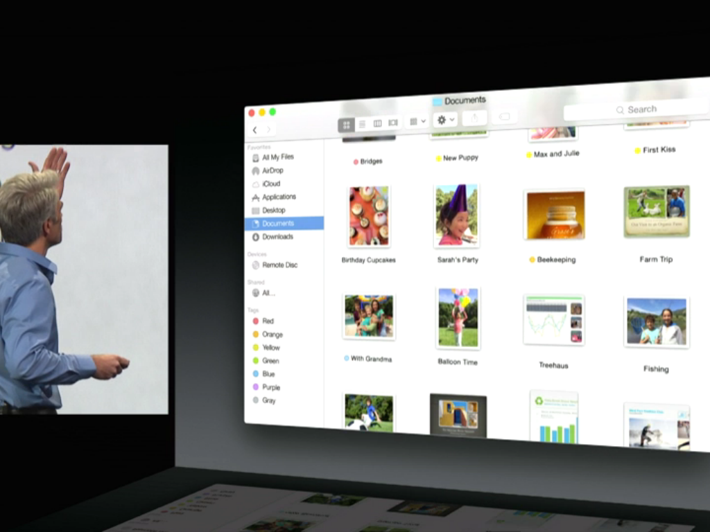
Apple has re-engineered OS X 10 completely. Menubars are now translucent, reflecting iOS. There is also a brand new icon set, featuring gorgeously flat iconography. In addition, there is now an optional dark mode for people who don’t want to be distracted by OS X’s default white bright interface.
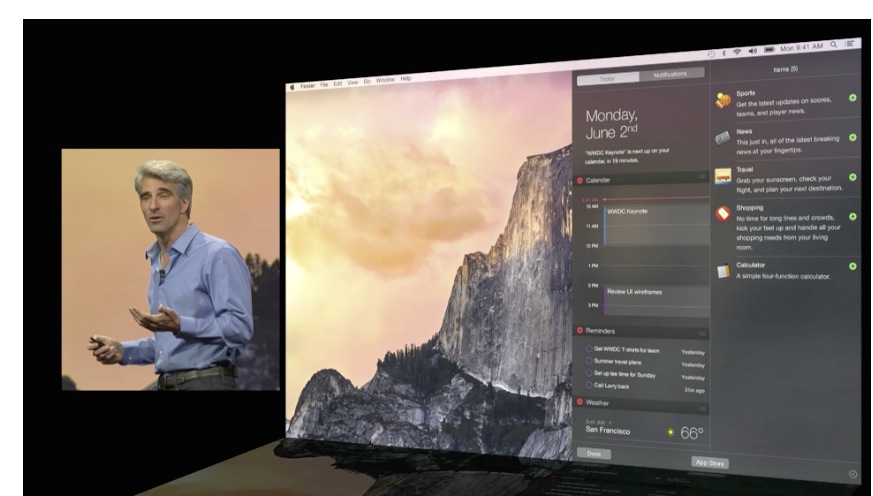
Apps have been reworked, featuring translucency and flatter materials throughout. Notification Center, for instance, flies in from the side with glossy blurs, very reminiscent of OS X.
FTC: We use income earning auto affiliate links. More.
You’re reading 9to5Mac — experts who break news about Apple and its surrounding ecosystem, day after day. Be sure to check out our homepage for all the latest news, and follow 9to5Mac on Twitter, Facebook, and LinkedIn to stay in the loop. Don’t know where to start? Check out our exclusive stories, reviews, how-tos, and subscribe to our YouTube channel


Dark Mode: Always on
To bad there is no way to turn horrible translucent blur off. Let’s blur all the detail into one big blob. Makes sense right? Just like Siri blacking out the entire page of information I want to read into siri, now having to stop everything and get paper and pen to write it down and then go back to speak it to siri. Without Steve apple has NO leadership. An abysmal JOKE. Horrible.
What are you smoking? No leadership? Are you on crack? I think what they’ve done to OS X is awesome, and I welcome the improvements! What is it with all you people against white interface elements? They’ve given you dark mode, and the translucency I find attractive.
Lighten up already!
@Edison, there are many reasons to be against a white-based interface… this is nothing new, that’s like design 101. Screen life, color perception, just how it affects your eyes period, it’s just not good for long exposure. And it’s ugly, but that’s my opinion. The dark mode however is great, and I have no idea what the OP is going on about with the translucence. It’s not as if there was none in the old dock, it just had faux-depth and shading. But yeah, dark mode and normal translucence look great. Just hope they offer some option to get out of the blinding white light that is iOS now.
I, for one, welcome our new insect overlords
It is possible there will be an option to turn off or reduce the translucent effects, there are options both in iOS 7 to reduce motion and translucent effects, and 10.9/10.8 to turn off translucent menubar.
You can disable the transparency in OS X Yosemite :) System Preferences, Accessibility, Reduce Transparency.
system prefs accessibility reduce transparency does nothing for the hideous transparent backgrounds assigned to Apps Downloads Utilities etc when they’re on the dock and their View Content is set to Grid or Automatic.
I find these particularly distracting:
A cos they take far longer to redraw that the equivalent in previous 10.x releases (no doubt will improve in later builds)
B cos they seem to pop up with a white background that shifts over to semi-transparent once drawn, the end result of which is a hellish flashing effect
For your information, you CAN turn off the translucency. Under accessibility -> display -> reduce transparency.
-A developer running the beta.
agreed
Thank god I can switch Off the Translucency. I also find It horrible horrible horrible! Specially the Side-Bar on the Finder Windows. What in the hell was Ive thinking? And those Folder Icons? Terrible looking. Aside these things, I Really enjoy the new aesthetics.
What are you smoking? Crack? I think you’re on crack. You would have to be on drugs not to think they same way I do. What is the deal with all of you people? You dislike things that I find attractive. What is up with that? You must be smoking crack! Just lighten up! I mean come on. And stop doing drugs already! Gawd.
Why was there no mention of the red iTunes logo???
In Yosemite (from what i downloaded) I do not have a red iTunes Logo, yet.. I think that it will be and update to iTunes for says Beta 2 or maybe later. Apple Engineers are already working on Beta 2 and so on, so who knows. Maybe it will be released with the final version of iOS 8. Maybe not.
I’ve just downloaded Yosemite… A beautiful high screen, used to show flat colour, doesn’t work for me, and also looks very amateur. The mail app looks condensed. For me the Mac was the best designed OS experience, I don’t think this is an improvement. On iOS, Apple used the colour of the app icon to come through, for instance back arrows or edit being blue in iMessage. Why not do something similar on Yosemite instead of dull, boring grey buttons. Helvetica Neue really doesn’t look good either. I preferred Lucida Grande, much more designer looking, this looks standard, windows looking, not premium. I’m not impressed at all.
You need to remember, this is beta software. The changes in iOS 7 between beta 1 and GM were drastic, as were changes between 7.0 and 7.1 — The same can be said about OS X. They’re still getting features packed in and will tweak the design till they’re happy with it before it goes to GM.
It’s not the final, it’s the developer preview.
Yeah, that worked.
I am a registered developer and downloaded OS X Yosemite. Is it possible to turn Dark Mode on? I really want the black status bar
It is not yet available. It will probably comes when Apple releases beta 2 or 3
Why is it not available yet?
It’s not possible yet because it’s still a early test feature, from what I saw on the Demo shown at the Keynote he didn’t even click an option it just happen like Terminal command perhaps.
Their focus is not the dark mode right now, they focus on all the errors that people are having and other improvements. If I’m to take a bet, it will come really late in the beta process. (Public beta probably, this summer)
How do you turn on dark mode?
Yeah, I was wondering the same thing…
How do you turn on transparency? None on my menu bars or title bars are opaque what so ever. I am running the beta.
Well if none of your menu or title bars are opaque then why are you asking how to turn on transparency? It’s already on.
I’m not getting transparency/Translucent effects either.