Apple and Google are back at it again and attempting to bring a safe and friendly mobile experience to your car. Android Auto and CarPlay are the two company’s re-imagining of mobile user interfaces for the car and both are gearing up for a major rollout over the next year.
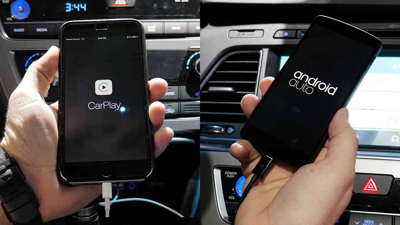
Each system is designed to work with its respective native mobile platform, but there are differences between the two that may appeal to different people. Today we’re comparing Apple’s CarPlay to Google’s Android Auto using the 2015 Hyundai Sonata. This car comes packed with both systems, so you won’t have to compromise either way, but there are some important differences between the two…
Apple’s CarPlay provides a very simple experience. When plugging in your iPhone, the CarPlay logo will appear and you’ll have the ability to launch the interface from the car’s in-dash screen. On the home screen for CarPlay, we have the basic options you’d expect: Phone, Music, Maps, Messages, Now Playing, and Podcasts.
The icons are laid out similarly to an iOS device and most of the available actions are controlled using Siri which can be accessed through individual apps or using the hardware button on the steering wheel. Of course third party app integration is available with choices like Spotify and iHeartRadio, but more compatible apps are rolling out.
Check out our Android Auto vs CarPlay comparison video below:
[youtube=https://www.youtube.com/watch?v=BCAWLKcohGE]
With Android Auto, you’re getting an experience that’s very similar to Google Now on a smarpthone. The dedicated home is filled with Google Now-like cards that will show relevant information depending on the situation. This acts as a home base for all notifications, navigation, and music. There’s not a traditional “home screen” as you’ll find with CarPlay, but there are menu options at the bottom of the screen to access the various features.
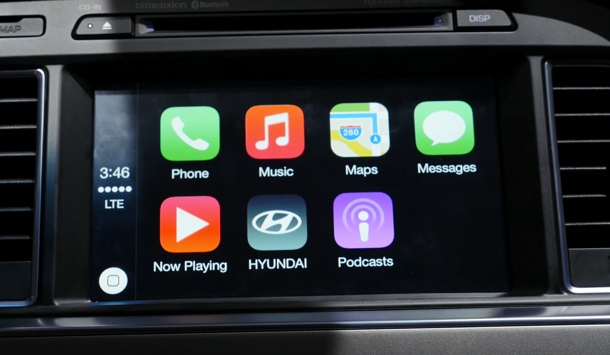
CarPlay’s user interface.
Android Auto offers a similar experience to CarPlay with Google Maps, Phone capabilities, SMS (and Hangouts), and Google Play Music (along with many other music/podcast services). Android Auto can be controlled using Google Now commands which are activated with the on-screen button or the dedicated hardware button on the steering wheel.
In terms of design, Google’s Android Auto interface takes on the Material Design look that comes along with Android 5.0 Lollipop. Everything is very clean and fluid when navigating through the system. CarPlay’s design seems very simple, but also features identical functionality for its native platform, though in my opinion Android Auto wins in terms of user interface controls and fluidity.
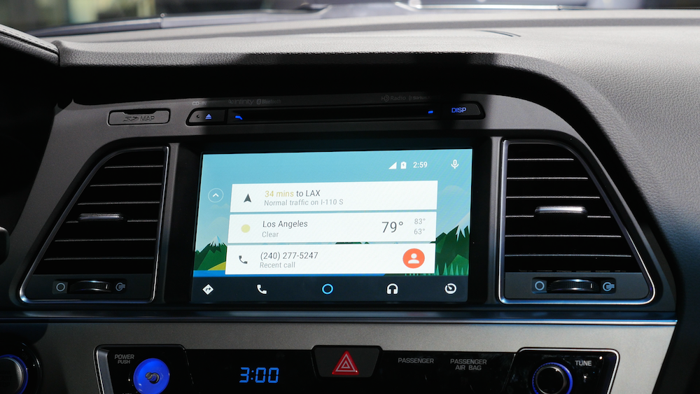
Android Auto’s user interface.
CarPlay and Android Auto apps are not installed directly on the system, but instead work as projections from your iOS device. If you install an app that has integration, the selection will be available on the interface’s home screen. Android Auto is still in beta, but the APIs and SDK have been made available to developers which will allow many of your favorite apps to roll out integration in the near future. With CarPlay there’s an API, but Apple will need to whitelist apps for them to be available. Keep in mind, neither of these platforms are available in the 2015 Hyundai Sonata yet, but will be available in the future.
Overall, both experiences are very similar, but there’s a clear difference between the two that may come with a few sacrifices depending on your needs. Meanwhile, check out our review of Pioneer’s aftermarket CarPlay solution. Check out the comparison video above to find out more and let us know what you think in the comments section below.
FTC: We use income earning auto affiliate links. More.


Dom says “go ahead” a lot. Completely extraneous language. grrrr!
Agreed
Good review – But your differently a Android fan boy and what version ran the Android –
2.11 Android 3.0 Honeycomb (API level 11)
2.12 Android 3.1 Honeycomb (API level 12)
2.13 Android 3.2 Honeycomb (API level 13)
2.14 Android 4.0–4.0.2 Ice Cream Sandwich (API level 14)
2.15 Android 4.0.3–4.0.4 Ice Cream Sandwich (API level 15)
2.16 Android 4.1 Jelly Bean (API level 16)
2.17 Android 4.2 Jelly Bean (API level 17)
2.18 Android 4.3 Jelly Bean (API level 18)
2.19 Android 4.4 KitKat (API level 19)
2.20 Android 4.4 KitKat with wearable extensions (API level 20)
2.21 Android 5.0 Lollipop (API level 21)
Yeah it requires Android 5.0 or higher so nice try.
He was running Android 5.0
It looked like lollipop to me. Had the animations from lollipop at least. When he held down his finger on one of the Google Now cards, it did the little expanding circle around it. Thats lollipop specific. Plus its a Nexus device, so he’s always on the latest and greatest :)
“But your differently a Android fan boy and what version ran the Android –”
Fantastically formulated, concise and easy-to-understand English grammar. Well done. (Not.)
LOL, I tried Google Translate but it couldn’t make any sense of his word farts either.
Android looks like they win this battle easily. CarPlay made me feel like you were playing with toddler toys.
Yes, I agree. There’s a certain visual sophistication/sharpness lacking with the Car Play interface. The zooming when launching apps doesn’t really work for me… I think Apple needs to try different effects.
That’s great to say when you’re sitting at your computer watching a demo. The fact of the matter is, these interfaces should be as simple as possible while still offering functionality. That Google Now interface, looks good, but it is an awful interface for someone driving a car – it’s a major distraction to need to scroll around reading those cards.
Furthermore, when you glance over, everything should be exactly where you think it would be and the text should be very easy to read (BIG). Also, the background should be BLACK, not white… that could be another major distraction, especially while driving at night.
CarPlay is designed the way it is for a reason. This isn’t something new for Apple. They started with iPod “Hands Free”, then moved onto Siri “Eyes Free”. Both of these were ideal for driving as neither needed much attention from the driver to use. CarPlay is designed with that in mind.
It’s clear that Apple designed CarPlay for driving, while Google designed Android Auto for car dash displays. Sorry, but just as with Accessibility in iOS, Apple thinks deeper than most other companies and will always “win” when it comes to responsibility.
I agree with both sides here… I like the sophistication of the Android interface here, but the moment the reviewer showed the dialing and input modes, it became a tiny rectangular mess that would require more focus to input on – specifically the phone dialing. Referring to the black/white backgrounds, I’d guess that there’s likely a nighttime mode for the Google version that goes dark – most GPS systems have it, as does the Apple Maps app.
While I’d say the Android interface looks great, I’m likely not going to be using an Android device.
However, I’m not into the iOS 6 look that CarPlay is using. It just doesn’t appear very polished or allude to how powerful it is, at least for me. I know the functionality is there, but it’s dressed in a cheap suit.
And as for all the “responsibility” angle, well… Let’s just say any one of these systems is likely going to lead to more accidents. The interface on either is going to allow someone to spend too much time looking at it.
I am sure the Droid version has a ‘night mode’ just as all nav units do, and in both cases you can control all of the functions with voice, so I don’t see a major downside to having it look nice. Why touch the text button, then use voice to dictate the text when you can just hit the button on the wheel and say “text Jason, Be home in ten minuets”.
I don’t understand how Apple fans bash Android endlessly for being unpolished, then the car players come out and Android makes Apple look like unrefined crap and its then defended as “simple and crude is better” as if the buyer of a New Ferrari is looking for a crude infotainment system in his $250k toy and the guy driving the Hyundai can’t manage to click on message because the screen also contains the weather.
Just say they are both in their infancy and you hope that Apple, your preferred brand for your own reasons, gets a little better in its next version.
I’m sad to say I agree with you. Both weren’t great, but I much preferred the look of the Android software.
I like Siri, but it seemed a bit intrusive.
Was it the camera, or was the Car Play interface kinda blurry? The Android Auto interface seemed clean and sharp in the video. I’m disappointed by the lag seen in the Car Play interface… I really hope that Apple addresses that before I get mine. :)
Looked sharp as a tack on my monitor.
You can tell that the focus point was off because Dom’s hand was in focus right in front of the display. I have the Pioneer 4000NEX unit and it’s tack sharp.
Also, it seems that the Android interface is trying to put the Android interface into the vehicle as sort of a mirrored display while CarPlay is meant to allow the user to keep their eyes on the road and use Siri so that they don’t have much physical interaction with the head unit. The previous comment about the black background and colored icons on top of that? Spot on. My 4000NEX is VERY easy to see out in the real world. Siri works great, the icons are easy to see, and you can even specify if the driver’s position is on the left or right. That showed up in the video where the phone keypad was on the left side of the display. Android puts their mic all the way in the upper right corner of the display…the further point from the user.
So does it look like the Android interface can do more? Sure. But they’re missing the point of SAFELY integrating the user’s phone into the vehicle. I was one of those people who would randomly look at their phone and even text while driving. I don’t do that anymore since I have CarPlay.
You miss a point. In Android Auto the driver uses his voice and has the buttons on the wheel. The mic button on the right side is for a person on the passenger seat to be able to use it as well.
The camera was out of focus when they were shooting the CarPlay portion.
I like both of the interfaces, maybe the Apple one a bit more, however, all this nonsense about it (or anything like it) making driving safer is nothing but marketing hype or complete ignorance as to what makes dangerous driving. The driver is in control. A distracted driver or a driver who is a dirtbag on the road is not going to be made any safer by devices or lack thereof. Back to topic, Google Auto Play is cool, I wish it looked less cartoony with all the new material bollocks, but at least it seems to work.
Please note that all comments on this section are COMPLETELY fanboy driven. As was the reviewer in the video. Though trying to be impartial (is that even possible?), I like the CarPlay interface better. The Android looked washed out to me. What was disappointing to me with both systems was that I thought the whole purpose of these systems was “Hands free navigation”. A lot of button pushing on both in this video. I doubt anyone could really make a judgement call on this inadequate review.
Yeah he didn’t go into the same level of detail with the CarPlay section. Disappointing. Didn’t call up a location in Maps, contacts among other things that he DID cover in the Android part. It lacked parity but it was still a good quick look into the feel of both systems. He should have shown us a test of both systems’ use of voice, but I have to chalk it up to being at an auto show.
My guess? He likely did the Android phone first, and rushed through the CarPlay part as the Hyundai reps were urging him to finish.
Definitely biased towards the Android piece. He went WAAAAAY into detail on that. And if the Hyundai reps were urging him to finish, as a fair blogged, he should have asked to come back a little later and do a full CarPlay piece.
At any rate, I have CarPlay and I think Apple hit a home run here. I love the interface…it’s more than enough for what I need WHILE I’M DRIVING.
Very much Android biased. But I wouldn’t expect anything less from someone who defended the YouTube guy pushing bendgate. Android Auto might look prettier but in a car icons, touch targets and text needs to be large. Also in a car a black interface makes the most sense as it’s much easier to read.
gotta say, andro auto looks way sweeter.
Android seems a little better at getting info to you in the least distracting way possible but there is a serious problem with that interface. Has no one at Google ever driven a car at night? That interface needs some sort of high contrast mode with zero bright white elements, something Apple appears to have definitely focused on with CarPlay. Maybe that mode exists but without seeing it in the video it’s hard to imagine what it might look like.
Android Auto has an automatic night mode: http://developer.android.com/reference/android/app/UiModeManager.html
who cares which looks the best. they will both be updated. that said it needs to be as simple as possible as you are DRIVING. icons need to be large and easy to press. we need to worry about when in the heck all the other auto manufactures will implement this.
I have CarPlay it’s pretty good but Siri really struggles with road noise. If you ask Siri something while driving sometimes she just keeps listening due to road noise or people talking in the vehicle, should be a way to turn of the mic so Siri can do its thing . Also they need to overhaul Apple maps to be more driver friendly like letting you know what lanes you should be in for turns. Also the iphone6 does not like it when its connected via lighting and you have to start your car or situations when car power is turned off then on quickly , apps in this situation will act funny like no sound or frozen app screen . Quick fix for that is double clicking home button and turning off the app and relaunching it . I do like CarPlay just needs to be smoothed out
Android Auto looks like an interface designed for a phone, but not for a car. Too much text to be reading while you are driving. Carplay looks significantly easier to use while driving as you merely glance, touch, then talk. Android Auto is just Google Now in the car. It’s pretty but not the right interface for a car.
Maybe Android Auto is better for the passenger….
The cards screen is more the interface when you join the car…..like the icon screen on carplay. The advantage of the cards is that it’s connected to your other devices, calendar and other things. If you’ve searched for a place or an apppointment and you enter your car you can directly pick your destination from that screen without having to enter it. That’s the advantage of Google Now as frontend. Once you’re driving you’ll be in the navigation or music screen and usually won’t interact with the cards.
CarPlay looks to me like they’ve found a 6 year old interface and re-used it. Buttons and tabs everywhere, colors and borders that make the interface look like a toy and no way to see the navigation directions on the main screen. They’ve much to do…
What do most people use a display like this for? Navigating. Which means maps. Who has the better Maps app of the two? Google.
It’s a good thing Google Maps is available on iOS as well as Android and there’s almost every chance that Google Maps will be available for CarPlay.
I think Apple Maps are better.
I have to say, Android Auto looks delightfully beautiful. I am worried about performance as thats always been the issue with Google products.
I love Apple, but Google looks light years ahead. Now I know i’m switching to Android.
So you’re a lame troll.
Hi Dom, excellent video. Presumably the Nexus 5 was a demo unit presented to you by Hyundai at the LA Auto Show: did you have a chance to check out the build number of Lollipop (was it also 5.0) and the version number of the Google Search app? I do wonder whether they are newer versions that have the ‘KITT’ functionality enabled.
Which leads me on to my point of concern: the touch-heavy interface you demonstrated. This is anathemic, not to mention unsafe, for the driving experience. The version of Android Auto showcased at I/O 2014 seemed to offer voice control – in some cases with the button on the steering wheel that you showed – of most of the functionality that you controlled with your finger scrolls and taps.
Let me start by saying that a full comparison video would’ve included real-world use, not tapping buttons at a convention in a parked car.
But the most egregious and unbalanced part of this review was what you started out saying at the top of this video: that both systems are attempting to make car dashboards “safer and easier” to use while driving.
If that’s the barometer then clearly Google is in favor of accidents. Any system that requires that much scrolling and swiping is asking the user to pay attention to (basically) a smartphone attached their dashboard and less time focusing on the road. A fancy background is extra ornamentation which is more distracting than helpful not to mention the horrid use of space on the Android Auto interface.
Clearly someone at Google doesn’t understand proper layout and space because they’re wasting nearly a ¼ of the little bit of screen real estate they have for cell phone bars, a teeny, tiny digital clock and the Google mic (in the far right corner, conveniently further away from the driver). That’s to say nothing of the wasted space on either sided of the cards just so the background can be seen.
Apple’s simple and understated don’t-look-at-me-look-at-the-road approach is far more safer and easier. With big, bright buttons that contrast against the black background getting to apps and information relevant to driving is easier and streamlined.
I’m sure we all appreciate the side-by-side but you’d be wise to reassess your priorities in what you want in a smart-dashboard system. I suppose the passenger would find things to do while you’re driving but I submit that having someone poke and prod your dashboard is equally distracting if not more so (swapping apps or stations could easily turn into a slap fight).
You exactly described my thoughts. The Google UI is crappy as always and is useful only when you can focus on the screen however, I don’t know about them, but the car is meant to be driven, not to stay on the parking spot.
Android auto does have more features I would love to see in the Apple Car Play, but it looks to complicated and intricate. I live in the mountains, and taking your eyes off the road long enough to press, scroll, or find something in that would be long enough to get me killed…
Hand off to Apple for following the kiss (keep it simple stupid) method, but I think it needs… more?
Google… are you trying to get me killed? To complicated!! I love the details, but leave them ON the phone!
Here we go again with people stating “Look at all of the things Android does that iOS doesn’t.” In this case, iOS is the clear winner since less is more here. The Android option looks like a second display. If the goal here was to put all of your mobile phone into the car, then Android clearly wins. But the real goal here is to make using your phone in your car as safe as possible, and for that reason, iOS is the clear winner. Does it look all fancy and cool with tons of icons? No. Because it’s not supposed to. It’s supposed to be simple so that you concentrate on the road.
Apple knows what the intent is here…I don’t think Android knows.
Hmmm…Android interface looks better and displays more information. CarPlay looks dated and instead of displaying information it’s just a bunch of icons like the first iPhone from 7 years ago.
WTF is wrong with Apple? Why can’t they come up with something new?
they where bot great but think that Apples will flow much more easier when driving. I need to focus on the road more and Apple make this possible.
Is the user able to access their web browser as well? For example, if the car is need of service, and I need to search for service providers in my area.
Wow.. Apple’s CarPlay looks worse than the existing dated systems out there now. Google Auto seems way ahead. It also controls everything by voice AND touchscreen – very handy if stuck in traffic or parked somewhere. Apple only gives you one option which kinda sucks. Android Auto looks very modern and polished, and easy/safe to use with big buttons and easy navigation. Looking forward to saying “OK Google, text Claire, tell her to buy beer” or “OK Google, find me directions Home.” Well played guys!