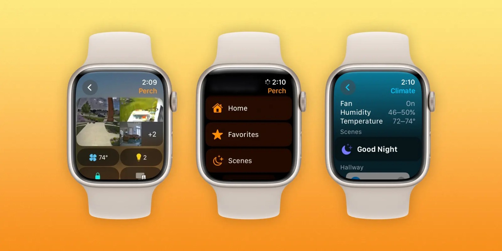
Seven native Apple Watch apps have been overhauled with watchOS 10, one of which is the Home app. The big update brings the Apple Watch HomeKit experience in-line with iPhone. Follow along for how the new Apple Watch Home app looks and works.
watchOS 10 brings a big overhaul for the Apple Watch experience with a new widgets UI, mental health features like mood tracking, new watch faces, and redesigns coming with native apps like Weather, Stocks, Maps, Messages, World Clock, Heart Rate, and Home.
As a refresher, here’s the main screen of the watchOS 9 Home app:
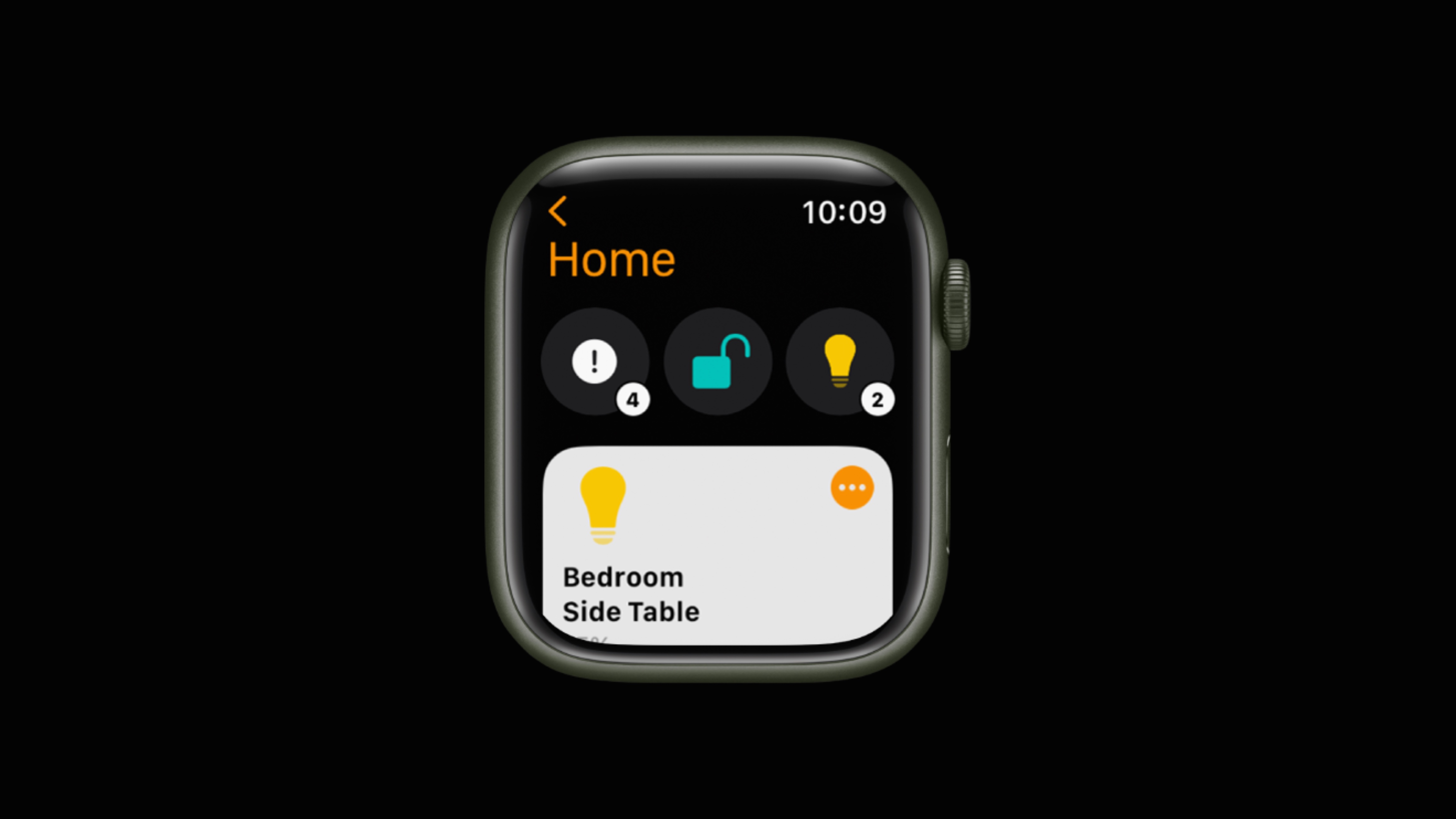
After we got a major overhaul of the Home app with iOS 16 last year for iPhone, this time it’s Apple Watch’s turn for a HomeKit upgrade with watchOS 10.
How the Apple Watch Home app looks and works in watchOS 10
- When launching the new Home app in watchOS 10, your camera feeds are at the top, next are four quick buttons for climate, lights, security, and speakers, and your favorite HomeKit devices are below that
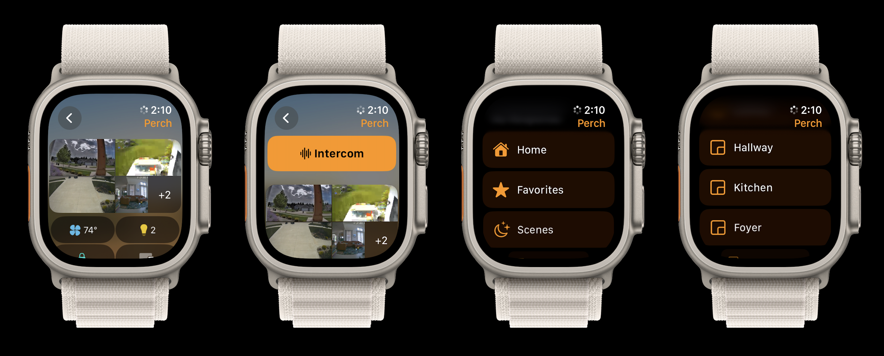
- Swipe to the very top to see the Intercom button
- Tap the back arrow in the top left to see categories and all your rooms
- Tap a HomeKit device in the new app to toggle it on/off (lock/unlock, open/close, etc.) or tap the … icon to get precise control for things like thermostats and lights
Here’s how the new Apple Watch Home app looks and works in watchOS 10:
Here’s the main screen with video feeds up top. You can tap a feed to see a closer view or tap in the bottom right corner of the video section to see all your HomeKit cameras.
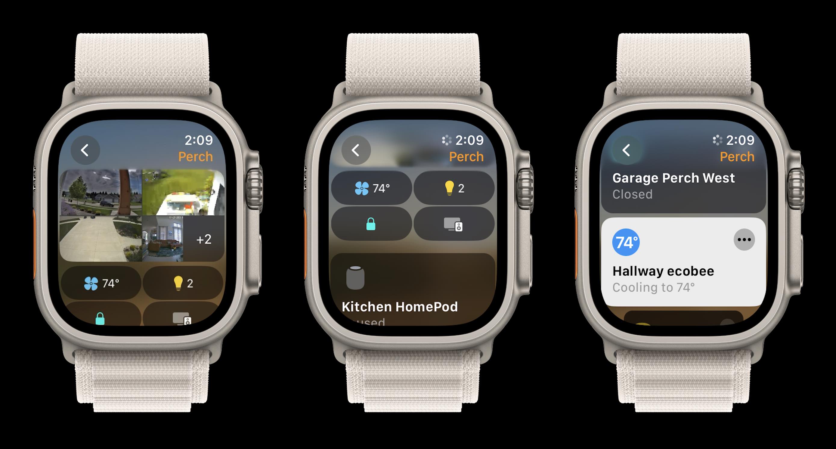
Next are the quick buttons for climate, lights, security, and speaker categories. And above on the far right is what HomeKit device tiles look like with the new Home app in watchOS 10.
The new quick access categories for climate, lights, security, and speakers are really handy with buttons at the top to do things like turn all lights off or pause all speakers.

Back at the main screen, swipe to the very top to see the Intercom button and tap the back arrow to see Home, Favorites, and Scenes followed by all of your rooms.
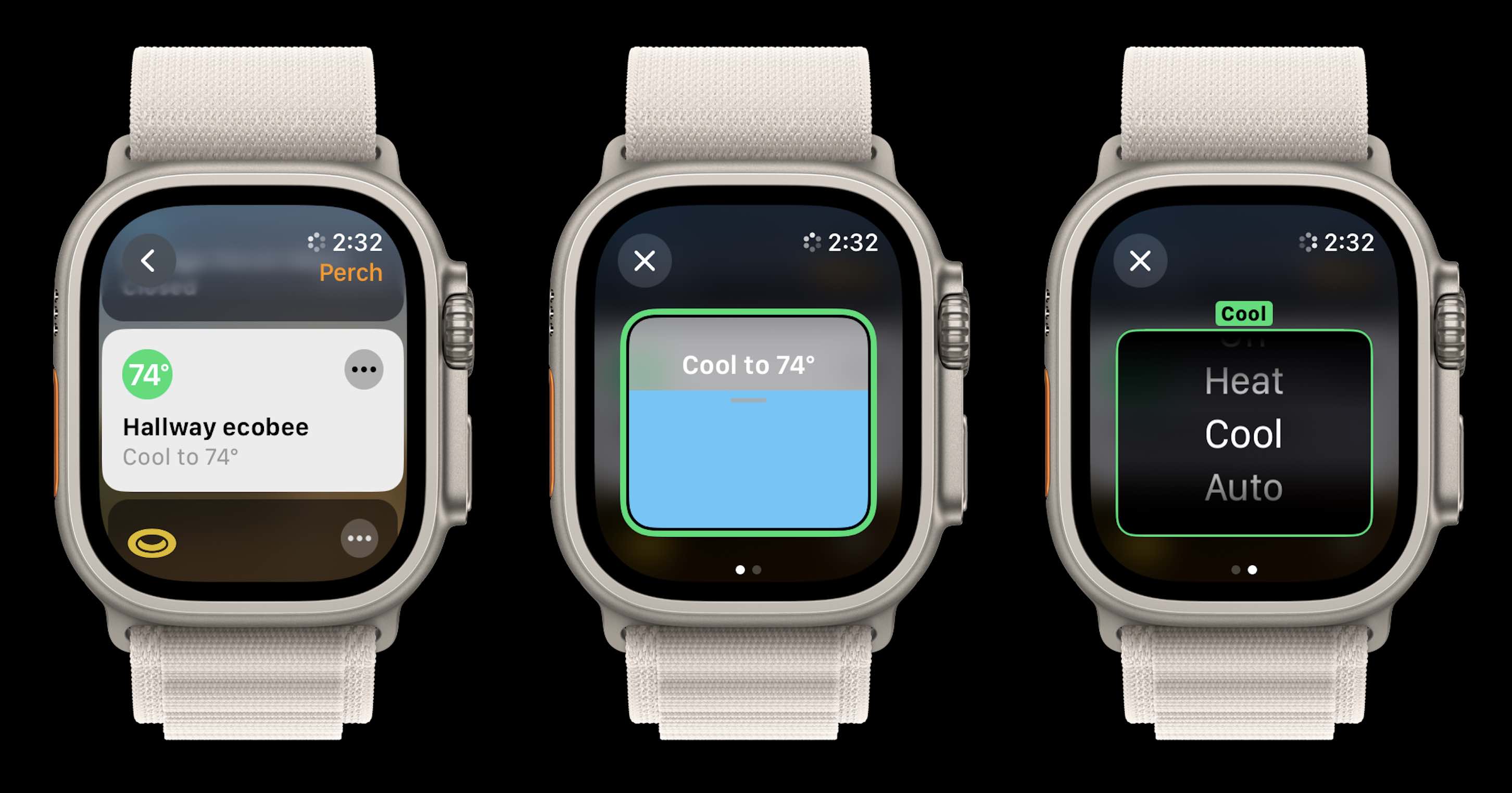
For individual devices, here’s what it looks like to tap the … icon to get manual control. Some devices will have multiple controls to swipe between:
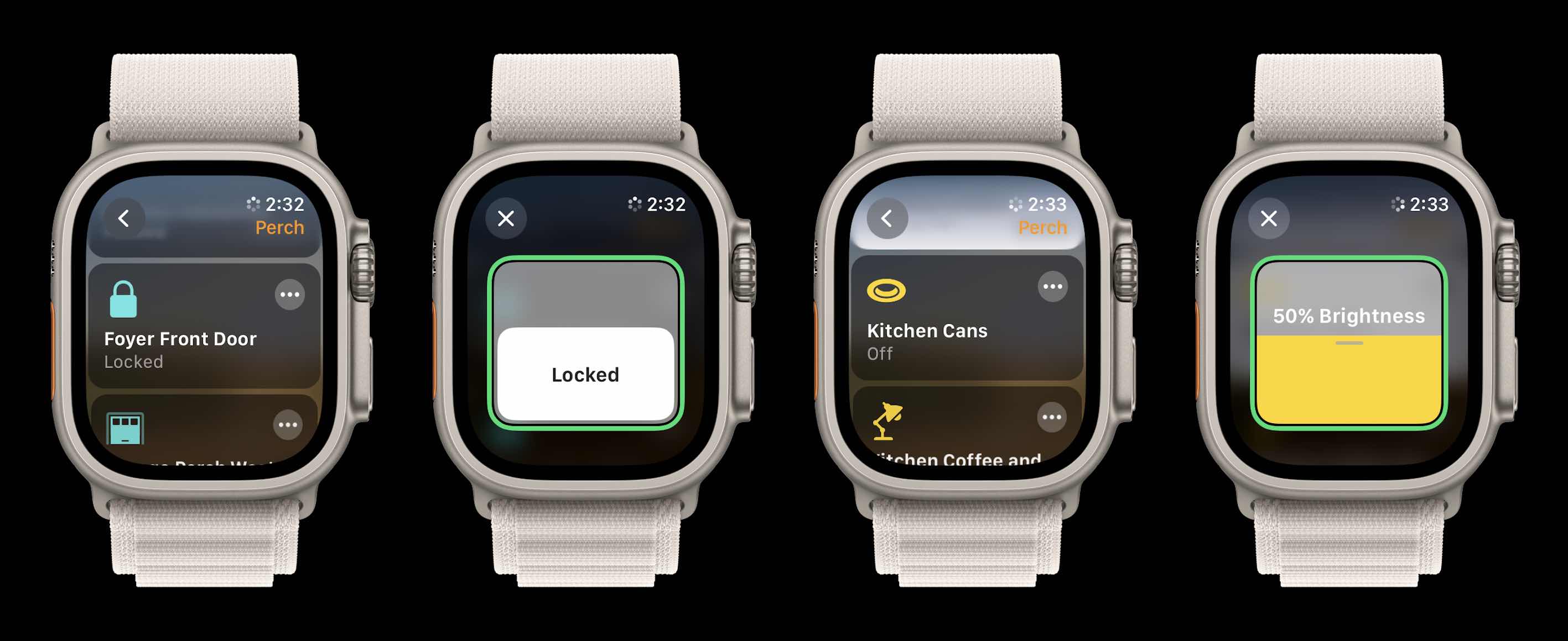
And here’s what it looks like to control devices like smart locks and dimmable lights:
Overall I think this is a great update that brings the Apple Watch HomeKit experience up to par with iOS.
It’s much easier to quickly get a glimpse of what’s going on at your home, access devices, and control them. And in my use the new watchOS Home app has been more responsive too.
What do you think about the new Apple Watch Home app? Share your thoughts in the comments below!
More 9to5Mac tutorials:
- watchOS 10 widgets: How the new Apple Watch UI works
- Here’s how the all-new Apple Watch Weather app in watchOS 10 looks and works [Gallery]
- How to turn on AirPods Pro Adaptive Audio, how it works, more
- iPhone Screen Distance in iOS 17 protects your eyes, here’s how it works
FTC: We use income earning auto affiliate links. More.


Comments