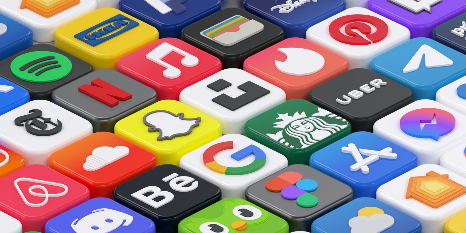
Mark Gurman reported over the weekend that customizing iOS app icons will be one of the new features we can expect to see in iOS 18.
On the face of it, that seems a relatively minor cosmetic change, but I think it does open the door to using it in rather an impactful way …
Gurman reported that in addition to being able to freely position apps on the home screen – something we’ve long been expecting – we’ll also be able to change the colors of app icons.
Another fun improvement (unrelated to AI) will be the revamped iPhone home screen. That will let users change the color of app icons and put them wherever they want. For instance, you can make all your social icons blue or finance-related ones green — and they won’t need to be placed in the standard grid that has existed since day one in 2007.
There are a number of reasons we might want to do that, with simple aesthetic preferences the most basic of them. Some people use Shortcuts to effectively replace app icons with custom ones, and there was something of a fashion a few years ago for having a single color palette – including retro and monochrome.
Another, as Gurman mentions, is categorizing apps – and it’s this one I think could be used to influence the ways in which we use our phones.
There has been growing concern about excessive smartphone use over the past few years, with many of us taking steps to reduce our usage. One of the most effective steps I’ve ever taken personally was to put my iPhone on an app and notification diet. I did that back in 2018, and have retained these settings ever since.
In terms of my life balance more generally, I use a color-coding system in Apple Calendar, so I can see at a glance how the various different priorities in my life are reflected in my schedule.
My color-coded calendar provides a super-easy way to see how I’m doing with this balance. If there’s no dark green, for example, then that signals I’m not actioning my video plans, and I should schedule something. If there’s no purple, that acts as a signal that I may not be taking care of my well-being. If there’s too little orange, that I need to schedule more fun things.
It strikes me that apps could be color-coded, either in the same way, or using similar principles. For example, I took steps to significantly cut down on my usage of social media apps, and if I gave those all the same color (perhaps red!), then it would make it more obvious if I found my finger headed toward one of them.
If you have particular personal or professional goals, and apps which support you in those, you could use it in the opposite way: Color-code those green as a way of signalling to yourself that you should be maximizing your use of them.
Do you expect to use option for color-coding iOS apps if it’s confirmed? Please share your own thoughts and plans in the comments.
FTC: We use income earning auto affiliate links. More.


Comments