Apple introduced a brand new interface to its Photos app with iOS 18, which for years had looked pretty much the same. Unsurprisingly, while some users liked the update, others are still reluctant to approve the new app. But there was one very annoying aspect of the new Photos app that Apple is finally fixing with iOS 18.2.
Apple changes the video player in the iOS 18 Photos app
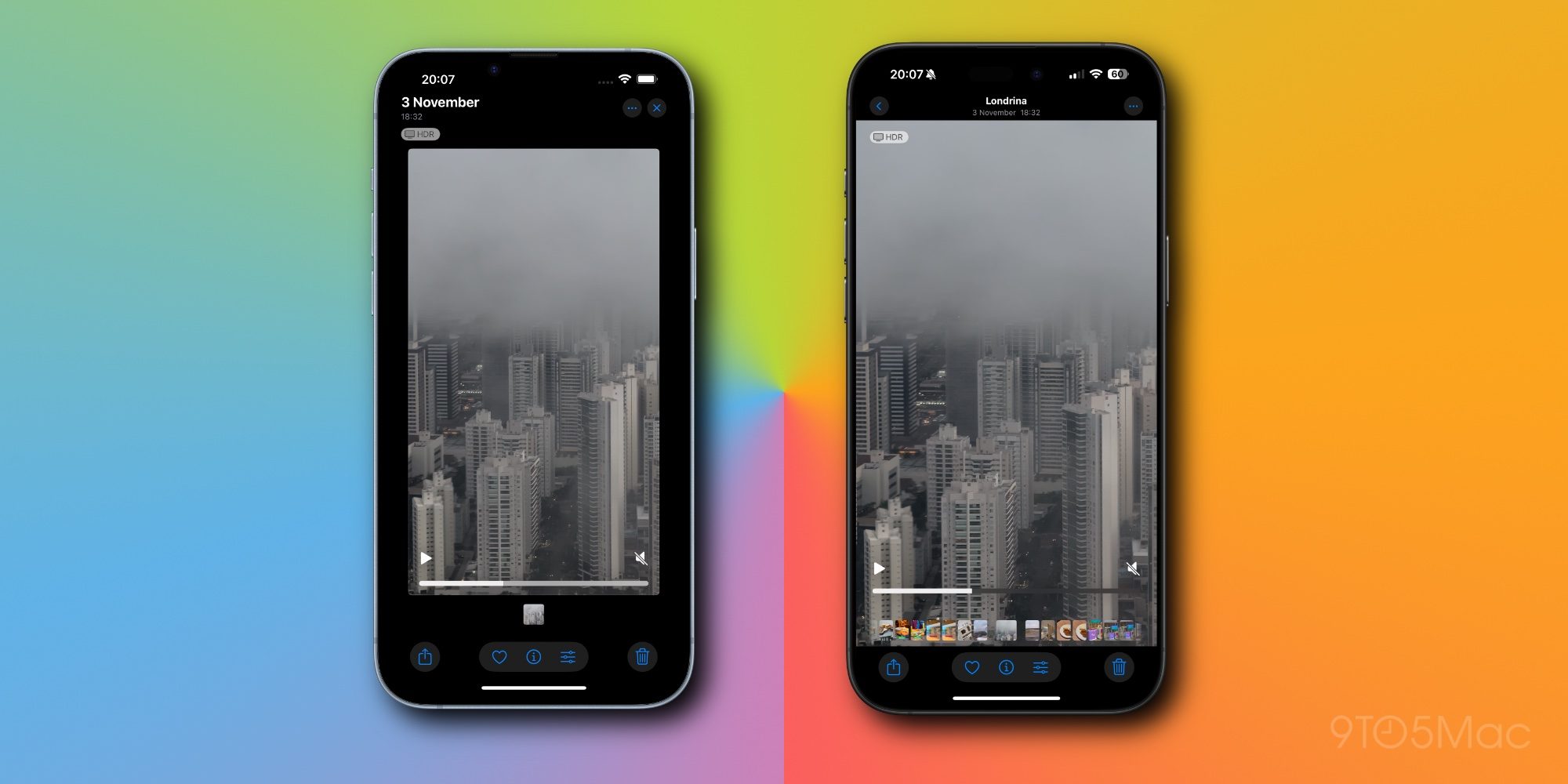
With the third beta of iOS 18.2, which was released to developers on Monday, Apple has made a small but important change to the Photos app’s video player. In previous versions of iOS 18, videos are displayed with white borders around them and users have to tap the screen to watch them in full screen. Now videos are always played in full screen, just like in older versions of iOS.
The new video scroll bar and playback controls are still there, but the white space around the videos is gone. Now tapping on the screen simply hides and shows the interface buttons as it used to before iOS 18.
Personally, I was never a fan of the new video interface in the iOS 18 Photos app, so I’m glad to see Apple changing it. Given that the company is reverting to the old design, it seems that more people were unhappy with this aspect of the Photos app.
Top comment by urname
At the end of the day, this whole story reminds me of when Apple tried – unsuccessfully – to introduce a major redesign to Safari and ended up bringing back the classic interface after many complaints.
I'm not sure I would be so confident in saying "unsuccessfully" here. You have no data on whether more or less users use the redesign to Safari currently. They only brought back the option to return to the classic interface. The default is actually the new interface.
I, for one, kept the new interface and never looked back. It's far easier to be able to access the URL bar, web tools, and switch tabs without reaching up to the top of the phone.
Since the very first beta of iOS 18.0 in June, Apple has made a lot of changes to the Photos app based on feedback from users and developers. The app is now entirely customizable and its internal navigation has been completely changed, which has caused some users to dislike the interface as they consider it too confusing.

During the development of iOS 18, some other more radical changes were also reversed – such as the carousel with highlights that was scrapped in iOS 18.0 beta 5. At the end of the day, this whole story reminds me of when Apple tried – unsuccessfully – to introduce a major redesign to Safari and ended up bringing back the classic interface after many complaints.
It’s worth noting that iOS 18.2 will be released to the public in December.
What are your thoughts on the new Photos app in iOS 18? Let us know in the comments section below.
Read also
- iOS 18.2 adds Safari Live Activity for file downloads
- iOS 18.2 beta includes redesigned Mail app with smart categories
- iOS 18.2 beta 3 adds new ‘Require Screen On’ toggle for Camera Control
- iOS 18.2 lets you ask Siri about what’s on your screen
- iPhone users in the EU can delete the App Store and more with iOS 18.2
FTC: We use income earning auto affiliate links. More.


Comments