Back in the summer of 2008, when I first joined Twitter, there weren’t very many good Twitter apps around. I had a Mac and an iPod touch, and I wanted a way to keep up with the few people I was following on those devices.
The first app I used was Twinkle, by the makers of the Tap Tap Revenge games. I used it for a while, but it started to show its age as things started breaking and new “social” features required separate accounts on other networks. I decided it was time to move on.
That’s when I discovered Twitterrific, and I loved it. Between the Mac and iOS versions, I had an app for keeping up wherever I was. The iOS version was a power user’s dream come true. There were buttons, filters, and toggles that did everything I wanted.
I used Twitterrific for several versions until I eventually moved on again; this time to Echofon for its fancy timeline position syncing across devices. This was something no one had done at that time.
Twitterrific has always held a special place in my Twitter client list. It was easily my favorite app for several years, and even after I stopped using it, I wished for timeline syncing so that I could return to it.
When Twitterrific 4.0 launched, I was caught somewhat off guard. The app had been completely rewritten for simplicity. Most of the power features I had enjoyed were gone. The focus was now on reading and composing, and not much else. I had since moved to Tweetbot and couldn’t imagine using any other app. Tweetbot’s power features had me hooked.
Today, Twitterrific 5.0 is available. The app has once again been redesigned from the ground up, with new features and customizability. But is it enough to win back former fans who have been turned off by the lack of focus on power users? Keep reading to find out.
Customizability
Let’s jump right in the most obvious change in Twitterrific 5: the design. I’ll be honest, I was shocked and slightly confused when I saw my first screenshot of Twitterrific 5. I didn’t like it. “It looks like a prototype,” I said. After using the app for ten minutes on my own, I had completely changed my mind. That’s because the main design feature in this overhaul is that there is no single design.
Unlike previous versions of Twitterrific, which gave you two colors and a handful of font sizes, “T5” gives you complete control over the size of the text, the size of profile photos in the feed, the line spacing, and of course, a choice of light or dark themes. Less of the app’s look and feel are forced on you, and much more control is handed over to the user.

Redesigned Everything
The new navigation layout is unlike anything I’ve seen in a Twitter app before. The only button that was exactly where I expected it to be was the compose button. The tabs for the main feed, mentions, and direct messages are located at the top of the screen, not the bottom. I found this decision a bit unwieldy on the iPhone 5, which makes it harder to reach the top of the display. Putting the navigation tabs at the top of the screen also presents a problem for those of us using banner notifications. The banners cover the entire navigation bar when you get a new notification.
Tapping an individual tweet in the timeline doesn’t bring up a detail page with more information about the post. Instead, it shows four icons at the bottom of the tweet for replying, retweeting, favorite, or seeing even more options (such as translation for foreign languages, or old-style “RT” retweets).
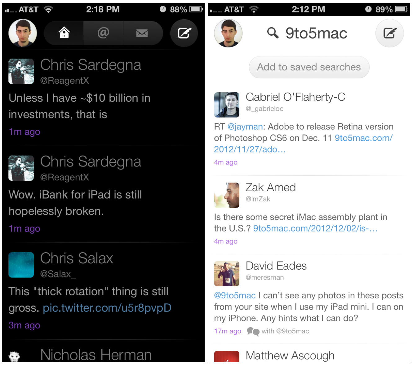
There are several other navigation elements that have never been done before in a Twitter app. A button in the upper left corner shows the profile picture of the current account. Tapping it brings up an overlay with access to your lists, the search button, and your list of saved searches, as well as the theme and app settings. Tapping and holding the profile photo button brings up the account switcher. Other new design paradigms introduced in version 5.0 include homescreen-style grids of photos for follower lists, search results, and other lists that include multiple users.
Version 5 finally brings pull-to-refresh to Twitterrific, and I am extremely pleased with the design of this feature. Unlike other apps that use a simple spinning arrow to indicate the gesture, the indicator is an egg that hatches a bird, which then flaps it’s wings before disappearing into oblivion. I love it.
Gestures
Twitterrific 5 is the first version of Twitterrific to implement so many useful gestures. You can swipe a tweet from left to right to quickly reply to it, or swipe the opposite direction to see a conversation thread or replies to a certain message.
There’s also a gesture that many people probably won’t discover. Using two fingers to swipe up on the navigation panel at the top of the screen will cause the status bar to hide, giving the app a few extra pixels to spread out. Doing the same gesture in a downward motion will bring it back. This incredible level of detail shows just how much work went into making this interface as customizable as possible.
Stay Caught Up
Twitterrific 4 introduced Tweet Marker support for syncing timeline positions between devices. With version 5, there is a new option for staying in sync. iCloud can be used to sync the timeline positions of any devices running the new version of Twitterrific. Presumably this feature will be available in any new Mac version that may launch in the future, although nothing is confirmed about that yet aside from a tweet by @twitterrific assuring a customer that the Mac version is also due for an upgrade soon.
Built for Speed
I found that almost everything I did was much faster in Twitterrific 5 than similar actions in Tweetbot. I was replying to tweets so quickly using Twitterrific that I wondered how I could possibly go back to anything else. Conversation threads load as fast as—or many times, faster than—their counterparts in other apps. Switching accounts is nearly instant. In fact, everything is nearly instant. This app is seriously fast. Aside from loading new tweets, I didn’t have to wait for it to do anything. I wish I could say the same for some other Twitter clients.
New app, old problems
Software, like everything else in life, is prone to imperfection. There are some bugs that didn’t get completely squashed. I found that it was sometimes difficult to trigger the sideways swiping gestures to reply or view a thread because the feed would try to scroll instead. There is also an issue where URLs in someone’s bio are not shown as actual links, but instead show up as “t.co”-style links. Usernames in bios are not linked either, which makes it a bit of a hassle if someone links to a second account on their profile page that way. Unfortunately, small bugs like this are the least of my worries with Twitterrific 5.
Many basic Twitter features are missing from the app, such as the ability to edit your own profile or manage your lists. While it’s nice to focus on the reading experience, having to login to the website in order to change their profile is quite annoying for users who may or may not care about the reasoning behind that feature’s exclusion. This point is made even more clear in the case of Twitter’s “lists” feature, which as far as I know cannot be managed through the official Twitter app or mobile website at all, meaning anyone who wants to add someone to a list must first login to the website through a desktop browser or choose to use another app just for that feature.
What’s more, Twitterrific 5 does not support video uploads at all. Because the app uses only Twitter’s native photo upload service, which doesn’t support video, you’ll have to upload the video through another app and then tweet a link to the video.
However, I am willing to overlook all of these if the app is very good. Make no mistake: this app is very good. Even the lack of streaming, which I have become dependent on since Tweetbot added it, can be overlooked for such a well-built app.
Twitterrific has confirmed that many of these features are coming in future updates on their support site.
iPad:
Twitterrific 5 is a universal app, and looks great on the iPad. The larger version includes all of the same interface elements, speed, and features of the iPhone version. iPad users will notice that the fonts, images, and user-interface elements are a big larger, but the experience is essentially the same. The larger screen on the iPad also allows room for a Favorites tab at the top of the screen, giving you much quicker access to your favorite tweets than the iPhone version provides.
One more thing…
Users of past versions will recall that Twitterrific did not previously support push notifications natively, and instead relied on third-party services, such as Boxcar, to deliver your push messages for you. This has not changed at all in version 5.
In the past week of testing, I’ve been less than thrilled with Boxcar’s service. Many of my messages were not delivered at all, and many were late. The Boxcar app’s setup seems simple, but caused many issues for me until I deleted it and set it up again.
The fact that Twitterrific relies on Boxcar also means that even when Twitterrific is running, you’ll keep getting banner and sound notifications from the Boxcar app, which, as noted above, cover the top navigation.
There is a silver lining to this, though. Twitterrific has confirmed that push notifications are on the roadmap for a future update, along with streaming.
[tweet https://twitter.com/twitterrific/status/276511998072725504]
Bottom Line
Overall, Twitterrific 5 is a solid app. The new design (or customizability thereof) is fantastic, although it does suffer from some small flaws. Functionally, there are still a few more features that can be added (even for non-power users) while maintaing the app’s lightweight footprint, but as it stands, there is enough functionality to serve as the main Twitter client for most people. While the lack of native push will be a big deal-breaker for many potential customers currently using other apps, those using older version of Twitterrific are already used to the Boxcar setup.
For new users, Twitterrific 5.0 provides a simple, customizable interface for reading tweets and conversing with friends. For existing Twitterrific users, version 5 presents an entirely new design along with new features, making it solid upgrade worth checking out.
Twitterrific 5 is available on the App Store for a special introductory price of $2.99. It runs on the iPhone, iPod touch, and iPad. It’s optimized for the iPhone 5, the Retina iPad, and the iPad mini.
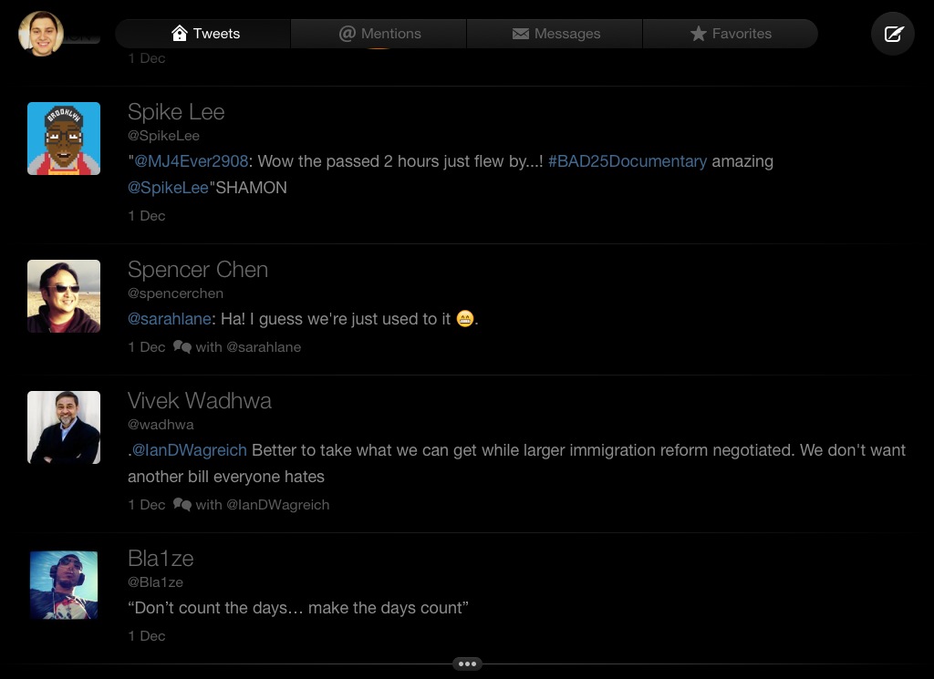
Check out some screenshots from Twitterrific 5 in the gallery below.
-

- Tweet options show up when you tap a tweet
-
- Font options
-
- Direct message threads are blue to set them apart from the other feeds
-
- Following and follower lists use the same grid
-
- User search
-
- Compose screen
-
- Profile screen
-
- Composing a reply
-
- Reply/conversation view
-
- Signika font
-
- Options for accounts you follow
-
- Search for people or phrases
-
- Swiping from left to right lets you reply to the tweet
-
- Main feed, dark theme
-
- Calluna font
-
- Replies view
-
- App settings
-
- Proxima Nova font
-
- Account switcher
-
- Museo Slab font
-
- Search for a term
-
- Settings, theme options, and more
-
- Swiping gesture in action; conversation icon on the right of the swiped tweet.
-
- Light theme, wider spacing
-
- Dark theme, narrow spacing
-
- Replies view of a @horse_ebooks tweet
-
- Account switcher
-
- More tweet options
-

- iPad compose screen
-
- iPad timeline
FTC: We use income earning auto affiliate links. More.


Comments