
The App Store has been around since iOS 2.0 (back when iOS was still called iPhone OS), and has undergone a variety of changes since it was launched. Aside from countless new features that have been added over time, the store has also seen several redesigns.
With iOS 9 set to be announced on Monday, let’s take a look at some ways Apple could simplify the App Store interface while making it more consistent with other apps and adding some much needed functionality tweaks.
Inspiration
First there are a few main points that need to be addressed to help you understand where some of these ideas and changes are coming from. Earlier this year Apple started seeding beta versions of its upcoming redesigned Music application. That app introduced several new UI concepts that had previously not been seen in any of Apple’s software.
A second factor that helped influence these design changes (to a lesser degree) is the rumor that iOS 9 will change the system font to San Francisco, the typeface created for the Apple Watch. All of these mockups use that font.
Click any of the mockups below to enlarge.
Featured, Explore, and Search

Let’s start with the Featured and Explore pages. These are two of the first things most people see when they open the App Store. There aren’t a whole lot of changes that I’d recommend here, but there is one notable difference. As you can see in the images, the Search tab bar button has disappeared, and there is now a search button on the top navigation bar next to the Wish List button.
This change was inspired by the iOS 8.4 Music app. There’s no real need for a entire tab bar button for this feature. Everything that’s currently on the Search tab can be moved into a new view that shows up when you tap that button. By putting the search button in the app’s navigation bar, it’s just as accessible as it is in the tab bar, but it’s more in line with the Apple’s other software. There’s even precedent for putting the search button next to another one in the navigation bar—just look at the Calendar app.
Tapping the search button brings up the same Trending Searches list along with the keyboard and search bar. Again, this is a design that’s taken directly from the Music app beta, which handled trending iTunes Radio searches the same way in one build. That app only listed five top searches, while this mockup lists ten to maintain the same number as the current App Store design.
Wish List and Purchases
The Purchased list is currently accessible through the Updates tab. It has been since it was first introduced several years ago. Unfortunately, Apple has been pretty inconsistent in how it handles the location of this list across its stores. In the App Store it may be in the Updates tab, but the iTunes and iBooks Stores give it a whole separate tab. I’m not convinced that this feature really deserves its own tab, though.
Originally I had considered moving the Purchased list (and the Wish List) onto the Explore page, but eventually, through a little brainstorming with 9to5’s Michael Steeber, I settled on something better that makes both of those screens more readily available.
In the new Music application, the iTunes Radio history screen is divided into two sections: “Played” and “Wish List.” Following that lead, I’ve added a division between two similar types of lists in the App Store: the Purchased list and Wish List.
Now when you tap what is currently the Wish List button (again, accessible from any screen just like the search function), you’ll be able to pull up your purchase history as well. Not much about the purchase list itself would change, making it just as quick and easy to access as the Search screen (the buttons are right next to each other), but quicker to actually pull up your content (because, unlike other views, the purchase history list is actually cached and loads instantly with little need for network activity of any kind).
There’s just one small issue with this layout, though it’s easy to address. Currently the purchase list includes a search bar for quickly finding what you’re looking for and a segmented control that lets you switch between your entire purchase history and only the apps that aren’t currently installed on your phone.
Carrying that over to the new design wouldn’t work because there’s already a different segmented control for switching between the Purchased and Wish List views. Instead, I borrowed yet another UI element from the new Music app.
Instead, tapping the ••• button in the upper left corner of the Purchased screen now pulls up an action sheet containing a switch to show or hide currently installed apps. This is similar both in design and language to the “Show Music Available Offline” option in the iOS 8.4 Music app (though the phrasing on mine may be a little more clear).
iOS and App Updates
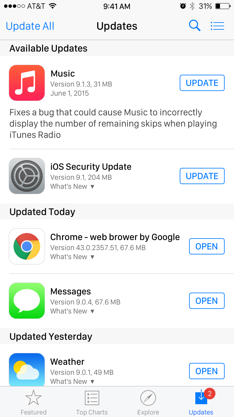
This brings us to our final tab: Updates. (I didn’t mock up Top Charts because there are far too many UI elements to recreate on that page—especially text—just to show off the new font, search button, and four-icon tab bar you can see in all the other images).
On this screen I had to make one concession regarding the placement of the Update All button. Since the dawn of time (or at least, the initial inclusion of that button), it has always been located in the upper-right corner of the screen. In order to accommodate the new ever-present search and list buttons, however, I had to move it to the opposite side of the screen. It’s not a big change, but if it were to happen it were certainly frustrate some users (myself included) who repeatedly hit the wrong button out of reflex.
However, that one relocated button is the smallest change I’ve added here. The Updates tab is the one that needs the most functional revision. Currently it only serves to show available updates to third-party apps you’ve installed (and to lead to the Purchased page, but that’s now moot). It’s time to give this screen a big capability boost.
This change was inspired by two very different sources: OS X and Android. Like its mobile counterpart, the Mac App Store contains five tabs, three of which are the same across platforms: Featured, Top Charts, and Updates. The Mac’s Categories tab lines up roughly with the iOS Explore tab (I even considered renaming the Explore tab to Categories in my mockup, but decided against it since the Featured and Top Charts tabs already have buttons with that name).
The Mac also has a Purchases tab, which functions like the list I moved around on iOS earlier. An ever-present search bar on the Mac App Store gives users access to that function at any time, just like my redesigned iOS App Store. It’s easy to see how the design of these two App Stores have influenced each other, so let’s take it a step further.
Depending on how long you’ve been a Mac user, you may recall that an app called Software Update previously handled system updates. These days that app is gone (unless you use Apple software on Windows!), and the Updates tab on OS X provides updates not only installed third-party apps, but for the entire Mac operating system. Security patches, OS X updates, new versions of Safari and iTunes, and much more are distributed through this tab.
On iOS, “Software Update” is still tucked away in the Settings app where most people never go. For the sake of consistency and ease of use, it would make a lot of sense for Apple to move iOS system updates and security patches into the App Store.
Let’s go beyond that, though. As I mentioned earlier, Android was also an inspiration behind this change, and this is where that comes into play. On Android, built-in applications like the messaging app, browser, phone dialer, and even the home screen (or Launcher, as it’s called over there) can all be updated independently of the operating system through the Google Play Store. This allows the company to rapidly iterate on its software and add new features and fixes. In fact, Android users should be familiar with the term “Update Wednesday,” or the day Google releases most of its new mobile updates each week.
Apple needs to bring a similar update mechanism to iOS. In my mockup, you may notice that several built-in apps are included among the updates: Messages, Weather, and Music. A third-party app (Chrome) and an iOS security update are listed as well.
I’m not arguing that users should be able to delete the built-in apps and re-download them on the App Store. Just that the interface for updating them should be combined with App Store updates.
Considering Apple’s recently gained reputation for subpar software releases (see iOS 8.0 and 8.0.1 for just a few examples), it wouldn’t be such a bad idea for the company to include the ability to quickly respond to bugs with fast, individual releases that don’t have to wait until a whole iOS update can be pushed out.
A Messages update could introduce a change to allow voice clips to be sent along with photos. A Music patch could, as seen in the mockup, fix a small issue with iTunes Radio or some other component. Some updates could also bring along updated system frameworks and libraries. Imagine if Apple could improve performance in the webviews in every app just by pushing out a new version of Safari with a WebKit update through the App Store.
Rebooting your phone and doing a lengthy iOS update just to fix a Music glitch would be a thing of the past (although some updates, like security fixes would still require a reboot). In theory, even SpringBoard (the app that powers the home and lock screens, among other key system features) could be updated and restarted much faster than the time required for a full reboot.
Of course, if this were to happen, some users might question if big iOS updates were even necessary anymore. The answer is a resounding “yes.” As with Android, new iOS APIs for developers would still need to be released, and major iOS updates are just the way to do that. Each major release could ship with updated built-in apps to take advantage of new system-wide features, then subsequent bug-fix or new-feature updates to those apps could be released one at at time as needed.
One Final Tweak
There’s one final, very minor change that I’d make to individual app listings. When you open an app’s page on the store now, you’ll see screenshots of the iPhone version as well as the Apple Watch version, if the app has one. I’d set the Apple Watch section to be hidden unless a watch was actually paired with the phone to help keep the pages clutter free.
Conclusion
So there you have it: a handful App Store changes that, in my opinion, would help make the app a bit easier and faster to use while providing a big boost in the importance of the Updates tab and finally giving Apple a way to remove the obscure Software Update panel in the Settings app.
How many of these changes do I expect to see Apple make in iOS 9? Unfortunately, none. Perhaps the company will eventually see the merit in rearranging certain UI elements to make them more accessible or consistent with apps like Music and Calendar, and maybe one day someone will finally insist that they combine the various software update screens into one interface like on the Mac, but I’m not holding my breath for any of these changes to show up on Monday.
FTC: We use income earning auto affiliate links. More.

What about ratings? I often use rating to see if the app is usable and is as what the developer said it is.
I’d like to see more improvements in that area, like letting devs reply to negative comments, report the comment to have the user contact the dev instead, and so on.
Yes! I would love to see developers gain the ability to reply to negative reviews. It’s not a section I use often, but for developers that would be a big advantage. I believe Google allows this already. Apple should, too.
Updating system apps in the way described is partly already possible since iOS 8 caused some built-in apps to use a sandbox that resembles one of an App Store app (a few were this way in iOS 7 too if I recall correctly) – previously they’d either run completely un-sandboxed or with sandbox rules but would still use a global home directory (/var/mobile) rather than a confined sandbox directory (/var/mobile/Containers/Data/Application/F8D21AFD-9CB0-4FC9-9A7D-D959F173E6F0). I say partly because the app itself is still in /Applications (which can’t be written to except from the special OS used during system updates).
Calculator, Mail, Maps, Music, Photos, Podcasts, Safari, Tips, Weather, and WebApp (used for full screen web clips – do people still use those?) all seem to be using this. I could only imagine more being brought over to this in iOS 9, especially with the rumor that some built-in apps are getting iCloud Drive integration (if you’re going to be dealing with data, you might as well get the app working in a sandbox directory too).
That still doesn’t make it 100% straightforward, however, because there might be daemons that need restarting, frameworks that are used by various apps which then requires all of those apps have to be restarted, and so on. Even if you don’t notice it, a lot of private frameworks get loaded into apps implicitly by virtue of the app linking against a public framework. Of course, a restart of SpringBoard and any background processes would fix most of this easily. We’ll just have to see what Apple does, if ever, I suppose.
I didn’t realize so many apps were sandboxed in iOS 8. Hopefully that signals some intent to move to this type of system one day, but I don’t know. Apple seems to be slow to make any big decent changes.
I’ve often felt the reason why Apple’s system apps don’t get updates outside OS updates is to reduce complexity. They don’t have to worry about backwards compatibility since the app version is explicitly tied to OS version. You end up introducing a heck of a lot more issues otherwise. And this probably explains why outside major iOS version upgrades, the system apps largely remain untouched.
Bring Back Steve Jobs! The “i” prefix to all new products has disappeared since his departure from this Earth, and so has the impeccable Quality of the Software, and even the Hardware! Whatever Apple changed after Mr. Jobs was no longer with us, PLEASE put it back to the state it was in BEFORE he left us. Don’t let Apple become just another flakey, undependable, unstable product. Thats what we have MicroSoft and Android for! Thank you….
I’d love to see the non-core iOS apps separated from the OS and added to the App Store (stocks, voice recorder, tips, newsstand). That way if you chose a third party app which is better than the iOS equivalent you don’t need to have it there taking up space on the home screen. Even a disable feature similar to android would be better than what’s in place now.
Updating individual iOS apps like Messages, Music, Safari though the App Store would be great. Look at the recent Messages bug, would of been easy to push a fix. Although I still think major updates to the system should still be handled through the settings app.
The redesigns you mention would be welcomed too, have the way the iPad and iPhone Appstores have the search in different places, it’s just one annoyance that I get right away.
Agreed that some (not all) of the built-in apps should be moved to the App Store. Lots of useless cruft is pre-loaded. Especially when you start getting into stuff like Tips. Obviously some key apps like Mail, Safari, Messages, Phone, Music, and so on would need to be permanent since some system features depend on them, but there aren’t any system-wide Stocks, Weather, or Voice Recorder features. Heck, even Podcasts and iBooks could probably go back to the store like they were before.
I’ve always wondered why this was not the case before. Keeping them in the store and letting users who want them download them (but with deeper-than-normal system integration like iBooks and Find My Friends) was such an elegant solution to pre-loading non-essential things.
Apple may do this eventually, but I’m glad they haven’t yet. In the two months I’ve been waiting for my watch, I’ve at least been able to examine some apps, wishlist some, purchase others… in anticipation of my watch arriving.
It was easier to review them when they were being freshly promoted. That whole time I didn’t have a watch paired to my phone, but I was at least able to enjoy some of the watch momentum, despite having the longest delivery time of anyone else that I know, who ordered on April 10.
Come to think of it, in some cases a person’s most loved app getting a watch interface may be something that pushes a handful of people over the edge, so with that in mind I’m not convinced Apple will ever hide the enticement.
The thing about waiting for your watch and looking at apps in anticipation is a fair point. Perhaps a toggle in the App Store page of the Settings app could be used to hide it instead? Apps that support Apple Watch already get a little badge with the watch app icon that says “Includes Apple Watch app” or something, so I think that might be enough to suffice. Maybe tapping it could load a watch app-specific page with more details? Apps also announce watch support in their change notes, so that’s another way to know when one you have installed gets it.
But yeah, fair point for sure. Leaving it open to exploration by people who don’t have a watch might be a good idea, but turning it off by default unless a watch is paired seems like the logical thing.
The icon just tells you it exists, it doesn’t show you what it looks like. With 12 calculator apps on day one, and about 400 of them today, I really am glad I could see what I was clicking on. Keep in mind, 2 bloody months is a long time… and of course, I expect that to be less of a problem in future releases. Fingers crossed :P
I like the idea of making it collapsible, with it collapsed by default if no watch paired, and opened by default if there’s a watch. I think that’s a good compromise, but still suffers from not gently pushing you into getting a watch by insisting on labelling you a holdout.
I think making people feel like they’re missing out on stuff is a powerful marketing tactic… One that Apple appreciates thoroughly, otherwise the Watch app would have been a separate download rather than a built-in reminder that they’re not part of the cool kids club.
Eh, I’ve seen a lot of Apple Watch app screenshots and not one of them has made me want a watch so far. I don’t know that screenshots of third-party apps are really a powerful marketing tool for something like this. You either want it or you don’t. 90% of what you see in the watch app screenshots is something you can do on the phone anyway, so people who don’t have one will likely not understand why they need a second device to do that when their phone works just fine.
I like having it there too, and don’t feel it’s obtrusive what so ever. If you want to hide it there’s a whole lot of ‘what if’ scenarios you need to consider. What if the person owns multiple iPhones (I used to carry both a work and a personal one., both logged into the one personal account), or what if they are accessing the store on a secondary iPod Touch? Also what about families that have family sharing enabled. The person purchasing the application may not be the one that’s actually going to use the app on their phone now days.
I’d keep it simple and just display the watch options. Even without owning the watch yet, it might impact where my money goes since I’d like one down the line.
Not sure a toggle is practical…if you start doing that you end up with 100 different toggles for all kinds of things and you loose the consistency Apple strives for.
Two months? Jeez. Sorry to hear that. I feel like I’ve had mine forever (04.24.15). I’ve actually loaned my Watch to my brother for a week (and counting) because the newness and ‘wow factor’ wore off and I missed wearing my other watches.
Nice to read an article that points out shortcomings and offer some solutions without bashing the current state of iOS. Excellent point about Apple Watch app showing up only when paired with the device, I could see this becoming part of the App Store.
Thanks! I reserve all my iOS bashing for Twitter ;)
iOS 9 has leaked guys, watch here:
https://www.youtube.com/watch?v=WLv412wCgsU
I would like to see Apple update stock apps on a per app basis, but I don’t think they will simply because the vast majority of people don’t want to be bothered by an update every so often. It only takes 1 bad experience or hearsay for someone to never update again for fear of “breaking” functionality.
iOS 8.0.1 was that bad update for many people. I still see people saying “is this iOS update safe? Maybe I’ll wait a few days just in case,” after that broke all cellular service on the iPhone 6/Plus for half a week. Remember, 8.0.1 was ostensibly released to fix a small HealthKit issue, but ended up having a detrimental effect on the whole system.
By moving to individual app updates, you can remove that risk. You won’t have to worry about a big update that says it fixes one small bug in a single app breaking the whole OS, because the whole OS won’t be updated. Just that one app will.
I think if anything this would solve a lot of the problem you’re describing rather than lead to more of it.
Count me disappointed. I hope Apple provides a lot more innovation than described here.
Hey, sorry my hypothetical App Store tweaks didn’t meet with your approval. If you’d like I can run my next opinion piece by you before publishing to ensure that it meets with your standard for sufficient levels of hypothetical innovation. :P
As convenient as it is to have all software updates in a single place, I’ve always though the system updates in the Settings app and apps in the *App* Store made so much more sense and should have been extended to OS X as well. And along those lines, Apple should push small updates (like security patches) independently of full System software updates like OS X. It would make much more sense than having System Updates in the App Store.
The Apple Watch screenshots in the App Store are there for users to see what the app would look like if they bought an Apple Watch.. I believe Apple won’t be hiding it soon… it’s a means of marketing the watch.
How about letting users make purchases with Apple Pay? You can use Touch ID to pay but you can’t use Apple Pay to make purchases which means you lose the security benefits. You also can’t use Apple Pay for iTunes purchases or the online Apple Store.
The credit card on file with the App Store is often the same one you have on file with Apple Pay, so there wouldn’t be a difference between using Apple Pay and using the actual built-in credit card option.
The credit card that I use with Apple Pay is not the same card that is on file with the App Store. I would like to use my Apple Pay credit card for App Store purchases without having my credit card number stored on Apple’s servers. If Apple was hacked, that would mean both of my credit cards would be compromised and I would be without credit until the cards were replaced. Taking it a step further, I shouldn’t have to give apple any credit card number where it can be stolen or unauthorized charges by Apple could be made. Apple is denying its own customers the very security benefits that it promotes with Apple Pay. For some reason, because it’s Apple, it seems you are saying that’s ok. It’s not ok with me. I work in banking and know the security advantages of Apple Pay over providing your credit card number to a merchant, and Apple is a merchant too.
In future iterations of iOS I would like to see Apple consolidate some apps across the OS.
For one; Contacts, Phone, Messages and FaceTime really could be just one app. They are all used for contacting people. The Contacts app alone already provides a functional user interface if Apple were to switch tomorrow. Of course, I would like to see some improvements made, in providing one log of conversations like in WhatsApp.
Now, one merger that is relevant to this story is the Store. I think a major goal here is to simplify the experience. Uniting that experience would be the best way. App, iTunes, Books, Music, Newsstand, Apple Store, Etc would all become the Store app. It could grow from it’s current incarnation or be completely redesigned.
Just some water cooler thoughts…
Messages should still be a standalone app, but agreed on Contacts, FaceTime, and Phone. Actually for a long time (and possibly to this day) FaceTime and Phone actually *are* the same app bundle, it just contains the resources for both applications and shows them both on the home screen. Don’t know if that changed in recent years, but that’s how it used to be.
Putting all the stores into one app would be a tremendous misstep. There would be so many different things all trying to compete for attention that there would be no room for anything at all. You only get 5 tabs on the bottom of the app. Do you dedicate one to each store? How then do you separate the Featured page on the App Store from the Charts page? If you give each of those a tab at the bottom of the main app, where does the iBooks store go? There’s no more room for it.