
Alongside beta 3 of iOS 8, Apple has released the third preview of OS X 10.10 Yosemite to developers. The update is available in the Mac App Store and under Software Update. We’ll be updating this post with new discoveries. You can let us know what you find at tips@9to5mac.com.

– New QuickTime icon
– Bookmark folders are now accessible via the address bar in Safari.
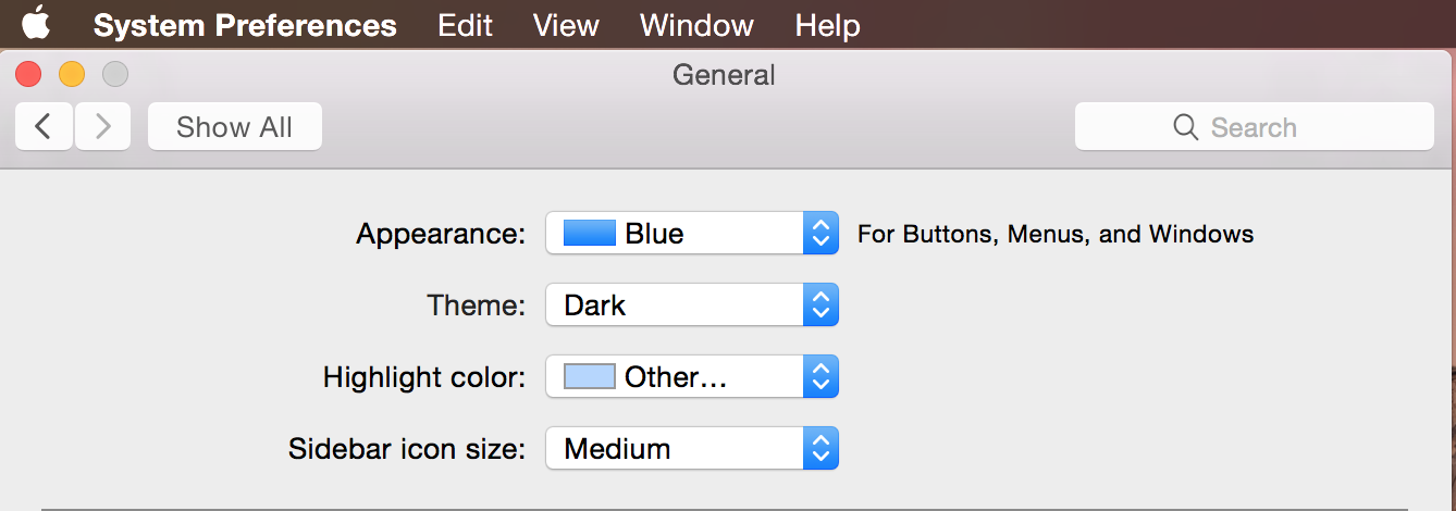
– Dark Mode has also been enabled.
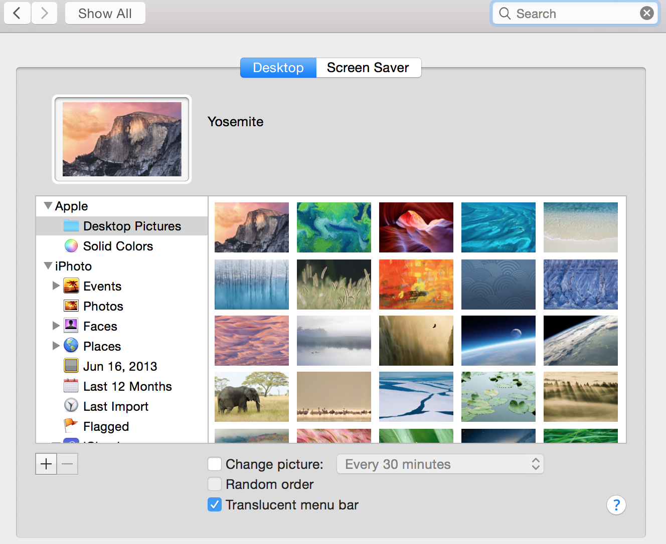
– Interface tweaks in System Preferences wallpaper chooser.
– Larger badges on App Icons for Notifications and improved font in Notification Center and in Safari Favorites Bar.
– Redesigned icons in Mail.
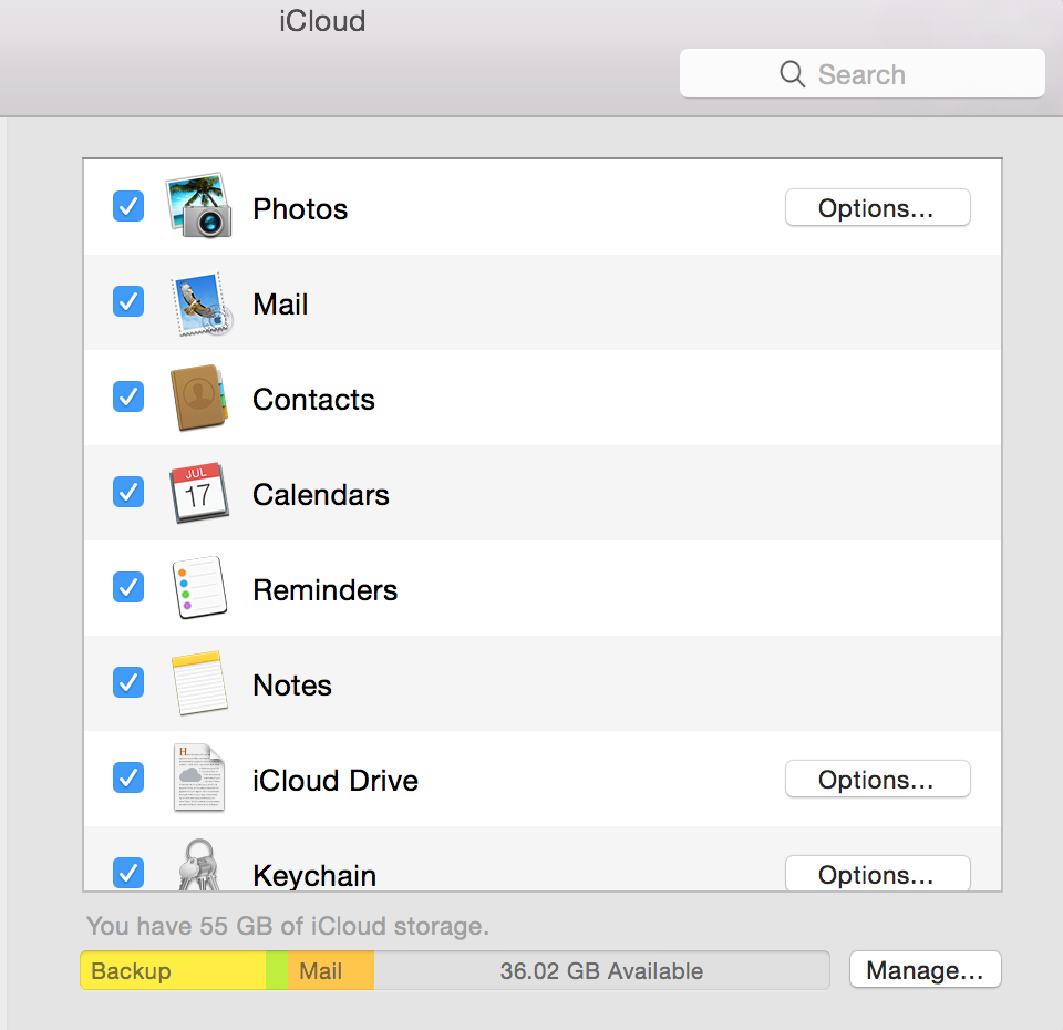
– UI Tweaks in iCloud preferences.
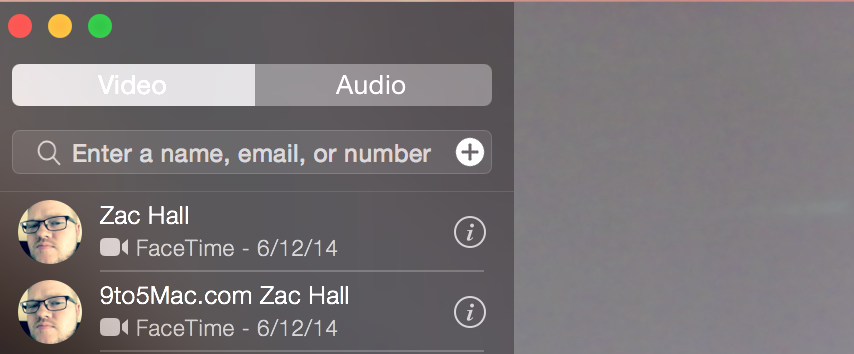
– FaceTime Audio and Video are separated:
Updated Time Machine UI:

FTC: We use income earning auto affiliate links. More.


Has anyone received the confirmation email from Apple regarding the Yosemite beta program?
Not yet. They said this summer, so technically it can come this week or the last week before the semptember event. :( I’m anxious about it too.
I installed beta 1 and I’m not a Mac dev. I am an iOS dev, but that shouldn’t count. I joined the public beta and just downloaded it. Can’t even remember if I clicked an email link or got it from the dev centre, but I got it.
Thats not Beta my friend, Apple let’s iOS dev’s get the OS X Yosemite Developer Preview. We are still at least 1 more Developer Preview away from public beta or maybe even 2. It’s not ready for public use at all. Too many bugs and too many polishes needed for Apple to give out a public beta. Remember when the public beta launches, it needs to be stable enough that people can have their important files and use it every day without any system-wide errors that might occur in a Developer Preview.
FaceTime isn’t even working properly and still 30% of the apps needs new icons, interface overhauls and so on. Not to mention iTunes. They would get really bad feedback if they seeded a public one as it is right now.
Also if the public beta had started it would be all over the internet just like DP1 was.
now you can activate dark mode in settings app :)
MUCH better. Darkened/Bolded UI fonts that were previously way too late. Also slightly darker app windows in focus, making it no longer look like the app in focus was actually in the background. Eureka.
Macs that don’t support handoff nolonger have the option in general settings.
Safari fullscreen finally looks normal. it used to be very dark, and when in fullscreen, the bookmarks bar and other icon was dimmed. now it’s perfect !
The have made some improvements in Mail App. IMAP Mails with my own Server are now working.
Mail and Calendar for Exchange suddenly works perfectly and fast. New color palette for calendar items.
New dynamic Folder Icons for Safari > Favorites
what do you mean ?
Can someone post proper screenshots of dark mode? The one in the article is just a screenshot of the corner.
Please post MORE PICS with the DARK MODE :)
Would like to have seen Dark Mode go as far as changing actual UI in apps like FCPX etc.
You can change the UI buttons and so on by changing the appearance to Graphite, but Apple won’t make the whole UI dark, they said they just wanted to get rid of bright menubars and docks by using the dark-mode so that they won’t be so distracting.
I use my mac as personal. can I do the upgrade to Yosemite or is not recommended?
Up to you, I’ve had both seeds on and restored via time machine both times. Just too unstable right now, my machine is a dev machine but I would rather avoid the new features than have a laptop that is constantly freezing. Mavericks runs like a dream, I will wait on this one. In case you’re wondering, late 2013 retina macbook pro 15 inch with 512 ssd and nvidia 750.
I’d wait. Running it on a development retina mbp and there is some real funky stuff going on that will annoy you if it is your personal machine. For example I’ve had some total failures just trying to watch video in Safari, and Chrome is still super crashy on the dev box.
Assume that when Apple releases the public beta it is ready for public consumption.
And no new iTunes yet…
itunes is a separate app.
There is also a new FontBook icon, new ‘Users & Groups’ icon, Face Time is glitchy as hell, Hand-Off works better, Spotlight icon in the menubar is barely visible during Dark Mode and iMessage is slower.
Phone Continuity is working on the iPhone 4S now, still can’t get handoff to work at all
This one surprised the heck out of me! All of a sudden my computer was calling me. It was probably the most exciting thing this month. That probably just reflects poorly on myself though :S
I honestly wish they had kept the old Time Machine interface. It was crazy cool.
how do you enable dark mode?
like got it
dammit *sike hahhah.
The old time machine UI was just awesome, bad move Ive
stars were cool but kinda corny + it doesn’t really follow the trends of getting rid of skeuomorphism.
Uh oh, App Store icon shadow still cropped at the bottom ;-)
What do you mean?
Place the App Store app next to the iBooks app in the launchpad (or in the dock at maximum magnification) and compare the shadows at the bottom. I know i’m nitpicking ;-)
There is no shadow under the App Store icon nor any other icon for what matters.
OS X 10.10 DP3 calendar suffers from the same disease like iOS 7.1.2 and OS X 10.9.4.
I partitioned one of the drives in my Mac Mini 2012 i7 and installed Yosemite DP3 on it . I really enjoy it. But some times goes panic crash and restart by it self. Why any help plz.
QuickTime is support slo-mo
Any ways to force the Mac App Store to pick up that you should be receiving the update?
Have 10.10 Preview 2 with the device hardware ID registered and all through the Dev Center but oddly not seeing it pop up as a download.
they’re really compromising the potential of the dark theme if they don’t make changes to all windows across the system, that will just look messy.