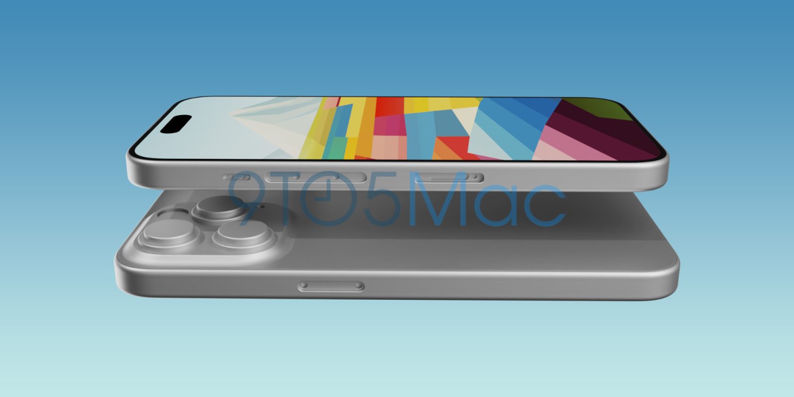
9to5Mac yesterday gave an exclusive first look at the iPhone 15 design, based on CAD drawings provided to a reliable casemaker.
It appears to be a truly beautiful evolution of the flat-sided form factor first seen in the iPhone 4, revisited in the original iPhone SE, and then revived for the iPhone 12 to iPhone 14 …
iPhone edges over the years
The original iPhone had a very rounded design, with a curve that began on the front bezels, continued around to the sides, and blended into the back. I picked up mine just now, to confirm what I was describing, and it still feels like a cute design.
Next up was the iPhone 4. This had a very different look, with flat sides that made it look less cute but significantly more modern. Apple stuck to this look through to the iPhone 5s – and I loved it.
With the iPhone 6, the company clearly thought it was time for a change, giving the device rounded sides that were retained through to the iPhone X.
I was never a fan of this. Indeed, it was one of the reasons I “downgraded” from the iPhone 6s to the original iPhone SE, which was given the retro flat-sided slab design.
Apple stuck with the rounded edges when it launched the iPhone X. Despite the radical shift in design, from a chin with a Home button to an all-screen front, the new phone still had the same rounded edges as its predecessors. The iPhone 11 likewise.
This changed again with the iPhone 12. Finally Apple combined the all-screen front with the classic slab-sided edges. This was, to me, a huge improvement – though I was less keen on the polished finish.

The iPhone 13 was largely unchanged, and the iPhone 14 Pro of course replaced the notch with the Dynamic Island, but the slab-sided form factor remained.
First look at the iPhone 15 design
We first got wind of two apparent changes to the iPhone 15 design late last year, when ShrimpApplePro indicated that Apple was working on a titanium casing, which would have a rounded back rather than the square edge of current models.
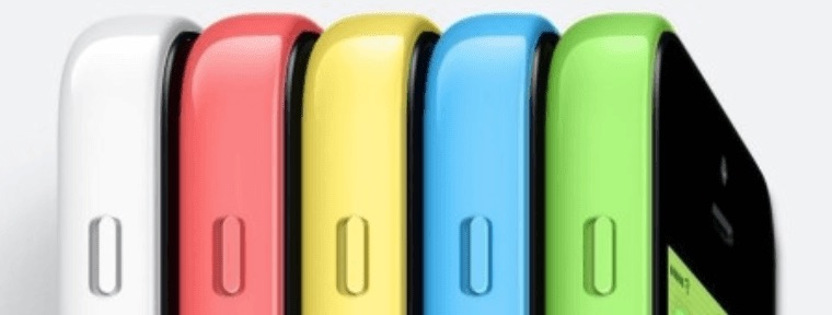
One suggestion was that this might be a curved profile similar to the iPhone 5C – of which I was not a fan – while another was that it would blend flat sides with a rounded back, along the lines of the MacBook Pro.


Having gotten our hands on a CAD model of the iPhone 15, Ian Zelbo set to work creating renders to give us a much better feel for the look of the new design.
Thankfully, what we see is indeed very similar to the MacBook Pro design: a completely flat side, with tight-radius curves front and back.
Even better, a subsequent image suggests that – for the two Pro models – Apple is not only switching from stainless steel to titanium, but with a truly beautiful-looking brushed finish.

That looks absolutely perfect in silver, and a black version would also look amazing.
Take my money
Given the annual camera improvements, I’m pretty much resigned at this point to upgrading every year – and the expected periscope lens is the big change we’re expecting on that front (for the Pro Max).
Top comment by Xtreme
As someone who enjoys using a case-less “naked” iPhone, the huge camera bump seems to be asking for the phone to be housed in a case to minimize the effect of the bump — detracting from the overall beauty of the product in my opinion.
The switch from Lightning to USB-C port is also a big part of the appeal for me. The sheer convenience of being able to use the same chargers and cables for MacBook, iPad, and iPhone is a winner – as is faster transfer of 4K video from the phone to Mac.
But throw in the new profile and brushed titanium finish, and it really feels to me like this year’s iPhone is actually going to live up to the standard keynote hype of an all-new device. Sign me up for the iPhone 15 Pro Max.
That’s my view – what’s yours? Please take our poll, and share your thoughts in the comments.
More caffeine consumed, and poll options corrected …
FTC: We use income earning auto affiliate links. More.


Comments