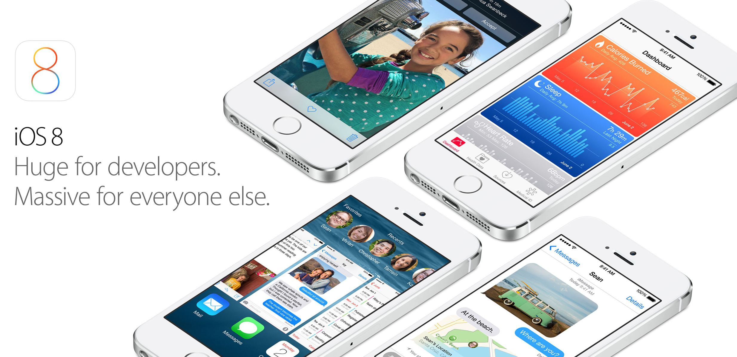
In the several months leading up to Apple’s 2014 Worldwide Developers Conference, we reported on several features on tap for iOS 8, the new iPhone, iPad, and iPod touch operating system, and OS X Yosemite. Many of the features we reported on were announced last week: improved messaging, revamped notifications, various user-interface enhancements, indoor mapping, iCloud improvements for end-users and developers, Shazam in Siri, Voice Memos improvements, the redesigned Mac interface, multi-resolution mode for Xcode app testing, and of course, health-tracking integration. But some of the reporting did not become official last week. Namely, the Healthbook name, various improvements to Apple’s controversial mapping software, and a split-screen iPad multitasking mode.
Let’s go through each feature one-by-one.
Healthbook:
While Apple did, indeed, announce a health tracking application and an API for partners to hook into, the interface did not match up with our screenshots from March. The reason, a source confirmed this week, is that Apple revamped the user-interface and dropped the “Healthbook” name late in development due to the leak. While the icon and interface is new, the entirety of the earlier reported functionality and in-app graphics are identical.
Let’s take a look:
Here are our screenshots of the Healthbook cards interface from March:
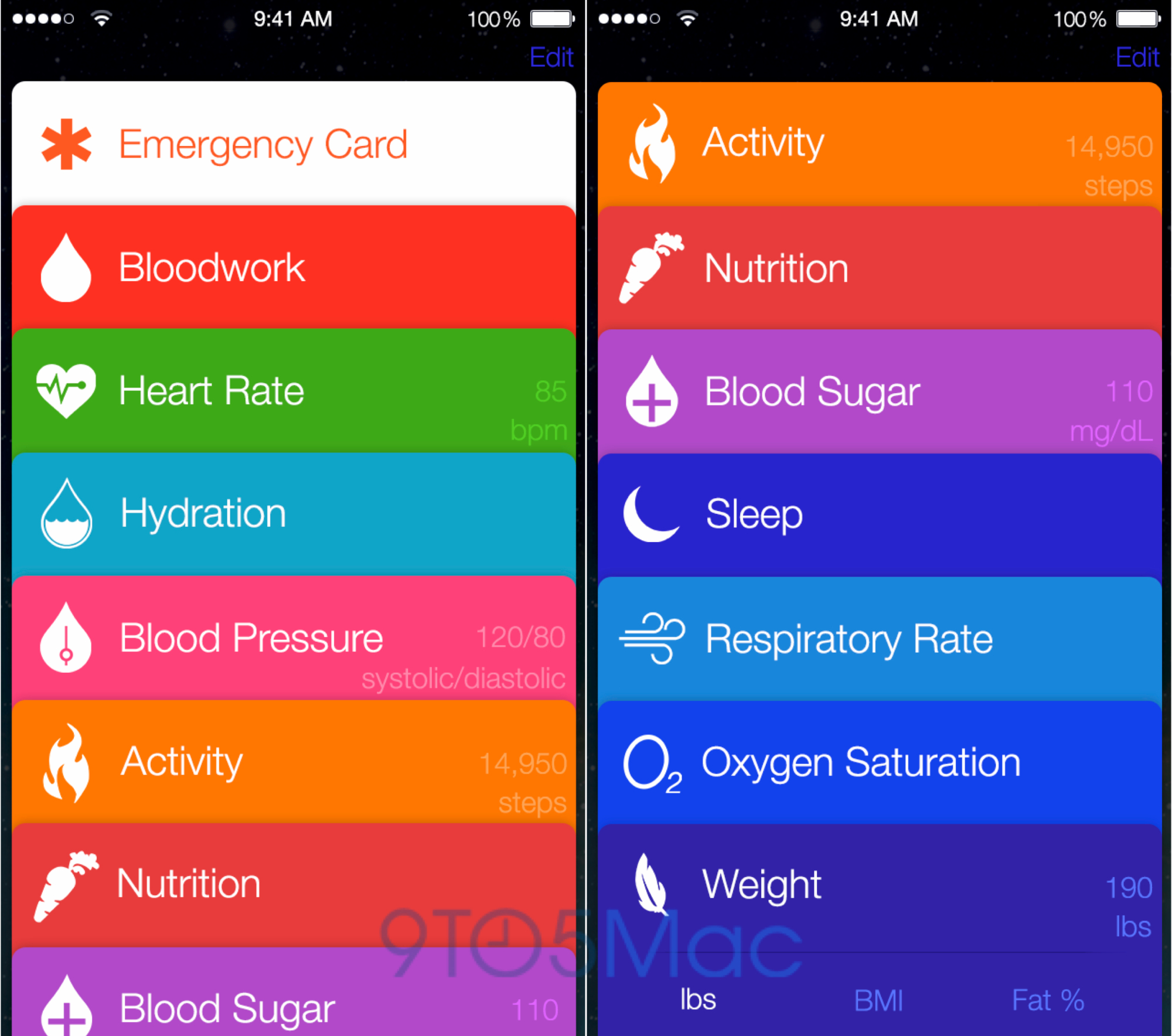
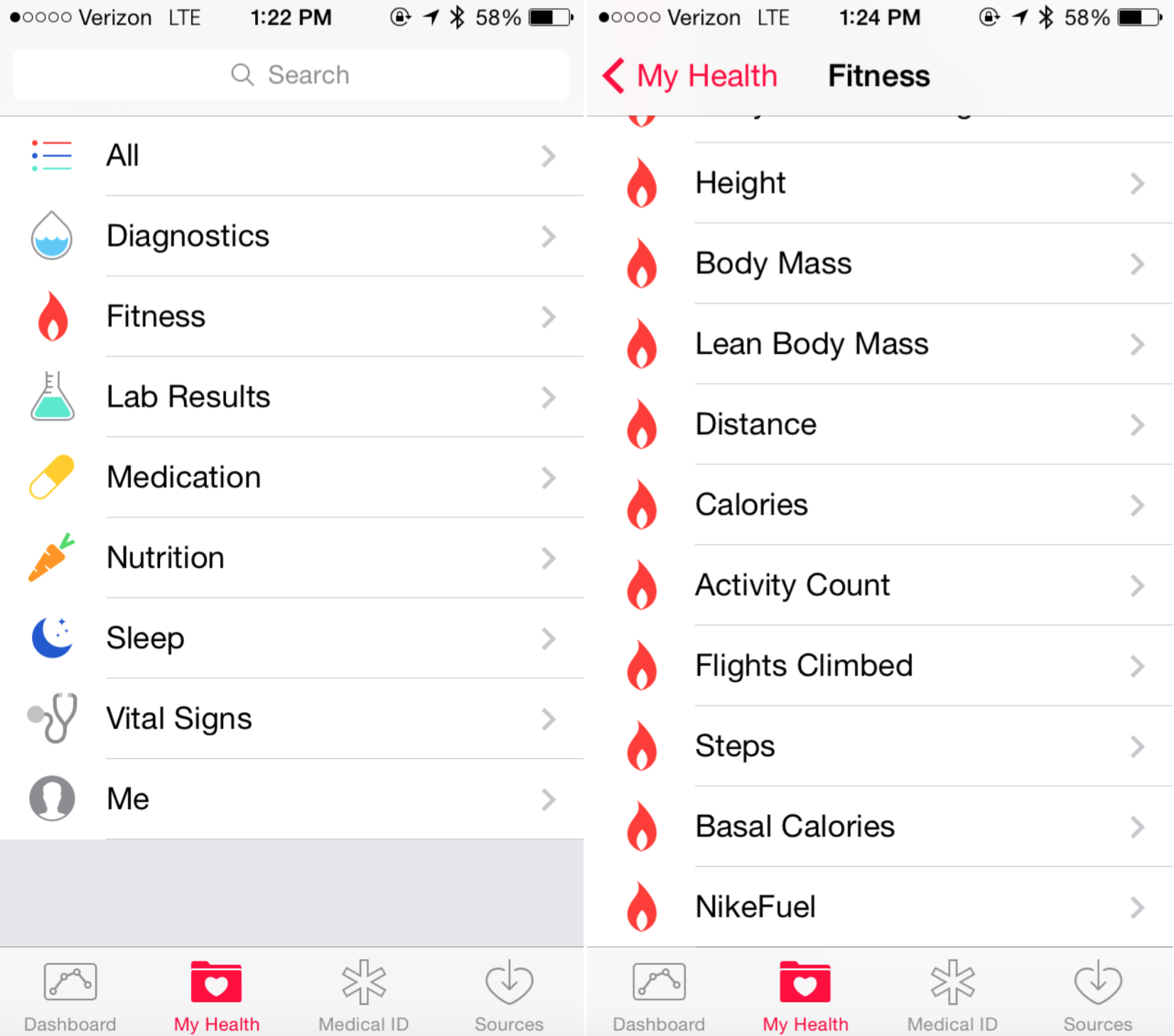
Here’s the Health app interface from beta 1 of iOS 8:
As you can see, the icons for each data point are identical in our March screenshots to the ones in the current iOS 8 build. The only change is the overall interface, and many Apple employees that I have spoken to agree that the original Healthbook UI is far superior in usability than the current look.
Here’s what the “Dashboard” graphs looked like in our March screenshots:
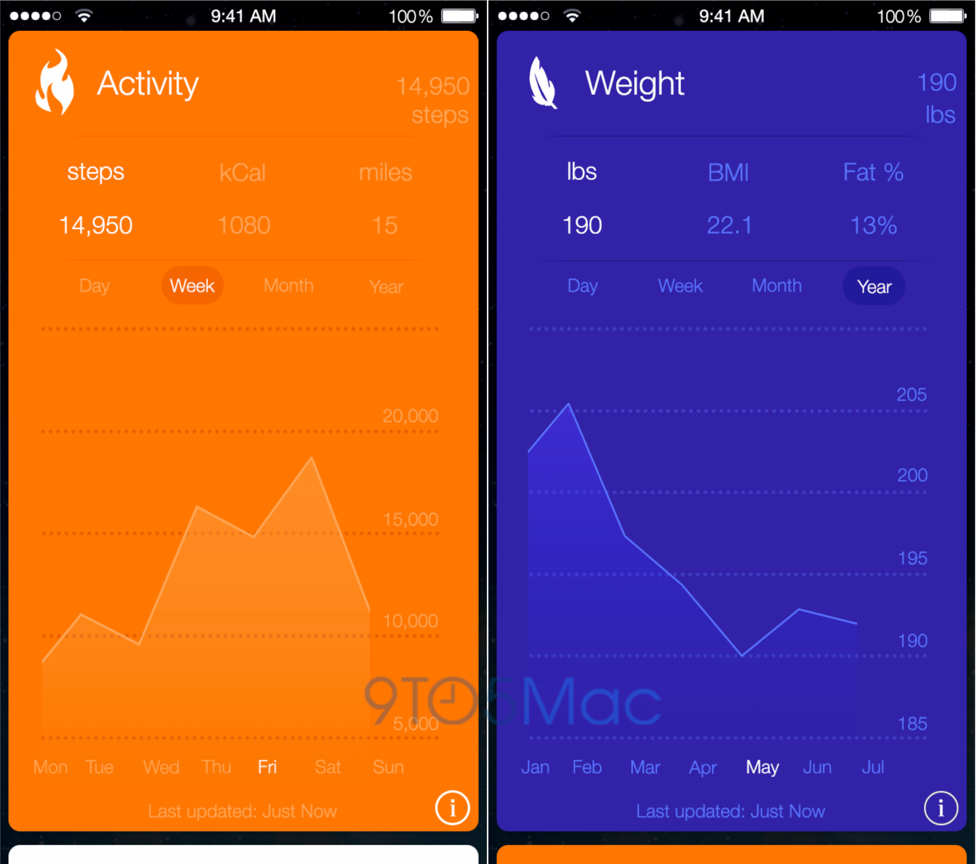
Here’s what it looks like in the newer Health app:
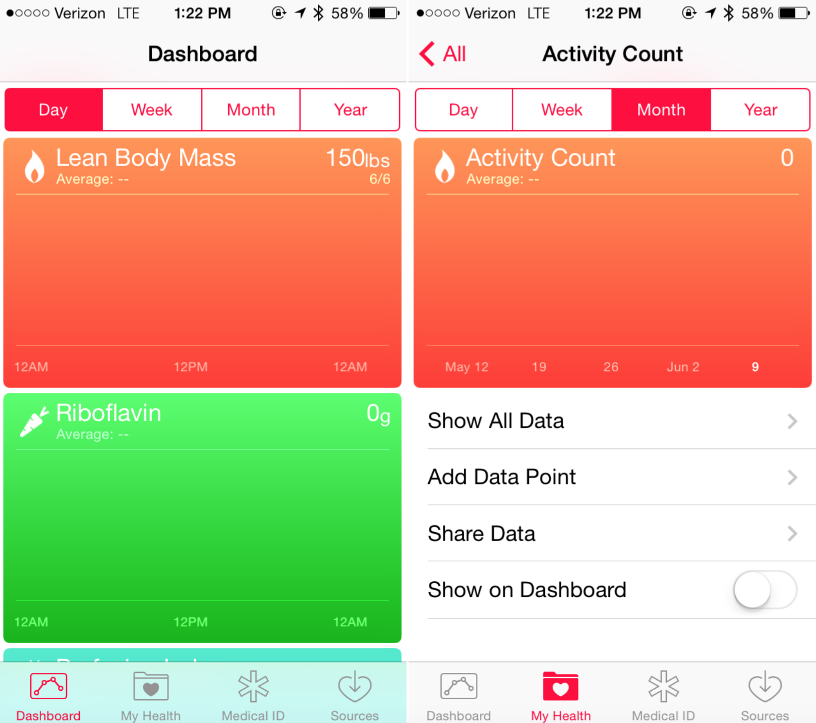
As you can see, the interface is nearly identical. Hamza Sood on Twitter has also confirmed in the iOS 8 SDK that the original name was Healthbook:
https://twitter.com/hamzasood/status/476161151668338688
Our original report on Apple’s health tracking application also detailed some features set to appear in a future Apple wearable device, like Maps integration, fitness tracking, and a sensor chipset, and we’re looking forward to seeing that functionality discussed at Apple’s October Special Event.
Maps:

We reported that iOS 8 would include a Maps app update with public transit directions, improved data, a new transit view, and indoor maps tracking. While the indoor mapping functionality was introduced, the rest of the improvements were not. As our own report and TechCrunch detailed, Apple’s Maps team has been facing internal political issues that resulted in the new functionality being delayed. We even reported a couple of months ago that the new maps features would be delayed.
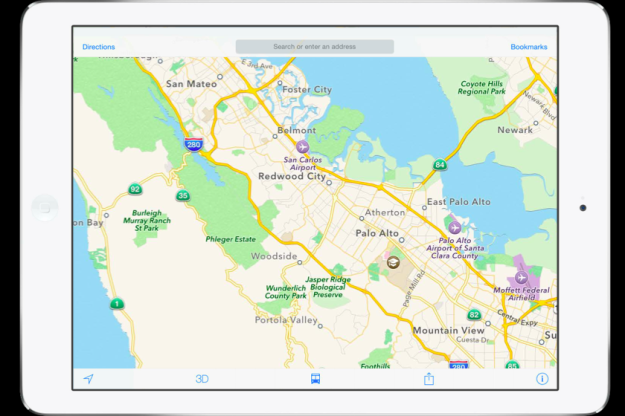
In addition to those reports today, developers have noticed that some Maps interface materials in WWDC developer sessions make reference to a new transit mode. You can see an image of the transit button on the iPad image above. Commenters on that original report have since noted that Apple removed that slide from the presentation.
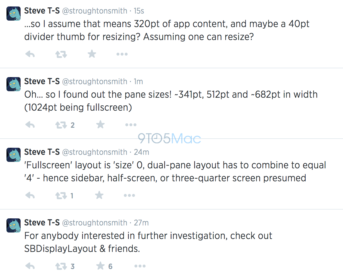
Split-screen iPad multitasking:
A few weeks ago, we reported that Apple is working on a split-screen application multitasking mode for the iPad that could ship as soon as iOS 8. Before WWDC, we reported that the feature would be pushed back to at least iOS 8.1 or even to a future software or hardware update (iPad Pro?).
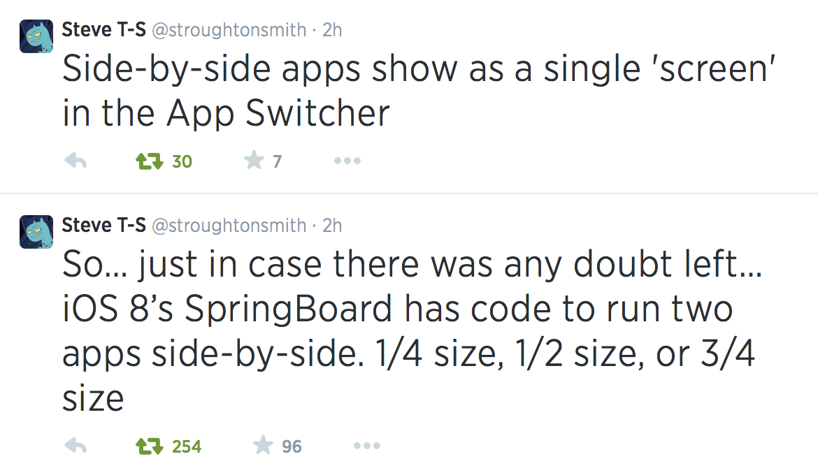
Developer Steven Troughton-Smith has since located code strings in iOS 8 that confirm the functionality to be in development. A source sent in the below screenshot of iOS 8 code that proves this:
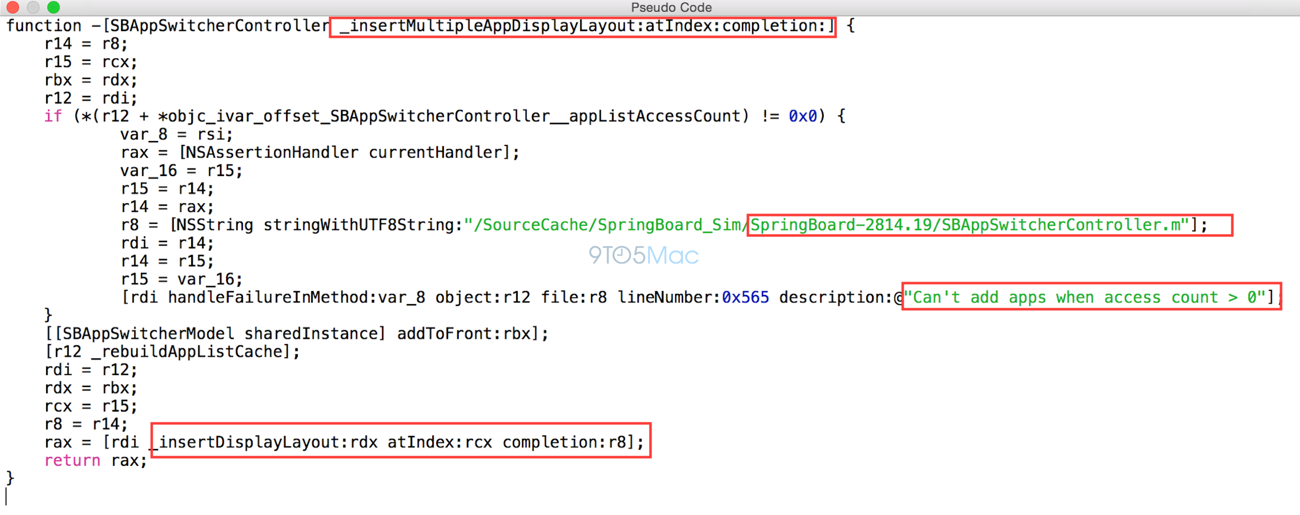
Troughton-Smith explained to us that, based on that above code snippet, Springboard in iOS 8 has support for more than just two apps side-by-side. The interface in testing is dynamic so that one app could take up 3/4 of the screen and the other app 1/4.
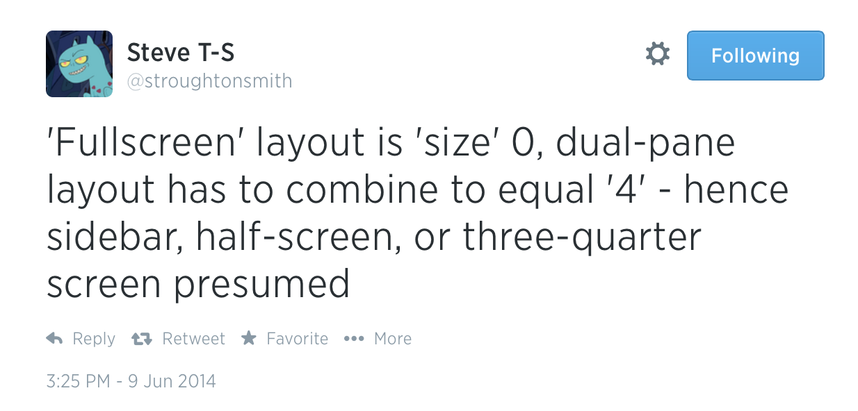
Perhaps future larger iPad models will have the boosted split-screen capabilities and current iPad screen sizes will have the more basic functionality.
Troughton-Smith has some more on multiple apps and screen resolutions:
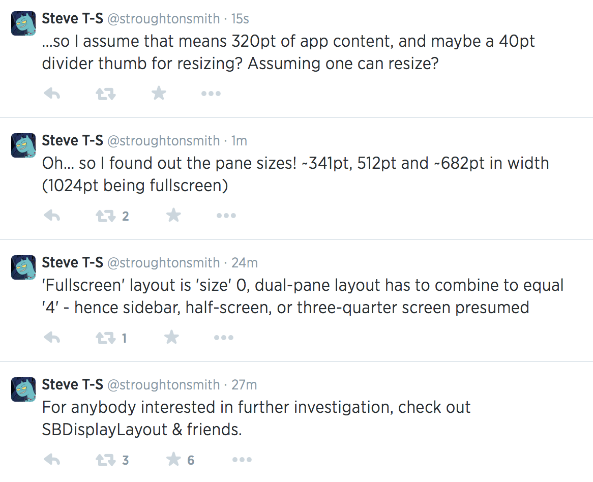
And some code to prove it:
Some other odds and ends on iOS 8:
– The TextEdit and Preview apps we discussed were containers for viewing files stored in iCloud. These features were test apps for the announced iCloud Drive (and the new CloudKit feature we reported on at the same time). Hamza Sood has more on this:
https://twitter.com/hamzasood/status/476162249468706817
https://twitter.com/hamzasood/status/476163466215325696
– The standalone iTunes Radio app was always something we reported was under consideration, not confirmed for release. It is likely that Apple decided to retain iTunes Radio in the Music app upon the acquisition of Beats Music, which will close around the time that iOS 8 ships to the public in the fall.
iOS 8 is scheduled to ship this fall alongside OS X Yosemite. Apple often keeps a few surprises for the final, public release, so it’s possible some of the features not announced at WWDC will make in time for the next-gen iPhone and iPad events.
FTC: We use income earning auto affiliate links. More.


Are you proud of yourselves then, that your leaking screwed up the Healthbook name and design? Any remorse that the hard-working designers and engineers had to settle for solution B because you wanted page views?
Are you serious?? Nobody forced Apple to change the design. They could have used the “old” design and name if they wanted to. And the old design was so much better!
Actually it wasn’t since managing the cards that matter to the user was harder
I don’t know it it’s clear the old design was better.
Why would Apple change a design ONLY because it was leaked? iOS 7 was leaked to a similar extent, with few changes as a result. I admit I like the passbook-like interface better, I just find it hard to believe that they changed the interface because of the leak
Ios 7 wasn’t leaked. There were even actual screenshots for healthbook.
I think it’s BS. Its 9to5Mac’s way of not having to admit they got something wrong.
Some one is getting emotional for no reason, do you really think Apple changed the app as it was leaked, they never did that with iPhones and iPad, there must be another reason for that.
Total rubbish from this guy again, his tweets are worse too after WWDC session. Pls grow up a bit instead of writing BS all the time.
I’m honoured you read my tweets. That’s 5 minutes of your life you’ll never get back. Thank you! On reflection, I guess I agree with everyone who has said that there’s no way Apple would be petty enough to change the design just because of 9to5 Mac. My comment, of course, was heading towards hyperbole, but I was trying to get at a deeper point: when music albums leak before the artist is ready to launch, or scripts for films are shared on the internet, most people agree it’s a bad thing Nd feel somewhat sympathetic for the artist. I argue it should be the same when Apple’s plans are leaked: they are the artists and engineers – why ruin their big reveal? I just think it’s a shame to spoil it.
Samuel, I don’t think agentunited was referring to you, I think he was referring to Gurman.
The iPad apps running at multiple sizes is interesting. Half and half makes sense, with two apps running in portrait on the horizontal iPad screen. And apps taking up 1/4 of the horizontal screen could basically run with the same interface as an iPhone app, only taller.
But I’m not sure how they could incorporate apps running on 3/4 of the screen. What would they look like?
I think half and half is probably the most useless input. It’s usually a list based app you want on the side, like messages or an IRC chat client or something. And perhaps having one app at 1/4 size would allow you to swipe the app around the screen out of your way until you are ready to interact with the app by touching it with a finger
The new Healthbook design is far more usable (e.g. can actually see immediately the periods such as hours, days, months)…
I think it’s funny that 9to5Mac is now saying the alleged original design is better when they (and others) mocked it at the time. The current design clearly fits iOS’s aesthetic much more so than a bunch of different colored cards.
Show me where they mocked it at the time?
When Mark Gurman leaked the “real” screenshot of Healthbook after Michael Steeber created the mockups, Mark Gurman made a snide comment in the comment section something along the lines of “Apple should hire Michael Steeber, pretty sad that Michaels mockup looks better than the real thing.”
I don’t have it saved obviously, but I remember seeing it. If you really need “proof” go search for the article yourself.
Yes, that’s exactly what I was referring to.
I wonder if iOS 8 will also have a dark mode like OS X Yosemite does… I hope so.
Also, the leaked UI of Healthbook looks so much better than the iOS 8 Beta version. I like how its look and name resemble the other twin app – the Passbook.
I’m glad they decided to keep iTunes Radio within Music app. They should’ve kept Podcasts and iTunes U within Music as well. It is annoying that they kept taking elements out from Music and make them separate apps. Keeping them all in one would have been nice.
I prefer them separate since they have their own player UI and their own stores and most people don’t use iTunes U and Podcasts.
iOS does not have a dark mode, sadly. And it’s not clear at this point if the ‘dark mode’ in Yosemite is just dark meus and a dark dock with nothing else dark. I think iOS needed a dark mode far more than Yosemite, but perhaps Apple just didn’t have time this year to work on that and it’ll come to iOS 9 along with other features such as updating cal, clock, alarm, time and weather app icons.
The “dark mode” in Yosemite just looks like inverted colors (it did in the demo anyway), which you’ve been able to do forever on both Mac and iOS.
nverted colours would make the highlight colour orange and it is not orange. And the wallpaper and windows don’t “invert”
Really? It looked like inverted colors? Because the demo I saw just changed the menus and dock to a dark translucent color and the wallpaper and other UI elements did not change at all.
Here’s a screenshot @cjt3007 to make it easier for you to understand http://i.imgur.com/057Xhz2.png
As you can see the highlighted menu colour is blue, inverted would make it orange. And you can clearly see it’s translucent. And the wallpaper and dock icons are their normal colours.
Ah, ok. I just figured that’s what they were doing as it wouldn’t require any new coding/styling. But I’m glad it isn’t going to just be inverted.
i think its entirely adorable that you guys honestly think you’re important enough for apple to completely revamp their design because of a few screenshot leaks. think about it. did apple re-do the entire iPhone 4 design when all the images leaked? they obviously had their reasons for changing and i would put the fact that its previous designed leaked at the bottom.
It’s you who is concluding 9to5 were the reason for the change.
I guess you missed this sentence:
“The reason, a source confirmed this week, is that Apple revamped the user-interface and dropped the “Healthbook” name late in development due to the leak.”
And even this tweet from a week ago: https://twitter.com/markgurman/status/473565076377858048
“I am convinced Apple completely redesigned Healthbook and dropped the “book” because of the leak.”
So.
My bad Chris, that tweet is quite telling. Even if he felt that way he should have kept it to himself. Cringeworthy indeed.
No no no…..you can’t try and make your rumors fit now! Disgusted!
Hmm…I call BS on Apple supposedly changing Health app design because of what 9to5Mac posted. Sorry guys, I don’t think you’re that important.
Who said were the reason?
Who said 9to5 were the reason?
Er, Mark did. He said Apple redesigned it because of what they leaked.
My bad. Someone just linked me his tweet. Can’t believe said that out loud
My bad. Someone just linked me his tweet. Can’t believe he said that out loud
I wonder if iOS 8 will also have a dark mode like OS X Yosemite does… I hope so.
The leaked UI of Healthbook looks so much better than the iOS 8 Beta version. I like how its look and name resemble the other twin app – the Passbook.
I’m glad they decided to keep iTunes Radio within Music app. They should’ve kept Podcasts and iTunes U within Music as well. It is annoying that they kept taking elements out from Music and make them separate apps. Keeping them all in one would have been nice.
Really? I thought it was kind of ugly with all those different colored cards – some dark and some pastel, especially against a black background. I’m sure Apple tests lots of
UI designs before they finally settle on something. And perhaps what was leaked to 9to5Mac was an early design. It obviously wasn’t something Apple was 100% set on.
I don’t like the UI you guys mocked up based on what was leaked to you. The UI doesn’t blend into iOS 7 or iOS 8. The color bands look like shit. Only thing I liked better was the icon and the name. Apple might not stick with the Health app for the name.
I hope so too, but for the opposite reason. I have a white phone and IMO possibly the ugliest most shitty looking part of iOS is the dark, muddy overlay that is the notifications pull-down. It doesn’t fit with anything else. Everything about iOS 7 is white, light and colourful.
If they make a dark theme, then presumably we could choose between light and dark for ALL overlays, making it possible (hopefully) to change the notifications pulldown to a light overlay instead of the current hideous piece of poo that it is.
Ditto for all you developers out there that think that a black icon for your app is cool. Not everyone, (in fact only a *minority* of people), likes “dark.”
9t5… “Identical” doesn’t mean what you think it does. It does not, for example, mean “completely different” as the screenshots of Health and your supposed “Healthbook” demonstrate. There’s not one icon that’s even remotely similar in design between the sets of images.
Apple changes designs and scraps and postpones projects all the time. They don’t do it because a web site caught wind of a leak – don’t get too self-important on us here.
I was going to say, there are a few icons that are the same general concept — fire, carrot, but most are diffrrent and none are identical.
Yeah, I can see the carrot and the flame which is fair enough, but identical is pushing it quite hard. I think Gurman would do well to rewrite that part.
That’s exactly what I was thinking, it does seem a little arrogant, and the whole article does give off the slight impression of attention seeking.
Yeah, same here. This icons are only superficially similar. Certainly not “identical.” Quite a few are completely different. They are only about as similar as you would expect two independent “health info interface” designs to be.
Good to see that iPad split-screen is coming. Imagine FaceTime on 1/4 of the screen and a collaboration app on the other 3/4.
Who said it’s coming?
Imagine FaceTime and stick golf. Games would be hilarious like that.
FaceTime on a quarter screen would give you a postage stamp video. On a phone it would give you a video the size of an icon almost.
Seems like a pretty nasty thing to want IMO.
Haha, I agree, but the article was about the iPad.
With the new iPad Air 2 coming out I better sell my old iPad before the value of it drops. I usually search 9-10 different sites to find the best offer, but I just found this site that compares all the buyback companies in one spot. it’s called http://www.recomhub.com It’s like Kayak but for Apple Devices that show you all the offers in one spot. I’ve used it before and loved it. I highly suggest it to other Apple lovers
This is obvious SPAM. Please try advertising elsewhere or do the honourable thing and actually PAY for your advertising.
My take? It absolutely was called HealthBook early on – a name they never intended to go to production with – but instead was one they planted in an effort to uncover some of the leakers in the company. I’d be interested to know if some of Mark’s sources are brushing up their resumes now…
I agree with John Gruber. I’m not convinced that your sources are correct, as it makes no sense that Apple would make such a change simply because it was leaked. I think the new design is more usable, from what I can from a screenshot, at least, and that is the only reason Apple changed it. The original GUI looks like you’d tap each card to expand it, one at a time, and they take up the whole screen, including a graph that is almost portrait, when graphs are generally landscape. While the revised version shows everything expanded and you simply scroll through, with graphs being in the more sensible landscape format.
Steve Jobs used to do this, which was to purposely give incorrect data to the suspected leaker, so they can fire that individual and stop the leaks from getting out.
do you have any proof of that?
This article is funny. I don’t believe Apple changed anything because of these leaks. And how fitting that Gurman says he gets support from employees saying that Gurman’s leaked design is the superior design. Hilarious. Personally I think the design for ‘Health’ is much better now.
I highly recommend John Gruber’s perspective on this article. I don’t think I have ever seen a more precise use of the word ‘solipsistic’.
http://daringfireball.net/linked/2014/06/09/gurman-apple-priorities
Best of luck Mark. Live to fight another day.
Wow, you are one proud kid, Mark. Grow up or go back to middle school.
Really guys? If I were you u would have just let it go.
My impression if your reporting the last few months vs. WWDC is that you were way off. WAY OFF. How many articles you posted about FITNESS FOCUS boring everyone out of their minds, which ended up taking literally 3 min of the keynote.
I much prefer the new Healthbook design. Not a fan of all the colored cards.
Wow! This is a very obnoxious reporting style.
“Hey everyone! I reported THIS, THIS, THIS, THIS, THIS, THIS, THIS, THIS, THIS, THIS, THIS, and THIS!”
There is nothing wrong with including relevant links to a post, but the sentence beginning with “Many of the features we…” is ridiculous and could have been left out of the article completely. How narcissistic is the author of this article that he feels the need to pat himself on the back for everything he has ever written and then make sad excuses for the things that he got wrong. In case there is any question of how self-absorbed the author is, go click a few of those links! It’s like the Mark Gurman Variety Show starring (you guessed it) Mark Gurman! Of the first 10 links that I clicked on (out of curiosity), only one of them opened to another author’s article… in a SEPARATE tab (unlike his articles that navigate to the new article in the current window) so we don’t leave one of his articles! I realize that all of the authors practice this technique (targeting the new url to a blank window), but it just adds to the annoying tone of this article.
Just sad… If your goal was to create engagement in the comment section for how ridiculously self-important you are… Congrats!
Damn.. people forget really fast what they learned in the past.
Let’s remember Steve’s joke when he unveiled the “brand new design” of the iPhone 4.
Refresh your memory @ 1:45 here: https://www.youtube.com/watch?v=z__jxoczNWc
I think that if someone was really impetuous, Steve definitely was this guy. And I cannot remember him radically changing the leaked design to satisfy its “pettiness”.
Oh the hubris of youth *smirk* Let it go Gurman, you’re not the reason Apple changed the interface or name no matter what you tell yourself. Your original screenshots were more than likely accurate, but that don’t kid yourself into believing you are of such concern to Apple they would do a 180º on account of your posts. Please.