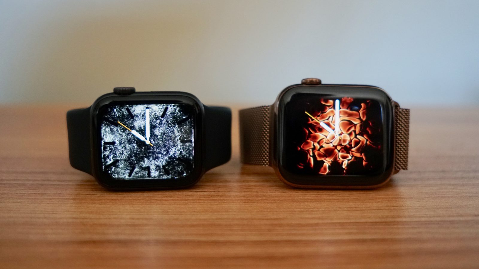
When people ask me what’s different about the new Apple Watch Series 4, my immediate answer is simply the design. There’s way more to Apple Watch Series 4 than its appearance, but the way it looks is arguably the one difference that anyone can appreciate.
The design isn’t so different that Series 4 feels like something different than the Apple Watch on your wrist though. It’s absolutely the biggest external change to Apple Watch since the original, but I’ve encountered a number of existing Apple Watch users who can’t immediately pinpoint what’s different.
I think that’s partly because the first three Apple Watches pulled off a great illusion: blending a thick black bezel with deep black elements using the OLED display. If you’re very familiar with the actual confines of the previous screen, the new rounded corner-to-corner display feels like a serious breakthrough.
While design is a major advancement on Apple Watch Series 4, it’s the features that you can’t see and may never need that matter the most.
Update 12/7: This post has been updated with links to the new ECG app and other heart rate features.
Series 3 or Series 4?
Apple Watch has quickly iterated with at least one major change and consistent speed improvements since the original. Series 1 addressed performance constraints, Series 2 debuted at the same time and added GPS for more precise outdoor fitness tracking, and Series 3 introduced LTE for always being connected without the iPhone.
In day-to-day usage, Apple Watch Series 4 doesn’t feel fundamentally different than Apple Watch Series 3. It’s hard to pinpoint something major that I can do with Series 4 that I couldn’t do with Series 3. The major difference for me is more about how it makes me feel when I see it. It’s just aesthetically more polished in so many ways.
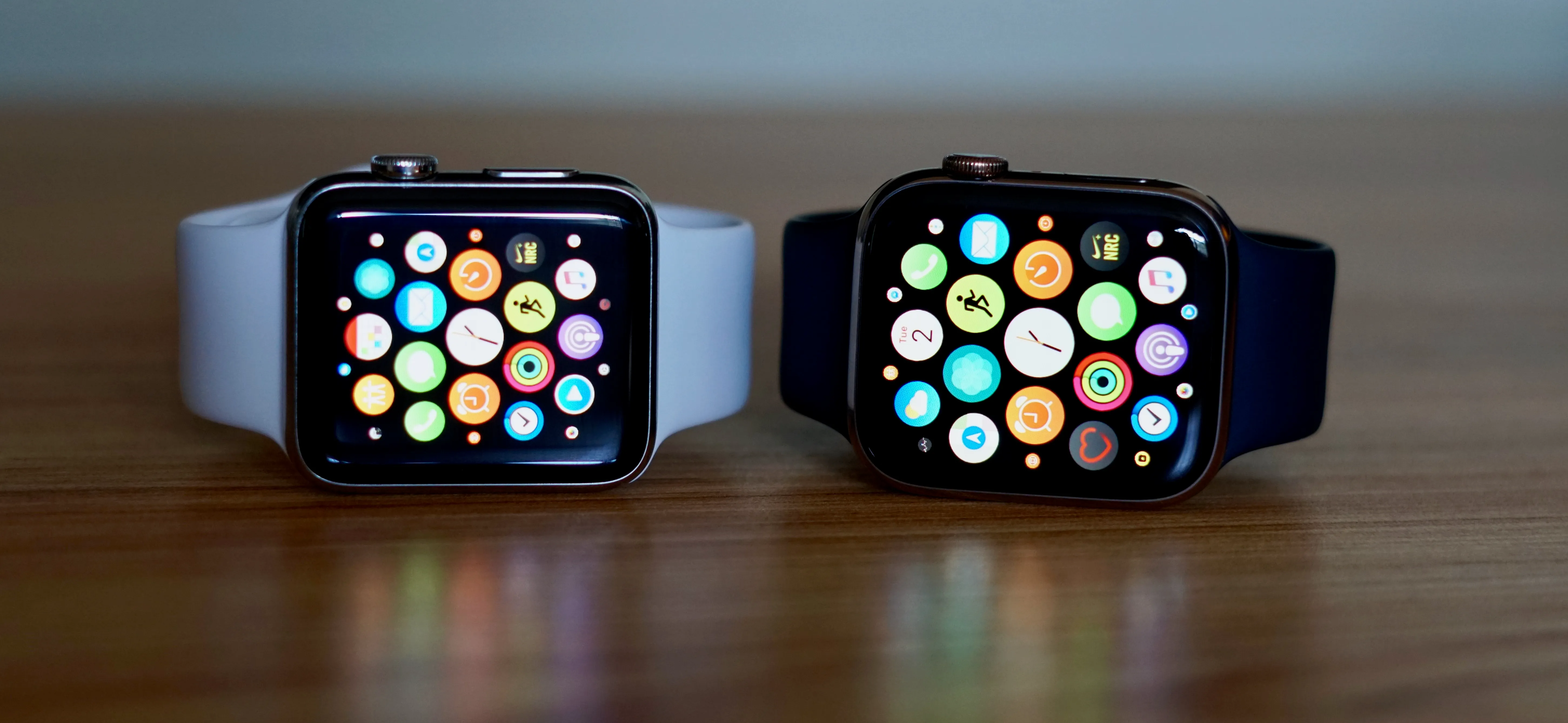
With that in mind, Apple currently offers two generations of Apple Watch for new customers and upgraders: Series 3 and Series 4. Both versions come in two sizes with options for GPS-only or LTE, but only Series 4 is offered in stainless steel now.
I recommend Series 4 if you’re upgrading Apple Watches. It will feel new in ways that Series 3 won’t. If you’re buying your first Apple Watch and want to save money, you can get almost the same utility from Series 3.
Check out our Series 3 versus Series 4 comparison for more details.
Video
Beautiful design
I’ve worn Apple Watch every day since the original and upgraded annually to get the most out of it. This paints my perspective in a way that is vastly different than if I was upgrading from the original, but we’ll have experience from that perspective soon too [Update: Apple Watch Series 4: A big leap for the Digital Crown]. I do think there’s value in an annual deep dive on what’s changed year-to-year though and how it affects the experience. For easy access to the timeline so far:
- Apple Watch as a watch, a gadget, and platform
- Apple Watch Series 2 improves speed and adds new workouts
- Apple Watch Series 3 unlocks new potential with LTE, improved Siri
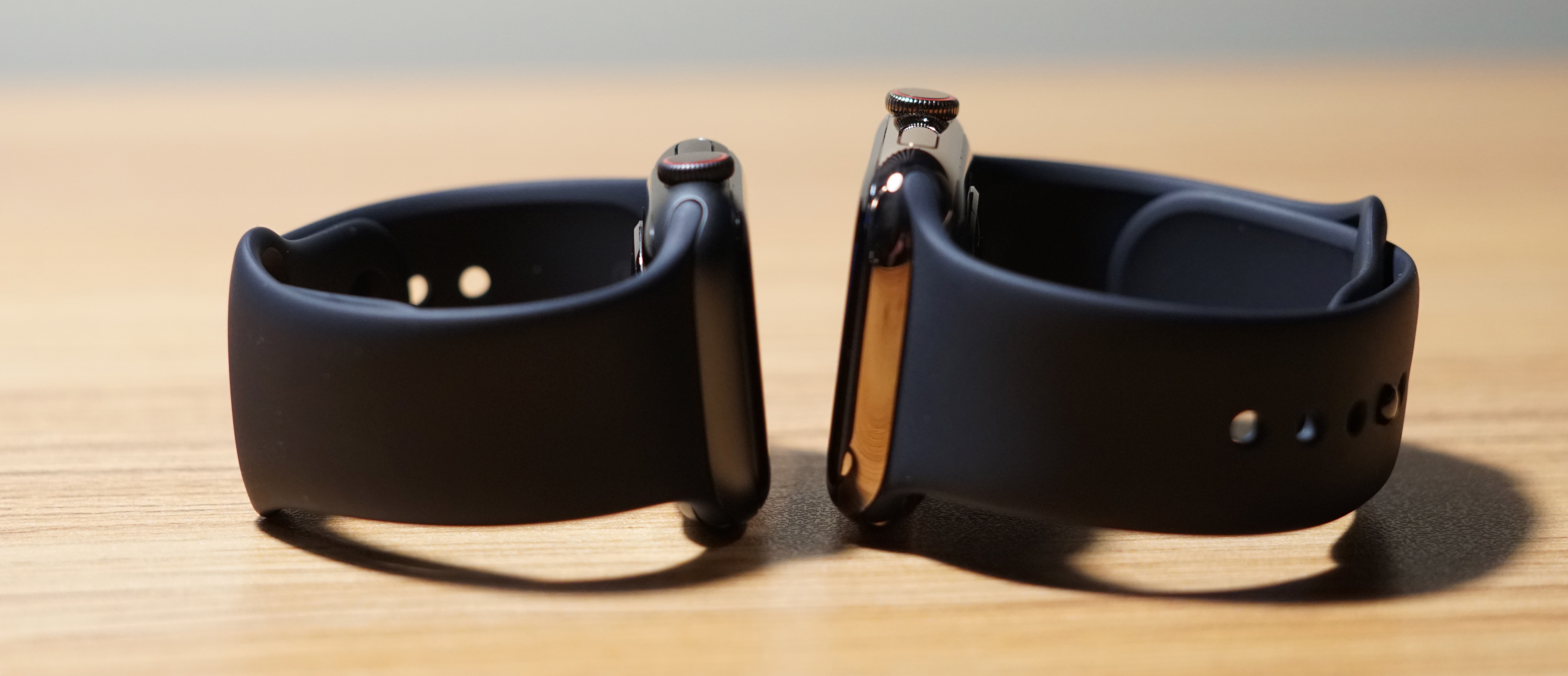
Apple Watch Series 4 includes two notable external changes to the way it looks: 38mm and 42mm sizes are replaced by 40mm and 44mm sizes, and stainless steel now has a gold option.
Display
I’ve always worn a 42mm model Apple Watch. For Series 4, I’ve tried both the 40mm and 44mm versions. The smaller version only feels like a minor decrease in screen size while the overall casing feels absolutely miniature. 40mm feels dainty on my wrist just like the 38mm version did, yet it shows almost as much content as the 42mm version. That’s impressive.
Series 4 in the larger 44mm version feels like brand new territory for Apple Watch. The iconic honeycomb app grid is larger than ever which makes it easier to use, there’s just more screen so apps can show more content, and text is more legible without cranking up the font size.
When I wore 40mm, I was impressed that Apple Watch could fit that much screen on that size device. When I started wearing 44mm, it felt like a whole new kind of Apple Watch. I imagine this feeling is the same if you’ve always worn a 38mm version.
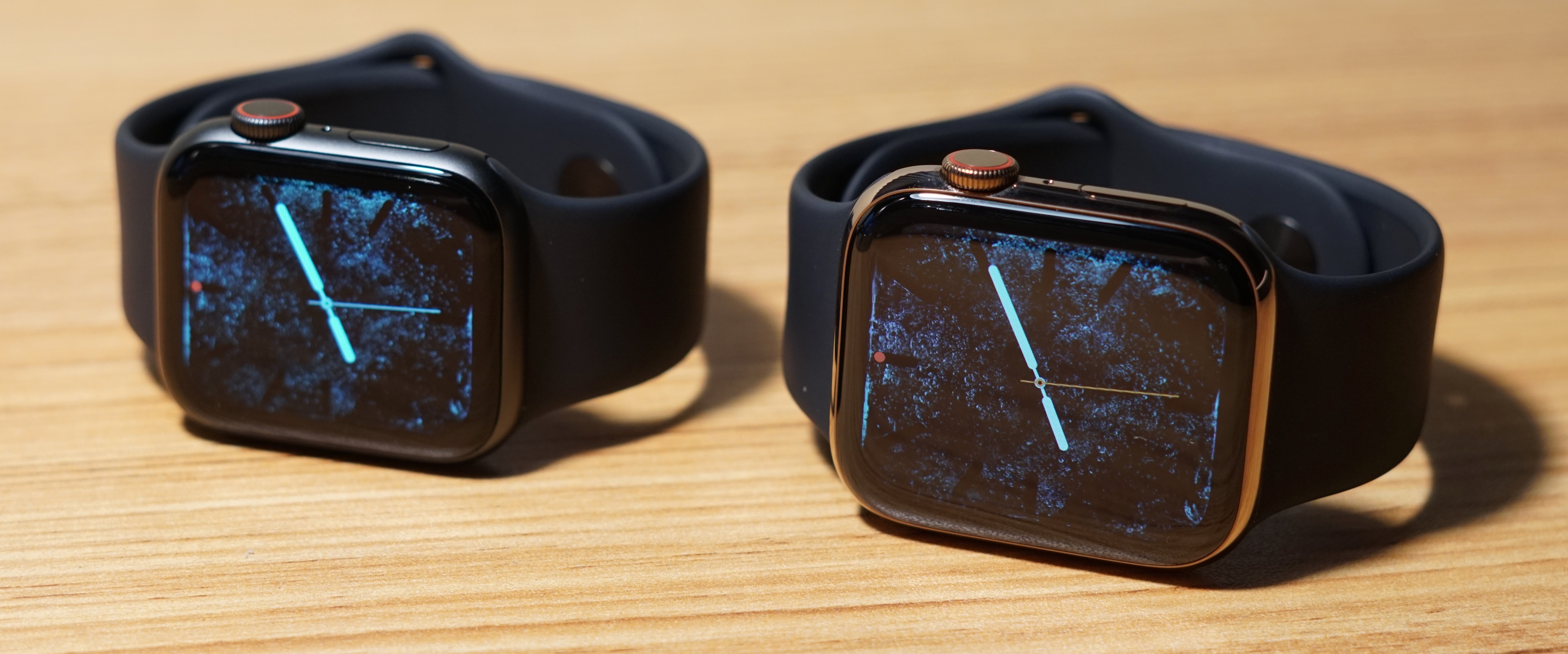
Once you use one of the new displays, the old screens feel absolutely dated. It’s similar to the difference between an iPhone X and an iPhone with top and bottom bezels. Apple has a marketing term, Retina, for its high-resolution displays. I think it needs a catchy term for its corner-to-corner screens too.
The change in thickness is less obvious to me, but it’s there. Series 4 is thinner than Series 2 and Series 3, but it’s not as thin as the original Apple Watch yet. It’s slightly less boxy, though, and that makes it feel fresh.
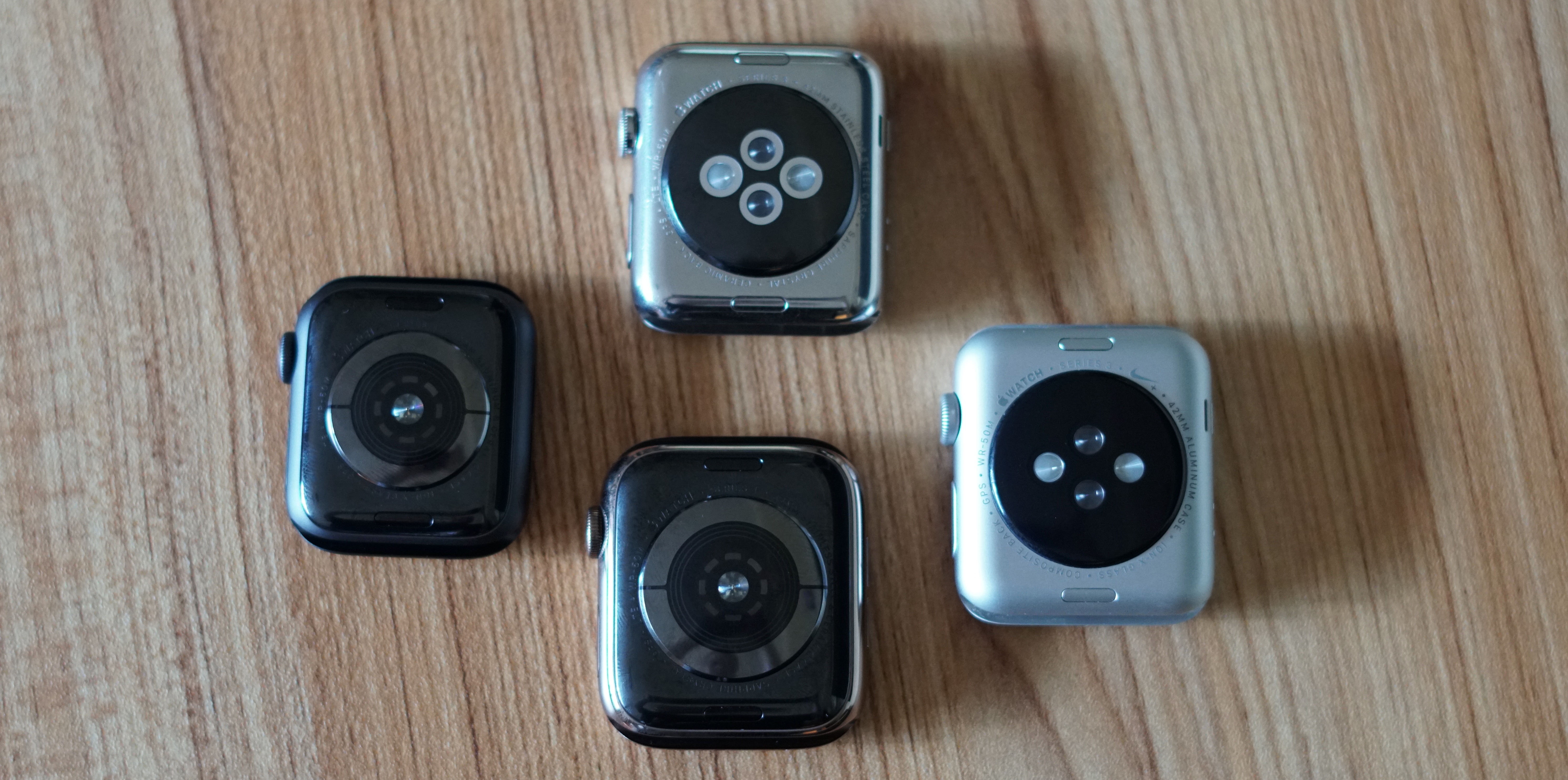
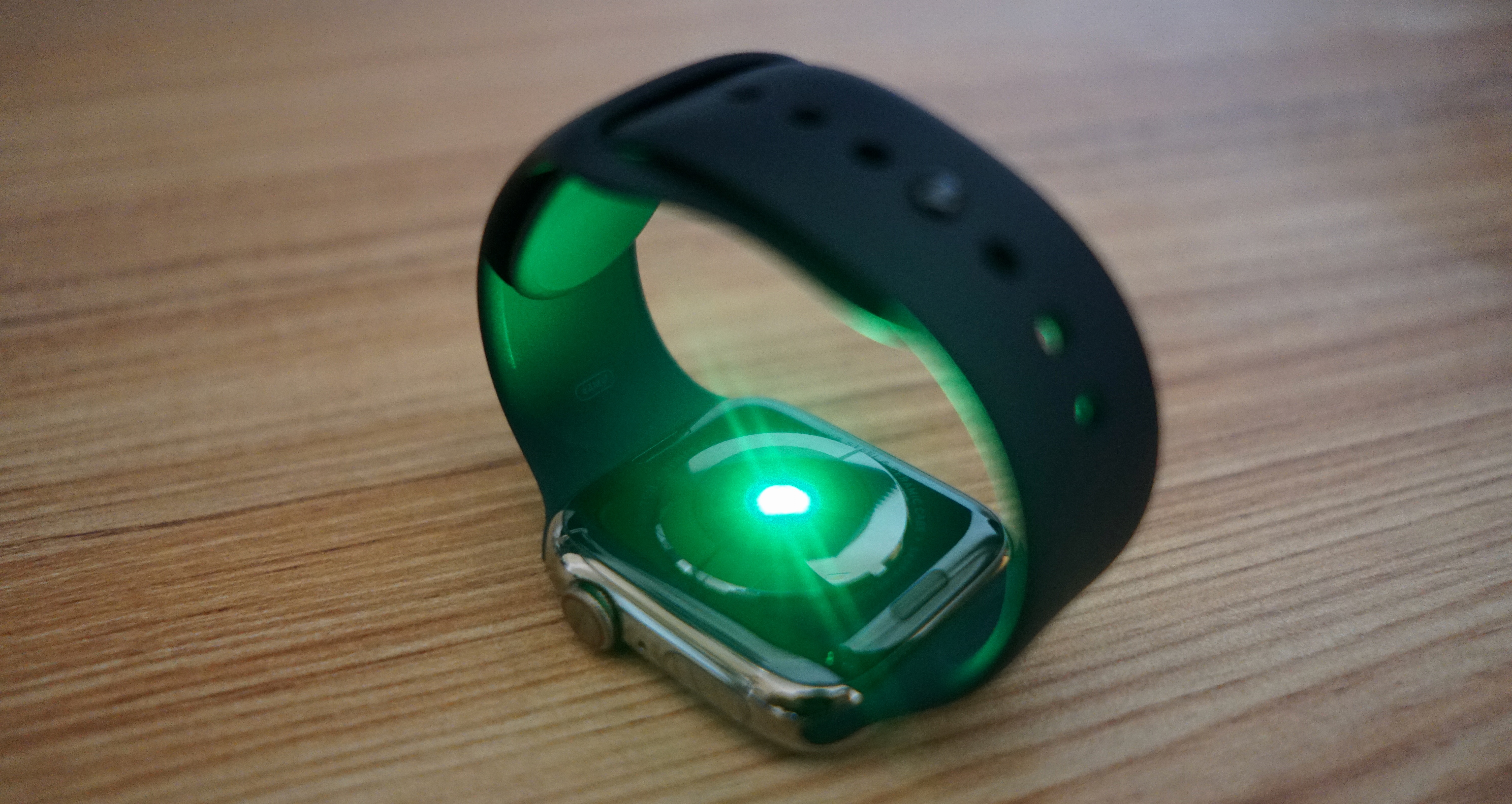
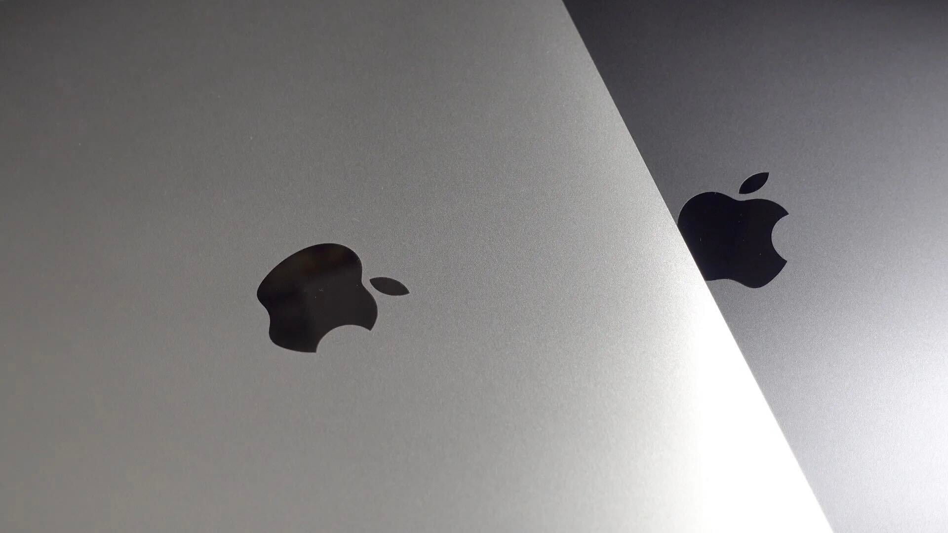
The back of Series 4 is also very attractive. You don’t see it when you’re wearing the watch, but it’s worth admiring. The upgraded heart rate sensor has been redesigned to look less technical and more balanced. The area around the heart rate sensor is ceramic and not aluminum nor steel — this is a clear upgrade on aluminum models especially. Apple says this helps radio waves pass through, but it also just looks great.
Gold stainless steel
Apple Watch and gold have a fun history. The original Apple Watch included the Edition collection with actual gold and prices ranging from $10,000 to $17,000. These were retired when Series 1 and Series 2 were introduced.
Apple later introduced gold and rose gold aluminum versions at normal prices (Series 3 combined gold and rose gold with a single finish that sits between the two shades). Stainless steel has always been limited to silver and space black — I’ve switched between both over the years — until now.
Like the iPhone XS and iPhone XS Max, Apple Watch Series 3 includes a gold stainless steel option. Personally, I’ve never considered myself a “gold” person, but I really like this gold. It’s not yellow, it’s not pink, and it’s not in your face. It’s a really restrained gold.
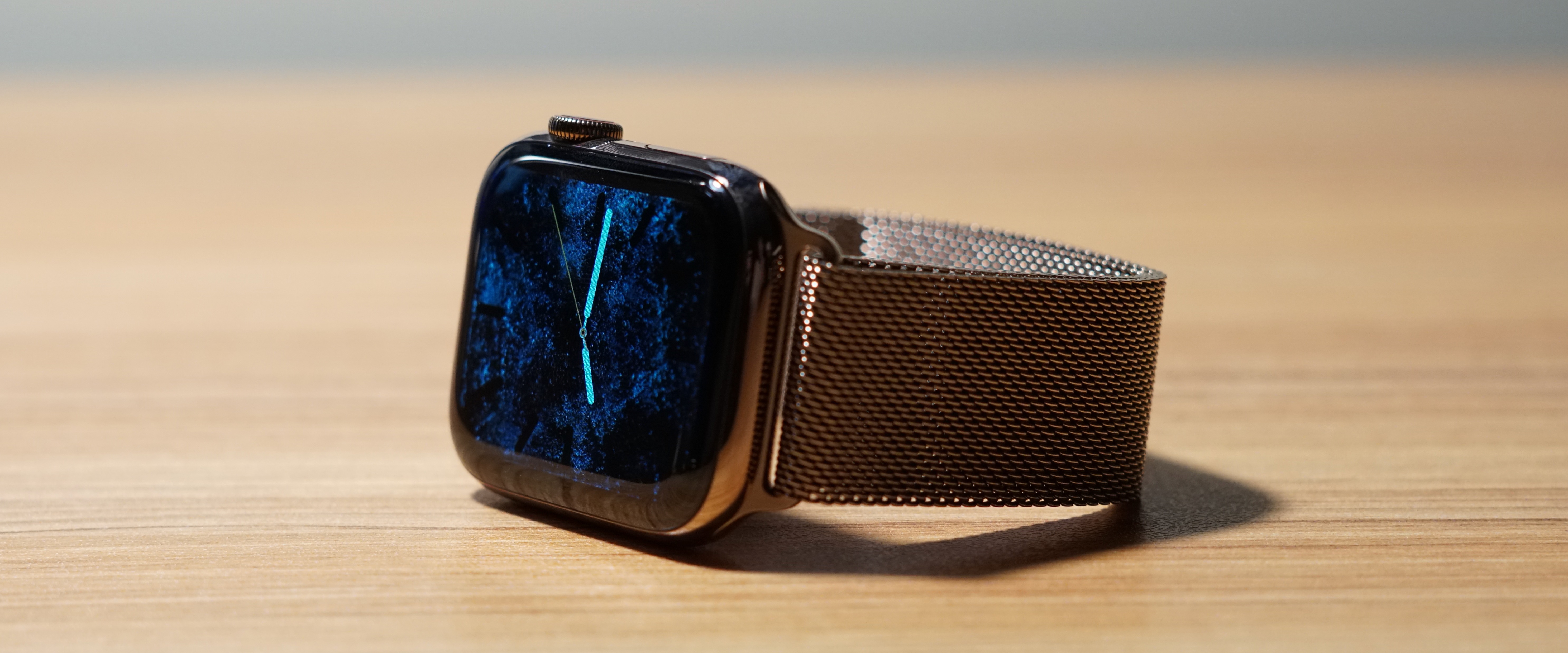
Apple made a version of their existing Milanese Loop to match the new gold stainless steel finish on Series 4. The original gold Edition watches came with Sport bands and leather straps (and a few celebrities had special gold Link Bracelets), but there wasn’t even an option for a gold Milanese Loop yet.
This watch color and band combination seems to get a lot of attention — and not by being obnoxious. People notice it and frequently use the word “pretty” to describe it. That seems new for the Apple Watch.
People often asked about my Apple Watch during the first year when it was new and different. Now Apple Watch is commonly spotted in populated areas so that’s no longer the case. That didn’t change when I tested the 40mm space gray aluminum Series 4, but it did when I started wearing 44mm gold stainless steel with the new gold Milanese Loop.
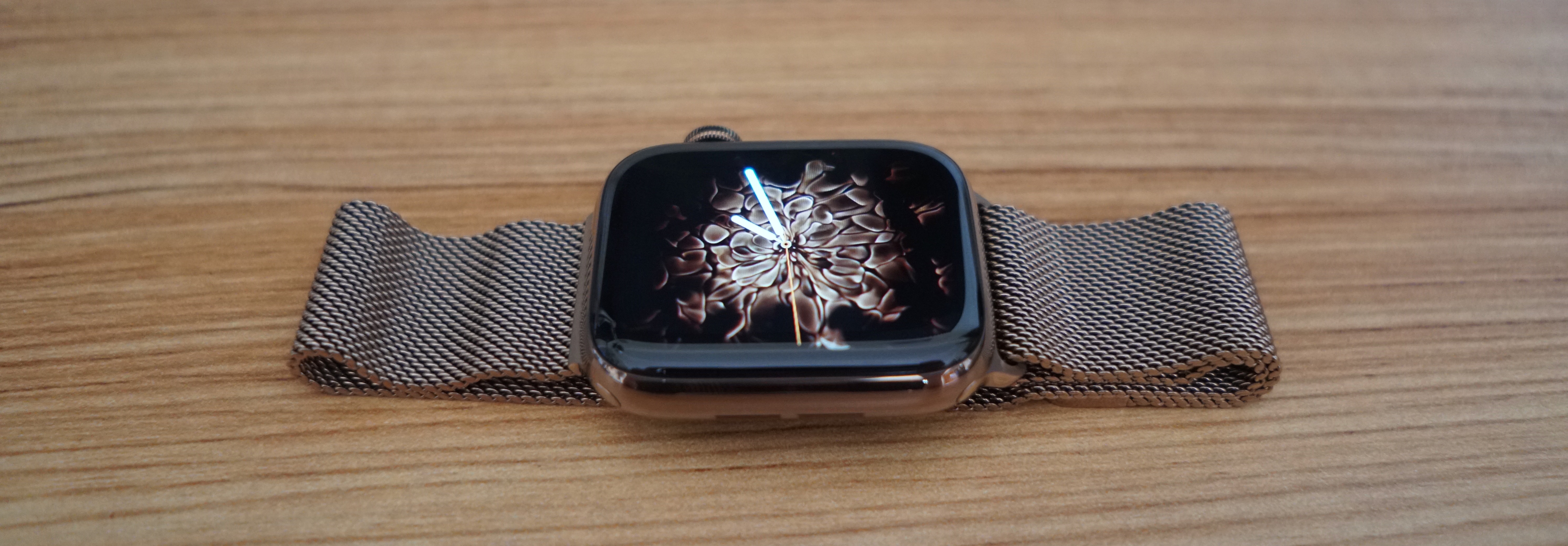
I hope Apple eventually makes more bands for the gold stainless steel watch. It currently ships with either a stone Sport band or the gold Milanese Loop, but I’d love to see the traditional leather Classic Buckle revived with gold hardware.
In day-to-day usage, I prefer the black Sport band with the gold stainless steel Series 4. You have to buy the black Sport band separately for now, but I think this should be a standard combination. (Other Sport band colors can work, but they have silver pins that don’t match as well as black or gold pins.)
Small touches
Series 4 isn’t just a larger display and new gold finish. There are lots of external design differences.
The two microphone and air vent dots of past models is now a single microphone dot, relocated from the left side to the right. The speaker is now much louder with a larger opening on the left side (this is used for alerts, Siri, and calls, but Music and Podcasts still require Bluetooth audio). And the water eject tone introduced with Series 2 is deeper now with the speaker change.

The side button below the Digital Crown is now flush with the side of the watch. It’s just as clicky to me, but visually it’s less noticeable. I really like this change. The side button looks borrowed from the iPhone or iPad and therefore too gadgety for my taste, whereas the Digital Crown is borrowed from traditional watches.
The side button is used for toggling power, activating the emergency SOS mode, and launching Apple Pay and the app launching dock so the Apple Watch needs it. But it doesn’t have to look so button-y, especially since the Apple Watch set up tutorial tells you it’s there.
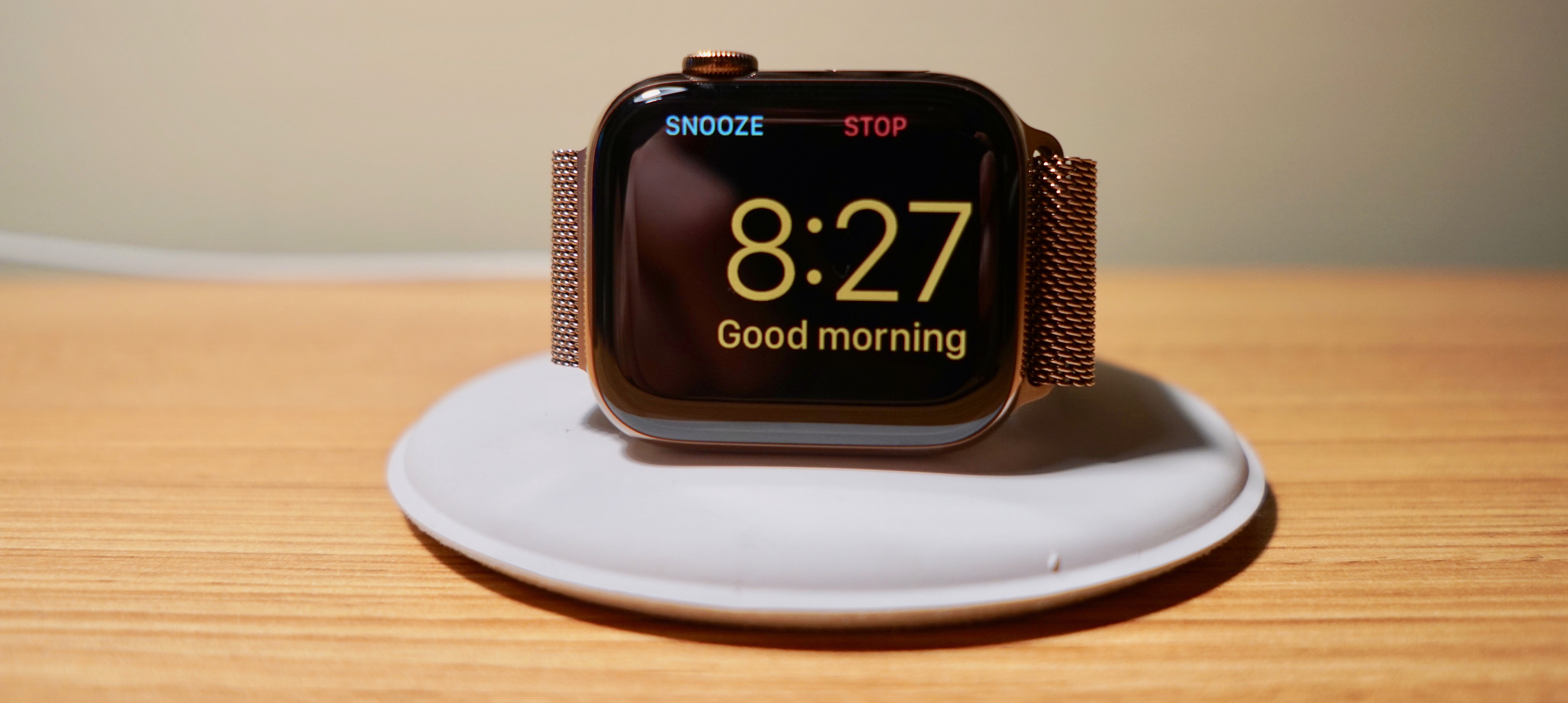
One small step back with this change is using the side button as a snooze button with Nightstand Mode and alarms. It still works, but it’s not quite as natural. I’ll take this tradeoff for the visual improvement though.
The Digital Crown replaces the red dot with a more subtle red ring on LTE models; GPS-only models have an even less noticeable black ring. It also features haptic feedback for the first time. This is turned on by default, but you can disable it for the previous experience.
After more than a week of testing, I’m still processing this change. Haptic feedback is definitely nice when flicking through album art in the Music and Podcasts apps or other lists like the Siri watch face. In these instances, each card flip is mapped to a click on the crown. Digital Crown haptic feedback is also nice when controlling volume. It feels like you have more precise control.

In other areas, haptic feedback seems to be mapped to each tick mark on the Digital Crown, not the content on the watch screen. This disconnection is strange to me. It’s a neat trick, but I much prefer haptic feedback mapped to on-screen elements and used in subtle ways over arbitrarily firing off with each spin regardless of what’s being shown.
Watch faces
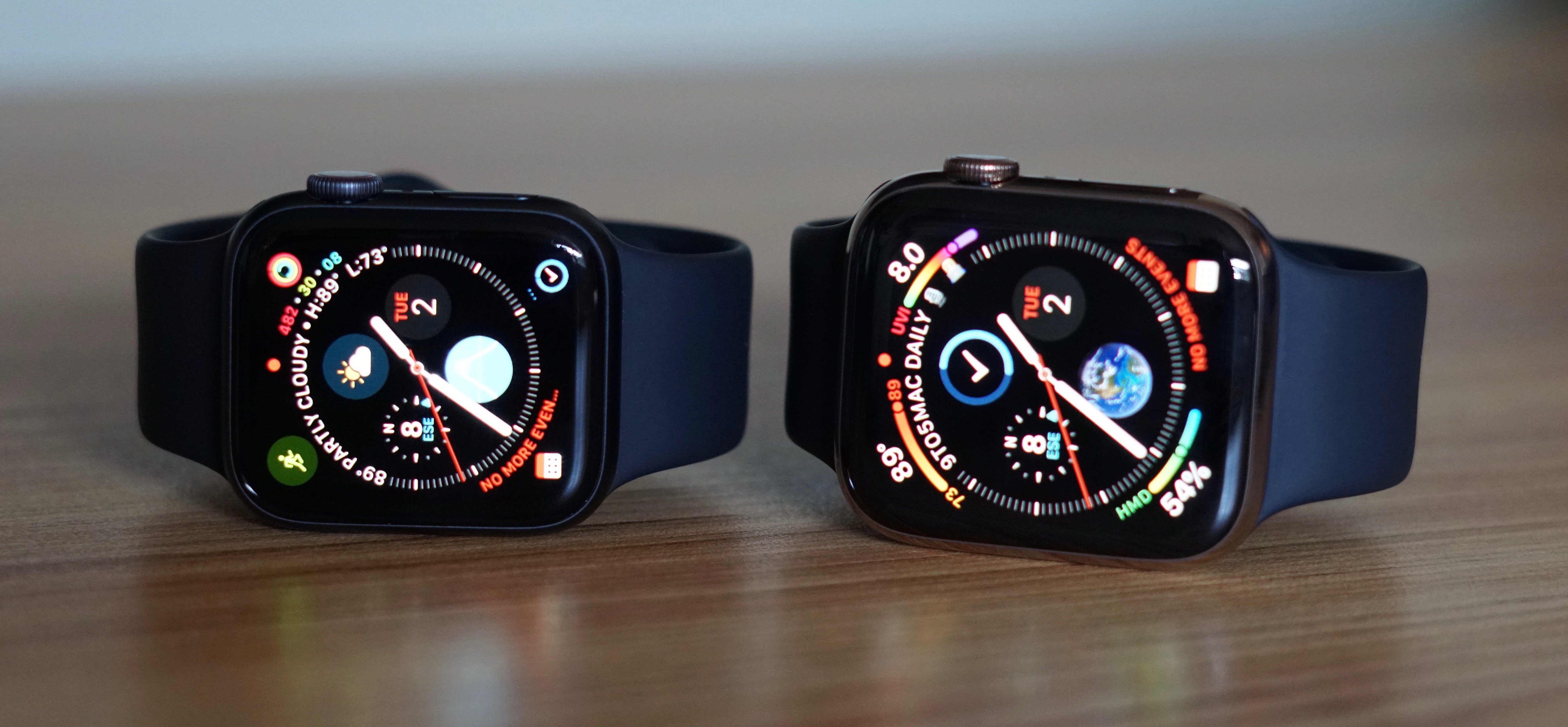
The new corner-to-corner display doesn’t just look more natural. It also accommodates new watch faces that can take advantage of the larger canvas. These new watch faces require creating new complications so some existing options — even from Apple — aren’t available yet. Hopefully this issue fades with future software updates.
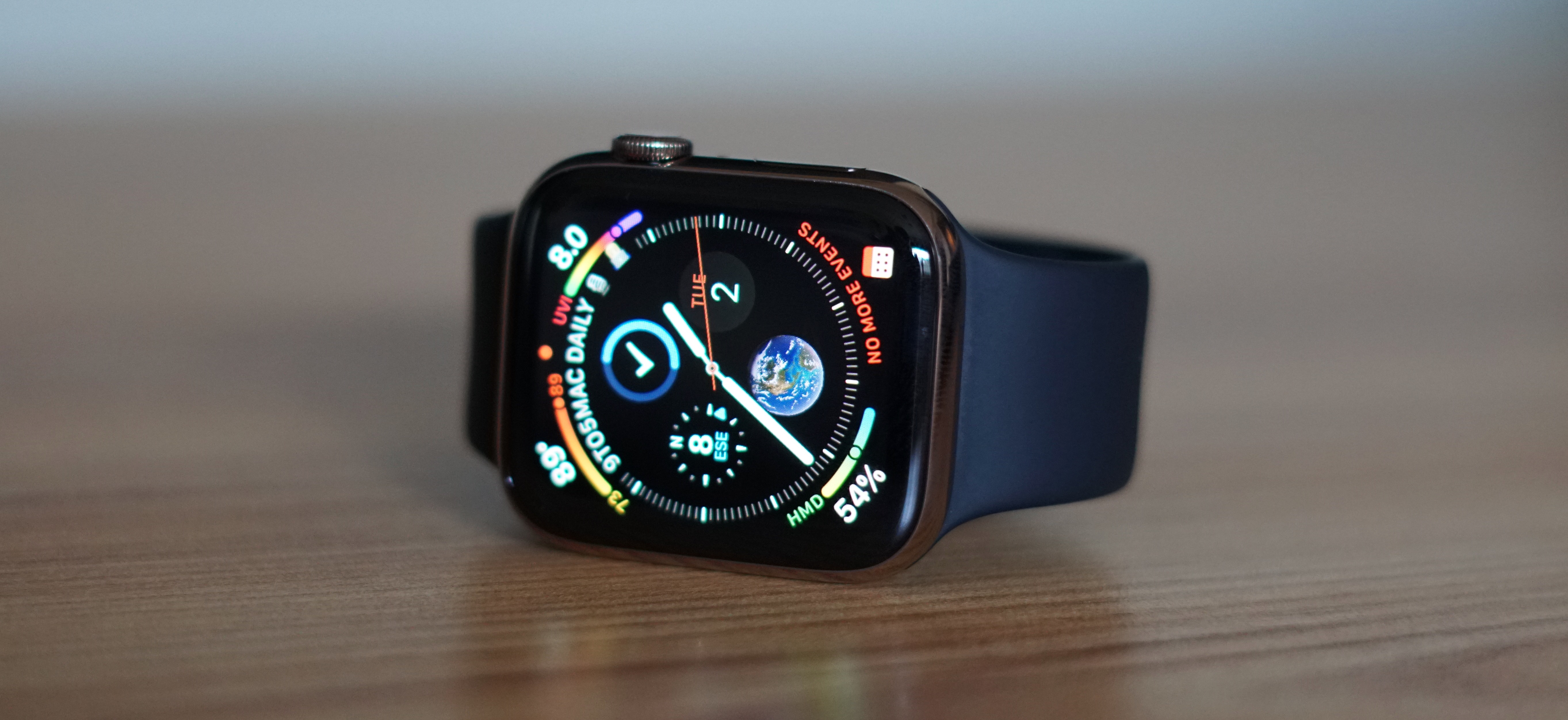
Infograph
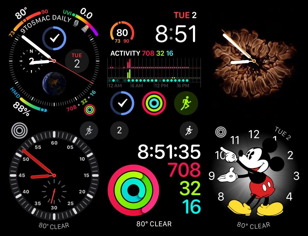
Infograph is an information dense watch face that shows up to eight complications around an analog clock.
Four center complications fit within circles larger than complications on other watch faces. The top center complication can even show text within the tick marks of the clock. You can also use a new Favorites complication to show favorited contacts from the Phone app on iPhone — sort of a throwback to the Friends circle mapped to the side button on the original Apple Watch software.
Other new center complications introduced on the Infograph face include air quality index, Earth, moon, solar, solar system, UV index, and wind speed.
The outer four complication spots introduce a new corner complication style that uses a gauge to show information like high, low, and current temperature, timer progress, and more. This complication style is a very clever way of showing more information in a tight space while still being legible.

New corner complication options from Apple include air quality index and UV index, new data points in the Weather app on watchOS 5.
I found that it’s easy to spend a lot of time tinkering with the Infograph face considering how many customization options it has. This is a good problem to have — especially as more apps update to work with the new watch face.
I especially like using the task manager Things on the top center complication so the next task can appear in text around the dial and the circle complication can be a progress ring. I’m using Carrot Weather (with all the snark turned off) to add a humidity gauge to one of the corner complications.
A lot of users just want to launch apps from complications, not see information, so one fix for the variety limitation could be fitting app icons in the center slots. This could apply to the next watch face too.
Infograph Modular
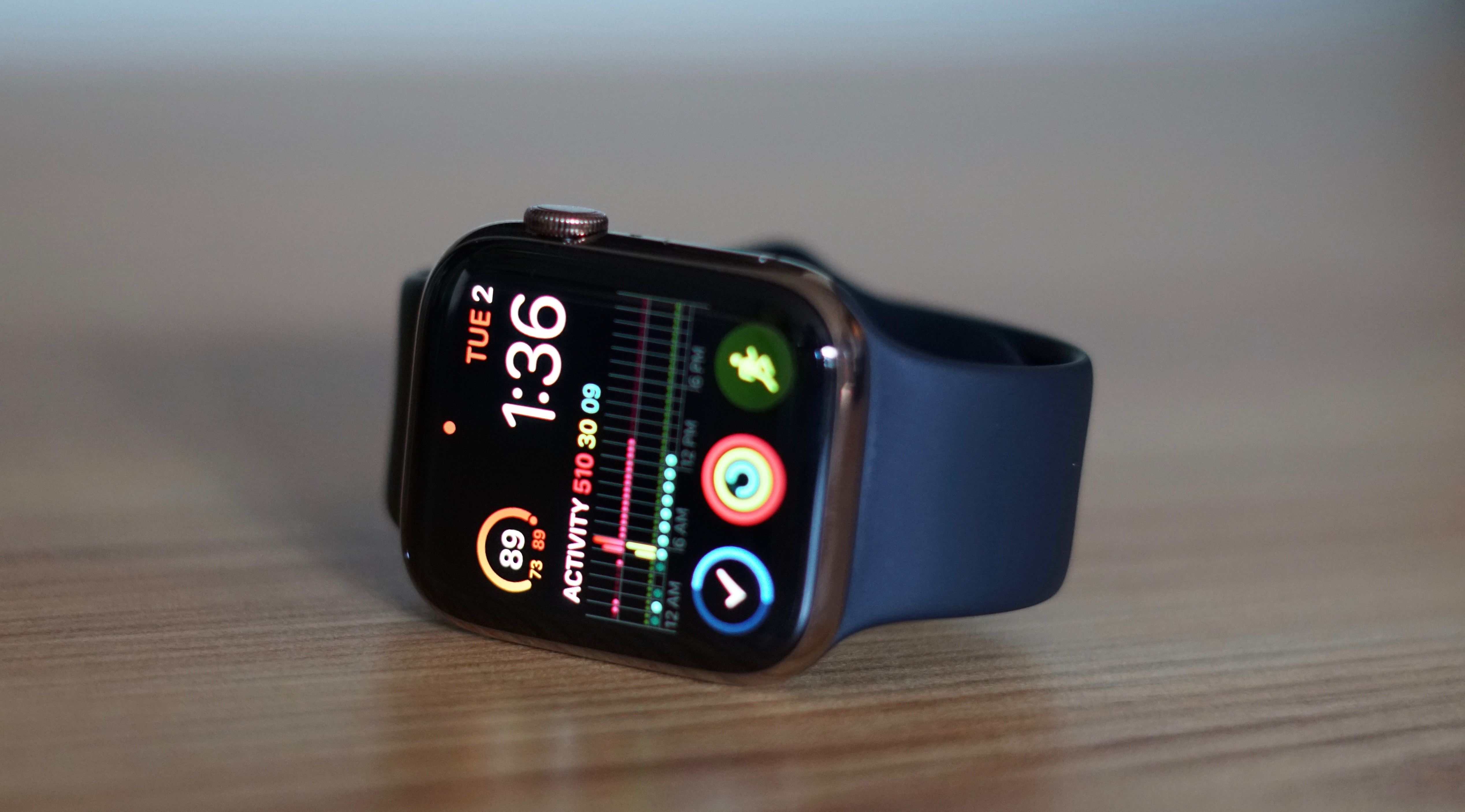
Apple Watch Series 4 introduces a new digital watch face called Infograph Modular. This features a digital clock for the time, an optional slot above that for the day and date, four circular complications, and a new large slot that lets apps show almost anything. Three circular complications sit below the large slot, one circular complication above it.
This is my new favorite Apple Watch face. I used to use Activity Digital primarily with the date, current temperature, and Workout complications around the Activity rings and digital clock.

Activity Digital shows seconds, not just hours and minutes, and Infograph Modular can’t do that yet. I wish it could. But I’ve otherwise created a better watch face for tracking my activity progress throughout the day.
I can see the current, high, and low temperature in one slot, my Activity rings in another, and view an updating chart of my activity progress with numbers on the same face that shows the day and date, launches the Workout app, and even shows me my task progress with Things.
Full Screen
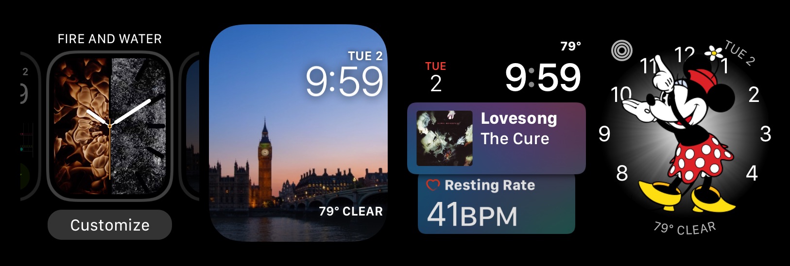
Infograph and Infograph Modular are the only watch faces that are totally unique to the new Apple Watch, but several watch faces have versions exclusive to Series 4.
Fire and Water, Liquid Metal, and Vapor are all new to watchOS 5 in circular mode, but only Series 4 has the more sophisticated full screen option. This lets the elements move around the corners of the display and the tick marks for each hour of the analog clock.

Kaleidoscope also gains the full screen option, and Color gains full screen and circular modes with watchOS 5.1 (currently in beta). These full screen modes look great on the new corner-to-corner display, but they remove the option to use any complications.
Personally, I’ve been using the water-only version of Fire and Water in full screen mode after completing my Activity rings as a way to reward myself and unwind. These full screen faces are visually pleasing but completely opposite of information dense faces.


Legacy faces
It may be inaccurate to describe all other watch faces as legacy, but that’s what most of them feel like on Series 4 — especially the new 44mm size. Some are updated with rounded complications where text used to be vertical, others remove the background label in a subtle way, and some complication slots are unchanged.
The Siri watch face is simply larger which is nice for reading at a glance. Most other watch faces feel like they would have been designed more like Infograph and Infograph Modular if they were created today.
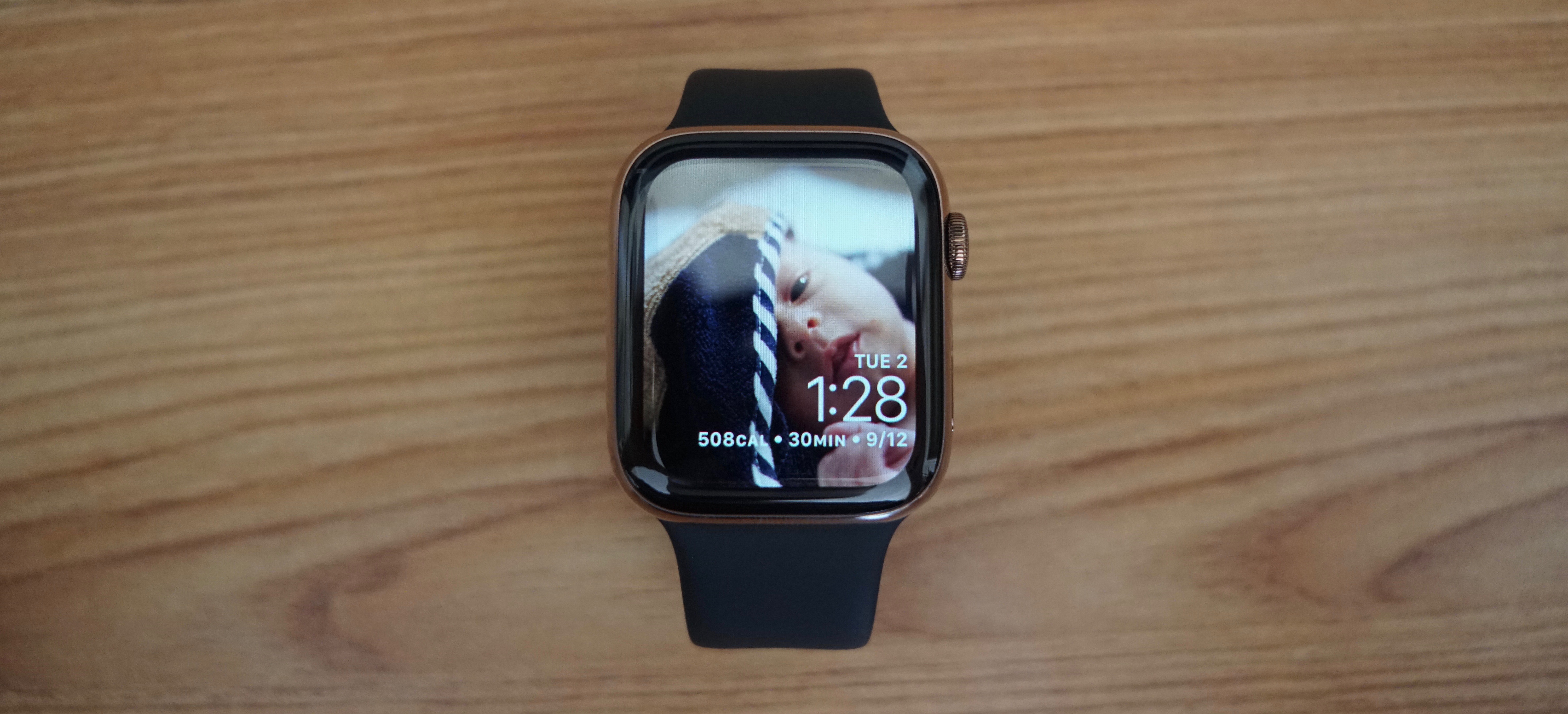
There are a few watch faces that do feel like they were made for the Series 4 that could fit into the full screen category though: Photos and Timelapse.
These faces used to reveal the thick bezel around the boxy watch face on older watches. Now they absolutely shine. I see Photos used as a watch face commonly in the wild so I think a lot of Series 4 users will enjoy it even more now.
Invisible features
So much of what I have to say about Apple Watch Series 4 is about how the watch itself looks and how watch faces respond to the new display because other major changes can’t be seen — at least yet.
The accelerometer and gyroscope have been upgraded which likely improves activity tracking, but not in a way that fixes something that was broken. Apple Watch Series 3 is already fantastic at this.
Fall detection
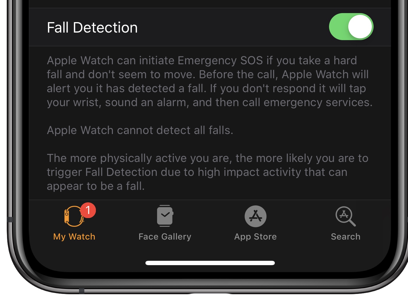
The upgrade does power newly added fall detection however. This feature intelligently detects when someone wearing Series 4 falls, presents an option to call emergency services or dismiss the alert, then automatically calls emergency services and notifies your emergency contact if you don’t respond within one minute of a detected fall.
Fall detection is turned off by default if you’re under 65. Apple says that’s because younger people often participate in activity that could be mistaken for a fall, like playing sports, but you can turn it on manually.
I frequently run with my Apple Watch and AirPods and nothing else. I stopped carrying my iPhone on runs when it gained LTE with Series 3. Fall detection and automatically alerting emergency services appeals to even me as a 27-year-old. The thought of stumbling during a run or even being clipped by a car in a hit-and-run is a real concern.
Apple warns that every fall cannot be detected, of course, but it’s a feature that has the potential to save lives.
ECG
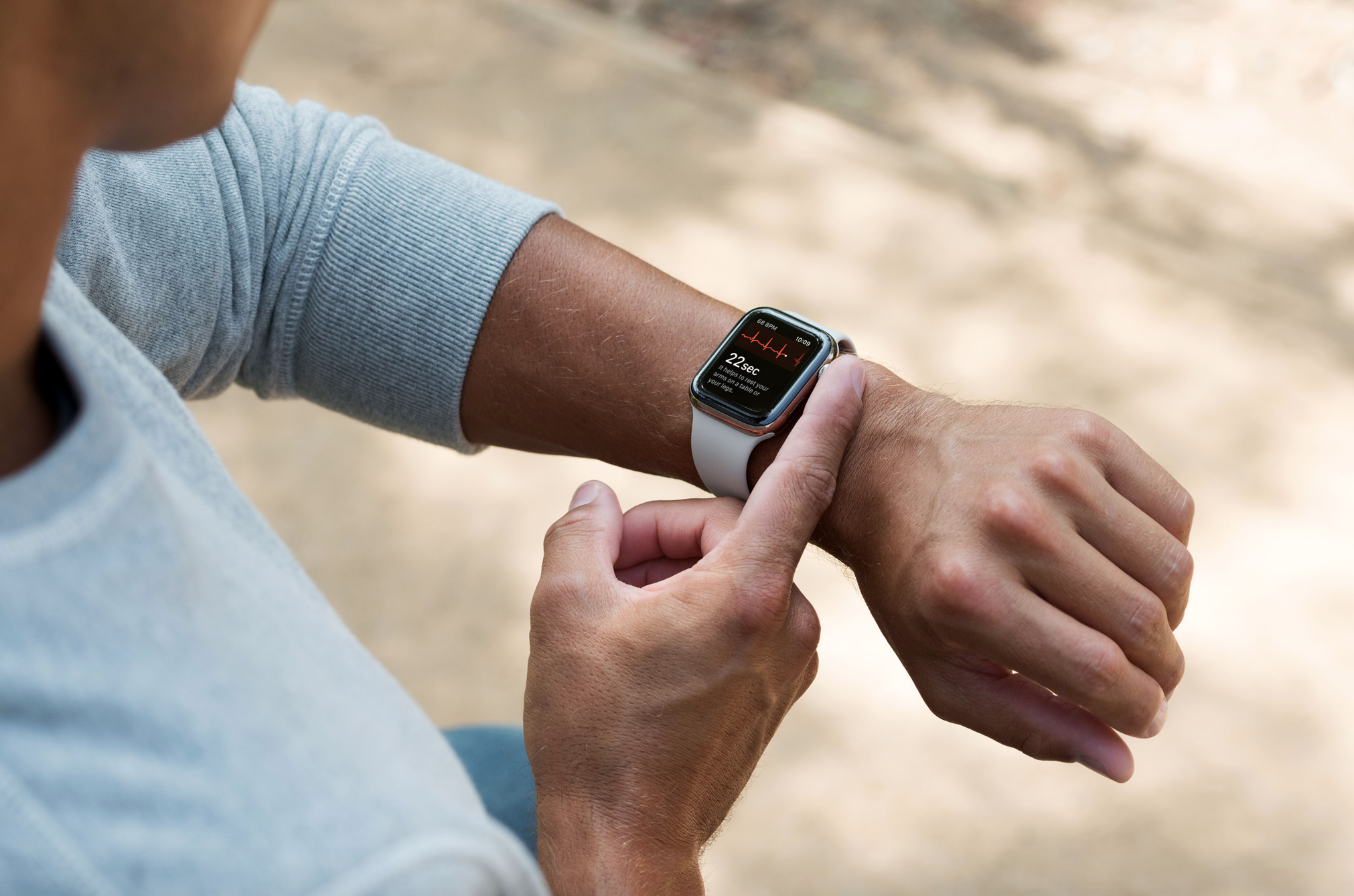
Apple Watch Series 4 will introduce the ability to take an electrocardiogram with the new ECG app in a future software update, but it’s not a feature that’s available at launch. This feature uses the upgraded heart rate sensor and Digital Crown to work. Here’s what Apple says about the new ECG feature:
Apple Watch Series 4 enables customers to take an ECG reading right from the wrist using the new ECG app, which takes advantage of the electrodes built into the Digital Crown and new electrical heart rate sensor in the back crystal. With the app, users touch the Digital Crown and after 30 seconds, receive a heart rhythm classification. It can classify if the heart is beating in a normal pattern or whether there are signs of Atrial Fibrillation (AFib), a heart condition that could lead to major health complications. All recordings, their associated classifications and any noted symptoms are stored in the Health app in a PDF that can be shared with physicians.
Like fall detection, the benefits of having a built-in ECG reader aren’t obvious in everyday use for a lot of users. But I’m certain Apple Watch Series 4 and the new ECG app will provide useful health information to customers who otherwise may go without crucial health data.
Update 12/7: The new ECG app and irregular heart rate detection features are now available in the United States for users 22 and older. The app is very easy to use and makes it possible to share results with your doctor using the Health app on the iPhone.
- watchOS 5.1.2 for Apple Watch now available with ECG app, new Infograph complications, more
- How to take an ECG (electrocardiogram) on Apple Watch [Gallery]
- PSA: ECG and irregular heart rate notifications not available for users under 22
- How to share ECG results with your doctor
- What’s new in watchOS 5.1.2 [Video]
More
I’ll end with a collection of observations from testing Apple Watch Series 4 in no specific order:
- Most of the functionality feels the same, but the enhanced Siri waveform that responds to audio input improves the user experience; Dictation still needs to be responsive
- Series 4 is faster than Series 3, but the leap from older Apple Watches is much more dramatic
- Some on-screen elements are truncated or even hidden behind the bezel on the 40mm version of Apple Watch Series 4 at launch, but not on the 44mm version (see the Heart app, Calendar corner complication on Infograph, and months with five weeks in Calendar app)
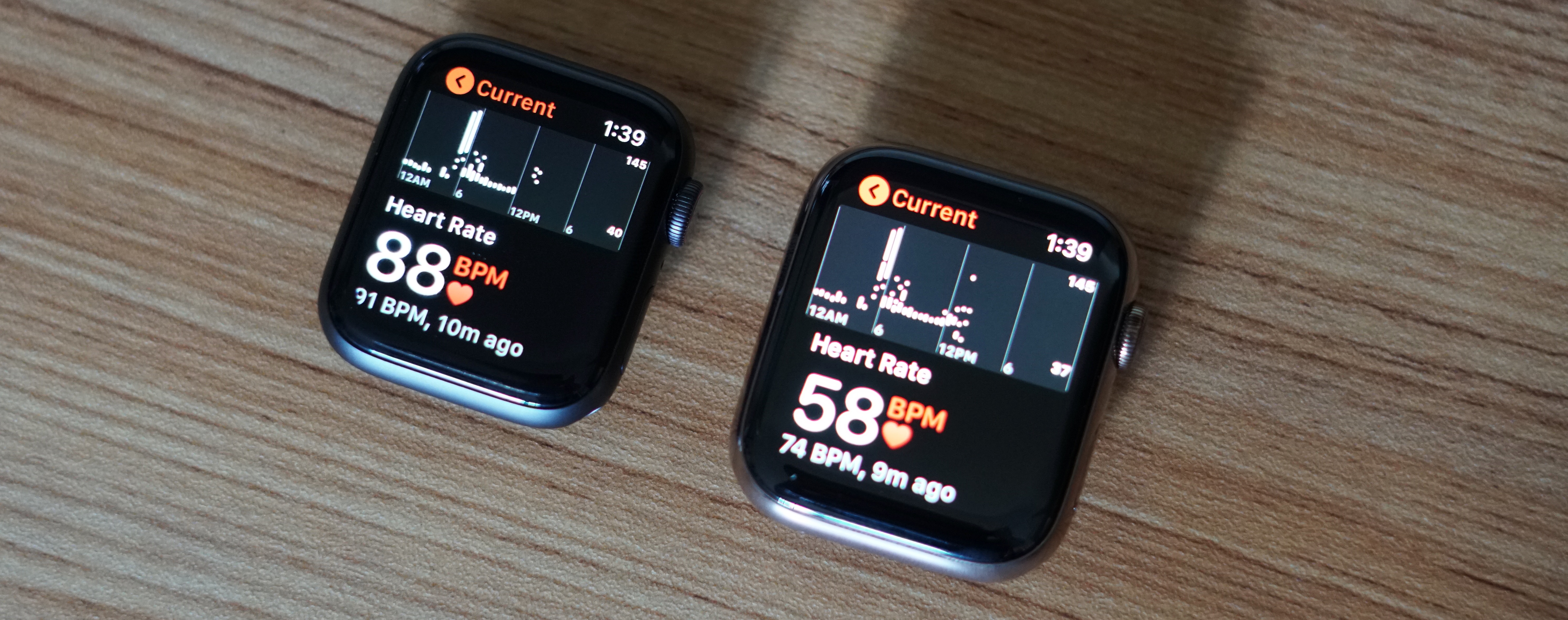
- Apps that haven’t updated for Apple Watch Series 4 aren’t full screen yet; 44mm runs 42mm apps, and 40mm runs 38mm apps
- No built-in sleep tracking, always-on display (even for the time), or camera, but the 44mm display is the first screen that feels suitable for a video call — view a portrait in the Photos app to experience
- The packaging change is curious — will we see watches and bands sold in more combinations in the future?
- Calendar’s ‘NO EVENTS’ placeholder text has to go — that’s a dealbreaker on Infograph for me (and it truncates as a corner complication on 40mm)
- After a full year of being able to make phone calls on the Apple Watch without an iPhone nearby, you still can’t leave the Phone app during a call
- I really want the six iPhone XR colors (black, white, red, blue, yellow, and coral) to replace space gray, silver, and gold aluminum finishes — white is technically still silver, but space gray is starting to look dated and matte black would be cool … and all those other colors
Apple Watch has become a lot of things for me.
It quantifies how much activity I need throughout the day to maintain a healthy lifestyle. It keeps me connected to friends and family even when I want to break my iPhone addiction and leave it behind. And it’s my workout partner with Siri, Apple Music, and Apple Podcasts streaming on LTE.
These were true of Apple Watch Series 3, and they’re just as true if not more with Apple Watch Series 4 — but the big reward this year is I absolutely love how the Apple Watch looks and feels. And I have no doubt the invisible features will prove their potential in time.
FTC: We use income earning auto affiliate links. More.


Comments