
Castro is a brand new podcasting app for the iPhone (available in the App Store for $2.99). It’s not an update to an existing podcast client. It’s a new app. It doesn’t have any legacy to anchor it down because it really is a fresh start.
This distinction is important. My favorite stock apps on iOS 7 are the ones that feel like they weren’t built by the same people who designed their iPhone OS counterparts. Weather is a good example of an app that doesn’t look like a derivative — flatter — work of its equivalent on iOS 6.
Castro gives off the same impression, with full-bleed backgrounds and a focus on typography. Castro hasn’t been dragged through the metaphorical bushes of a skeuomorphic world. It is has been built alongside iOS 7’s design philosophies of context and clarity.
Like any App Store app, my first impressions of Castro came from the app icon. Castro follows the stereotype set by almost every other podcasting client on iOS, with the icon incorporating a radio tower silhouette on a gradient backdrop.

I don’t really know why this aquamariney-green color was selected for the icon because the app’s main UI revolves around a stark black and white theme, but it does look stylish on my home screen. It’s a relatively-dull shade of green, but I mean that in a good way — too many iOS 7 icons oversaturate their colors.

The main view of Castro is extremely simple, dominated by a scrolling list of episodes sorted by date or shows sorted alphabetically, toggled using a segmented control at the top of the screen. Pull-to-refresh is available here, which refreshes all your current subscriptions, but there is no corresponding progress indicator, which is odd.
The shows list is as you would expect. Each row represents a show, displaying title, bylines and artwork. The decision to mask square artwork into a circle is debatable. It is hit and miss whether it works or not. Most shows I tested were fine, but art that features anything remotely square looks bad, unfortunately.
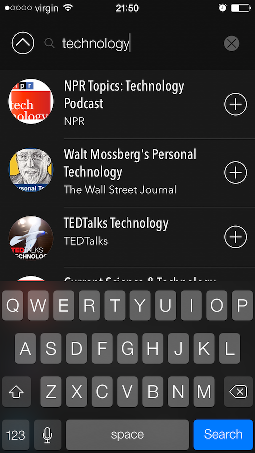
Scroll all the way to the bottom in ‘Podcasts’ mode and there is an ‘add’ button. This reveals the search interface. Castro uses the iTunes database with a customized ranking algorithm to display results and I was satisfied. If your podcast of choice is on iTunes, you will find it. If it isn’t in the iTunes database then you are stuffed but what podcast isn’t these days?
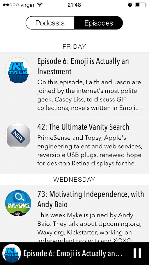
Returning to the main screen, when viewing by episode, the shows are sectioned by day. I’m not sure how well this interface would scale for someone who has a lot of subscriptions, but for someone who subscribes to just a handful of shows (about 10), it works great for me. It should be noted that only ‘unlistened’ episodes appear in this list. This was disorientating at first — I was searching for a ‘show all’ toggle — but it makes sense. The number of times I go back to an old episode is extremely low. If you want to see all current and previous episodes of a show, you have to dig through to the detail view.
The show detail view is the meat of the app. It’s clear most of the developer’s attention has gone into this screen. It is beautiful. The blurred background serves as a nice contrast to the grayish tones of the main list and the dominant color bleeds downwards. Elements such as the settings button and switches are also color matched to the artwork, which is a nice touch. Unlike a lot of other implementations of this tinting technique, the title and body text always remains white or black so it’s always readable. An in-focus version of the artwork is also displayed, again masked into an ellipsis.
As you scroll, the header folds into nothingness to leave the screen dedicated to the episode list. Of course, everything transitions smoothly with a playful scale animation on the art ‘balloon’ to boot. Tapping settings allows for customization of download and playback options for this show only. Naturally, tapping on an episode description brings up more information such as show notes and controls specific to that episode.
Playing an episode places a thin bar of playback buttons at the bottom of the screen. It’s a persistent widget, so it follows the user across every screen of the app. This means transport controls are visible when something is actually playing and hidden otherwise. Obvious really … but that’s what makes it great.
One design element that doesn’t quite keep up is the scrubbing mechanism. On their site, Castro tout this as “revolutionary” but it doesn’t click for me. You grab an end of the play controls and slide your finger to move forwards or backwards in time. Unfortunately, my thumb obscures the timecode when I slide so it’s more of annoyance than revolution. Also, when you are not on the episode detail view, the scrubbing feature is hidden anyway, so the space-saving advantages this mechanism has isn’t justified in any meaningful way.
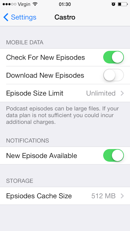
Interestingly, the Castro team have opted to put global settings for the app in iOS’ Settings rather than in-app. This is rarely seen in apps nowadays, as the system settings aren’t dynamic enough for most apps’ needs. A lot of users tend to forget that settings are available here, so developers have stopped using it. I asked Castro for their perspective on this. They said:
We’ve tried to keep the UI within the app as minimal as possible. We prefer settings in the settings app but understand there are some limitations, and potential confusion, with this. We will continue to evaluate this once 1.0 is released.
Frankly, when compared to more mature podcast clients, the only omission I noticed functionally was the lack of support for video podcasts. When you add a video podcast to Castro, it can play the audio track but the video itself cannot be displayed. I asked them about this and they said that they focused on audio for 1.0 (which is fair enough) and they’ll “see where that goes” in regards to video support.
This app is great. It’s a new entrant into the iOS podcasting space, but it shouldn’t be seen that way. It’s a very functional app in a visually impressive package.
FTC: We use income earning auto affiliate links. More.


Will it synchronize to iTunes? Is there a synchronizing application for the Mac?
No sync. It’s standalone.
“it should be noted that only ‘unlistened’ episodes appear in this list.” 100% deal breaker for me, I need to be able to revisit listened podcasts. to bad, it looked good. I like Pocket casts flexible episode filter system. I miss the ability to download podcasts from itunes tho, pocket casts store isn’t that big and I constantly have to copy rss feeds to have them imported.
You can still access older episodes, you just have to dig a bit deeper into the hierarchy.
Also should be noted, circle avatar masks doesn’t work to well in podcast apps IMO. Most podcast album art are designed for square masks, look at ATP’s logo, looks weird in a circle mask…
Castro, [with high] Fidel[ity]
Nice name!
Can it automatically delete played episodes? Can it be configured for each podcasts?
This is a podcast client. If you use it, you are accessing podcast episodes. That is not the same as podcasting. I was hoping it was an app that would help me put together a killer podcast episode of Tech Salad on my iPhone.
“If it isn’t in the iTunes database then you are stuffed but what podcast isn’t these days?”
Paid ones with custom URLs or authentication. Dealbreaker for me.
When I search for this app on the App Store, the first thing that comes up is Gay Station Castro- Find hot gay men. Maybe they should have looked to see if anyone else had used that name first.