
Following its introduction earlier this month, Apple’s newest operating system has fallen under criticism and scrutiny from both designers and casual users alike. Due to both the tight development timetable and the new design direction under Jony Ive, following the removal of former iOS SVP Scott Forstall last fall, iOS 7 is, understandably, the most controversial and intriguing iOS version yet.
In response to much of the negative criticism directed towards iOS 7, some have suggested that iOS 7 will change substantially before it is released to the general public. Looking back at previous versions of iOS reveals a long trend of subtle refinements to the operating system during beta periods, not dramatic changes. Let’s take a look at how each version of iOS has transformed:
iPhone OS 1
Even more than iOS 7, iPhone OS 1.0 was a major software undertaking for Apple, a culmination of technologies and ideas that had been in development for years. By the time Apple was ready to show off the original iPhone’s software at Macworld 2007, many of the UI elements and design choices that would define iOS for the next half decade were already in place, but Apple still changed and updated quite a few features before the iPhone went on sale that summer. Although the unavailability of any iPhone OS compatible hardware and the lack of third-party application support in iPhone OS 1 prevented Apple from making any beta versions of the software available to developers, Apple’s iPhone keynote and website archives show just how much the software was tweaked before release.
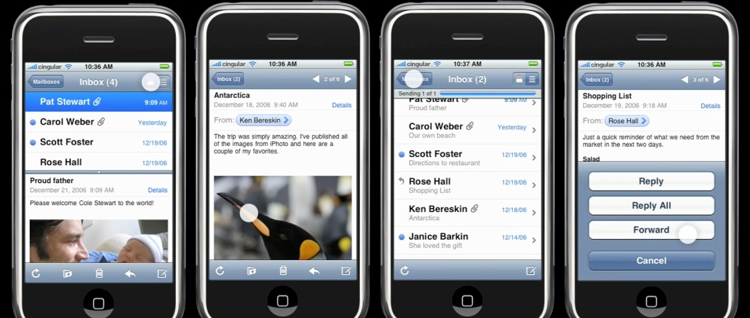
Some of the user interface elements that didn’t make it to the shipping version of Mail.
One of the most dramatic changes that the iPhone OS went under between initial demo and release was a complete redesign of Mail.app. During the Macworld keynote and early promotional material, Apple promoted a split message viewer. The interface brought familiarity from the Mac, but ultimately hampered the message reading experience. The original Mail design also offered a different message sending progress bar and tweaked navigation. Another large addition to the final shipping version of 1.0 was the addition of the native YouTube app, which was subsequently removed during the iOS 6 beta period.
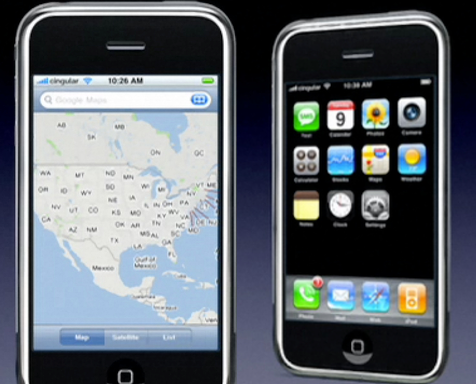
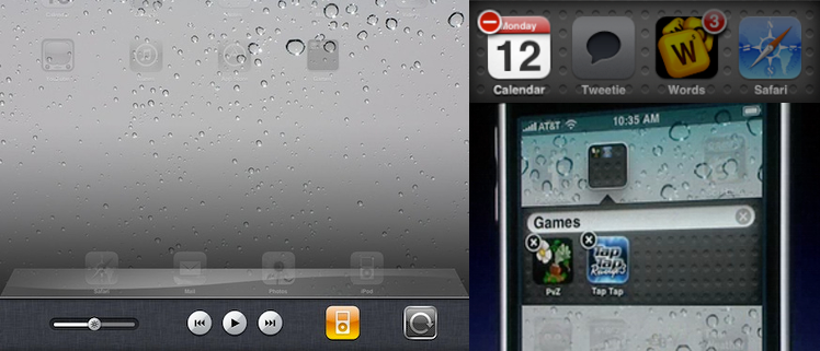
The non-shipping version of Maps and the in-call Phone icon.
Maps also received feature updates near launch, adding the ability to route directions, which wasn’t available when the software was first demoed. The Weather and Stocks functions, which Apple initially dubbed “widgets,” were introduced as web apps, not native software.
Most other tweaks to the software during the first release were purely visual. A notable example is the iPhone’s iconic unlock animation, which initially included a simple fade transition. Although most Home screen icons were finalized by the time the software was shown, the original Phone icon would pulsate during a call. That behavior was transformed into a “return to call” banner.
iPhone OS 2
iPhone OS 2.0 had one main focus: the iPhone SDK. Rather than add a host of changes, 2.0 focused on letting third-party applications into the store. As a result, iPhone OS 2.0 changed the least between initial preview and final release of all versions of iOS. However, one major feature was added that wasn’t present in Apple’s early demos: MobileMe. In March of 2008, iPhone OS 2 debuted, but MobileMe wasn’t announced until June’s WWDC.
iPhone OS 3
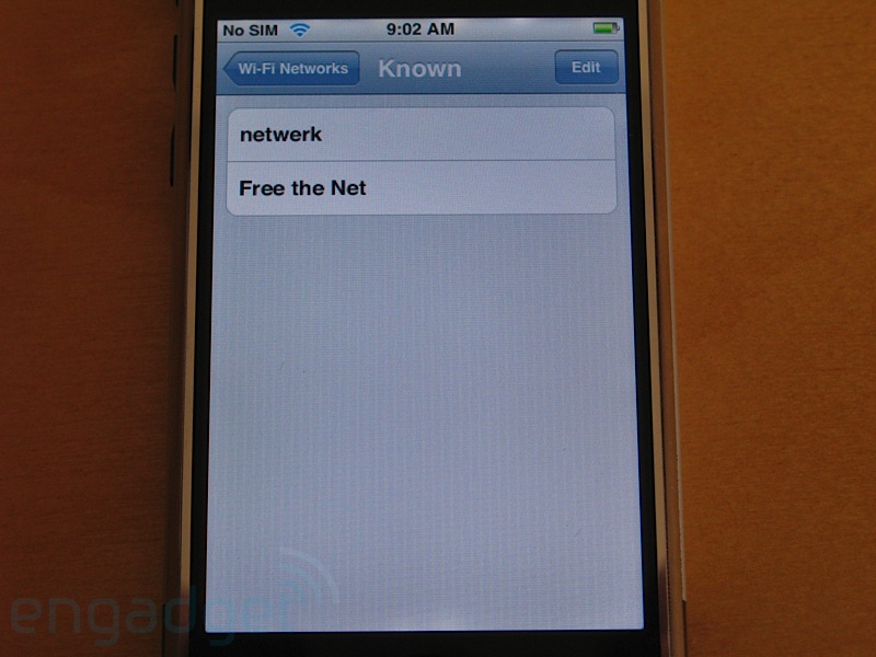
The removed “Known Networks” Settings panel. (Photo credit: Engadget)
After the instant success of the App Store in 2008, Apple focused on many new features for iPhone OS 3.0. Like with the previous release, Apple gave a sneak preview of the new iPhone OS, leaving room for feature and UI enhancements between initial beta and final release. Perhaps the biggest addition that didn’t appear until later betas was Find My iPhone- the service, not the app- which was added at WWDC. MobileMe also saw other changes in later betas: data merging and publishing options being added/tweaked in beta 3.
In terms of smaller features, two more optional Home screen pages were added in beta 2, bringing the grand total up to 11, and both the spotlight and copy/paste interfaces were cleaned up and refined before launch. A “Known Wi-Fi Networks” panel also appeared in Settings.app in 3.0 betas, although it was removed before the OS shipped.
iOS 4
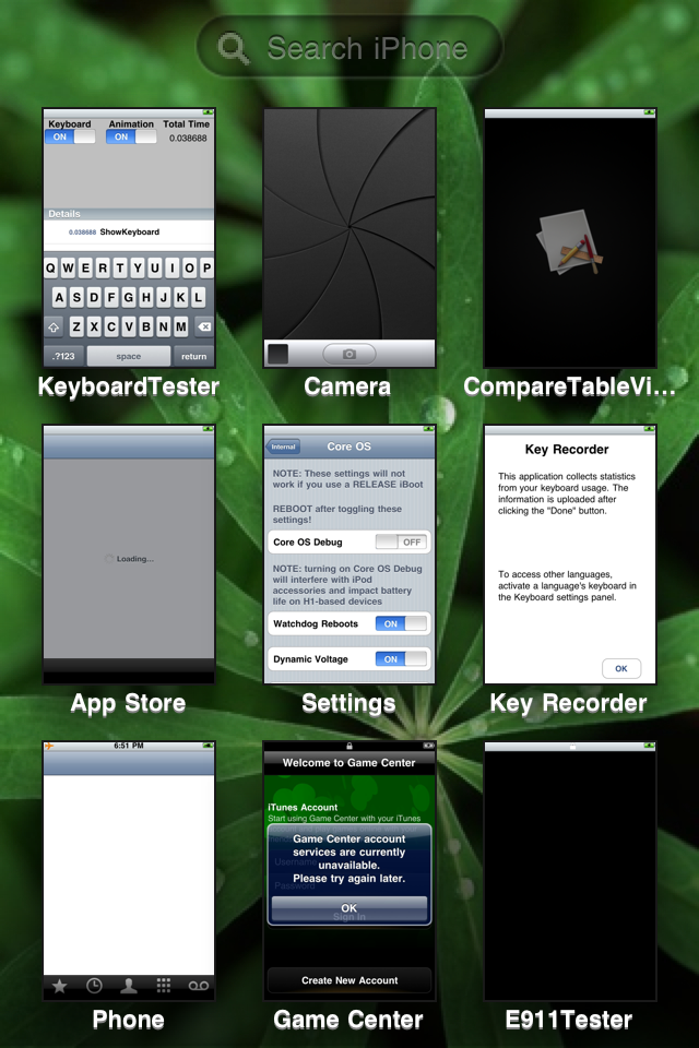
Game Center as it appeared in early iOS 4 betas.
iPhone OS 4- renamed iOS 4 during the beta period- represented perhaps the most noticeable user interface changes and additions for a version of iOS until iOS 7. Of course, this meant that there was a lot of fine-tuning to be done. Most notable with iOS 4 is the inclusion of Game Center. When iPhone OS 4 was previewed in April, 2010, Apple mentioned that Game Center would be making its way to iOS later that year. The beta interface bears no resemblance to the casino-themed app that arrived in iOS 4.1.
Some of the UI ideas Apple played around with for iOS 4.
Aside from Game Center, most of the other changes made in iOS 4 betas were entirely cosmetic. The linen texture that Apple has made heavy use of over the past few years was absent entirely from the first iOS 4 beta. Folders and multitasking trays sported a texture similar to that of Dashboard in Mountain Lion. While a light linen texture was added in beta 2, the look wasn’t finalized until the third beta. Many other facets of multitasking weren’t finalized either during early developer seeds. Initially, killing apps in the multitasking tray was less intuitive. Holding down on an app’s icon would bring up a close button only for a single app, making the process of closing large amounts of apps lengthy. The app-switching animation was also redesigned between beta 1 and launch. The iPhone orientation lock and media controls were added during iPhone OS 4 beta 3. iOS 4.2 iPad media controls on the were reorganized before the consumer release. iPad app-switching gestures were introduced (then later removed) in iOS 4.3 betas.
Also notable is an iOS 4 alpha leaked from Vietnam which sported a completely different idea of multitasking and Spotlight than what made it even to the beta versions of iOS 4. Multitasking in this build was treated similar to how it functions in iOS 7 with large, full app previews.
iOS 5
While tweaks to issues with iCloud during the iOS 5 beta period would’ve been server-side, Apple still made changes within the operating system. iOS 5 was one of the first times that Apple made changes to app icons before launch. Both the iCloud icon itself and the newly minted Reminders icon were redesigned. This is interesting in light of the complaints specific to iOS 7’s new icon set. As testers might remember, the Reminders icon originally showed text that represented a grocery list.
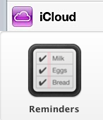
Early iCloud and Reminders icons.
As Apple ramped up iCloud during testing, they gradually opened up more of the features to developers in later betas. Wireless syncing first made an appearance in beta 2, and over the air updates were turned on for developers to update in beta 4.
As we discovered before the feature was announced, iOS 5 contained references for panorama photography. The feature was cut sometime before developer betas were made available. Apple continued tweaking the camera application, redesigning the lock screen camera button between iOS 5 and iOS 5.1.
iOS 6
Apple’s most recent release of iOS saw only minor improvements before release. Aside from data and stability improvements in the all new Maps application, very few differences found their way to the OS in subsequent betas. The most notable change was the quiet removal of the built in YouTube app from iOS 6 beta 4, as part of Apple’s continual push towards eliminating their dependence on Google. Aside from YouTube, the only other user facing change in iOS 6 was the behavior of the Flyover button in Maps. Originally, the button always displayed the text “3D,” but the release version added a buildings glyph.
![]()
The original Flyover icon (top) compared to the current Flyover icon (bottom).
While iOS 7 is without a doubt the most radical change to iOS, Apple typically has their ideas together by the public debut. Apple’s past actions say a lot about their future intentions, and if previous versions of iOS are a benchmark, expect to see a similar, yet refined version of iOS 7 (at the very least) at release for consumers this fall.
FTC: We use income earning auto affiliate links. More.

Comments