
One of the most significant design opportunities in recent history was announced with a simple blog post on Apple’s website. “Let me just say it: We want native third-party applications on the iPhone, and we plan to have an SDK in developers’ hands in February,” Steve Jobs wrote. On a quiet Thursday morning less than a year later, the App Store opened to iPhone users with a selection of just over 500 apps.
Few contemporary innovations have changed how we live our lives and interact with the world around us more than iPhone apps. The creators of the first 500 available at launch had the unique opportunity of shaping the design direction and interaction methods of the millions of apps created since.
To celebrate the App Store’s 10th anniversary, let’s study the visual evolution of 10 original App Store apps.
The Apps
For the purpose of this piece, I’ve focused exclusively on notable visual changes to apps that were available to download on day one and are still receiving updates today. While many of these apps are also available for iPad, this review highlights changes to iPhone versions. (Click on any photo to view a larger version.)
iTunes Remote
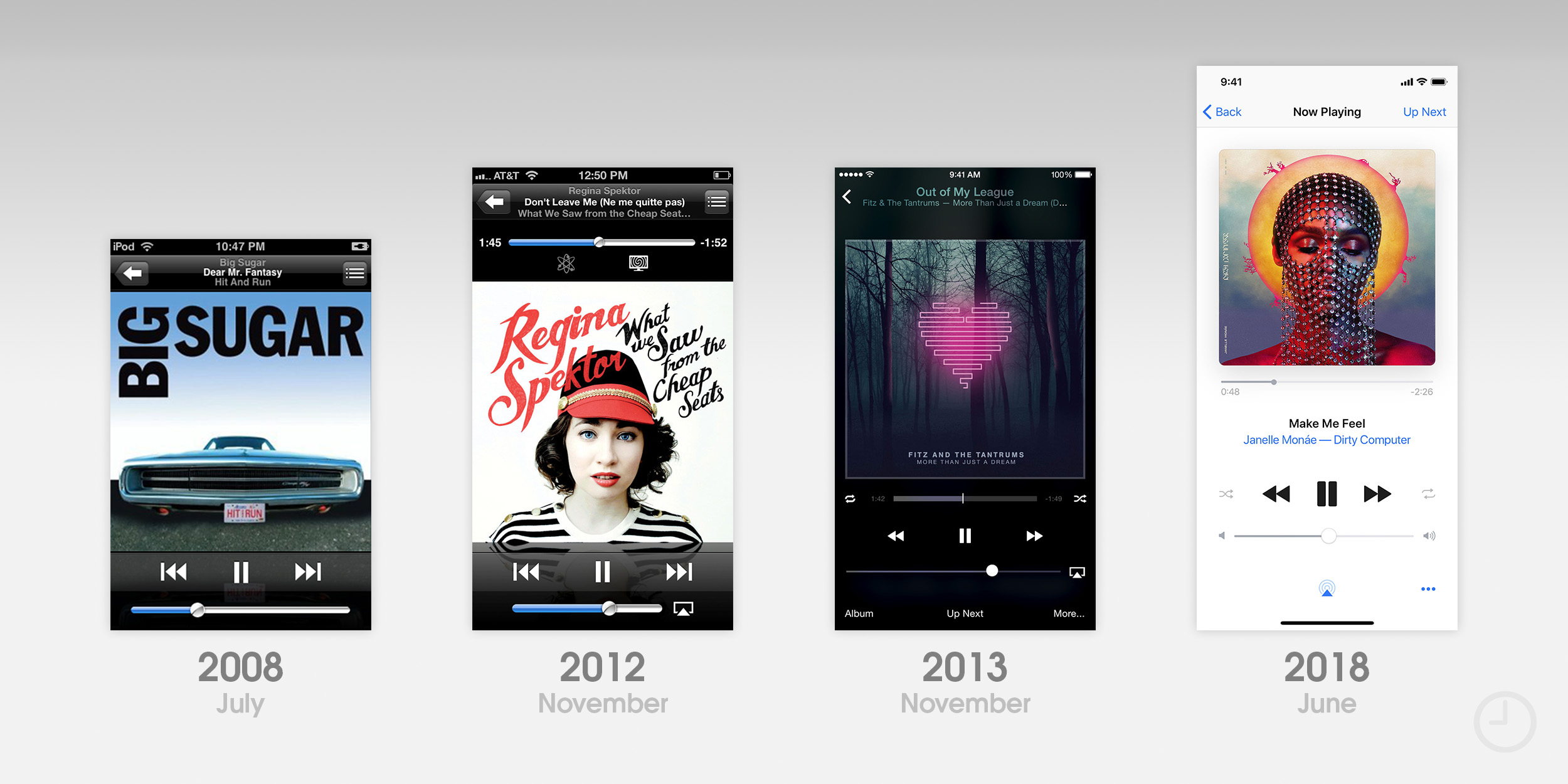
Apple set an example for other developers right out of the gate by publishing some of their own software on the App Store. Two of the first apps created were the game Texas Hold’em and Remote, a simple utility for controlling playback of your Mac or Apple TV’s iTunes library over Wi-Fi. While Texas Hold’em was pulled from the store in 2011, Remote lives on today.
From the beginning, Remote’s design was heavily influenced by the look and feel of the iPhone’s iPod app (today called Music). In fact, the Now Playing view was essentially identical in appearance. Version 2.0 brought a new icon designed by Louie Mantia. The two apps began to diverge at iOS 6, when the stock Music app was completely redesigned and featured a volume slider that responded dynamically to the movement of your iPhone. Remote kept a more stock appearance. The icon was again updated to match the styling of iTunes 11 on the Mac.
![]()
Remote’s first major ground-up redesign came with iOS 7. In contrast to the Music app’s stark white theme, Remote featured a dark, blurred background that was tinted by the color of your album artwork. In 2016, Apple released the Apple TV Remote app for the 4th-generation Apple TV, a logical step forward that appeared to replace Remote. Shortly after, Remote was renamed iTunes Remote. While the app continued to be available for download, it remained practically unchanged until this past June, when it received a completely new design and support for the iPhone X’s taller display.
iTunes Remote’s refresh returns to a much more visually conservative look reminiscent of the iOS 11 Music app, but forgoes large titles and cards in favor of traditional navigation. Instead of a red tint color, iTunes Remote uses blue to match the updated icon.
In contrast to iTunes Remote’s modest changes, the Facebook app has been continuously redesigned over the past decade with increasing frequency. A comprehensive visual history of the app would fill a small book, so I’ve chosen to highlight eight of the more significant changes.
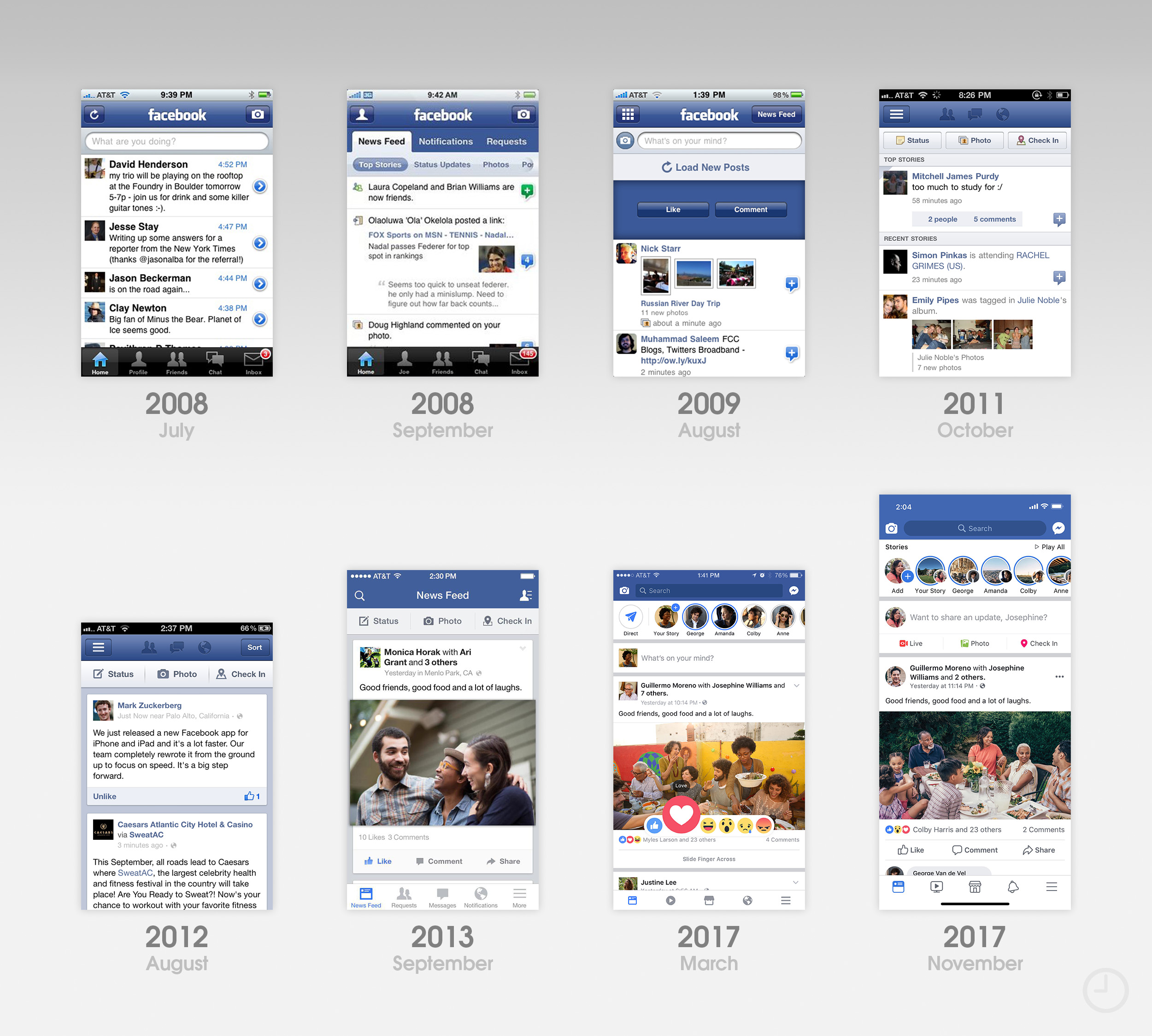
Facebook’s adventures on the iPhone actually began before the App Store existed. The service was initially available as one of the iPhone’s first web apps in October 2007. Version 1.0 in the App Store is barely recognizable as Facebook today aside from the signature blue navigation bar. Even the icon is missing the signature white “f.” The app’s News Feed was essentially an embellished table view above a tab bar with five icons: Home, Profile, Friends, Chat, and Inbox. Version 2.0 built on the same concept, adding two more layers of navigation underneath the main title bar.
Facebook 3.0 was first previewed in July 2009, and introduced a 3×3 grid of icons to help solve the app’s ballooning navigation. Early screenshots show an entirely blue tiled grid, but this design was never released in a public build of the app.
![]()
In October 2011, Facebook 4.0 was an early adopter of the “hamburger menu” for navigation. The app’s popularity hastened the embrace of the controversial design element across countless apps and websites in following years. After version 4, Facebook’s design timeline becomes significantly more challenging to follow. The app’s look began to iterate faster, and changes were often rolled out incrementally instead of being held for major releases.
In April 2013, Facebook experimented with “Chat Heads” in the iOS app, moveable profile photos that expanded into chat windows when tapped on. iOS 7’s new look necessitated a redesign that saw the reintroduction of a tab bar for navigation. Tab bar icons are still regularly redesigned and relocated between updates.
Some of Facebook’s design challenges come from their operational scale. Unlike many smaller apps, Facebook must offer a consistent experience to its customers on a large number of platforms, not just Apple’s. An update in August 2017 attempted to unify the design of the News Feed across iOS, Android, and the web with comments styled to look more like a Messenger conversation.
Things
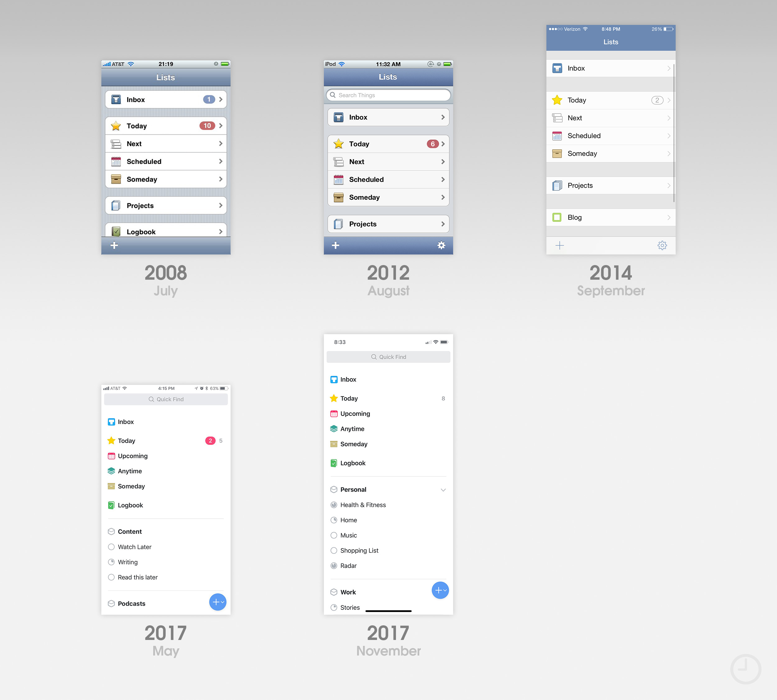
Things began development as a task management tool for the Mac, but ended up hitting 1.0 status on iOS first. Cultured Code, the app’s developer, noted in their launch post that the original version was built in just over a month – a deadline that seemed impossible.
Things 1.0 lacked a way to sync with the Mac version and had tagging disabled, both critical features. Despite the stressful launch, the same basic hierarchy of the app persists to this day. An excellent Flickr album documents the app’s early design stages. The first major visual refresh came in August 2012 when Things 2.0 was released. A fresh coat of paint shed the stock iOS look, and little graphical embellishments gave it unique personality.
![]()
Things 2.5 in September 2014 refreshed the app’s UI again with a flatter look and lighter color scheme. A redesign was originally planned for Things 3, but development took longer than expected. Things 3 released in May 2017 was the most significant change the app’s look yet. Virtually every icon and UI element was re-drawn while preserving the underlying layout. In the update’s launch video, Cultured Code specifically highlights how animation was used to give the app an all-new feel. The redesign earned Cultured Code an Apple Design Award in 2017.
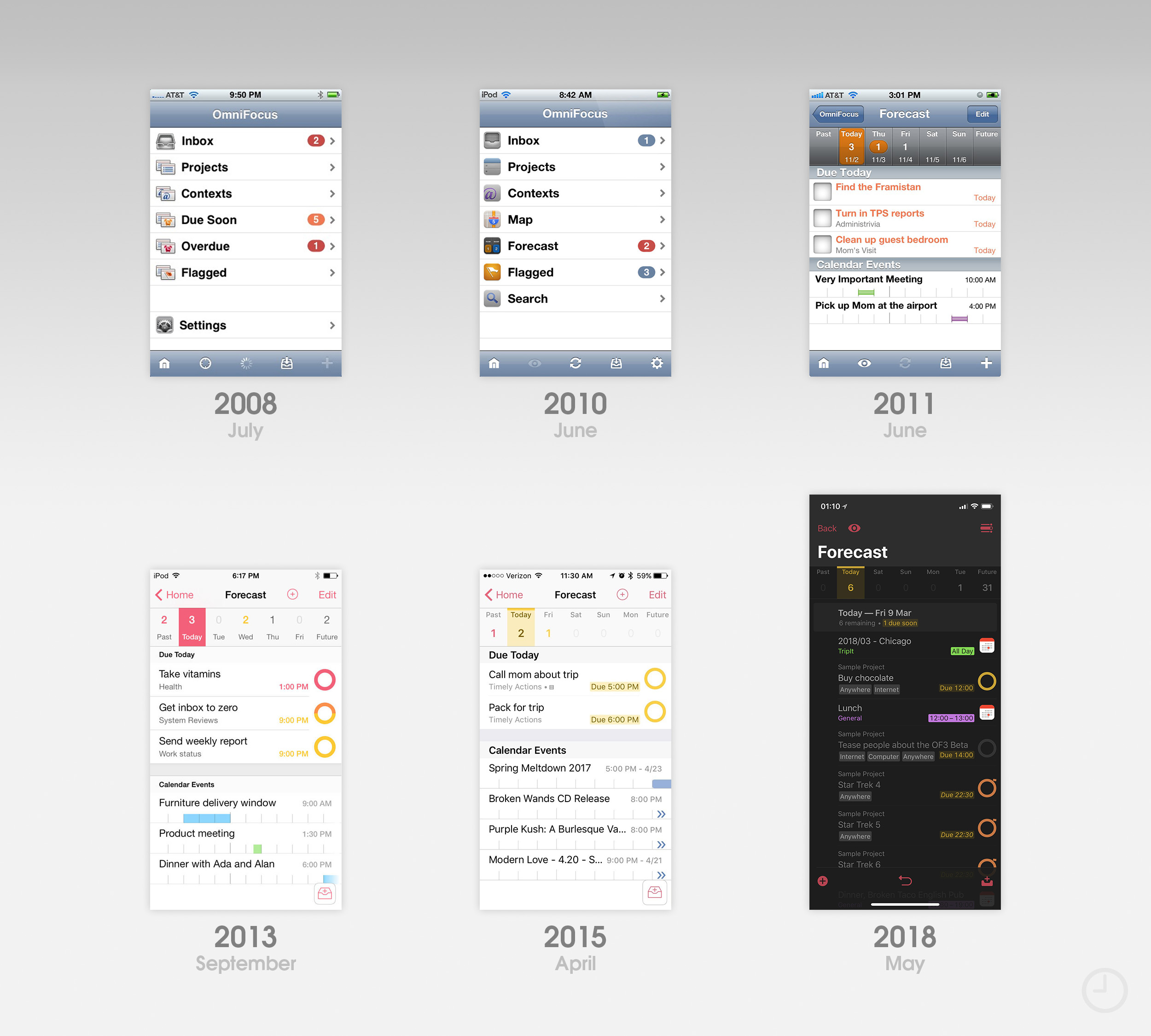
OmniFocus
Even in its infancy, the App Store was well-stocked with task management apps. Both Things and OmniFocus, from The Omni Group, have been available since day one. Although both apps provide similar utility, each has taken unique design directions over the past decade.
OmniFocus for iPhone initially used simple table views with custom iconography for navigation, winning an Apple Design Award in 2008. The Omni Group redrew all of their artwork and the app’s icon in June 2010 in response to the iPhone 4’s Retina display. One of the app’s largest changes came in June 2011 when Forecast mode was added. A glossy date picker just under the navigation bar became a defining UI element, even when the gloss was dropped in 2013 for an iOS 7-era redesign. The new flat look relied heavily on text tint colors for spatial awareness.
![]()
An update in spring 2015 brought a darker app icon to the iPhone with softer edges on the check mark. Every icon since 2012 has included an Easter egg that even longtime users might not know about. Zoom in and you’ll notice that the carbon fiber texture is actually made up of tiny, repeating Omni logos.
The most recent major update to OmniFocus came this past May with OmniFocus 3.0. While many of the changes were engineering related, large titles and iPhone X optimization freshened up the UI.
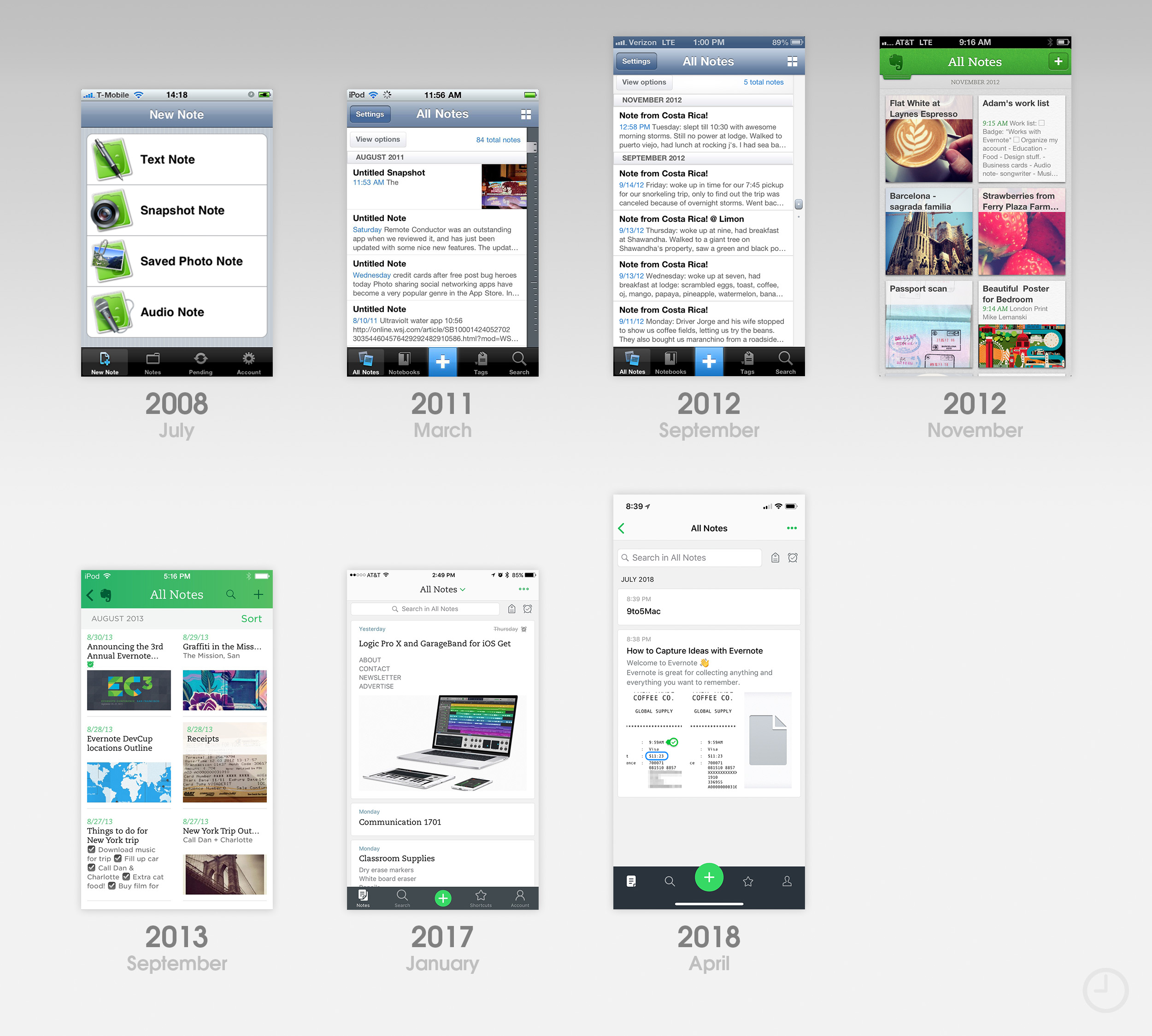
Evernote
Evernote’s styling story perfectly highlights many of the major software design trends since 2008. The note taking and organizational tool got its start as a desktop application prior to the App Store, and had recently rebranded with its recognizable elephant logo before launching on the iPhone.
Like many early iPhone apps, Evernote 1.0 leaned heavily on stock UIKit elements and large, glossy graphics. A redesign in 2011 reorganized the tab bar and prioritized a chronological “All Notes” view. When Evernote added support for the iPhone 5’s larger display in 2012, the app still used default iOS UI elements. Navigation bars and buttons automatically picked up the matte finish of iOS 6.
![]()
In November 2012, Evernote 5 launched. Redesigned from scratch, the app was a textbook example of the richly textured, highly themed designs typical of the era. Embossed iconography, faux paper textures, and deep drop shadows gave the app depth. The app’s icon dropped the aging glossy appearance but retained brushed metal.
In an announcement blog post, Evernote said, “It’s not often that we launch a complete redesign. In fact, it happens only once every few years.” While they didn’t know it at the time, Evernote would need to be redesigned again less than one year later when iOS 7 was announced at WWDC 2013. Evernote 5 won an Apple Design Award the same day.
Evernote embraced iOS 7’s flatness with open arms. Every texture, shadow, and bevel was replaced. A bright left-to-right gradient streaked the app’s navigation bar, matching the colors used on the new texture-free icon. An early 2017 refresh toned down the design with a more muted icon, white navigation bar, note cards with subtle shadows, and a dark tab bar. Further refinements to typography and tab bar icons have followed.
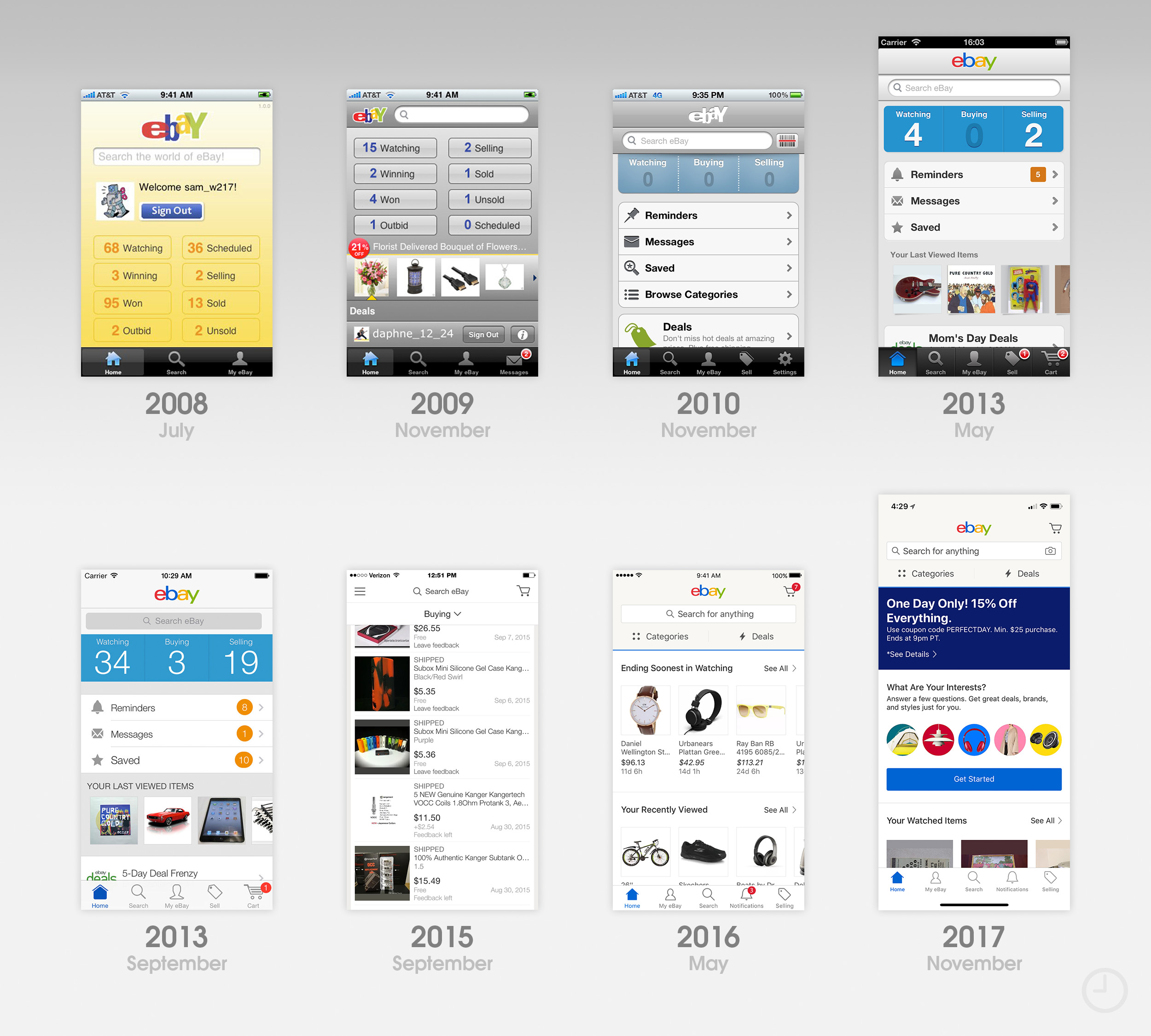
eBay
eBay’s design has seen arguably the most dramatic transformation out of the 10 apps featured in this piece. Although Apple highlighted it onstage at WWDC 2008, the original version of eBay for iPhone was downright crude compared to the refined experience today. By November 2009, the entire app had been rethought with a more consistent gray UI.
One year later, eBay 2.0 laid the groundwork for how the app would be organized for years to come. While eBay had previously offered a standalone selling app, the feature was now rolled into the main experience. The app’s home screen was refreshed too, and finally felt like a truly native iOS design.
![]()
Several updates across 2013 gave eBay new coats of paint while keeping the same basic user experience. Each change reflected the rapidly evolving software design tastes of the era. This continuous iteration meant that eBay’s look transitioned rather smoothly when the app was redesigned for iOS 7. Using a familiar color palette and navigational hierarchy helped preserve user muscle memory.
In September 2015, eBay 4.0 broke the mold. Most of the app’s functionality was placed underneath a hamburger menu, leaving just three tabs near the top: “Activity, Shop, Sell.” With a stark, text heavy UI and new icon to match, the design didn’t last long. By May 2016, eBay had almost entirely reverted the app’s organization. Today’s layout bears closer resemblance to the design launched all the way back in 2010.
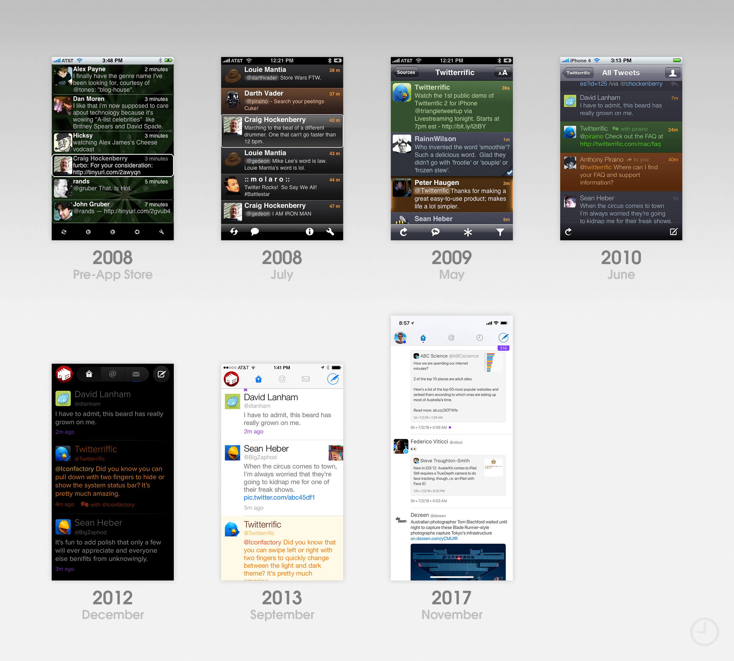
Twitterrific
Craig Hockenberry and The Iconfactory built the first Twitter client for the iPhone before the App Store had even been announced. Thanks to jailbreak software developed by the Apple enthusiast community, developers had several months of experience writing apps by the time Apple provided officially sanctioned tools.
Twitterrific 1.0 borrowed few design elements from the jailbreak days, looking surprisingly polished right out of the gate. It won an Apple Design Award in 2008. Twitterrific was also one of the first apps to use a dark theme – an increasingly popular option today. But Twitterrific’s design story speaks more to the history of Twitter as a service than it does to design trends. Each update reflected changes to the features and functionality of Twitter’s platform. In the early days, these features were often pioneered by third-parties themselves.
![]()
In 2012, Twitterrific 5.0 moved all navigation to the top of the display and used completely custom UI elements. A similar layout has persisted all the way through today. Just as fascinating as the app’s design is its icon. In addition to being the first Twitter app to use bird imagery, Twitterrific is one of the few iOS apps that has managed to retain a richly detailed icon while still looking modern. The app’s mascot, Ollie, barely changed in appearance during the transition to iOS 7, and still looks just as fresh today as in 2012.
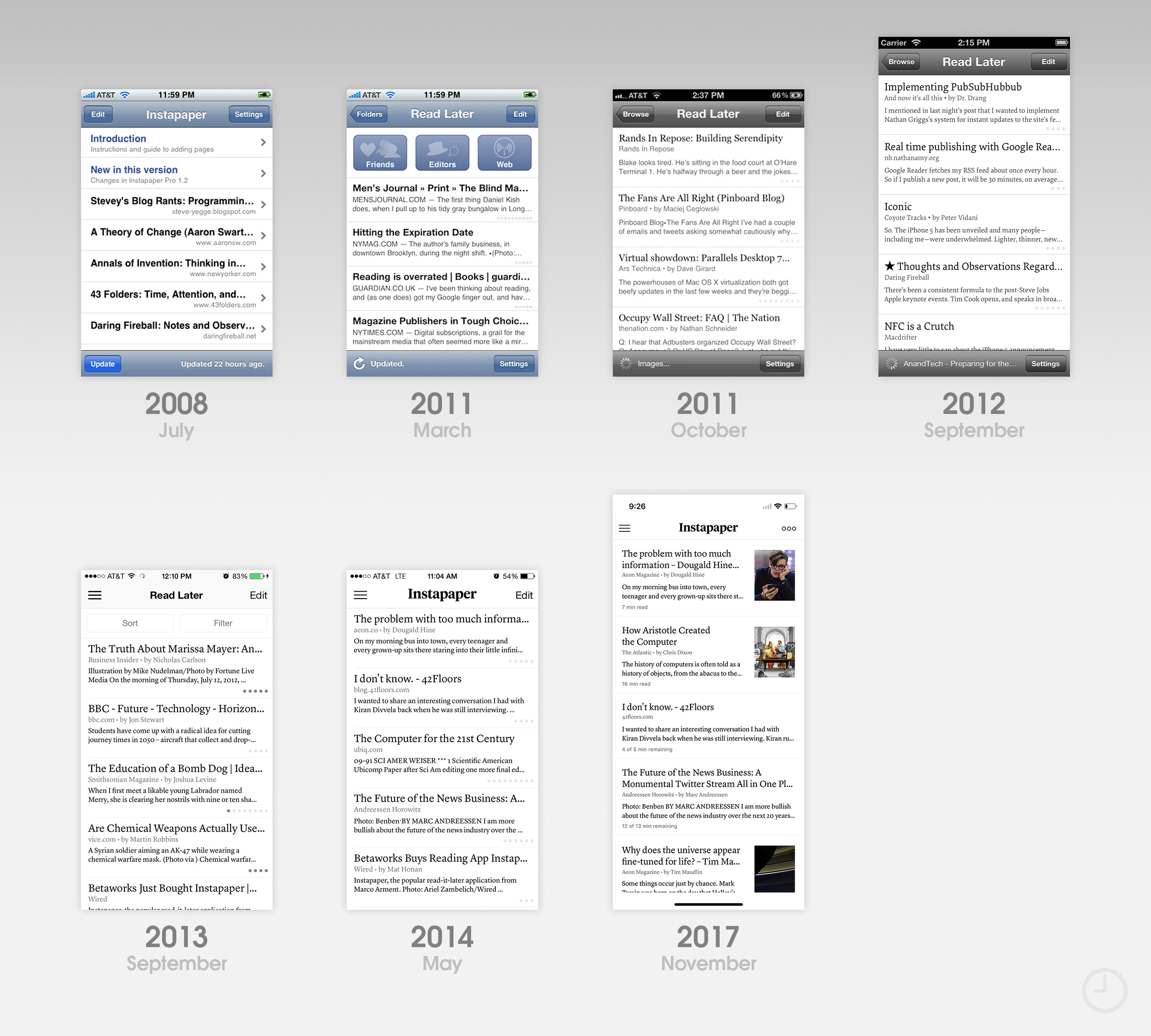
Instapaper
An app built for reading prioritizes content over chrome, so Instapaper’s design was naturally subdued from the start. In fact, some of the most obvious visual changes the app received came thanks to changes to iOS itself. Navigation bar and button styles were changed in both iOS 6 and 7, giving the app two “free” visual refreshes.
Saying the app didn’t evolve would be a misrepresentation, however. Instapaper began its life on the App Store as a free download. Shortly after, a paid version called Instapaper Pro was launched. Big updates to the reading experience and darker UI elements came in fall 2011, when a new icon designed by Dribbble co-founder Dan Cedarholm was added. The icon was later featured on a WWDC session slide about great iconography.
![]()
In April 2013, Betaworks acquired Instapaper from founder Marco Arment, sending the app on a different trajectory. The first major update under Betaworks’ guidance came in September 2013, an iOS 7 refresh. Pinterest acquired Instapaper in August 2016, when the company promised the app would live on. Under current ownership, Instapaper has maintained fairly consistent visuals even after an update to support the iPhone X’s Super Retina display.
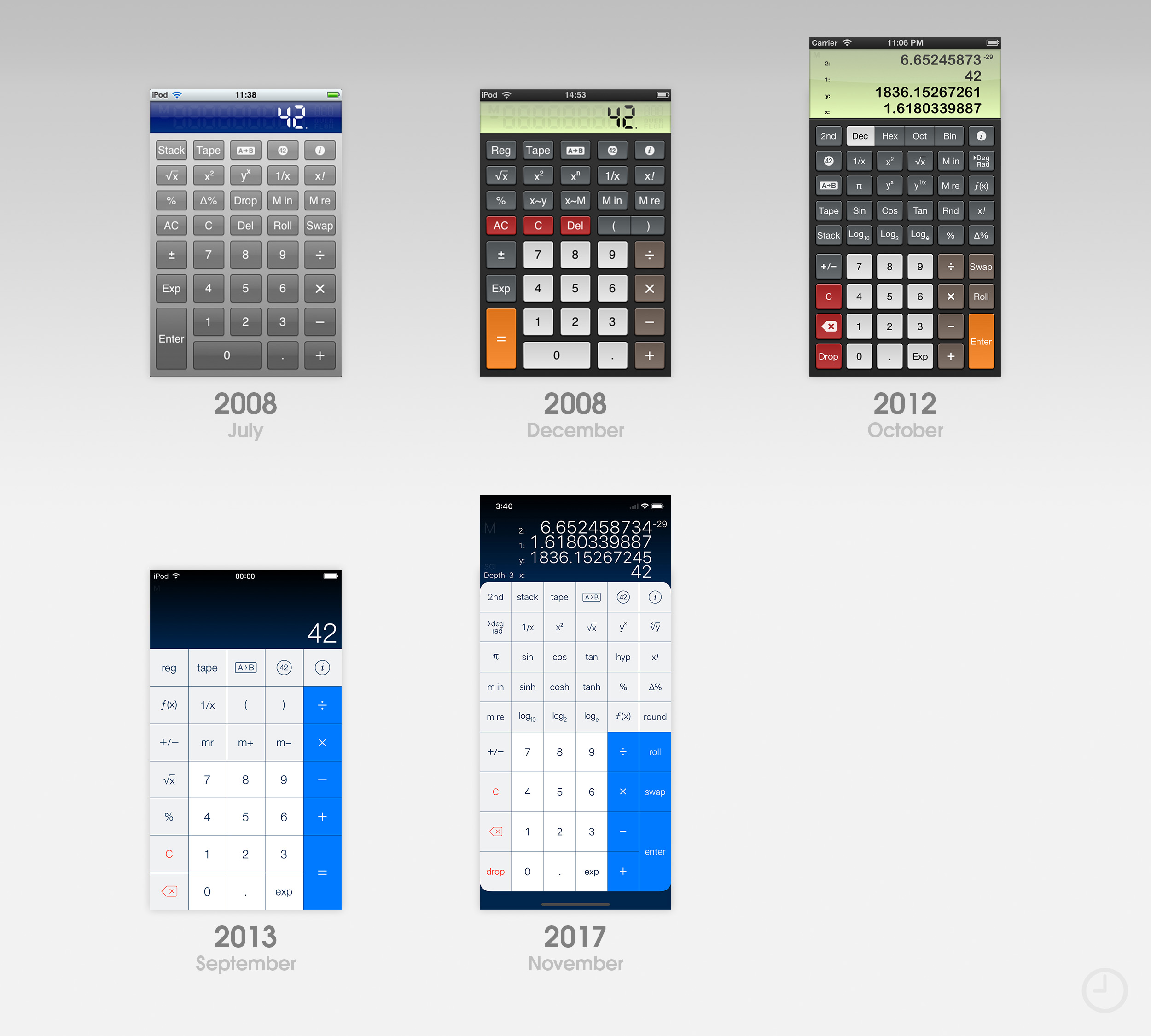
PCalc
The story of PCalc begins well over a decade before the launch of the App Store. Developer James Thomson shipped the original app for the Mac in 1992, and its evolution continues today. PCalc has sported an entirely custom interface on iOS since the beginning, offering an ever-growing selection of themes and customization options. There’s too many to highlight here, so I’ve chosen a few milestones to point out.
The first version of PCalc for the iPhone was ported from a Mac dashboard widget, but paired with the classic iPhone UI well. Glossy buttons and a deep blue LCD panel matched the app’s icon. In December 2008, a popular theme called Twilight was added with even more detailed graphics and a color scheme similar to the default iOS calculator app. Twilight was later updated with retina graphics and support for larger displays. It’s still an option in the app today.
![]()
PCalc adapted to iOS 7’s flat transformation with a new default theme called “Samurai” and a matching icon. Older themes remained available in the app’s settings. PCalc’s icon was refreshed again in March 2016. Since the release of iOS 10.3, Apple has allowed third-party apps to dynamically change their app icons without submitting a new version to the store. PCalc began taking full advantage of the feature in May 2017, rolling out a huge variety of alternate icons to choose from. More have been added in subsequent updates.
After 10 years of development, PCalc has pushed up against the practical limits of an iPhone calculator app. Recent updates have enjoyed some creative freedom with novelty features like an AR calculator mode. Support for the iPhone X display brought rounded corners to the Samurai theme.
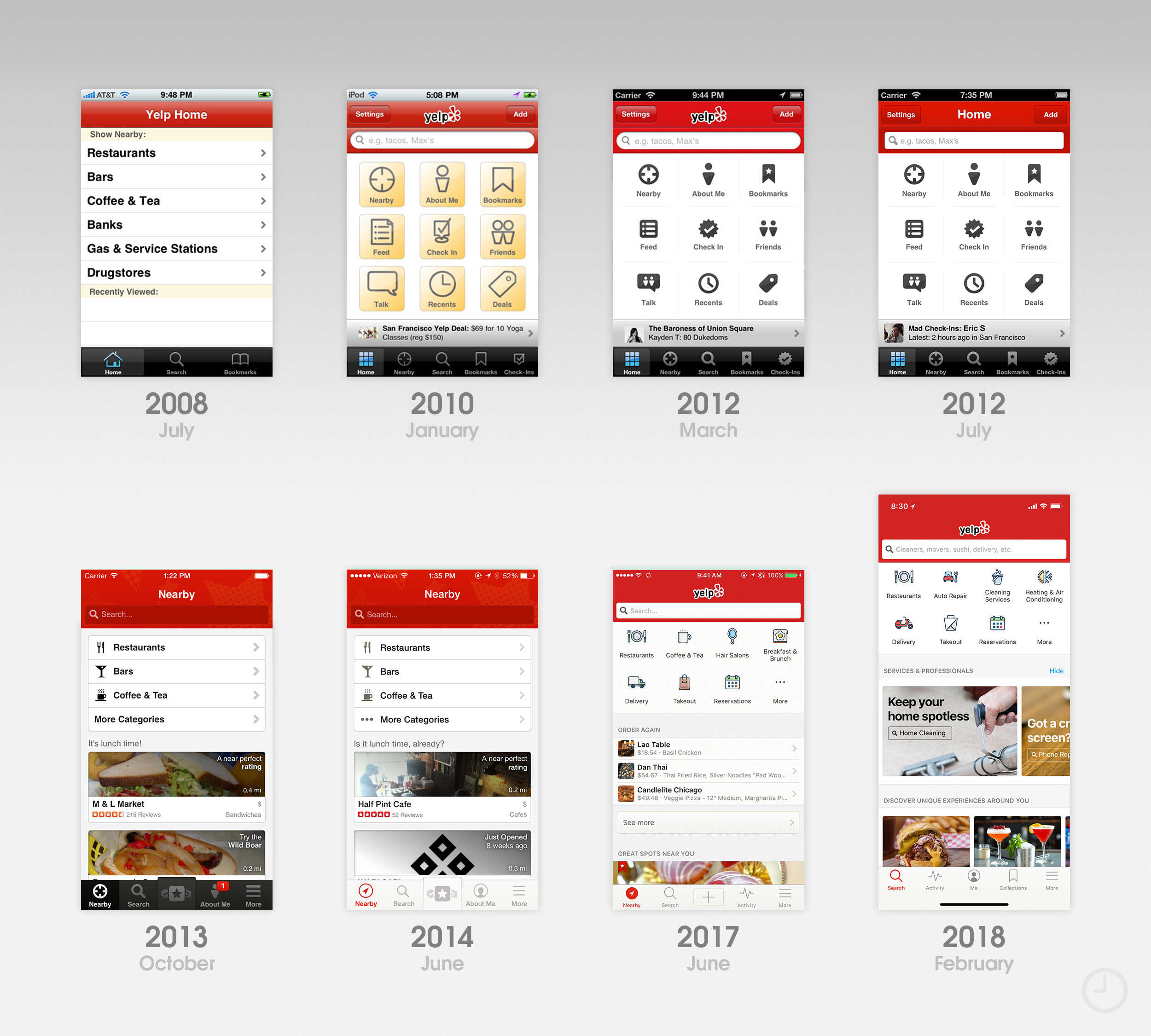
Yelp
Like Facebook, Yelp’s iPhone interface has changed significantly over the years, but maintains recognizable branding thanks to its use of consistent navigation bar coloring. The app has enjoyed increased popularity due to its deep integration with Apple Maps.
![]()
In August 2009, Yelp snuck a rudimentary augmented reality interface into the iPhone app for locating businesses around you. While it was little more than a novelty at the time, the feature feels prescient today given the rise of ARKit apps.
In January 2010, a new Yelp home screen rolled out with a 3×3 grid of quick shortcuts. The same basic interface was stylistically refined until the entire app was redesigned in October 2013 with a flatter appearance and more prominent “Nearby” tab.
Yelp’s most recent updates extend beyond simple location-based results by surfacing content relevant to you. This method of discovery through curation is a user experience design trend that has enjoyed great success in iOS 11’s redesigned App Store.
![]()
The Icons
Comparing the icon iterations of all ten highlighted apps side-by-side reveals the unique path to modernity each chose. Some icons have remained fairly consistent over the past decade with only minor refinements, and others have been redesigned every few years. Lined up chronologically, industry-wide design trends become obvious.
Across the board, glossy icons ruled the land when the App Store launched. Icon gloss was applied by default, and developers had to specifically disable the effect in Xcode to remove it. As iOS apps matured, most eventually lost their gloss and adopted highly detailed custom designs.
iOS 7 famously reset the metric for what makes a good icon. Highly textured and 3D rendered assets generally looked out of place alongside Apple’s new icon set, and some clashed with the updated rounded corner radius. As designers and developers gradually established new guidelines and best practices for icon design, detail and more restrained color palettes have crept their way back into many icons.
Personality
Early iPhone apps plunged into an unknown world headfirst. With no preconceived notions of how an app should look or work aside from Apple’s own small set of stock apps, designers and developers had complete freedom to experiment.
Despite this, many early apps looked and felt very similar as users and developers learned best practices hand-in-hand. Early feedback and trial and error quickly shaped how each app evolved. Within a few years, most apps found their way and developed unique styles and personalities. As hardware capabilities improved, design differentiation gradually shifted from static graphics to animations and dynamic interfaces.
After the homogenizing interface guidelines introduced with iOS 7 sent designers and developers back to the drawing board, many apps began to differentiate themselves with experiential choices that are felt, not seen. Thoughtful curation and predictive information design are often employed to help surface new and interesting content that might otherwise go unnoticed. Intelligent workflows simplify common actions and help you spend less time accomplishing tasks. The importance of good design beyond the pixel level has led to the rise in popularity of user experience (UX) design in recent years.
The Next 10 Years
In 2008, it was impossible to accurately predict how the App Store would evolve. Innovation sprang from innovation, and the tastes and habits of iPhone owners shaped the kinds of apps developers chose to make. The same can be said going forward. Upcoming iPhones and versions of iOS will surely change the app landscape in unforeseen ways. A new design trend could sweep the globe tomorrow. Even after 10 years, the future is exciting.
Check out 9to5Mac on YouTube for more Apple news:
FTC: We use income earning auto affiliate links. More.


Comments