Icon

See All Stories

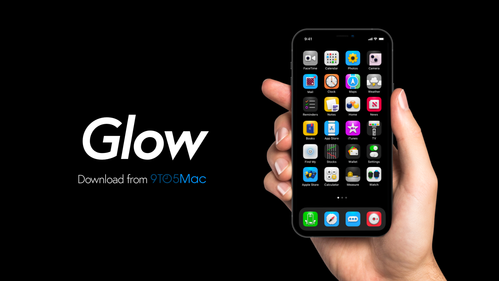
Customize your iPhone Home Screen with this gorgeous new icon pack

We’re holding out hope that this will finally be the year when Apple decides to let users natively customize their Home Screen icons. While we wait for a sound solution, you can still use the Shortcuts app to create your own alternate app icons. We’ve been working on a new set of icons with lots of detail, depth, and vitality that you can use to make your iPhone more fun.

Expand Expanding Close

GarageBand, Star Walk, Threes and more apps go (RED) until December 7th, all proceeds going to charity

Site default logo image

A range of apps have been updated today with limited-time promotions, in aid of the (RED) charity. Apple has participated in the event with an update to GarageBand, offering a limited-edition In-App Purchase that makes over 300 new drum, guitar, synth and bass loops available as an In-App Purchase. All proceeds from the sale of this expansion pack go directly to the (RED) charity, which sends the money to the Global Fund to fight AIDS, Tuberculosis and Malaria. The In-App Purchase, which is priced at $0.99, will be available until December 7th.

Other notable developers are also participating, many of which including exclusive additional content. For example, Threes has been updated, with a fresh red theme and updated icon. Monument Valley has added one special (RED) level, Star Walk has added exploration of Mars, The Red Planet. The popular drawing app, Paper, has also participated with a red application theme and icon. The ‘Over’ app has made special edition font and artwork packs available for purchase. djay and Heads Up! are also taking part in the event. Like GarageBand, 100% of proceeds of app and IAP sales go to the (RED) fund.


Expand
Expanding
Close

Site default logo image

Easter egg in icons for Swift files features ‘Here’s to the crazy ones’ from Think Different campaign

In a throwback to Apple’s Think Different campaign, the icon used by OS X for Swift files, Apple’s new programming language. Swift documents have the file extension ‘.swift’.

The code seen in the icon makes reference to the iconic speech, with functions named ‘heresToTheCrazyOnes’ and ‘villify(troubleMaker: NSObject)’. The code also generates collections of ‘misfits’, ‘rebels’ and ‘troublemakers’.


Expand
Expanding
Close

Site default logo image

Want the new Mac Pro without the price tag? Bring it to your Mac dock

If you’re one of the few eager to try out the Mac Pro but can’t stomach the $2,999 and up price tag, here’s a super-cheap non-solution for you.

https://twitter.com/apollozac/status/399651472922902528

Sure, you won’t get the madness that is the Mac Pro internals, but it’s a black circular trashcan on your Mac dock, so that counts for something, right?


Expand
Expanding
Close

Redesigned iPhoto & Garageband iOS icons appear, indicate likely makeovers next week

Site default logo image

Redesigned icons for iPhoto for iPhone, iPad, and iPod touch and Garageband have appeared in the iCloud Storage Management function in the iOS Settings app. The new icons are simpler, flatter, and is designed with iOS 7’s new icon grid system in mind. They are a stark contrast from the colorful, 3D-like icons used in the current versions of the apps.

In line with the app redesigns for all of Apple’s bundled iOS 7 apps, it is likely that the new icon will come as a complement to a completely redesigned version of the iPhoto app. When Apple released iOS 7 last month, the designs to Apple’s App Store apps went noticeably unchanged. Besides iPhoto, Apple has a slew of other App Store apps (like iWork’s Pages, Numbers, and Keynote & iLife’s iMovie). However, there are yet to be any solid indications of redesigns for the other apps…


Expand
Expanding
Close

Site default logo image

Spotify for iOS gets ‘Discover’ feature, editable playlists, new icon and more

Spotify updated its iOS app today with a few new features, one of which is a brand new ‘Discover’ experience that is rolling out to all users as we speak. As you might expect, the feature allows users to discover content based on their previous listening habits, and is of course a nice feature to have as Apple prepares to roll out its iTunes Radio service with built in Genius features.

Also included in today’s update for Spotify is a brand new logo and the ability to edit playlists directly on your iPhone. Spotify noted that “a shiny, new Now Playing view, featuring the ‘Up Next’ queue” is available now on iPhone and rolling out to all users soon.

A full list of what else is new and fixed in today’s release is below:

What’s New in Version 0.7.1

• New: Ever find yourself wondering what to play on Spotify? Introducing the new Discover experience on iPhone. (Coming soon to everyone.)
• New: A shiny, new Now Playing view, featuring the ‘Up Next’ queue on iPhone. (Again, rolling out to everyone soon.)
• New: Say hello to our new logo.
• New: You can now edit your playlists on your iPhone.
• Improved: We’ve changed the order of the iPhone search tabs. Now it’s Artists, Albums, Tracks. (iPhone/iPod only.)
• Improved: We’ve moved the … context menu button in the Playlist and Album views to the top right of the screen. It’s better there. (iPhone/iPod only.)
• Fixed: Ford integration now works correctly when your iPhone/iPod is set to a language other than English.
• Fixed: In your playlist folders, “All Tracks” will now show you the actual number of tracks.
• Fixed: We’ve sorted lots of crash issues too.
• Fixed: The unread messages in your inbox will now update correctly.
• Fictitious: This app shares 73% of its DNA with bees.

Site default logo image

Dropbox 2.0 lands for iOS, introduces redesigned UI, new photos tab, & easier uploads

Dropbox announced on its blog today the introduction of an all-new iOS app that introduces a redesigned, streamlined UI, a new Photos tab that allows you to scroll through a timeline of your automatically uploaded photos, and improvements to the photo-viewing experience. Dropbox noted that uploads have now been improved, allowing users to ” tap the ‘+’ icon to upload something or create a new folder.”

We’ve packed a ton of love and tiny details into our new iOS design, and we think you’ll dig its simplicity. For example, we got rid of the text labels on our tabs in favor of clean and streamlined iconography. Splashed across the app is the glorious Dropbox blue you’ve come to know and love, and we’ve reduced complexity to make everything feel so fresh and so clean, clean.

Site default logo image

Find My Facebook Friends app forced to change name – becomes ‘Locate’

Developers of the Find My Facebook Friends app have had quite a rough time getting their app past Apple’s App Store review team. The app was originally called “Find My Friends For Facebook” until Apple rejected the app name and icon for being too similar to its own Find My Friends app, forcing the developers to resubmit the app with a new icon and name. While the app has been live in the App Store and steadily growing among users as “Find My Facebook Friends” since March, the developer told us today that it is once again being forced to change its name—but this time by Facebook.

After a few emails with Facebook’s Platform Operations team, Find My Facebook Friends has now been renamed “Locate”. Facebook also requested the developer remove the “f” logo, and then alter the white silhouette used in its icon. It appears Facebook’s platform policy and trademark rights allow iOS developers to use “for Facebook” in their app titles to clearly indicate the app is “for” Facebook and not an official app. However, there are many apps, such as Facebook Chat+, that seem to violate Facebook’s policies the same as Find My Facebook Friends, and they have been available in the App Store for almost a year. The developer noted Facebook contacted him after briefly testing its location-based Find Friends Nearby feature, which did not include the exact same functionality. However, it could easily be confused with Find My Facebook Friends by its title alone. The app still includes the same features, allowing you to locate Facebook friends on a map, receive proximity alerts, and more, but it is now available as “Locate: Real-time Location Sharing for Facebook” in the App Store.

Site default logo image

iOS 6 Apple TV beta 2 lets you reorganize icons with wiggle mode

[youtube=http://www.youtube.com/watch?v=Z4XlSrc4Xuk&feature=player_embedded]

We told you the other day that Apple began seeding the iOS 6.0 Beta 2 OTA update to developers with an update to Apple TV beta 2. One new feature of the Apple TV update spotted by MacMagazine.com.br (via MacRumors) is the ability to reorganize icons on the main UI. Much like the wiggling animation when reordering icons on iOS devices, holding the Select button will allow you to move icons while others reorder automatically the same as on iPhone and iPad. The feature, unlike on other iOS devices, only activates the mode for the currently selected icons, opposed to sending all icons into “wiggle mode”, and does not yet allow icons to be deleted.

Rejected twice by Apple, ‘Find My Facebook Friends’ app finally goes live on App Store

Site default logo image

Rejected twice for being too similar to Apple’s “Find My Friends” app, a new app from developer IZE called “Find My Facebook Friends” is now live on the App Store. The app essentially works the same as Apple’s, allowing you to see your friend’s location on a Google map. It also provides privacy settings to control who can view your location. The difference is rather than using your Apple ID and iCloud account, the app allows you to sign-in and invite friends through Facebook. We talked to the developers who told us the story behind why Apple rejected the app the first two times…

Expand
Expanding
Close

iCloud icon revealed, looks familiar

Site default logo image

Douglas Bowman (via MR) had a peak into Moscone West and saw an iCloud icon.   Looks familiar, no? Oh yes, we detailed this just a few months ago:

A 9to5mac reader writes in telling us he/she’s found some interesting files in Lion.  These files are labeled “MobileDocumentsFolder.icns, Mobile Documents 32.png and SidebarMobileDocumentsFolder.icns” and show new types of icons for a Cloud file system.  Clearly, this would seem to be the successor to iDisk and is probably shows a more transparent interface between the desktop and the Cloud, perhaps a little more like Dropbox. We’re also thinking there is an iWork.com component as well since these are “documentsFolders”.

– here’s the new sidebar icon.

Update: In fact, it looks a lot like a mix of iDisk and iSync (which makes a lot of sense)


+
Expand
Expanding
Close

Manage push notifications

notification icon
We would like to show you notifications for the latest news and updates.
notification icon
You are subscribed to notifications
notification icon
We would like to show you notifications for the latest news and updates.
notification icon
You are subscribed to notifications