9to5Mac Concepts

See All Stories

9to5Mac concepts try to realistically represent Apple product and software ideas. We believe that you need to think like Apple to make a good concept, so that’s precisely what we do. Our concepts range from reported rumors to ideas we have ourselves. We hope that you enjoy them.
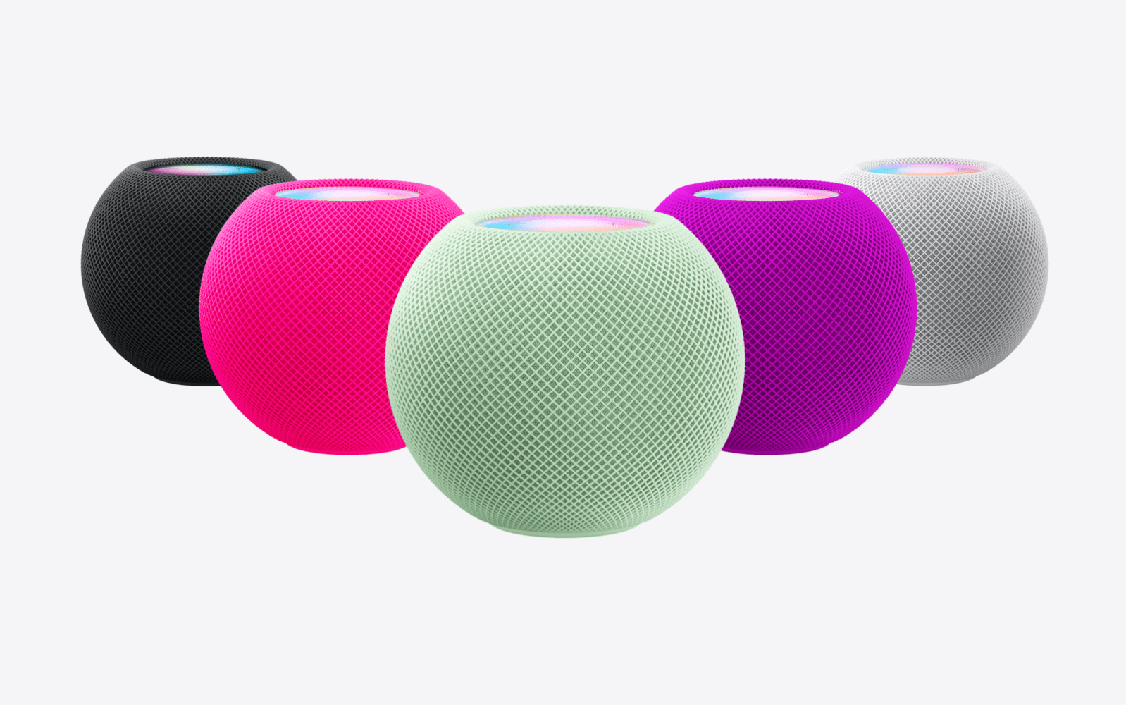
Concept: Could HomePod mini see a colorful update at Apple’s March event?

In November Apple refreshed the HomePod mini with three new fall colors. They’ve been particularly difficult to get recently – nearly unavailable in many retail stores and suffering from longer-than-usual shipping times. Despite this, the white and space gray models are widely available. With Apple’s March event now revealed, might we see a spring color refresh for the HomePod mini?

Expand Expanding Close

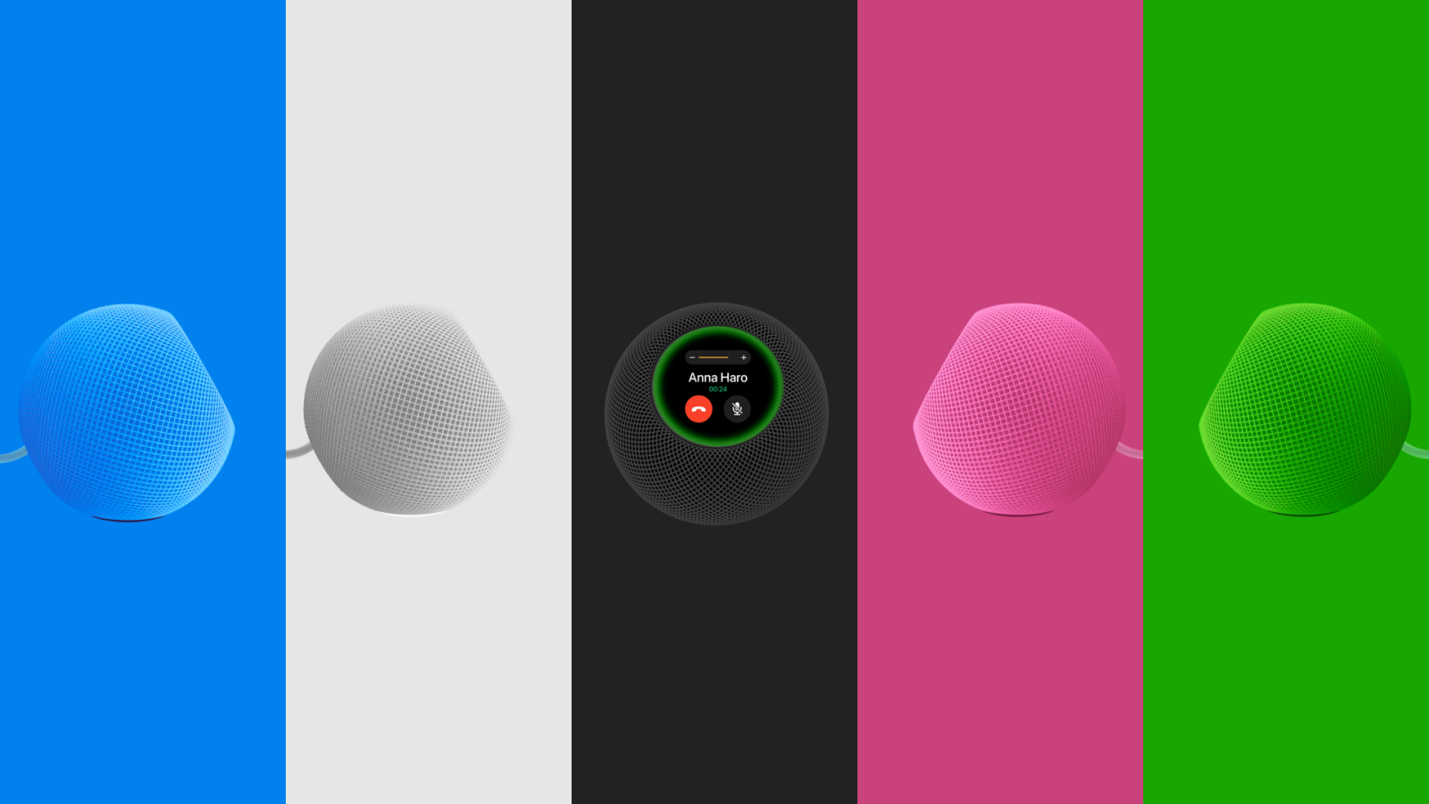
Concept: How Apple could turn HomePod mini into a delightful and adorable smart display

Apple’s home strategy has been all over the place, but the company appears to finally have a hit with the HomePod mini. Rumors have been floated about Apple making a HomePod with a display, but word on the street is that the product being tested looks a lot like an iPad mounted to a speaker. Instead of making a Frankenstein product very similar to Google and Amazon’s products, Apple should take the blueprint it’s laid out with HomePod mini and use it as a basis for a unique ambient smart display.

Expand Expanding Close

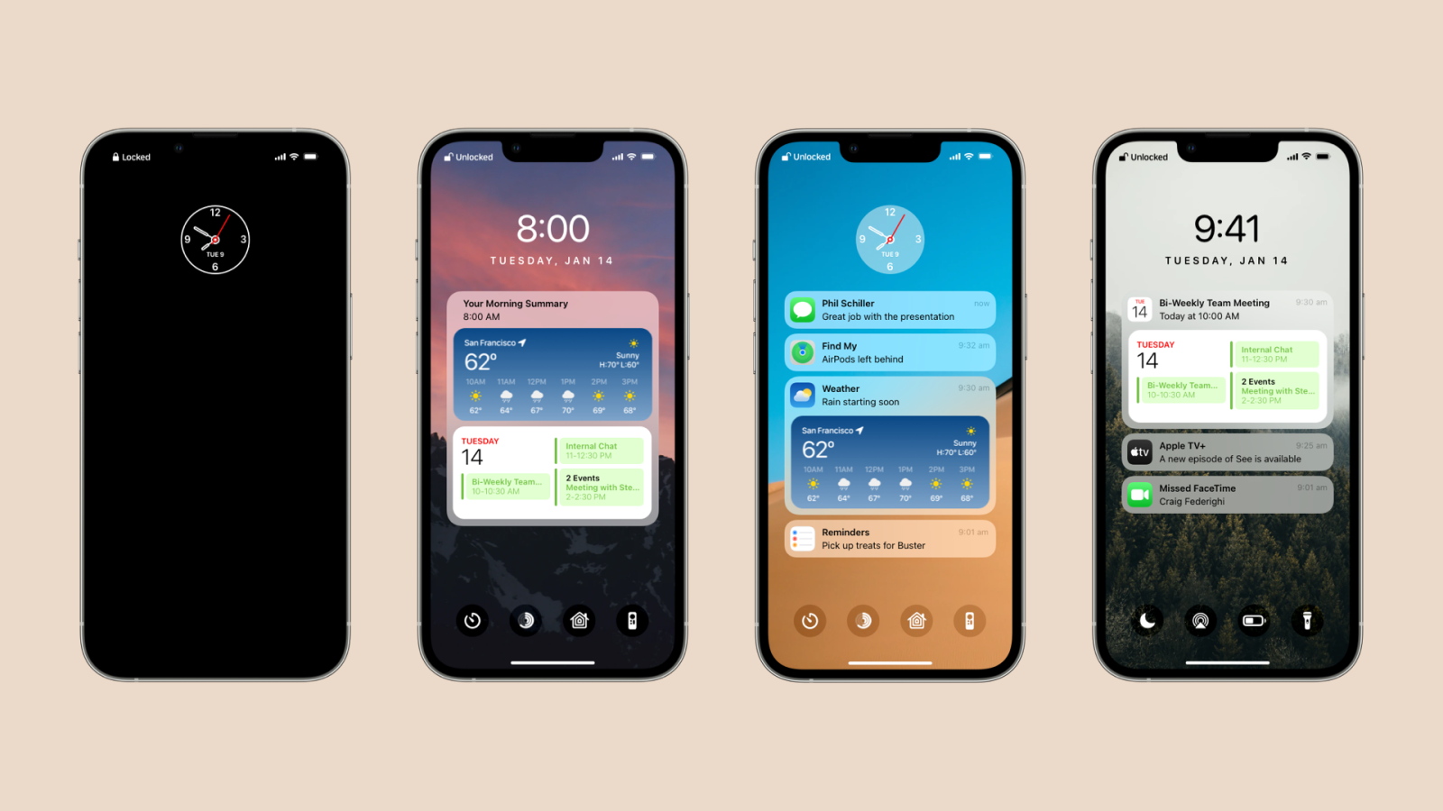
Concept: It’s beyond time to supercharge the iPhone’s lock screen

The iPhone’s lock screen has gone through a small handful of design changes over the years, but it’s never truly been supercharged. With iOS 5, Apple improved the way multiple notifications appear. In iOS 6, they introduced the persistent camera shortcut. In iOS 8, notifications gained quick reply. iOS 10 brought widgets with a quick swipe to the left. The last major change was with iOS 11, when Apple added two haptic shortcuts and merged the lock screen with the Notification Center giving way to the “cover sheet.” But here we are in 2022 and the Lock Screen still isn’t truly customizable. It’s also nowhere near as proactive as other areas of the operating system that have been upgraded over the years.

Expand Expanding Close

Comment: Apple, please don’t overthink your next external display

Apple hasn’t made an affordable high quality external display since 2016 when they retired the final iteration of the Thunderbolt Display. The company has a long history of offering the best possible mass market monitors for notebooks and desktops, dating back to the late 90s or the early days of the Studio Display. Apple’s made a lot of weird decisions over the past decade and this certainly falls under that category. Now that the company has started to reboot the Mac and meet the needs of clamoring customers, it’s time for them to step up and make the display we actually need.

Expand Expanding Close

Concept: AirPods Max just turned one; here’s what we’d like to see in the next version

AirPods Max are officially one year old. That means we’re probably getting close to the first revision, assuming Apple is planning to keep them around. There are lots of ways Apple could improve upon these excellent over-the-ear headphones. But, we wanted to think realistically. What might Apple actually do to upgrade AirPods Max?

Expand Expanding Close

Concept: What might Google’s iOS apps look like with native UI components?

In October, Google announced that they were going to eventually move their iOS apps away from Material Design and introduce more native-looking user interfaces. While we still haven’t gotten a glimpse at what some of the most used apps on the planet may look like built with native UIKit components, I thought it’d be cool to draw up some concepts and imagine what they might entail.

Expand Expanding Close

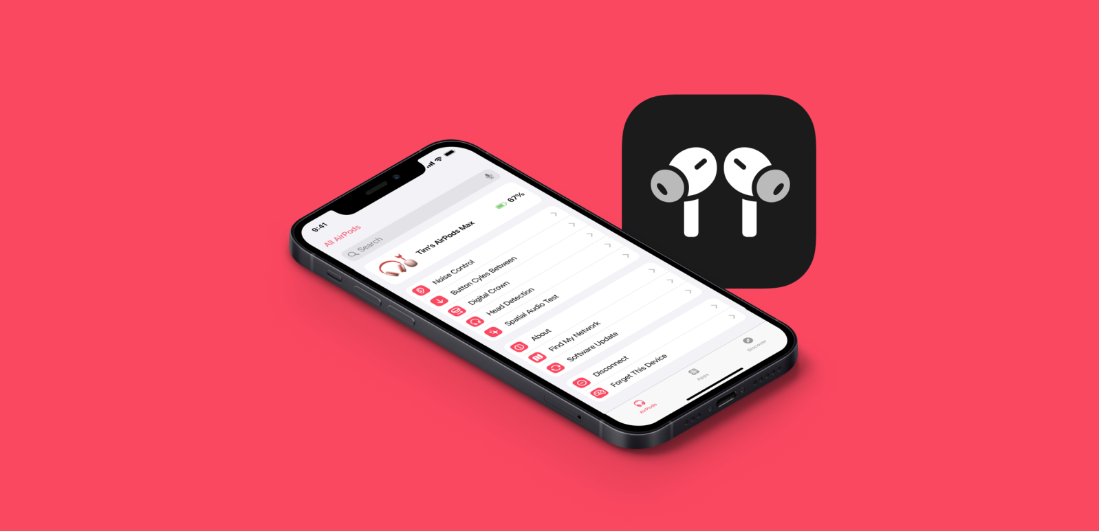
Concept: AirPods have outgrown the Bluetooth menu, they deserve their own app

One of the main draws of AirPods has always been their ability to essentially be invisible, both to the user and to people around them. When they were first introduced they had two features, the ability to play music and the ability to talk to Siri with a tap. But over the past five years, Apple has added new features both through hardware revisions and in software updates that have us wondering if AirPods deserve their own companion app on iPhone. Here’s what we think it should look like.

Expand Expanding Close

Concept: How Apple Card+ could rival other premium cards with exclusive perks and rewards

One of Apple’s best services is Apple Card. Sure, it might just be another credit card that happens to have a really great app in Wallet, but Apple Card could be much more than that. Currently, Apple Card offers excellent customer support, powerful security features, and one of the best physical cards you can get your hands on. Folks like Mark Gurman over at Bloomberg have been wondering, though, what could be next for Apple Card? We’ve been wondering the same thing, and here’s a dive into our ideas.

Expand Expanding Close

Comment: Apple should make a larger version of the base iPad to serve even more customers

larger iPad

One of Apple’s most important products is the $329 iPad. On the surface it seems uninteresting, almost boring. But it serves as a key entry point to the Apple ecosystem, and as a way to get iPad owners to upgrade every couple of years without having to spend an arm and a leg. It’s the best value Apple offers right now. The latest 9th-generation iPad is, in my opinion, one of the best products Apple makes. It has virtually no compromises for the price. But there are plenty of us who would love the option of a larger display that doesn’t cost a fortune. After all, people love big screens and low prices.

Expand Expanding Close

Concept: What if the notch were to eventually make its way to the Apple Watch?

It could be any day now. The notch is inescapable. It’s making its way to any and every device is can. The new MacBook Pro didn’t need a notch, it’s there primarily for aesthetics. Last night, Bloomberg published images of Meta’s upcoming smartwatch that happens to have a notch with a camera. It is entirely possible that Apple is considering putting a notch and a camera on the Apple Watch eventually.

Expand Expanding Close

Concept: How a new MacBook Air could adopt the best parts of the iMac and MacBook Pro

As soon as Apple unveiled the new iMac earlier this year, it hit me that the company needed to give the same design treatment to its mobile counterpart, the MacBook Air. Soon after, the rumors started flowing in, and now that Apple has officially revealed its newest notebook designs with the MacBook Pro, it’s time to look ahead to how the MacBook Air could be redesigned.

Expand Expanding Close

Concept: Here’s what the new MacBook Pro could look like if even the wildest rumors pan out

There are lots of wild rumors floating around the internet ahead of Apple’s big Mac-focused on Monday. New leaks have appeared that say the MacBook Pro is going to get a notch and an edge to edge display. There’s also much debate about the color options Apple is going to offer. We wanted to see what the new MacBook Pro might look like with all of the rumors combined.

Expand Expanding Close

Concept: Here’s how Apple could supercharge CarPlay with deeper integrations and more

Apple Car CarPlay

CarPlay has always been a temporary way for Apple to get its software into existing cars while they work on something far more innovative. Everyone under the sun knows that Apple is building its own car. When we will see the rumored “Project Titan” though, nobody knows. In the meantime, Apple appears to be expanding its efforts to integrate into more aspects of existing cars from other manufacturers. Bloomberg has reported on Apple’s plans to connect CarPlay with things like air conditioning, batteries, seats, and more. Here’s what we think CarPlay could look like with deeper car integration.

Expand Expanding Close

Concept: Please Apple, end the drought already and bring the weather app to iPad

iPadOS 16 concept

We’ve been saying it for years, where’s the iPad’s weather app? It’s been missing from the iPad since day one but many of us expected the app to eventually make its way over. It is one of the few first-party holdouts that haven’t made the leap to iPad, despite being an obvious addition. With the complete overhaul that weather received this year and the acquisition of Dark Sky, we have renewed hopes that the iPad will finally gain the weather app. We’ve thrown together a concept of what it might look like.

Expand Expanding Close

Concept: Quick note-style apps are the key to the iPad’s more productive future

When Apple unveiled iPadOS 15, lots of iPad power users were disappointed that larger changes weren’t made. But one feature has become quite popular and that’s quick note. Quick note is the first applet that can freely float and resize over other full-fledged apps. Quick note is quite useful and fairly smart, letting users add links, rich data, and drawings. But what if this same UI paradigm was used for other tools?

Expand Expanding Close

Concept: How macOS Mammoth could improve productivity, entertainment, and safety with new apps (part 2)

In the first part of our macOS Mammoth concept, we shared a look at ideas for improving the system and redesigning core elements of the desktop. Now, we want to share some ideas for new apps that we’d love to see Apple add in the next version of macOS. There were plenty of different things that we tried out during the design phase, but ultimately we landed on four distinct apps. Let’s take a look.

Expand Expanding Close

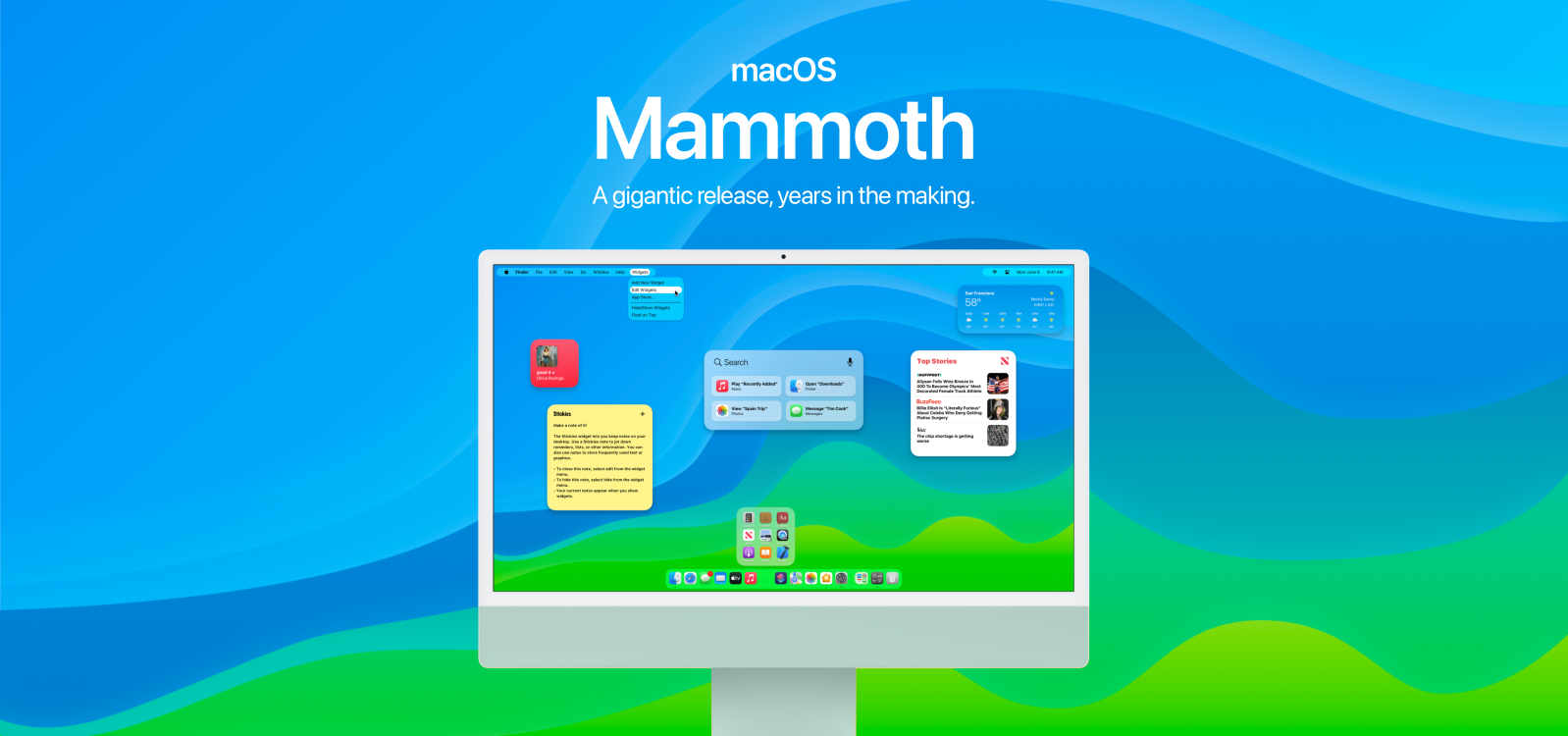
Concept: macOS ‘Mammoth’ should redefine the Mac experience with major changes to the desktop, menu bar, widgets, search, and the dock

Earlier this year we correctly predicted that macOS 12 would be called “Monterey” and later discovered renewed Apple trademarks for places in California. The two renewed names were in fact “Monterey” and “Mammoth.” It’s only natural to assume that next year’s release of macOS will be called Mammoth with Monterey being chosen this year. So what might we see in macOS 13 in 2022? Well, we don’t know yet. But we do know what we want to see.

Expand Expanding Close

Just for fun: What if Apple had made Mac OS-based smartphones, tablets, and watches in the ‘90s?

I often wonder what things would have looked like at Apple if major events hadn’t occurred. Lately, I’ve been thinking a lot about classic Mac OS and old-school small gadgets. So naturally, the question arose: “What if Apple kept making Newtons and what if they ran Mac OS?” Well, if you’re now wondering the same thing, keep on reading.

Expand Expanding Close

Concept: Rethinking Safari in iOS 15 with the same core design principles and goals

Apple’s newest Safari design in iOS 15 has been controversial, to say the least. It’s a complete overhaul of one of the iPhone’s most popular apps that follows entirely different design philosophies. Countless folks, including myself, have tried to come up with ways to “fix” the new design and make it more familiar and comfortable to use. This is my latest try. What I wanted to do was to follow the same principles and aim for the same goal. A mobile browser that’s easy to use in one hand and one that makes switching between sites on the fly a breeze.

Expand Expanding Close

Concept: How Apple could bring Safari’s new design to other built-in apps on the iPhone

Yesterday I published a piece about how Apple could address concerns about Safari’s new bottom bar centric design in iOS 15. Many folks are unhappy with the redesign, but some of us (me included) really like it. I spent some time figuring out different ways Apple could extend this new design language to other built-in apps on the iPhone. I narrowed it down to three distinct user interface components.

Expand Expanding Close

Concept: How Apple could address concerns about Safari’s new design on iPhone in iOS 15

One of the biggest updates in iOS 15 is the completely overhauled Safari. It’s been controversial, to say the least. We’ve heard from many users who are already fed up with the new design just a few weeks after using it in beta. And while some do seem to like the new design, there are still several ways that could make it more useable for the average person.

Expand Expanding Close

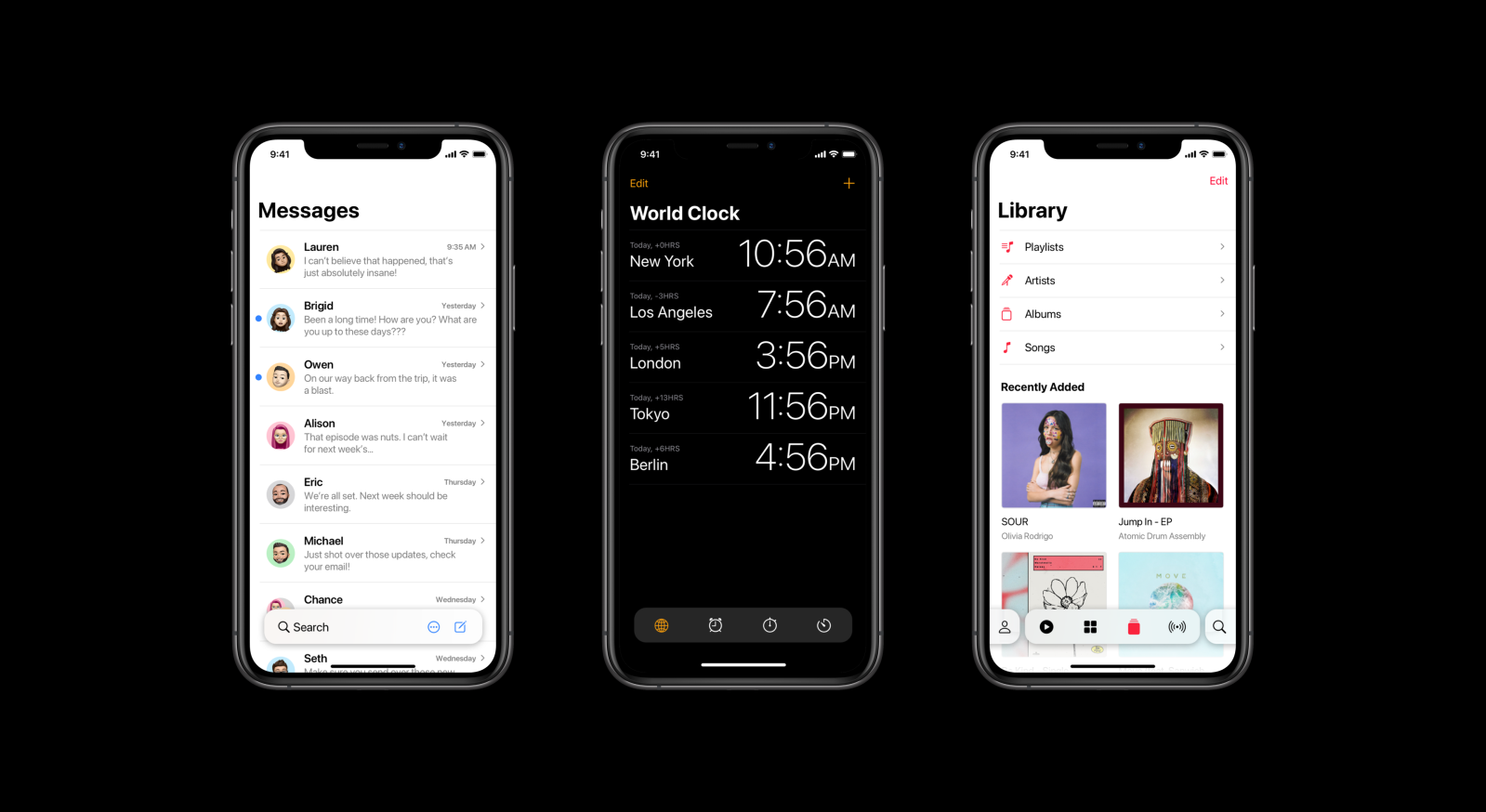
Concept Part 2: How iOS 16 should improve apps like Photos, Music, Watch, Clock, Calculator, and more

Earlier this week, we shared the first part of our iOS 16 concept and explained why we were publishing these ideas so far in advance, especially with the first iOS 15 beta just dropping. That first piece focused on changes to system components, while this piece focuses on individual apps and ties the two together. We looked at a few of Apple’s built-in apps that we believe could use some additional love, as well as ways for Apple to go after some of its biggest competitors.

Expand Expanding Close

Manage push notifications

notification icon
We would like to show you notifications for the latest news and updates.
notification icon
You are subscribed to notifications
notification icon
We would like to show you notifications for the latest news and updates.
notification icon
You are subscribed to notifications